This seminar describes how to conduct a logistic regression using proc logistic in SAS. We try to simulate the typical workflow of a logistic regression analysis, using a single example dataset to show the process from beginning to end.
In this seminar, we will cover:
the logistic regression model
model building and fitting
interpretation of estimated parameters
assessment of model fit
exploring nonlinear effects and interactions
graphing of model effects
The Logistic Regression Model
Binary variables
Binary variables have 2 levels. We typically use the numbers 0 (FALSE/FAILURE) and 1 (TRUE/SUCCESS) to represent the two levels.
Conveniently, when represented as 0/1, the mean of a binary variable is the probability of observing a 1:
$$y = (0, 1, 1, 1, 1, 0, 1, 1)$$
$$\bar{y} = .75 = Prob(y=1)$$
The above data for \(y\) could represent a sample of 8 people, where 0=Healthy and 1=Sick.
Now imagine you repeatedly randomly sampled 8 people 1000 times from the same population where \(Prob(Y=1)=.75\). The number of sick people in each sample
will not always be 6, due to randomness in the selection. However, the average number of sick people in those 1000 samples should be close to 6.
Binomial distribution
The number of sick people in each of our samples of 8 people can be described as a variable with a binomial distribution.
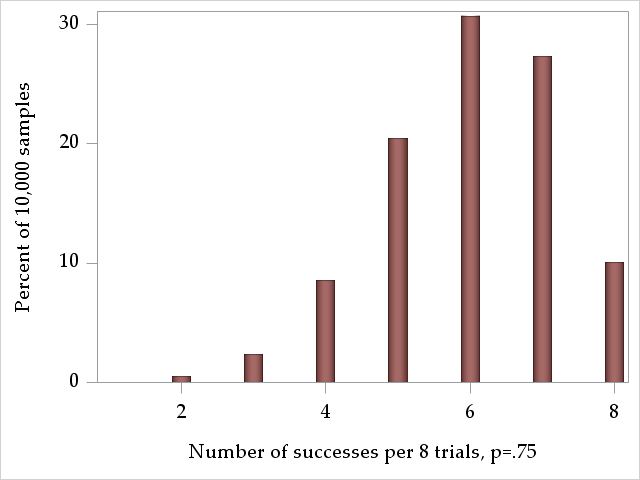
The binomial distribution models the number of successes in \(n\) trials with probability \(p\). For a binomially-distributed variable with \(n=8\) and \(p=.75\), we
can expect something like the following distribution of successes:
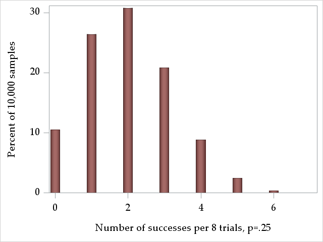
Now imagine we administered a drug to a subgroup of these people, and for this group the probability of being sick is \(Prob(Y=1)=.25\). Their expected distribution of the number of sick per sample of 8 people would look like this:
The mean of binomial distribution, or the expected number of observations where \(Y=1\) is simply the number of trials times the probability of the outcome:
$$\mu_Y = np$$
The variance of the binomial distribution is a function of the same 2 parameters, \(n\) and \(p\), so it is not independent of the mean (as it is in the normal distribution):
$$\sigma_Y^2 = np(1-p)$$
The variance of a binomially distributed variable is largest at \(p=.5\) and equal to zero at the extremes, \(p=1\) and \(p=0\), where everyone has the same outcome value.
Regression of binary outcomes
With regression models, we attempt to model relationships between the mean of an outcome (dependent variable) and a set of predictors (independent variable). Probabilities are means of binary variables, so we can model them as outcomes in regression. We could attempt to model the relationship between the probability of being sick and using the drug with a linear regression:
However, linear regression of binary outcomes is problematic for several reasons:
The error term in linear regression, \(\epsilon_i\), is assumed to have a normal distribution. A binary 0/1 variable cannot have normally distributed errors.
The error term is also assumed to be homoskedastic, having the same variance across each of the \(i\) observations. For binomially distributed variables, the variance is a function of the mean, so populations in which the probability varies will be heteroskedastic.
The range that probabilities can take in this model is unrestricted, with values above 1 and below 0 possible, impossible values for probabilities.
Instead, we would like to use a regression model that assumes that the outcome is binomially distributed and restricts the values of the outcome to be within [0,1]. Logistic regression will help with this, but it models odds directly, rather than probabilities.
Odds
Odds are a transformation of a probability, and express the likelihood of an event in a different way. Given an event has probability \(p\) of occuring, then the odds of the event is:
$$odds = \frac{p}{(1-p)}$$
So, the \(odds\) of an event is the ratio of the probability of the event occuring to the probability of it not occuring. If \(p=.5\), then \(odds=\frac{.5}{.5}=\frac{1}{1}\), which expresses that the event has 1-to-1 odds, or equal odds of occurring versus not occurring. If \(p=.75\), then \(odds=\frac{.75}{.25}=\frac{3}{1}\), and the event has 3-to-1 odds, or the event should occur 3 times for each 1 time that it does not occur.
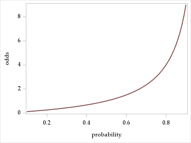
Odds have a monotonic relationship with probabilities, so when the odds increase, the underlying probability has also increased. The following graph plots odds for probabilities in the interval \([.1, .9]\). We see the monotonicity as well the range of values that odds can take:
The graph suggests that \(odds=0\) when \(p=0\) and that \(odds=\infty\) when \(p=1\), so odds can take on any value in \([0, \infty)\).
Logits
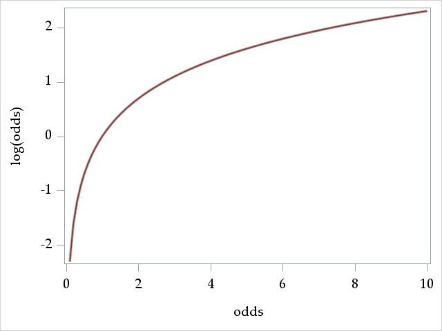
Conveniently, if a variable \(x\) is defined over the interval \([0, \infty)\), then its logarithm, \(log(x)\) is defined over \((-\infty, \infty)\). Thus, since \(odds\) is defined over \([0, \infty)\), then \(log(odds)\) is defined over \((-\infty, \infty)\).
The logarithm of the odds for probability \(p\) is also known as the \(logit\) of \(p\):
$$logit(p) = log\left(\frac{p}{1-p}\right)$$
Because the logit can take on any real value, using it as the dependent variable in a regression model eliminates the problem of producing predictions from the model outside of the range of the dependent variable. This was a big problem when using the probability \(p\) directly as the outcome.
The logistic regression model
The logistic regression model asserts a linear relationship between the logit (log-odds) of the probability of the outcome, \(p_i = Prob(Y_i=1)\), and the \(k\) explanatory predictors (independent variables) for each observation \(i=1,...,n\):
First, notice there is no error term \(\epsilon_i\) in the model. Unlike in linear regression, no residual variance is estimated for the model. Remember that for a binomially distributed variable, the variance is determined by the probability (mean) of the outcome, \(\sigma_Y^2 = np(1-p)\), so does not need to be independently estimated.
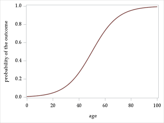
Second, notice that the while the explanatory predictors have a linear relationship with the logit, they do not have a linear relationship with the probability of the outcome. Instead, continuous variables have an S-shaped relationship with the probability of the outcome. Once we have our logistic regression coefficients, the \(\beta\)s, estimated, we can use the following alternate form of the model to get the predicted probability:
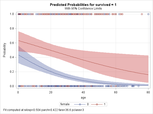
A graph plotting predicted probabilities against ages ranging from 0 to 100 shows the expected S-shape:
This non-linear relationship implies that 1-unit increases in age do not always translate to a constant increase in the probabilities. Indeed, moving from age 50 to 51 causes a larger increase in probability (more vertical distance) than moving from age 99 to 100. Importantly, though, the change in odds (expressed as a ratio) is constant over the entire range of age.
Practically, this also means that one cannot know the difference in probabilities due to a unit change in a given predictor without knowing the values of the other predictors in the model.
Logistic regression coefficients can be interpreted in at least 2 ways. First we'll look at the interpretation in the logit metric. Imagine we have a very simple logistic regression model, with a single predictor, x:
So the intercept, \(\alpha\), is interpreted as the logit (log odds) of the outcome when \(x=0\). This generalizes to multiple predictors to be the logit of the outcome when all predictors are equal to 0, \(x_1 = x_2 = ... = x_k = 0\).
In the logit metric, the \(\beta\) express the change in logits, or log odds, of the outcome for a 1-unit increase in the predictor (similar to linear regression). Positive coefficients signify increases in the probability with increases in the predictor, though not in a linear fashion.
For the following section, we will use \(odds_p\) in place of \(\frac{p}{1-p}\) to make the formulas more readable.
Recall the inverse function for the logarithm is the exponentiation function:
$$exp(log(x)) = x$$
Thus, we can get ourselves out of the logit metric through exponentiation. In the last slide, we saw that the intercept \(\alpha\) is estimated logit of the outcome when the predictors were equal to zero:
$$log(odds_{p_{x=0}}) = \alpha$$
Exponentiating both sides yields:
$$odds_{p_{x=0}} = exp(\alpha)$$
The exponentiated intercept is then interpreted as the odds of the outcome when the predictors are equal to zero.
Now let's interpreted an exponentiated \(\beta\). First, the expression for \(\beta\) in the logit metric:
Exponentiated \(\beta\) coefficients expresses the change in the odds due to a change in the predictor as a ratio of the odds, and are thus referred to as odds ratios.
The effects of predictors expressed as log-odds or as odds ratios are independent of the values of the other predictors in the model (unless they are interacted).
To demonstrate logistic regression modeling with PROC LOGISTIC, we will be using a dataset describing survival of passengers on the Titanic. The dataset was obtained from the Vanderbilt Univeristy Biostatistics Department datasets page. Sources for the data include Encyclopedia Titanica and Titanic: Triumph and Tragedy, by Eaton & Haas(1994), Patrick Stephens Ltd.
The original dataset contains 1,309 passengers and 14 variables. However, to avoid dealing with missing data issues in this seminar, we have restricted the dataset to the 1,043 passengers that had no missing on the following 7 variables:
age: passenger age
fare: fare paid
female: gender, transformed from the original character variable sex
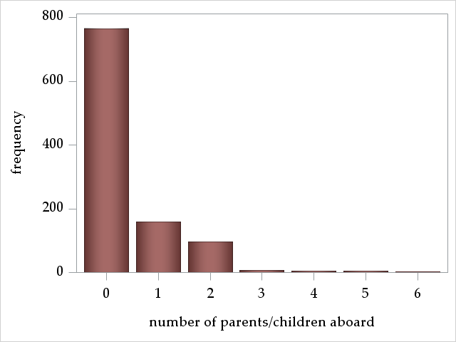
parch: number of parents/children aboard
pclass: passenger class
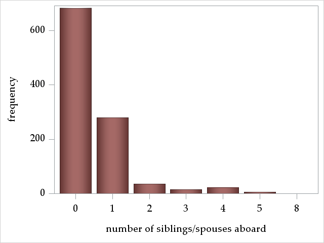
sibsp: number of siblings/spouses aboard
survived: whether passenger survived the sinking
We always recommend familiarizing yourself with model variables before running the model, which we do now.
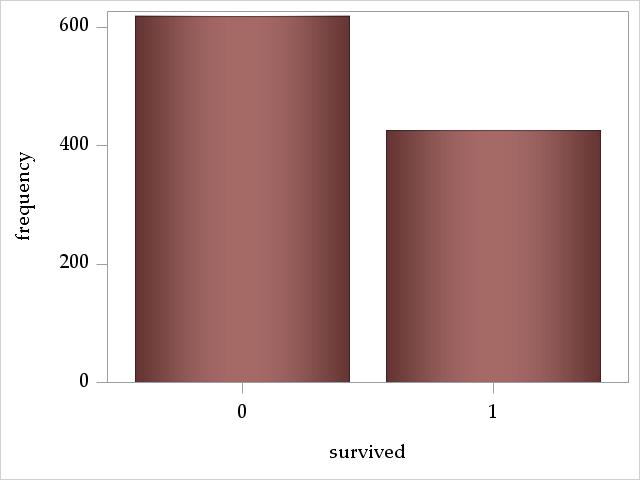
Outcome: survived
The outcome survived is a binary 0/1 variable that indicates whether a passenger survived the sinking of the Titanic. The mean of survived, or \(Prob(survived=1)\), is about 0.41. So, less than half of the passengers survived.
Analysis Variable : survived survived
N
Mean
Std Dev
Minimum
Maximum
1043
0.4074784
0.4916009
0
1.0000000
Discrete predictors: female, pclass, parch, and sibsp
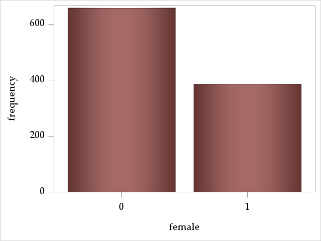
The variable female is a binary 0/1 variable signifying male/female. The majority of passengers were male:
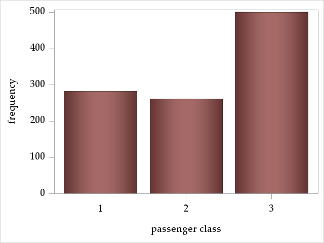
The variable pclass describes the passenger's travel "class" and is a three-level, ordered categorical variable, where 1, 2, and 3 signify first, second, and third class, respectively. Almost half of the passengers were travelling third class:
The variables parch and sibsp are count variables, counting the number of parents/children and siblings/spouses aboard. Most passengers traveled alone.
Continuous predictors: age and fare
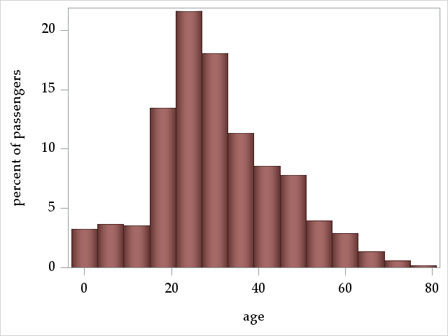
The variable age ranges from 0.1667 years to 80.
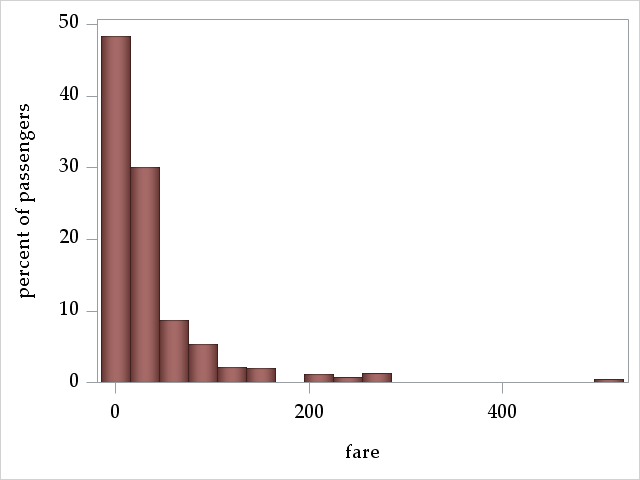
The variable fare ranges from 0 to 512.33 pounds.
Forming hypotheses about what predicts surviving the Titanic sinking
Based on our intuition and vague recollections of the surely historically accurate Titanic movie, we might hypothesize that:
Female passengers were more likely to survive, because of the "Women and children first into lifeboats" code of conduct
Passengers with more siblings and parents are more likely to survive, because they are more likely children or women
Younger passengers might be more likely to survive, perhaps up to adulthood
Passengers in higher class and who paid a higher fare are more likely to survive, because of preferential treatment and access to lifeboats
Correlations among variables
To preview whether or hypotheses might be confirmed and whether predictors are correlated and might thus explain the same variance in survival, we inspect a correlation matrix of all of our variables. Correlations only account for linear relationships, so a non-significant correlation does not imply that two variables are unassociated. Note: We do not recommend forming hypotheses about survival after looking at this matrix.
Pearson Correlation Coefficients, N = 1043 Prob > |r| under H0: Rho=0
survived
female
pclass
parch
sibsp
age
fare
survived
survived
1.00000
0.53633
<.0001
-0.31774
<.0001
0.11544
0.0002
-0.01140
0.7130
-0.05742
0.0638
0.24786
<.0001
female
0.53633
<.0001
1.00000
-0.14103
<.0001
0.22253
<.0001
0.09646
0.0018
-0.06601
0.0330
0.18640
<.0001
pclass
pclass
-0.31774
<.0001
-0.14103
<.0001
1.00000
0.01634
0.5981
0.04633
0.1348
-0.40908
<.0001
-0.56456
<.0001
parch
parch
0.11544
0.0002
0.22253
<.0001
0.01634
0.5981
1.00000
0.37396
<.0001
-0.14931
<.0001
0.21765
<.0001
sibsp
sibsp
-0.01140
0.7130
0.09646
0.0018
0.04633
0.1348
0.37396
<.0001
1.00000
-0.24235
<.0001
0.14213
<.0001
age
age
-0.05742
0.0638
-0.06601
0.0330
-0.40908
<.0001
-0.14931
<.0001
-0.24235
<.0001
1.00000
0.17721
<.0001
fare
fare
0.24786
<.0001
0.18640
<.0001
-0.56456
<.0001
0.21765
<.0001
0.14213
<.0001
0.17721
<.0001
1.00000
We see that:
Many of our hypotheses might be confirmed, although siblings/spouses may not be associated with survival
age, fare, and pclass are all correlated with each other (and survived), so might explain some of the same variance in survival
female and parch are also correlated with each other
Fitting the Logistic Regression Model with proc logistic
Basic proc logistic syntax
The dataset is rather large at 1,043 observations with a not terribly skewed split along the binary outcome survived at 425 survived and 618 who did not survive. Therefore, we feel we have a sufficient sample size to have enough power to include all predictors in our intial model.
proc logistic data=titanic descending;
class pclass female;
model survived = pclass age sibsp parch fare female / expb;
run;
proc logstic statement: calls the procedure with options to controls some aspects of output and plots (among other things)
use the option data= to specify the dataset
descending requests that proc logistic model the probability that the outcome equals the larger value of a binary variable, or the 1 for a 0/1 variable; if this option is omitted, proc logistic will instead model the probability of the smaller value
class statement: specifies variables to be treated as categorical (nominal, classification). Note the default parameterization of the model used in proc logistic, which is "effect" parameterization, different from many other SAS procs. Parameterization affects interpretation of the intercept and the parameters associated with the class variables.
model statement: specifies the logistic regression model, options for fitting the model, and additional statistics available for output.
the outcome variable survived appears to the left of =
the predictors appear to the right of =; those that do not appear on the class statement are modeled as continuous with a linear relationship with the log-odds of the outcome
options appear after the /
expb requests that exponentiated coefficients appear in the coefficients table. For non-interaction effects, these will be odds ratios.
First model output, part 1
We will examine the output of our first logistic regression model in detail:
The SAS System
The LOGISTIC Procedure
Model Information
Data Set
WORK.TITANIC
Response Variable
survived
survived
Number of Response Levels
2
Model
binary logit
Optimization Technique
Fisher's scoring
The Model Information table asserts that we are running a binary logistic regression on the outcome survived in the dataset work.titanic, and that the Fisher scoring (iterative reweighted least squares) algorithm is used to find the maximum likelihood solution of the parameter estimates.
Number of Observations Read
1043
Number of Observations Used
1043
This table asserts tells us that all of the 1,043 observations were used in the model
Response Profile
Ordered Value
survived
Total Frequency
1
1
425
2
0
618
The Response Profile table shows the unconditional frequencies of the outcome survived.
Probability modeled is survived=1.
This statement asserts that we are modeling the probability of survived=1 (the result of using the option descending on the proc logistic statement).
Class Level Information
Class
Value
Design Variables
pclass
1
1
0
2
0
1
3
-1
-1
female
0
1
1
-1
The Class Level Information table shows us that "effect" parameterization has been used for our categorical predictors. With effect parameterization:
\(k-1\) design variables are used to represent all but one of the \(k\) levels of the categorical variable in the regression model (one must be omitted due to perfect collinearity)
the omitted level is represented by the value -1 in the design variables, (so pclass=3 and female=1 are the omitted levels)
the intercept is interpreted as the grand mean of the logit (log-odds) of the outcome when all predictors equal 0, and the parameters for the class variables are interpreted as differences (in logits or log-odds) from the grand mean
We will discuss using an alternative class variable parameterization, reference parameterization (dummy coding), later.
Model Convergence Status
Convergence criterion (GCONV=1E-8) satisfied.
The Model Convergence Status table tells us that the (default) model convergence criterion has been met with the current set of model parameters. This means that the algorithm searching for the best solution cannot find a set of parameters that improves the fit of the model more than .00000001 (measured by the objective/loss function) compared to the current set of parameters.
Model Fit Statistics
Criterion
Intercept Only
Intercept and Covariates
AIC
1411.985
985.058
SC
1416.935
1024.657
-2 Log L
1409.985
969.058
The Model Fit Statistics table displays two relative fit statistics, AIC and SC(BIC), and -2 times the log likelihood of the model. Generally, you'll want the values in the Intercept and Covariates column, as these reflect the full model just fit. Lower values on AIC and SC signify better fit (both penalize adding more parameters to the model).
Testing Global Null Hypothesis: BETA=0
Test
Chi-Square
DF
Pr > ChiSq
Likelihood Ratio
440.9268
7
<.0001
Score
391.2102
7
<.0001
Wald
277.4250
7
<.0001
The Testing Global Null Hypothesis: BETA=0 table contains the results of three tests of the global null hypothesis that all coefficients (except for the intercept) are equal to 0, often thought of as a test of the utility of the whole model:
$$\beta_1 = \beta_2 = ... = \beta_k = 0$$
These tests are asymptotically equivalent (equivalent in very large samples), so will ususally agree. In cases where they don't, many prefer the likelihood ratio test (Hosmer et al., 2013)
Type 3 Analysis of Effects
Effect
DF
Wald Chi-Square
Pr > ChiSq
pclass
2
70.7619
<.0001
age
1
34.9919
<.0001
sibsp
1
11.4336
0.0007
parch
1
0.3366
0.5618
fare
1
0.3886
0.5330
female
1
214.8255
<.0001
The Type 3 Analysis of Effects table conducts Wald tests for all of the coefficients against 0 for each effect in the model. For the effect of a categorical variable with more than 2 levels, this will be a joint test of several coefficients. For example, the Wald test for variable pclass involves 2 coefficients and is significant at zero, suggesting systematic differences in survival among passenger classes.
The interpretation of these Type 3 tests depend on the parameterization used in the class statement and whether there are interactions in the model. With "effect" parameterization and no interaction, these Wald tests are tests of equality of means across levels of the variable (test of main effects). See here for more information:
First model output, part 2: model coefficients
Analysis of Maximum Likelihood Estimates
Parameter
DF
Estimate
Standard Error
Wald Chi-Square
Pr > ChiSq
Exp(Est)
Intercept
1
1.3424
0.2515
28.4870
<.0001
3.828
pclass
1
1
1.1788
0.1644
51.3910
<.0001
3.251
pclass
2
1
-0.1048
0.1257
0.6952
0.4044
0.901
age
1
-0.0393
0.00665
34.9919
<.0001
0.961
sibsp
1
-0.3577
0.1058
11.4336
0.0007
0.699
parch
1
0.0597
0.1029
0.3366
0.5618
1.062
fare
1
0.00121
0.00194
0.3886
0.5330
1.001
female
0
1
-1.2727
0.0868
214.8255
<.0001
0.280
The Analysis of Maximum Likelihood Effects table lists the model coefficients, their standard errors, and tests of their significance.
Next to the Parameter column is an untitled column with a few numbers in it (1 and 2 next to pclass, 0 next to female). These are the levels of the class variables (pclass or female) that correspond to the coefficient on that row.
The coefficient estimates here are in logit (log-odds) units
The Intercept is the expected log-odds of survival when all predictor in the model equal zero (age=0, sibsp=0, parch=0, fare=0) and averaged across levels of female and pclass
The coefficients for the continuous predictors, age , sibsp, parch, and fare express the change in the log odds of survival per unit increase in the predictor.
The coefficients for the class variables pclass and female represent comparisons of those groups to the grand mean.
Although many of us are not used to thinking in log-odds coefficients, we can at the very least interpret positive coefficients to mean that increasing levels of the predictor increase the probability of the outcome (survived=1) Thus, we can interpret these coefficients to mean that:
First class passengers, but not second class passengers, were more likely to survive than average survival of the 3 classes. NOTE: these are not interpreted as differences from a reference group, since we used the default "effect" parameterization
Older passengers were less likely to survive
Having more siblings or spouses on board decreased chances of survival
Number of parents did seem to predict survival
Passenger fare also did not seem to predict survival, perhaps because it is strongly correlated with passenger class (which did have an effect)
Male passengers were less likely to survive
The Exp(Est) lists the exponentiated coefficients. Except for the intercept, values in this column are odds ratios. This column is added because we specified expb on the model statement.
Odds Ratio Estimates
Effect
Point Estimate
95% Wald Confidence Limits
pclass 1 vs 3
9.515
5.584
16.212
pclass 2 vs 3
2.636
1.779
3.905
age
0.961
0.949
0.974
sibsp
0.699
0.568
0.860
parch
1.062
0.868
1.299
fare
1.001
0.997
1.005
female 0 vs 1
0.078
0.056
0.110
The Odds Ratio: Estimates table displays the exponentiated coefficients for predictors in the model and their confidence intervals (formed by exponentiating the confidence limits on the logit scale). An odds ratio of 1 signifies no change in the odds, so confidence limits that contain 1 represent effects without strong evidence in the data. We will interpret the point estimates of the odds ratios:
Conveniently, this table directly compares the groups of pclass, which the regression coefficients did not. Notice that the values in the Point Estimates for pclass differ from the values in the Exp(Est) in the previous Analysis of Maximum Likelihood Effects table. Both 1st and 2nd class passengers were significantly more likely to survive than 3rd class passengers. First class passengers had 9.5 times greater odds of survival than 3rd class passengers, or a greater than 850% increase in odds, a rather large effect! The advantage for 2nd class was more modest.
Each additional year of age was associated with .96 times smaller odds of survial, or a 4% decrease in the odds.
Each additional sibling or spouse led to an almost 30% decrease in the odds of survival.
The confidence intervals for both parch and fare contain 1, coinciding with the p-values above the criterion for these effects
Males had a 92.2% reduction in the odds of survival compared to females!
First model output, part 3, Association statistics
Association of Predicted Probabilities and Observed Responses
Percent Concordant
84.5
Somers' D
0.692
Percent Discordant
15.3
Gamma
0.694
Percent Tied
0.2
Tau-a
0.335
Pairs
262650
c
0.846
The final table in our first model output, the succintly titled Association of Predicted Probabilities and Observed Responses table, lists several measures of the ability the current model to predict correctly the survival status of model observations. These statistics are useful to assess the predictive accuracy of the model. We will discuss them in more detail later when we discuss assessing model fit.
Changing to reference parameterization
Unfortunately, many people ignore the Class Level Information and Odds Ratios table, and do not realize that "effect" parameterization is the default, and thus misinterpret the coefficients of class variables. Many people assume the use of dummy coding for categorical variables, known as "reference" parameterization in SAS. Our experience is that most researchers prefer reference parameterization.
Specify param=ref after the / on the class statement to change all variables to reference parameterization. Alternatively, specify (param=ref) directly after a variable's name to change only that variable's parameterization.
proc logistic data=titanic descending;
class pclass female / param=ref;
model survived = pclass age sibsp parch fare female;
run;
We only show some output:
Class Level Information
Class
Value
Design Variables
pclass
1
1
0
2
0
1
3
0
0
female
0
1
1
0
We see that the design variables have changed to dummy coding. The default omitted/reference group in SAS is the last group. We could change the reference grouop for pclass by specifying (ref='1') or (ref='2') after pclass on the class statement.
Type 3 Analysis of Effects
Effect
DF
Wald Chi-Square
Pr > ChiSq
pclass
2
70.7619
<.0001
age
1
34.9919
<.0001
sibsp
1
11.4336
0.0007
parch
1
0.3366
0.5618
fare
1
0.3886
0.5330
female
1
214.8255
<.0001
The Type 3 Analysis of Effects is exactly the same as the table for the model using "effect" parameterization, indicating that switching between these parameterizations does not change the overall fit of the model -- only the interpretation of the coeffcients.
Analysis of Maximum Likelihood Estimates
Parameter
DF
Estimate
Standard Error
Wald Chi-Square
Pr > ChiSq
Exp(Est)
Intercept
1
1.5411
0.2468
39.0025
<.0001
4.670
pclass
1
1
2.2528
0.2719
68.6480
<.0001
9.515
pclass
2
1
0.9692
0.2005
23.3621
<.0001
2.636
age
1
-0.0393
0.00665
34.9919
<.0001
0.961
sibsp
1
-0.3577
0.1058
11.4336
0.0007
0.699
parch
1
0.0597
0.1029
0.3366
0.5618
1.062
fare
1
0.00121
0.00194
0.3886
0.5330
1.001
female
0
1
-2.5454
0.1737
214.8255
<.0001
0.078
Here, the model coefficients and associated statistics have changed for pclass and female. Now the pclass coefficients are interpreted as differences from the reference third class. The female coefficient is males-females.
Because the model fit is the same as the effect parameterization model, odds ratios comparing groups are the same, as is the Odds Ratio Estimates table. Again, 1st class passengers have 9.5 times the odds of survival of 3rd class passengers.
Assessing Model Fit
Checking logistic regression model assumptions
The validity of the results of any regression model depends on the plausibility of the model assumptions. The logistic regression model makes no distributional assumptions regarding the outcome (it just needs to be binary), unlike linear regression, which assumes normally-distributed residuals. We thus need verify only the following logistic regression model assumptions:
Predictor effects have a linear and additive relationship with the log odds of the outcome.
Observations are independent
No important predictor variables have not been omitted from the model
There is no test for independence in the data (though we suspect that the sibsp effect may be due to correlated outcomes among families), and we have no additional predictors to add in our dataset, so we will only be assessing the first assumption.
We will use global tests of model fit and graphical methods to assess possible poor model fit, which might be remedied by the inclusion of non-linear effects and interactions into the model.
Global tests of model fit
Tests of model fit are designed to measure how well model expected values match observed values. In the case of logistic regression models, these measures quantify how well the predicted probability of the outcome matches the observed probability across groups of subjects.
Omission of non-linear effects and interactions can lead to poor estimates of predicted probabilities, which these tests may detect.
One commonly used test statistic is the Deviance \(\chi^2\) (sometimes just called Deviance \(D\)), which measures how far the current model is from a perfectly fitting saturated model. A saturated model produces predicted probablities that perfectly match the observed probabilities by estimating a separate parameter for each distinct covariate pattern \(j\) (see below).
Another measure is the Pearson \(\chi^2\), which measures lack of fit in a slightly different way. Large (and significant) \(\chi^2\) values for both signify poor fit. The two statistics have the following formulas (adapted from Allison, 1999):
To calculate these statistics, observations are collected into \(j=1...J\) groups, where each group is defined by a unique set of values on the model covariates or "covariate pattern". For example, passengers with covariate pattern (pclass=1, age=30, sibsp=1, parch=0, fare=100, female=0) would form one group. Passenegers with pattern (pclass=2, age=60, sibsp=3, parch=1, fare=200, female=1) would form another.
If all of the covariates are categorical, the number of \(J\) covariate patterns will generally be much smaller than the number of observations, \(n\), in which case these statistics are appropriate to use. However, if there are continuous covariates in the model, the number of distinct patterns can the sample size, or \(J \approx n\).
When \(J \approx n\), these statistics are no longer distributed as \(\chi^2\) under the null hypothesis, so should not be used for goodness-of-fit testing. One indication of too many groups \(J\) is when the Deviance \(\chi^2\) and Pearson \(\chi^2\) disagree by a large amount.
\(O_j\) is the observed number of 1s (successes) for covariate pattern \(j\).
\(E_j\) is the expected number of 1s based on the model for covariate pattern \(j\).
In a saturated model, \(O_j=E_j\)
When \(O_j = E_j\) across \(j\), both \(\chi^2\) values will be small, as \(log\left(\frac{O_j}{E_j}\right)=0\) and \(\frac{(O_j-E_j)^2}{E_j}=0\) in these cases
Despite the warning about using these statistics when \(J \approx n\), we will show how to request these \(\chi^2\) test in proc logistic. On the model statement, specify the two options aggregate and scale=none to request these two statistics. The aggregate option creates the \(J\) groups with unique covariate patterns.
proc logistic data=titanic descending;
class pclass female;
model survived = pclass age sibsp parch fare female / expb aggregate scale=none;
run;
Deviance and Pearson Goodness-of-Fit Statistics
Criterion
Value
DF
Value/DF
Pr > ChiSq
Deviance
900.0562
938
0.9595
0.8086
Pearson
977.7152
938
1.0423
0.1789
Number of unique profiles: 946
The output tells us that \(J=946\), the number of unique covariate patterns in the dataset. That is only slightly smaller than \(n=1,043\), the total number of observations, so \(J \approx n\), and we shouldn't interpret these tests.
Hosmer and Lemeshow goodness of fit test
Hosmer and Lemeshow (1980) developed a goodness-of-fit statistic designed to be more appropriate to use when \(J=n\), when the number of unique covariate patterns is the same as the number of observations. The statistic is calculated in the follwing way:
Sort the observations by their estimated predicted probabilities based on the model.
Divide the observations into 10 or so equally-sized groups, creating groups with similar predicted probabilities.
Then use the formula for the Pearson \(\chi^2\) statistic, where \(E_j\), the expected number of 1s (successes) in each group is calculated by summing the predicted probabilities in that group, and \(O_j\) is the observed number of 1s in the group.
Under the null hypothesis, the distribution of the Hosmer and Lemeshow statistic, called \(\hat{C}\), is well approximated by the \(\chi^2\) distribution with \(g-2\) degrees of freedom, where \(g\) is the number of groups created in step 2.
To request the Hosmer and Lemeshow goodness-of-fit statistic, simply add the option lackfit to the model statement:
proc logistic data=titanic descending;
class female pclass / param=ref;
model survived = pclass age sibsp parch fare female  / expb lackfit;
run;
Partition for the Hosmer and Lemeshow Test
Group
Total
survived = 1
survived = 0
Observed
Expected
Observed
Expected
1
104
8
6.64
96
97.36
2
104
18
10.42
86
93.58
3
104
19
13.36
85
90.64
4
104
12
16.91
92
87.09
5
104
23
26.19
81
77.81
6
104
36
39.40
68
64.60
7
104
43
57.27
61
46.73
8
104
71
71.38
33
32.62
9
104
91
84.53
13
19.47
10
107
104
98.91
3
8.09
This table shows us that proc logistic split the dataset into 10 groups, and then shows the observed and expected number of survived=1 and survived=0 in each group. There are small discrepancies between observed and expected throughout the table, and a few large discrepancies (group 7).
Hosmer and Lemeshow Goodness-of-Fit Test
Chi-Square
DF
Pr > ChiSq
25.8827
8
0.0011
Above we see the Hosmer and Lemeshow \(\hat{C}\) statistic, labeled Chi-Squared, with a significant p-value at \(p=0.0011\), suggesting poor model fit. Perhaps we should consider interactions and non-linear effects.
Not everyone agrees on the usefulness of the Hosmer and Lemeshow goodness-of-fit test, despite its wide usage. Paul Allison notes that the test can give conflicting results depending on the number of \(J\) groups chosen, and does not always improve when significant effects are added to the model. See here for more details.
Identifying poorly fit observations
Now that we know that the overall model does not fit well, we should try to identify poorly fit observations to see how we might improve the model.
We have previously discussed how the Deviance is an overall measure of the goodness-of-fit, with larger values indicating poorer fit. Each of the \(J\) covariate patterns contributes to the Deviance. Poorly fitting patterns, indicated by disagreement between the observed and expected probabilities of the outcome, contribute more to the Deviance.
We can estimate the contribution of each covariate pattern to the Deviance by calculating the change in the Deviance if we were to rerun the model without that covariate pattern.
This change in the Deviance due to deleting a covariate pattern group, or \(\Delta D\) (Hosmer et al., 2015.), can be estimated for each observation using the difdev= option on the output statement in proc logistic. In the code below:
The output dataset is named diag with out=
The option difdev= requests \(\Delta D\) for each observation, and the new variable will be named deltad
The option predicted= requests a variable of predicted probabilities, which we name predp; we will use these graphing
proc logistic data=titanic descending;
class female pclass / param=ref;
model survived = pclass age sibsp parch fare female  / expb lackfit;
output out=diag difdev=deltad predicted=predp;
run;
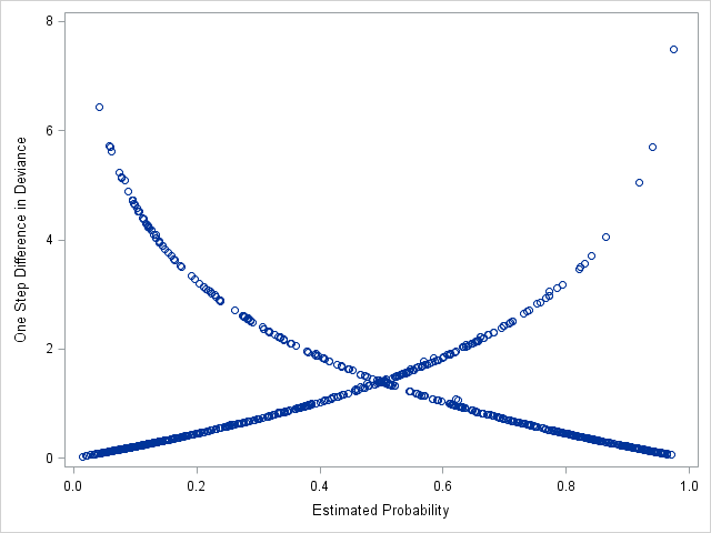
Plotting \(\Delta D\) vs predicted probabilities
Hosmer et al. (2013) and Allison (1999) recommend plotting \(\Delta D\) (y-axis) against predicted probabilities to find poorly fitting covariate patterns. \(\Delta D\) values greater than 4 are recommended as a rough cutoff for poor fit.
We use proc sgplot to create the plot using the diag dataset that we just output from the previous model. We put the predicted probabilities predp on the x-axis and the \(\Delta D\) on the y-axis.
The curve going top left to bottom right represents covariate patterns where the observed survived=1. The curve going bottom left to top right represents covariate patterns where observed survived=0.
The majority of the covariate patterns with poor fit, \(\Delta D\)>4, are found on the curve for survived=1 (top left). In other words, there are many covariate patterns and observations where the predicted probability of survival is quite low, but the passengers actually survived. We should inspect these observations to see if there are effects we might have missed.
Inspecting the observations with the largest \(\Delta D\)
Now, we'll sort the observations by descending \(\Delta D\) and view the top 20 observations to see if we notice anything systematic. Note the use of the option descending in proc sort to sort by descending order. We then use obs=20 in proc print to print the first 20 observations.
We see that majority of the 20 largest \(\Delta D\) observations have survived=1, just like we saw in the graph.
Almost all of these survived=1 observations are for pclass=3 and female=0, or males in 3rd class. Many of these males survived, even though their predicted probabilities of survival (predp) are below .1.
Three of these top 20 are for female in 1st class.
Together, this might suggest that we are not modeling female and pclass correctly in the model, and that we might want to consider an interaction between them to allow the effects of passenger class to vary by gender.
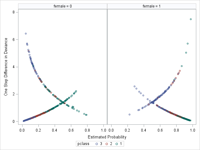
Using proc sgpanel to remake the graph of \(\Delta D\) vs predicted probabilities, now colored by pclass and paneled by female, reinforces our idea that the model is not fitting well for third class males (blue circles, left panel) and first class females (green circles, right panel).
Failing to allow for nonlinear effects in the model can also lead to poor fit. Remember that entering a variable "as is" into regression model assumes a linear effect with the outcome, or the log-odds of the outcome for logistic regression. While this will be correct for 0/1 class effects, it may or may not be correct for continuous effects.
We would be surprised if the effect of age on (the log-odds) survival was entirely linear. Hosmer et al. (2013) suggest a simple method to explore whether a continuous variable will have a nonlinear relationship with the log-odds of the outcome.
Split the continuous variable into several intervals to form a categorical version of the variable. They suggest splitting into 4 groups based on quartiles, but note that other grouping strategies can work.
Refit the logistic regression model with the categorical variable and all relevant covariates.
Create a line plot with the coefficient value on the y-axis, and the midpoint of each interval along the x-axis.
We will slightly adapt their method for the seminar to keep coding succint. Instead of quartiles, we are going to use 5 intervals with (nearly) equal spans of age, because the data are large enough to support enough observations in each interval. The advantage of using intervals that span the same range is that we don't have to use the midspoints of the interval to plot -- we can plot them as ordinal 1-2-3-4-5 values because the intervals are equally spaced along the number line.
In SAS, we can use formats to split a continuous variable into intervals. This proc format code creates the format we will use for age:
We used a 15-year interval to restrict the first group to what should be considered "children" (hopefully, at the time), since we believe they were preferred for lifeboat rescue.
The -< expression for a range means including the value on the left but not the value on the right, 0-<15 codes for the range from 0 to 15 but not including 15. The expression <- means not including the value on the left but including the value on the right.
The keyword high signifies the maximum value.
We can now run the logistic regression model treating age as categorical with the format we just created. To do this, we need to apply the format with a format statement, and specify age on the class statement.
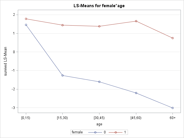
We are going to interact (categorical) age with female because we suspect the nonlinear effect of age may not be the same for both genders.
In addition, we will use the lsmeans statement to create the plot of the coefficients vs age categories. The lsmeans statement estimates least squares means, or predicted population margins, which are the expected values (means) of the outcome in a population where the levels of all class variables are balanced and averaged over the effects of the continuous covariates. We can estimate these means at each level of categorical age and across female. A plot of these means is analagous to the plot of coefficients suggested by Hosmer et al. (2013).
In order to use the lsmeans statement, we must change the parameterization of the class to param=glm. With "glm" parameterization, the parameter estimates in the Analysis of Maximum Likelihood Estimates are interpreted in the same way as those using reference parameterization (differences from reference group), but the type 3 tests from the Type 3 Analysis of Effects are interpreted in the same way as using effect parameterization.
proc logistic data=titanic descending;
class female(ref=first) pclass age / param=glm;
model survived = pclass age|female sibsp parch fare / expb;
lsmeans age*female /  plots=meanplot(join sliceby=female);
format age agecat.;
run;
Again, we need param=glm on the class statement to use the lsmeans statment.
Notice that age appears on the class statement to tell SAS to model it as categorical.
The format statement applies the formats, which SAS uses as groups for age.
In the lsmeans statement:
the specification age*female requests means (on the log-odds scale) be estimated for each crossing of age and female.
The plots=meanplot() requests a scatter plot of the means vs age by female.
Options for the meanplot include join, which connects the points with lines, and sliceby=female, which creates separate joined lines by female.
The age effect appears quite different between genders, with not much of an effect for females (red) and a strong effect for males (blue). We should consider an interction of age and female.
The effect for males appears somewhat nonlinear (possibly for females as well), which we will model in the next section.
Modeling Interactions and Nonlinear Effects
Adding interactions to the model
Interactions allow a predictor's effect to vary with levels of another predictor.
Our diagnostics suggested poor fit due to lack of an interaction of female and pclass and possibly female and age. Omitting these interactions constrains the effects of pclass and age to be the same across genders. Instead, we might suspect that the "women and children first" protocol might have affected how passenger class and age were related to survival for the two genders. Or, passenger class and age might have affected which women and children were chosen to save.
In SAS, to add an interaction between 2 variables and the component main effects to a model, specify the two variables separated by |. Here we add interactions of female with both pclass and age.
proc logistic data=titanic descending;
class female pclass / param=ref;
model survived = female|pclass female|age sibsp parch fare / expb;
run;
Relevant output:
Model Fit Statistics
Criterion
Intercept Only
Intercept and Covariates
AIC
1411.985
936.198
SC
1416.935
990.646
-2 Log L
1409.985
914.198
Criterion
No interactions
Interactions
AIC
985.058
936.198
SC
1024.657
990.646
The model fit statistics AIC and SC have dropped by more than 30 points each from the previous additive (no interactions) model, suggesting that the interactions are improving the fit.
Type 3 Analysis of Effects
Effect
DF
Wald Chi-Square
Pr > ChiSq
female
1
4.1817
0.0409
pclass
2
65.7214
<.0001
female*pclass
2
30.7923
<.0001
age
1
5.6899
0.0171
age*female
1
3.5980
0.0579
sibsp
1
11.5648
0.0007
parch
1
0.7197
0.3962
fare
1
0.0136
0.9073
The Type 3 tests show strong evidence of a pclass by female interaction, but weaker evidence of an age by female interaction.
Analysis of Maximum Likelihood Estimates
Parameter
DF
Estimate
Standard Error
Wald Chi-Square
Pr > ChiSq
Exp(Est)
Intercept
1
0.6928
0.3227
4.6084
0.0318
1.999
female
0
1
-0.8032
0.3928
4.1817
0.0409
0.448
pclass
1
1
3.8387
0.5866
42.8184
<.0001
46.466
pclass
2
1
2.3803
0.3766
39.9540
<.0001
10.809
female*pclass
0
1
1
-2.0225
0.6130
10.8872
0.0010
0.132
female*pclass
0
2
1
-2.4146
0.4663
26.8084
<.0001
0.089
age
1
-0.0277
0.0116
5.6899
0.0171
0.973
age*female
0
1
-0.0278
0.0146
3.5980
0.0579
0.973
sibsp
1
-0.3560
0.1047
11.5648
0.0007
0.700
parch
1
0.0918
0.1083
0.7197
0.3962
1.096
fare
1
-0.00025
0.00216
0.0136
0.9073
1.000
In the parameter estimates table, we see that both of the female by pclass interaction coefficients are significantly different from 0 (p=0.001 and p<0.0001), suggesting that the effects of passenger class depend on gender, and that the effects of gender depend on passenger class. We again see weak, but perhaps not neglible, evidence of an interaction between female and age.
The parameter estimates for pclass alone, 3.83 and 2.38, are not estimates of main effects, but instead are simple main effects, or the effect of pclass at a specific level of female, here at the reference level female=1. The values in Exp(Est) column for these rows can be interpreted as odds ratios. So, females passengers in class 1 had 47 times greater odds of survival than passengers in females in class 3. This odds ratio is quite a bit larger than the gender-averaged odds ratio, which was close to 9.5.
The values in the Exp(Est) column for the interaction coefficients (female*pclass and age*female) are indeed the exponentiated interaction coefficients, but they are not odds ratios. These values express the factor change in the odds ratio when changing the value of the interacting variable (i.e. the ratio of 2 odds ratios). For example, the exponentiated interaction coefficient for age*female is .973. We can interpret this to mean that the age effect for males is .973 times the effect of age for females, or a 2.7% decrease in the effect. The odds ratio for the age effect for females also happens to be .973 (the Exp(Est) for age). We thus expect the age effect for males to be .973*.973=.947.
\begin{align}
exp(\beta_{age*female}) &= \frac{OR_{age,male}}{OR_{age,female}} \\
0.973 &= \frac{OR_{age,male}}{0.973} \\
0.947 &= OR_{age,male} \\
\end{align}
Odds Ratio Estimates
Effect
Point Estimate
95% Wald Confidence Limits
sibsp
0.700
0.571
0.860
parch
1.096
0.887
1.355
fare
1.000
0.996
1.004
Odds ratios for effects involved in interactions will not be displayed in the Odds Ratio Estimates table, so we will not see odds ratios for pclass, age, or female here. However, we can use the oddsratio statement to help us estimate ORs for effects involved in interactions.
Use the oddsratio statement to estimate and graph odds ratios
The oddsratio statement can be used to estimate odds ratios for any effect in the model. If an effect is involved in an interaction, SAS will estimate the odds ratio for that effect across all levels of the interacting (moderating) variable.
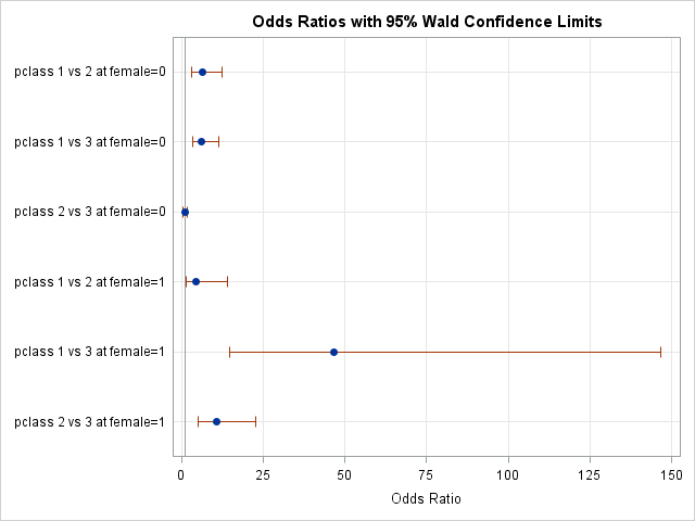
Let's estimate the odds ratios for pclass across genders:
proc logistic data=titanic descending;
class female pclass / param=ref;
model survived = female|pclass female|age sibsp parch fare / expb;
oddsratio pclass;
run;
Note that even though we only specify pclass on the oddsratio statement, proc logistic is aware that pclass is interacted with female in the model, and will thus estimate its effects across levels of female. Here are the output and graph produced:
Odds Ratio Estimates and Wald Confidence Intervals
Odds Ratio
Estimate
95% Confidence Limits
pclass 1 vs 2 at female=0
6.362
3.238
12.500
pclass 1 vs 3 at female=0
6.149
3.353
11.276
pclass 2 vs 3 at female=0
0.966
0.562
1.662
pclass 1 vs 2 at female=1
4.299
1.302
14.190
pclass 1 vs 3 at female=1
46.466
14.716
146.719
pclass 2 vs 3 at female=1
10.809
5.167
22.611
The plot above shows the estimates of the ORs with their confidence intervals. Effects whose intervals cross the reference line at x=1 are not significant. Unfortunately, this particular plot is dominated by the confidence interval of the pclass effect for class1-vs-class3, making the other intervals harder to see.
Nevertheless, we can see that effects of passenger class are quite different for the two genders.
The exponentiated interaction coefficient for female*pclass=1 was .132, meaning the OR for pclass=1 vs pclass=3 for males should be .132 times as large as the OR for females. The pclass=1 vs pclass=3 OR for females is 46.47. So, 46.47*.1323=6.149, the OR for pclass=1 vs pclass=3 for males.
Controlling which variables appear on the odds ratio plot
Each oddsratio statement only accepts one variable to process, i.e. to estimate and plot its odds ratio(s), but we can specify multiple oddsratio statements to place multiple variable effects on one odds ratio plot.
Here we place all variables but pclass on one odds ratio plot:
proc logistic data=titanic descending;
class female pclass / param=ref;
model survived = female|pclass female|age sibsp parch fare / expb;
oddsratio female;
oddsratio age;
oddsratio sibsp;
oddsratio parch;
oddsratio fare;
run;
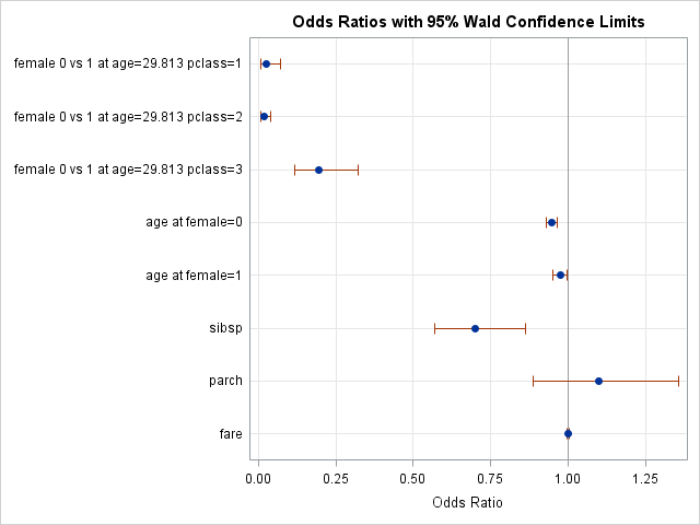
Several ORs are plotted for female and age because they are involved in interactions. The ORs for female span levels of pclass, but age is held at a fixed level of 29.813.
We see the non-significant fare effect on top of the reference line.
The linear axis depicts the magnitude of the odds ratios in a somewhat misleading way. The plot suggests that the effect of female at pclass=3 is nearly the same size as the effect of female at pclass=2. They are closer to each other than either is to the reference line at 1. However, these are ratios, and the female for 3rd class OR at .196 corresponds to a ratio of 1/5, while the OR for 2nd class at .017 corresponds to a ratio of 1/59, a nearly 10-fold reduction. We address this in the next section.
Modifying the odds ratio plot
For the odds ratios of variables involved in interactions, the at option on the oddsratio statement allows us to control which levels of the interacting varaible at which to estimate the odds ratio of the other variable.
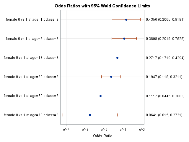
Below we use the at option to estimate the odds ratios for female at pclass=1, and across an array age values. Remember to put values for class variables inside ''.
Options for the odds ratio plot to alter its appearance are specified by placing the desired options inside plots=oddsratio() on the proc logistic statement.
Below we convert the axis to a logarithmic scale with base \(e\), the base of the natural log, for a more accurate depiction of the magnitude of the ORs using option specification logbase=e. We also change the type of the plot to horizontalstat, which adds the estimate of each OR and its confidence interval to the graph.
proc logistic data=titanic descending plots(only)=(oddsratio(logbase=e type=horizontalstat)) ;
class female pclass / param=ref;
model survived = female|pclass female|age sibsp parch fare / expb;
oddsratio female / at(pclass='3' age=1 5 18 30 50 70);
run
Now the x-axis units are logarithmically scaled along successive powers of \(e\). For convenience, the values \((e^{-4}, e^{-3}, e^{-2}, e^{-1}, e^{0})\) are equal to \((.0183, .0498, .135, .368, 1)\).
We can see the possible effect that age has on the female ORs, but we should be cautious to make any claims because the evidence is not terribly strong for this interaction.
Exploring non-linear effects with restricted cubic splines
Age spans a wide range in this dataset, from about 2 months to 80 years. It's quite possible it does not have a linear effect on (log-odds) of survival across its entire range.
Regression splines are transformations of variables that allow flexible modeling of complex functional forms. Spline variables are formed by specifying a set of breakpoints (known as knots), and then allowing the function to change its curvature rapidly between knots, but constrained (usually) to be joined at the knots. Restricted cubic splines are a popular choice of splines, that are cubic functions between the knots, and linear functions in the tails, which allows for many possible complex forms.
SAS makes it quite easy to add cubic spline transformations of a variable to the model. The effect statement allows the user to construct effects like regression splines from model variables. In the effect statement below:
agesp is name of the collection of spline variables that can be added to the model
spline() requests a spline transformation, and the variable to transform and all options are specified inside
basis=tpf(noint) and naturalcubic together request restricted cubic splines
knotmethod=percentiles(5) specifies that 5 knots be placed at equally spaced percentiles of age
details requests that SAS displays the knot locations
proc logistic data=titanic descending;
effect agesp = spline(age / basis=tpf(noint) naturalcubic knotmethod=percentiles(5) details);
class female pclass / param=ref;
model survived = female|pclass female|agesp sibsp parch fare  / expb;
run;
Notice that we interacted the new spline variables with female to allow the age spline functions to vary gender.
Knots for Spline Effect agesp
Knot Number
age
1
18.00000
2
23.00000
3
28.00000
4
34.00000
5
45.00000
This table show us the knot locations.
Type 3 Analysis of Effects
Effect
DF
Wald Chi-Square
Pr > ChiSq
female
1
1.2680
0.2602
pclass
2
62.2160
<.0001
female*pclass
2
33.8166
<.0001
agesp
4
7.4472
0.1141
agesp*female
4
15.3006
0.0041
sibsp
1
18.3201
<.0001
parch
1
0.0716
0.7891
fare
1
0.1157
0.7338
The Type 3 tests are not significant for agesp alone, which represent the splines for females. This might suggest that age does not explain much variance in survival for females, something our previous exploration of nonlinear effects of age suggested. On the other hand, the agesp*female interaction Type 3 test are significant, suggesting that the age spline function is quite different for males.
Analysis of Maximum Likelihood Estimates
Parameter
DF
Estimate
Standard Error
Wald Chi-Square
Pr > ChiSq
Exp(Est)
Intercept
1
1.0394
0.5157
4.0619
0.0439
2.827
female
0
1
0.7087
0.6294
1.2680
0.2602
2.031
pclass
1
1
3.7285
0.6063
37.8133
<.0001
41.617
pclass
2
1
2.3909
0.3798
39.6191
<.0001
10.923
female*pclass
0
1
1
-2.1504
0.6326
11.5572
0.0007
0.116
female*pclass
0
2
1
-2.6053
0.4799
29.4706
<.0001
0.074
agesp
1
1
-0.0355
0.0299
1.4136
0.2345
0.965
agesp
2
1
-0.0147
0.0269
0.2982
0.5850
0.985
agesp
3
1
0.0499
0.0735
0.4614
0.4970
1.051
agesp
4
1
-0.0527
0.0671
0.6159
0.4326
0.949
agesp*female
1
0
1
-0.1417
0.0383
13.6707
0.0002
0.868
agesp*female
2
0
1
0.0926
0.0339
7.4685
0.0063
1.097
agesp*female
3
0
1
-0.2313
0.0915
6.3900
0.0115
0.794
agesp*female
4
0
1
0.1857
0.0825
5.0740
0.0243
1.204
sibsp
1
-0.4842
0.1131
18.3201
<.0001
0.616
parch
1
-0.0319
0.1194
0.0716
0.7891
0.969
fare
1
0.000741
0.00218
0.1157
0.7338
1.001
We present the parameter estimates for the splines here, but they are rather hard to interpret. Instead, spline functions are more easily interpreted if graphed. Fortuantely, SAS makes it easy to graph these functions.
Use the effectplot statement to visualize spline effects
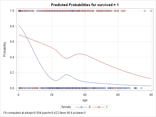
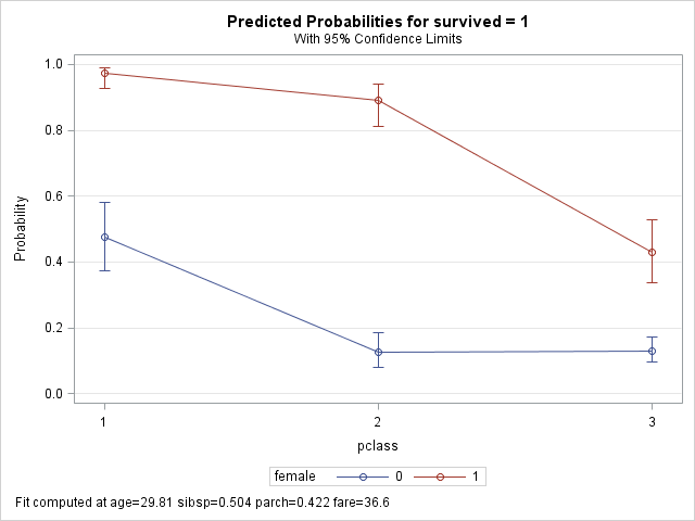
A graph of the spline functions will greatly facilitate interpretation. The effectplot statement displays the results of a fitted model by plotting the predicted outcome (y-axis) against an effect (x-axis). We will use the slicefit type of effectplot, which displays fitted values along the range of a continuous variable (age), split or "sliced" by a class variable (female). Note that we specify that age appear on the x=axis, not the spline variable agesp.
Note that probabilities are plotted on the y-axis, not odds or logits. We can change the y-axis scale to log-odds by adding the option link after the / on the effectplot statement. The shapes of the plots on the log-odds look very similar to the shapes on the above plot.
We see that the functions are very different, with a mostly linear function for females (red), and a less linear but stronger effect
of age for males (blue). For males, the probability of survival drops precipitously with age at first, but flattens some after adulthood.
The circles at 0 and 1 represent observed deaths and survivors for males (blue) and females (red).
Criterion
Linear age
Splines age
AIC
936.198
923.98
SC
990.646
1008.128
The table above compares the fit statistics for the model with linear age versus the model with spline functions for age (age interacted with female in both). Althought the AIC is lower for the splines model, the SC is higher by more than that difference. The SC penalizes additional parameters more harshly, and the spline functions introduce quite a few new parameters. Nevertheless, the estimated functions look rather non-linear, so arguments can be made to either use either model. We proceed in the seminar with modelling linear effects of age to keep code and output compact.
Reassessing global model fit
We return to our model with both linear effect of age and pclass interacted with female. We can again test for goodness-of-fit with Hosmer and Lemeshow's test, and use diagnostics again if necessary to identify poorly fit observations. We should see some improvement in the Hosmer and Lemeshow statistic since we added meaningful interactions to our model (AIC and SC improved over additive model).
proc logistic data=titanic descending;
class female pclass / param=ref;
model survived = female|pclass female|age sibsp parch fare  / expb lackfit;
run;
Partition for the Hosmer and Lemeshow Test
Group
Total
survived = 1
survived = 0
Observed
Expected
Observed
Expected
1
105
9
6.66
96
98.34
2
104
11
11.98
93
92.02
3
104
14
15.86
90
88.14
4
105
20
19.89
85
85.11
5
105
20
24.05
85
80.95
6
104
39
34.20
65
69.80
7
104
49
48.54
55
55.46
8
104
67
67.73
37
36.27
9
104
96
95.29
8
8.71
10
104
100
100.80
4
3.20
We see fewer large discrepanices in the Observed vs Expected columns compared to the model without interactions.
Hosmer and Lemeshow Goodness-of-Fit Test
Chi-Square
DF
Pr > ChiSq
3.4171
8
0.9055
Now the test statistic is smaller (previously 25.89) and is not significant, suggesting good fit.
Influence Diagnostics
Observations whose outcome values do not match the expected pattern predicted by the model (have large residuals) and who have extreme predictor values (high leverage) can have disproportionate influence on the model coefficients and fit. We recommend assessing how influential observations are affecting the model estimates before concluding that model fit is satisfactory.
We will use the \(DFBETAS\) and \(C\) diagnostic measures to help us identify influential observations. The \(DFBETAS\) statistic is calculated for each covariate pattern and measures the change in all regression coefficients if the model were to be fit without that covariate pattern. \(DFBETAS\), for observation \(j\), is a vector of standardized differences for each coefficient \(i\):
\(\boldsymbol{\Delta\hat{\beta_j}}\) is the vector or differences in parameter estimates when covariate pattern \(j\), so the above formula refers to the ith element for a particular coefficient. \(\sigma_i\) is the standard error of the ith coefficient.
The \(C\) diagnostic is also calculated for each covariate pattern, so will be the same for observations with the same covariate values. It measures how much the overall model fit changes with deletion of that pattern. It is analogous to the linear regression influence measure Cook's Distance. For observation \(j\), \(C\) is calculated as:
$$C_j = \frac{\chi^2h_j}{(1-h_j)^2}$$
\(\chi^2\) is the square of the Pearson residual, a measure of bad fit, while \(h_j\) is the diagonal element of the hat matrix for covariate pattern \(j\), a measure of leverage.
For both statistics, larger values indicate larger influence on the model. Both are easy to inspect in SAS.
Identifying influential observations
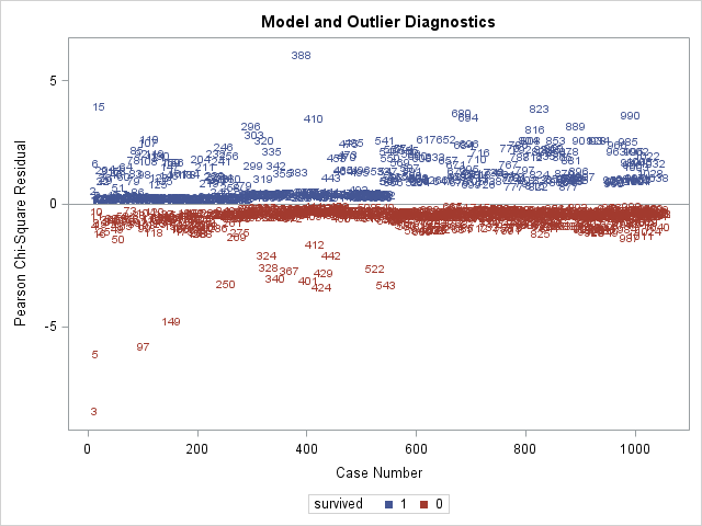
We will use the plots option on the proc logistic statement to request 2 sets of plots, one set of dfbetas plots and one set of influence plots that include plots of \(C\).
The label option inside plots() reqeusts that points be labeled by observation number, making it easier to subsequently find the influential observations in the dataset.
The unpack option specified for each plot disables the paneling of the plots, so that all plots are separate.
proc logistic data=titanic descending plots(label)=(influence(unpack) dfbetas(unpack));
class female pclass / param=ref;
model survived = female|pclass female|age sibsp parch fare  / expb lackfit;
run;
Many plots are produced. We only show a few.
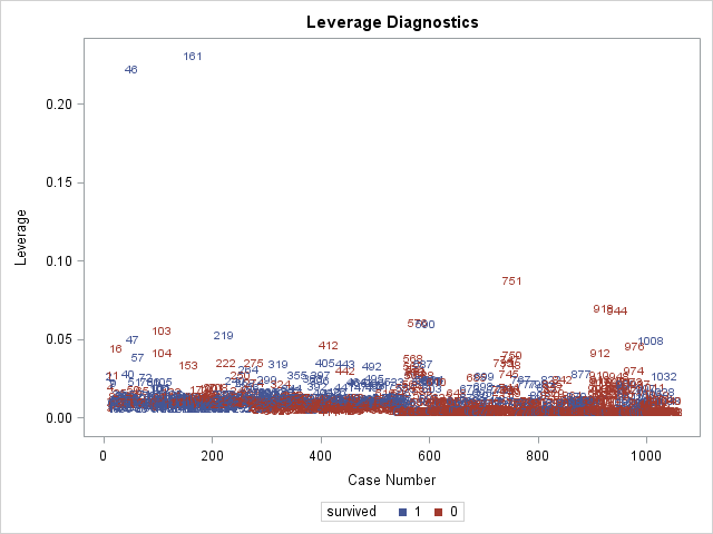
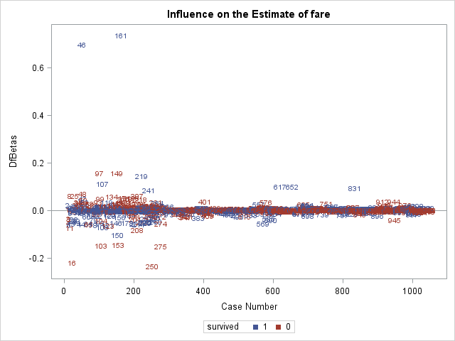
The above 2 plots are produced by influence, and are plots of Pearson residuals on the left and plots of leverage on the right. Remember that influential observations typically have both large residuals and high leverage. We see that observation 3 has the largest residual (in absolute terms) and that observations 46 and 161 have the highest leverages.
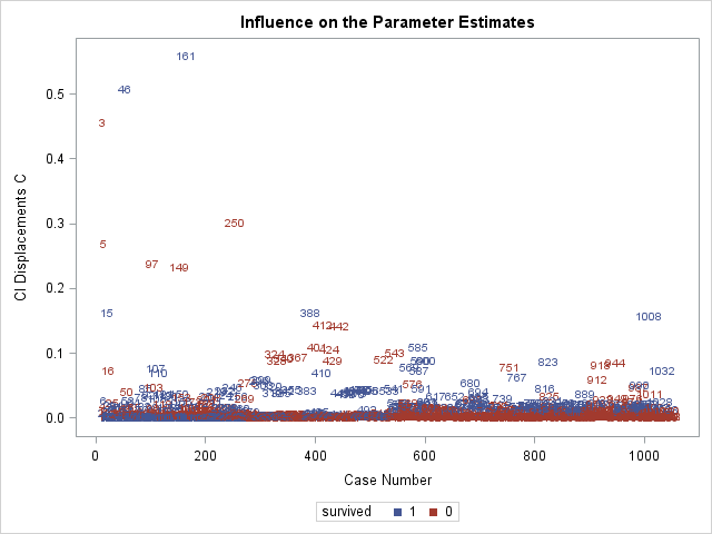
Above is the plot of \(C\). Since \(C\) is calculated using the Pearson residual and leverage, it is not surprising to see obervations 3, 46, and 161 have the highest \(C\) values. Regarding cutoffs for deeming an observation "influential", Hosmer et al. (2013) do not recommend any cutoffs, but instead recommending identifying points that fall far away from other observations, which describes obervations 3, 46, and 161 on the plot of \(C\).
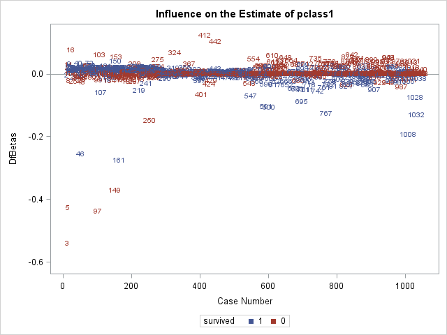
We next inspect some of the \(DFBETAS\) plots. Again, we are looking for observations that are far away from the rest.
In the above two plots, we can see that observation 3 is having a large influence on the coefficients for pclass1 and age.
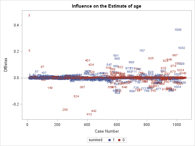
In the \(DFBETAS\) plot for fare, we see the large influence of observations 46 and 161.
Inspecting influential observations
Now that we have identified observations 3, 46, and 161 as potentially unduly influential, we should examine them to evaluate whether we should include them in the model
We'll use data step to create a dataset of just these 3 observations, which we call influence.
The if statement will output any observation that satifies its condition. Here the condition is that _N_, meaning "observation number", is in the list of numbers (3, 46, 161).
data influence;
set titanic;
if  _N_ in (3, 46, 161) then output;
run;

proc print data=influence;
run;
Obs
pclass
survived
age
sibsp
parch
fare
female
1
1
0
2
1
2
151.550
1
2
1
1
36
0
1
512.329
0
3
1
1
35
0
0
512.329
0
The rows going down correspond to observations 3, 46, and 161. Observation 3 is a young, female, first-class passenger, so would be expected to survive by our model. However, she did not, so has a large residual. Observations 46 and 161 are two male passengers who paid the very highest fare at 512.33 pounds, giving them large leverage values. They both in fact survived, so the fact that they are influential suggests that the model expected them not to survive.
We could now proceed to run a model without these observations. However, refitting without them will not reveal any large enough change in any coefficient that our inferences will changes (coefficient estimates from the 2 models lie within the other models' confidence intervals). In general, we should be cautious about removing observations, particularly to move estimates toward confirming hypotheses. So, we will not show the refitted model.
Evaluating Predictive Power
Association statistics
Several association statistics can be used to quantify the predictive power of a fitted logistic regression model, or how well correlated the predicted probabilities of the responses are with the observed responses themselves (Harrell, 2015). These are somewhat different from the global \(\chi^2\) statistics we used before to test for goodness-of-fit, and can agree or disagree with these assocation statistics about the "quality" of a model.
These statistics are output by proc logistic in the Association of Predicted Probabilities and Observed Responses table. Here is that table from the latest model, whose code we repeat here:
proc logistic data=titanic descending;
class female pclass / param=ref;
model survived = female|pclass female|age sibsp parch fare  / expb lackfit;
run;
Association of Predicted Probabilities and Observed Responses
Percent Concordant
85.7
Somers' D
0.716
Percent Discordant
14.1
Gamma
0.718
Percent Tied
0.3
Tau-a
0.346
Pairs
262650
c
0.858
We first discuss, the statistic \(c\), also known as the concordance index. For this statistic, we form all possible pairs of observations where one has survived=0 and the other has survived=1. If the predicted probability of survival for the observation with survived=0 is lower than the predicted probability of survival for the observation with survived=1, then that pair is concordant. Pairs where the observation with survived=0 has the higher predicted probability of survival are discordant. The \(c\) index is the proportion of all survived=0/survived=1 pairs that are concordant.
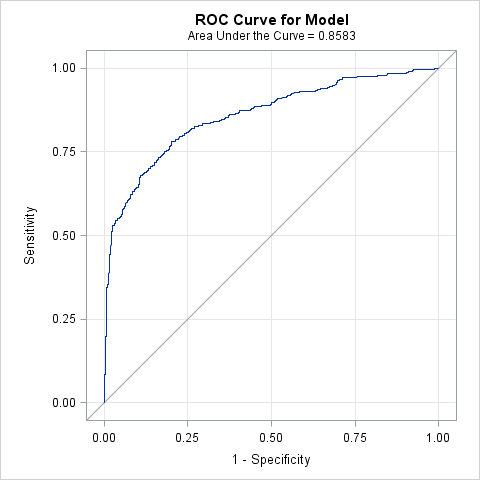
The \(c\) index is popular because it is also equal to the area under the receiver operating characteristic curve. \(c=1\) means perfect prediction, while \(c=.5\) means random prediction. Values of \(c\) greater than .8 may indicate a model that predicts responses well (Harrell 2015; Hosmer et al., 2013).
\(Somers' \, D\) is closely related to the \(c\) index and is widely used. It measures the difference between the proportion of pairs that are concordant minus the proportion that are discordant:
$$Somers' \, D=c-(1-c)$$
\(Somers' \, D\) ranges from -1 to 1, where \(Somers' \, D=1\) means perfect prediction, \(Somers' \, D=-1\) means perfectly wrong prediction, and \(Somers' \, D=0\) means random prediction.
We will not be discussing \(Gamma\) and \(Tau-a\) further, beyond to say that they are similar to \(Somers' \, D\), except that \(Gamma\) accounts for pairs of observations with tied values on the predicted probabilities differently, and \(Tau-a\) includes all pairs of observations with the same observed responses in its calculation.
Overall, the model appears to discriminate pretty well.
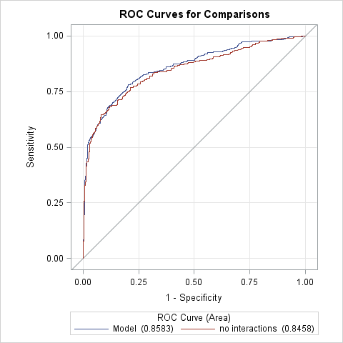
We present a comparison of \(c\) and \(Somers' \, D\) for the additive model without interactions and the model with interactions (of female with pclass and age). The interactions model has slightly improved values.
Association Statistic
No interaction
Interactions
c
0.846
0.858
Somers' D
0.692
0.716
Sensitivity and specificity
Sensitivty and specifity are two measures of the ability of the model to detect true positives and true negatives. By "detect true positives", we mean how often the model predicts the outcome=1 when the observed outcome=1.
Remember that a logistic regression model does not predict an individual's outcome to be either 0 or 1, only the probability that outcome=1. We could try to assign 0/1 values based on the predicted probability, by for instance, choosing a cutoff probability above which observations will be assigned outcome=1. For example, we could choose probability=0.5 to be the cutoff, and any observation with predicted probability above 0.5 will be assigned outcome=1 as their predicted outcome. It is likely that some of those who were assigned predicted=1 actually have observed=1 (a true positive), while others have observed outcome=0 (false positive). Those who have probability<0.5 will be assigned predicted=0. This will match the observed outcome for some (true negative), and will not for others (false negative).
Observed=0
Observed=1
Predicted=0
true negative
false negative
Predicted=1
false positive
true positive
Now imagine lowering the cutoff probability to prob=0, where everyone will be assigned predicted=1. In this way we will maximize the true positive rate by matching everyone who has observed=1, but we will also be maximizign the false positive rate, as everyone who has observed=0 now has predicted=1. Increasing the cutoff to probability=1 will lower the false positive rate to 0, because no observations will have predicted=1, but will maximize the false negative rate, because now everyone who has observed=1 will have predicted=0. Researchers often search for a cutoff probability that maximizes sensitivity and specificity.
Sensitivity is the proportion of all observations with observed=1 that are assigned predicted=1 . In the formula* below, true positives is the number of observations who have both predicted=1 and observed=1, while false negatives have predicted=0 and observed=1.
Lowering the probability cutoff yields more predicted=1 and less predicted=0, so will raise true positives and lower false negatives, which will thus increase sensitivity.
Specificity is the proportion of all observations with observed=0 that are assigned predicted=0. Below*, true negatives is the number of observations with both predicted=0 and observed=0, and false positives is the number observations with predicted=1 and observed=0.
Increasing the cutoff probability yields more predicted outcome=0, and will generally increase specificity, because true negatives will increase as false positives decrease.
Reciever operator characteristic curves
Receiver operator characteristic (ROC) curves display the give-and-take of sensitivity and specificity across predicted probability cutoffs. The y-axis measures sensitivity. The x-axis measures (1-specificity). Therefore, points toward the top maximize sensitivity while points toward the left maximize specificity.
A point at the very top left of the graph represents a predicted probability cutoff where sensitivy and specificity are both maximized, where all Predicted=0 and Predicted=1 have been correctly classified. In that scenario, all observations with Observed=0 have a predicted probability lower than the cutoff, and all observations with Observed=1 have a predicted proability higher than the cutoff. That is an unlikely situation.
Producing and ROC curve for a fitted regression model is quite simple in proc logistic. Simply specify the plots=roc on the proc logistic statement to request the plot. We add the option (only) to prevent the influence plots from being generated.
proc logistic data=titanic descending plots(only)=roc;
class female pclass / param=ref;
model survived = female|pclass female|age sibsp parch fare  / expb lackfit;
run;
Each point on the curve represents a predicted probability cutoff.
The area under the ROC curve (AUC), which is equivalent to the concordance index \(c\) is displayed and quantifies how well the model discriminates. The AUC will increase if cutoffs are found more towards the top left of the graph, pulling the curve away from the diagonal reference line (which signifies AUC=.5 or no discrimination.) We could now choose a probability cutoff that has the desired tradeoff between sensitivity and specificity.
Comparing ROC curves
proc logistic makes comparing ROC curves graphically and statistically between models quite easy using the roc statement. In the roc statement, one can specify a model that uses a subset of the covariates used in the fitted model. This "submodel" will be fit, its ROC curve plotted agains the ROC curve of the full model, and its AUC will compared to the AUC of the full model. We need only specify the covariates we want to appear in the submodel. The roccontrast statement can produce a \(\chi^2\) test of the difference of AUC values between ROC curves.
In the code below, we use the roc statement to create a submodel that omits the interactions female*pclass and female*age from the model. We label this model 'no interactions'. The roc will estimate the ROC curve for both the full model and the submodel, will plot both, and then estimate the AUC for both. The roccontrast statement then requests a test of the difference between AUC values of the full model and the submodel by specifying the label of the submodel.
proc logistic data=titanic descending;
class female pclass / param=ref;
model survived = female|pclass female|age sibsp parch fare  / expb lackfit;
roc 'no interactions' female pclass age sibsp parch fare;
roccontrast 'no interactions';
run;
ROC Association Statistics
ROC Model
Mann-Whitney
Somers' D (Gini)
Gamma
Tau-a
Area
Standard Error
95% Wald Confidence Limits
Model
0.8583
0.0122
0.8345
0.8822
0.7167
0.7167
0.3464
no interactions
0.8458
0.0129
0.8207
0.8710
0.6917
0.6918
0.3343
The plot and table above are produce by the roc statement. We can see the the model with no interactions has a slightly smaller AUC than the full model.
ROC Contrast Test Results
Contrast
DF
Chi-Square
Pr > ChiSq
no interactions
1
6.7568
0.0093
Above is the \(\chi^2\) test requested by roccontrast. It suggests that the AUC values are different, somewhat suprising since the estimate of the AUC for both models is well within the confidence interval of the other AUC.
Estimating and Reporting Predicted Probabilities
Deciding on the final model
We may be somewhat satisfied with the last model we have fit, as we have:
Explored nonlinear effects and interactions
Tested for overall goodness-of-fit with the Hosmer and Lemeshow test
Inspected regression diagnostics for poorly fit observations and overly influential observations
Judged that the model has good predictive power
Now we can proceed to decide how to report the results to an audience. We have already produced some output would be useful to convey model results:
Parameter estimates tables are nearly always reported
Joint tests (like Type 3 tests) are useful to report the presence of an overall effect of a variable described by many coefficients.
Tables and plots of odds ratios make comparing the magnitude of effects easier
One drawback of each of the above outputs is that they are not in the probability metric, which is most readily understood by the majority of readers. Many readers have a hard time conceptualizing the magnitude of effects if they are expressed as differences in log odds or even as odds ratios.
Predicted probabilities
Although the logistic regression model directly models and predicts the log odds of the outcome, it can easily transform those predictions to probabilities of the outcome, using the transformation:
Several statements available in proc logistic can produce estimated predicted probabilities based on the fitted model, including:
the lsmeans statement is used to estimate population marginal means, which can be transformed to population marignal expected proabilities.
the estimate statement is typically used to test custom hypotheses after fitting a model, but can also be used to estimate predicted values of the outcome for any set of covariate values.
the lsmeansestimate combines lsmeans and estimate to allow custom hypothesis testing of population marginal means.
the effectplot statement can be used graphs predictor effects against predicted probabilities.
Each of the four statements above has an option ilink that cause probabilities rather than log odds to be predicted.
We will explore using lsmeans and effectplot, as the coding for those statements is simple.
Predicting probabilities with lsmeans
We used the lsmeans statement earlier to explore nonlinear effects of age as it produces mean estimates across levels of model covariates, including interactions. So, for example, the statement lsmeans A*B would produce mean estimates for each crossing of the levels of variables A and B. By default, when estimating these means, the effects of other categorical predictors are balanced, while the effects of continuous covariates are averaged over the population. This essentially "adjusts" for the effects of the additional covariates.
The following lsmeans specification will estimate separate predicted probabilities for each crossing of female and pclass, but averaging over the effects of the remaining covariates (age, sibsp, parch, and fare), since they are all continuous. The ilink option requests the back transformation to probabilities.
proc logistic data=titanic descending;
class female pclass / param=glm;
model survived = female|pclass female|age sibsp parch fare  / expb lackfit;
lsmeans female*pclass /  ilink;
run;
female*pclass Least Squares Means
female
pclass
Estimate
Standard Error
z Value
Pr > |z|
Mean
Standard Error of Mean
0
1
-0.09700
0.2172
-0.45
0.6551
0.4758
0.05416
0
2
-1.9474
0.2421
-8.04
<.0001
0.1248
0.02645
0
3
-1.9132
0.1703
-11.23
<.0001
0.1286
0.01909
1
1
3.5567
0.5084
7.00
<.0001
0.9723
0.01371
1
2
2.0984
0.3240
6.48
<.0001
0.8907
0.03154
1
3
-0.2820
0.2011
-1.40
0.1608
0.4300
0.04928
The predicted probability estimates can be found in the Mean column. It is quite easy to understand the effect passenger class on the probability of survival for both genders. For males, we see a sharp drop in the probability going from first to second class, but then only a slight drop going down to third class. For females, we see a small drop from first to second class, but then a large drop to third class. A table of graph of these probabilites might help the reader understand the female by pclass interaction. These can be more or less interpreted as the population-averaged predicted probabilities for males and females across passenger classes.
Instead of averaging over the covariate effects in the population, we can estimate these population means at fixed values of the other covariates. We can use the at option of the lsmeans to set these values. Below, we set the values of the covariates at which to estimate the predicted probabilties to be fixed at age=30, sibsp=0, parch=1, and fare=100.
We can see the fixed values of the covariates in the table now. The values in the Mean column are now interpreted as the predicted probabilites for a particular kind of person with those covariate values, rather than a population average, since we fixed every covariate.
Using effectplot to plot predicted probabilities vs combinations of predictors
Conveniently, the effectplot statement provides easy graphing of predictors vs predicted outcomes, including on the probability scale in proc logistic. SAS offers several types of effectplots, which are ideal for different combinations of categorical and continuous predictors. We will use the effectplot types interaction, which is good for plotting effects of multiple categorical predictors, and type slicefit, which good for plotting the effects of continuous predictor interacted with a categorical predictor. Below we use two effectplot statements:
We first use an interaction type plot to graph predicted probabilites across levels of female and pclass. pclass will appear on the x-axis, while sliceby= requests separate lines will be made by female.
The additional options clm requests confidence intervals be plotted, connect joins the dots with lines, and noobs prevents the observed values from being plotted on the graph, as they are not useful here (too many overlapping points).
The second slicefit type plot graphs predicted probabilities across the range of age, sliced (separate lines) by female.
The above interaction plot makes both the passenger class and the gender effects clear.
The above plot shows the effect of age on survival, and how the age effect differs between genders. With confidence interval, we can see that females have clearly better probabilities of survival except at the very youngest ages.
Final Words
Extending the logistic regression model
The following extensions to logistic regression modeling can not be covered in this course, but here is some direction for interested researchers:
Ordinal logistic regression models an ordered (ordinal) outcome with more than 2 levels. proc logistic will automatically run an ordinal logistic regression model if the outcome is numeric with more than 2 levels.
Multinomial logistic regression models a nominal, unordered outcome with more than 2 categories. proc logistic can run multinomial logistic models with the option link=glogit on the model statement.
Conditional logistic regression, or fixed effecs regression, is often run on matched-pairs data to partial out the effects of time-invariant covariates when non-random assignment is not possible. A conditional logistic regression can be run in proc logistic using the strata statement.
Mixed effects/multilevel logistic regression cannot be run in proc logistic. See proc glimmix to run these models.
References
Allison, PD. 1999. Logistic Regression Using the SAS System. SAS Institute Inc: Cary, North Carolina.