
Version info: Code for this page was tested in R Under development (unstable) (2012-07-05 r59734)

On: 2012-07-08

With: knitr 0.6.3
Types of smooths
Although points and lines of raw data can be helpful for exploring and understanding
data, it can be difficult to tell what the overall trend or patterns are. Adding data
summaries can make it much easier to see. When working with two or more variables, rather
than raw summaries such as means, we can use conditional means or expected values of one
variable based on some model. To demonstrate this,
we will use a data set that is built into R, the ‘mtcars‘ data. Specifically,
we will look at the relationship between miles per gallon (mpg) and horsepower
(hp). in 32 different cars.
head(mtcars)
##                    mpg cyl disp  hp drat   wt qsec vs am gear carb
## Mazda RX4         21.0   6  160 110 3.90 2.62 16.5  0  1    4    4
## Mazda RX4 Wag     21.0   6  160 110 3.90 2.88 17.0  0  1    4    4
## Datsun 710        22.8   4  108  93 3.85 2.32 18.6  1  1    4    1
## Hornet 4 Drive    21.4   6  258 110 3.08 3.21 19.4  1  0    3    1
## Hornet Sportabout 18.7   8  360 175 3.15 3.44 17.0  0  0    3    2
## Valiant           18.1   6  225 105 2.76 3.46 20.2  1  0    3    1
require(ggplot2)
require(methods)
## plot base + points
p <- ggplot(mtcars, aes(x = hp, y = mpg)) + geom_point()
print(p)
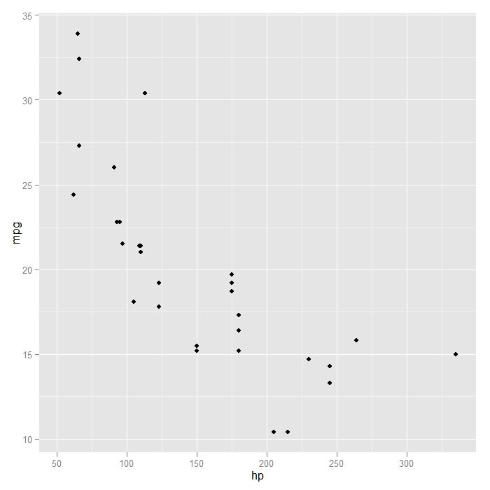
One thing to notice is that into the ‘p‘ object, we saved both the basic plot setup and
the request to add points. This saves typing down the road if we know we always want points
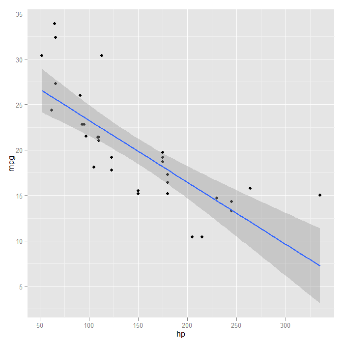
plotted in our graph. A quick visual of the data indicates the relationship may not be linear.
This is confirmed when we look at a linear smooth. The fit is poor at the extremes.
## looking at a linear fit, we see it is poor at the extremes
p + stat_smooth(method = "lm", formula = y ~ x, size = 1)
To get a sense of something like the mean miles per gallon at every level of horsepower,
we can instead use a locally weighted regression.
p + stat_smooth(method = "loess", formula = y ~ x, size = 1)
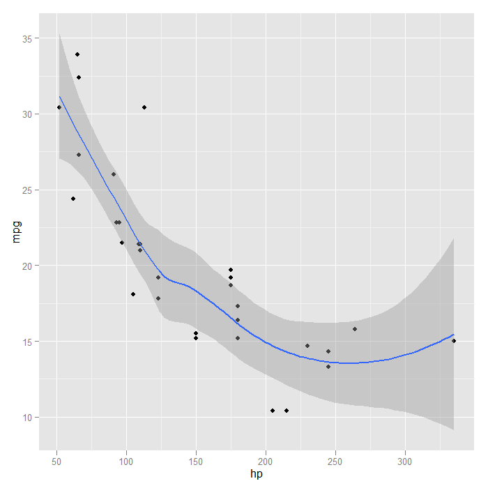
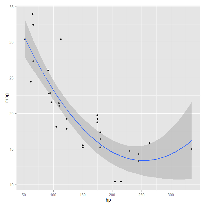
Looking at the fit, it seems a quadratic function might be a good approximation.
We can go back to a linear model, but change the formula to include a squared term
for x (which is horse power here).
p + stat_smooth(method = "lm", formula = y ~ x + I(x^2), size = 1)
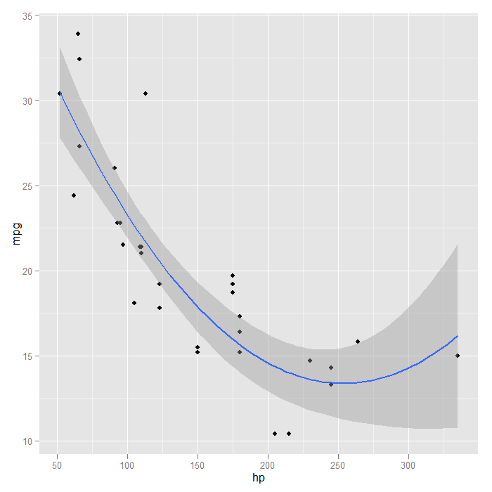
We could achieve the same results using orthogonal polynomials,
in this case with a second order (quadratic) polynomial. The advantage is that
the poly() function can easily fit polynomials of arbitrary degree
## R can automatically create these using the poly() function
p + stat_smooth(method = "lm", formula = y ~ poly(x, 2), size = 1)
Another flexible aspect of the smooths is that it can use many different
modelling functions as long as they follow some common conventions. This opens up
access to many R packages to fit very specialized models. For the sake of demonstration, we will try a
generalized additive model (GAM) from the ‘mgcv‘ package with a smooth on the
x predictor variable. First we load the required package, and then show how it is
easily used inside our graph.
## load a package to fit generalized additive models (GAMs)
require(mgcv)
## we now fit a GAM adding a penalized smoother with x
p + stat_smooth(method = "gam", formula = y ~ s(x), size = 1)
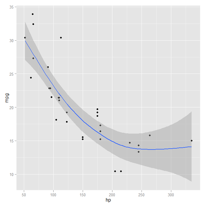
The GAM with a smooth seems to fit the data better than the straight line did. We
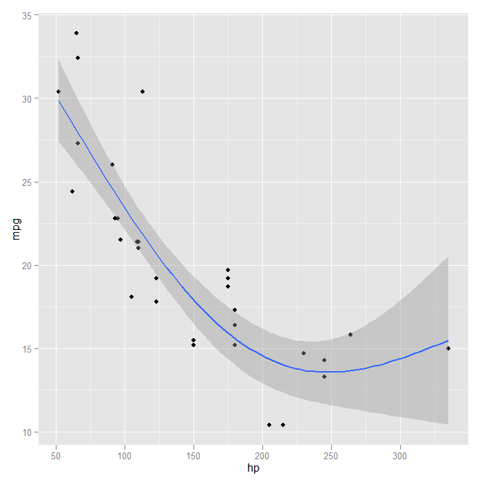
could also customize the basis dimension. Arbitrarily, we choose 3.
p + stat_smooth(method = "gam", formula = y ~ s(x, k = 3), size = 1)
If we wanted to directly compare, we could add multiple smooths and
colour them to see which we like best. By default each smooth would include
shaded standard errors, which would be messy so we turn them off.
p + stat_smooth(method = "lm", formula = y ~ x, size = 1, se = FALSE,
    colour = "black") + stat_smooth(method = "lm", formula = y ~ x + I(x^2),
    size = 1, se = FALSE, colour = "blue") + stat_smooth(method = "loess", formula = y ~
    x, size = 1, se = FALSE, colour = "red") + stat_smooth(method = "gam", formula = y ~
    s(x), size = 1, se = FALSE, colour = "green") + stat_smooth(method = "gam",
    formula = y ~ s(x, k = 3), size = 1, se = FALSE, colour = "violet")
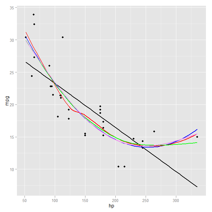
It is clear in this case that all the models except the strictly linear fit
the data similarly. To distinguish which was “best” any further would likely
require comparing model fit statistics.
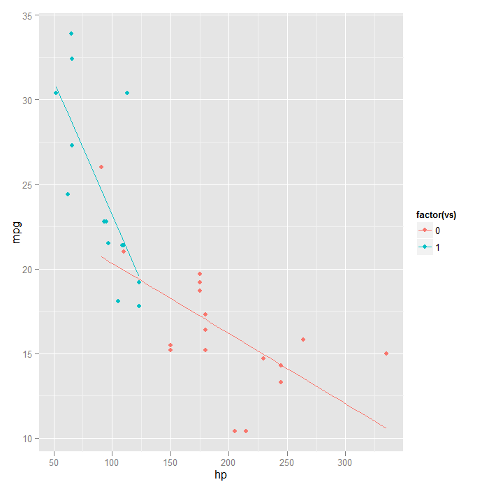
Smooths can also be fit separately by levels of another variable. This
allows a sort of examination of ‘interactions’ in the data.
## when vs is mapped to colour, separate lines are automatically fit
ggplot(mtcars, aes(x = hp, y = mpg, colour = factor(vs))) + geom_point() +
    stat_smooth(method = "lm", formula = y ~ x, se = FALSE)
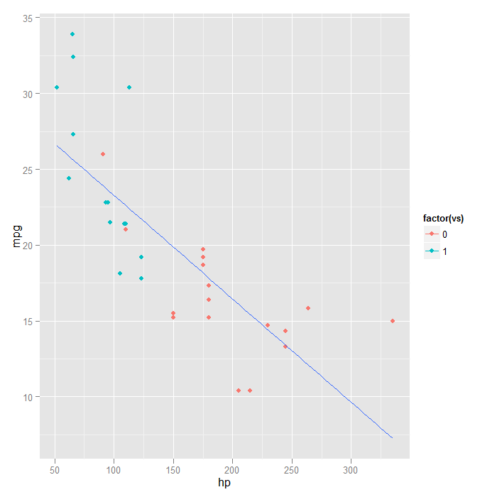
## if we wanted the points coloured, but not separate lines there are two
## options---force stat_smooth() to have one group
ggplot(mtcars, aes(x = hp, y = mpg, colour = factor(vs))) + geom_point() +
    stat_smooth(aes(group = 1), method = "lm", formula = y ~ x, se = FALSE)
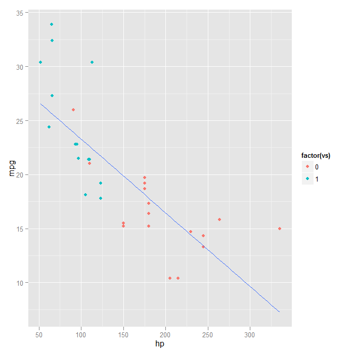
## or only add colour to the points, not in the global ggplot() call
ggplot(mtcars, aes(x = hp, y = mpg)) + geom_point(aes(colour = factor(vs))) +
    stat_smooth(method = "lm", formula = y ~ x, se = FALSE)
Summary
Smoothed, conditional summaries are easy to add to plots in ggplot2. This
makes it easy to see overall trends and explore visually how different models fit
the data. Many of the examples were redundant or clearly a poor choice for this
particular data; the purpose was to demonstrate the capabilities of ggplot2 and show
what options are available. Each example may be more or less appropriate for
exploring a particular set of data.