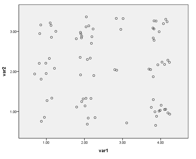
Scatterplots are often a good way of displaying data. Oftentimes,
however, two or more observations will have the same values on the variables
being graphed. When this happens, the points are graphed on top of each other,
and you cannot tell from the scatterplot how many data points each symbol on the
graph represents. Consider the data set below. The variable wt is
simply the number of
observations for each combination of values for var1 and var2. After reading in the data, we will do a crosstab to clearly show how many
observations have the same values for var1 and var2. Then we will
make a scatterplot of the data.
data list list / id var1 var2 wt.
begin data
1 1 1 4
2 1 2 7
3 1 3 6
4 2 1 9
5 2 2 5
6 2 3 11
7 3 1 1
8 3 2 2
9 3 3 3
10 4 1 12
11 4 2 8
12 4 3 10
end data.

weight by wt.

crosstabs tables = var1 by var2.
Case Processing Summary Cases Valid Missing Total N Percent N Percent N Percent VAR1 * VAR2 78 100.0% 0 .0% 78 100.0%
VAR1 * VAR2 Crosstabulation
CountVAR2 Total 1.00 2.00 3.00
VAR1 1.00 4 7 6 17 2.00 9 5 11 25 3.00 1 2 3 6 4.00 12 8 10 30 Total 26 22 30 78
The ggraph command can be used to create a scatterplot with jittered points. Note that the weight command cannot be used with the ggraph command, so we begin by issuing the weight off command.
weight off.GGRAPH /GRAPHDATASET NAME="graphdataset" VARIABLES=var1 var2 wt /GRAPHSPEC SOURCE=INLINE. BEGIN GPL SOURCE: s=userSource(id("graphdataset"), weight(wt)) DATA: var1=col(source(s), name("var1"), unit.category()) DATA: var2=col(source(s), name("var2"), unit.category()) DATA: wt = col(source(s), name("wt")) GUIDE: axis(dim(1), label("var1")) GUIDE: axis(dim(2), label("var2")) ELEMENT: point.jitter(position(var1*var2)) END GPL.