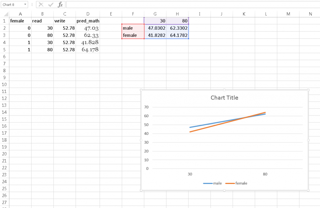
Graphs of simple slopes are great aids in interpretation of interactions involving simple slopes. At times, unfortunately, the statistical software used to estimate a regression model does not provide an easy way to visualize the effects involved in an interaction. In these cases we can create the graphs ourselves in Excel. We will need to use the regression coefficients estimated from statistical software to transform sets of predictor values into predicted response values, all of which will then be plotted.
The general strategy for creating a display of the effect of a predictor in a regression model is to choose a range of values of the predictor over which we will estimate the predicted value of the response, and then to display the predictor on the x-axis and the predicted response on the y-axis. Typically the plot produced is a line plot. This is all that needs to be done if the regression model contains only one predictor. When we have covariates in addition to the predictors whose effect we would like to display, typically the covariates are fixed at certain values, such as the mean, when we predict the response to keep their effects constant (control for their effects). For example, if we are using height and age as predictors of weight, and we want to display the effect of height on weight, we might fix age at its mean when predicting weight so that the effect of age does not interfere with the effect of height to be displayed.
To demonstrate, we will run a linear regression model in SPSS and use the model coefficients from the output to generate predicted values of the outcome in Excel. We will use the hsbdemo (click to download) dataset. We will regress math score on reading score, female gender (a 0/1 variable), the interaction of reading score and gender, and the covariate writing score. Our goal is to plot the slope of reading score for both genders.
Step 1: Run the regression model to get model coefficients
We used the glm procedure in SPSS to run our linear regression model. Because we want to use males (female=0) as the reference group, we entered female as a covariate rather than as a factor (which by default omits the last group). Here is the output table of model coefficients:
| Parameter | B | Std. Error | t | Sig. | 95% Confidence Interval | |
| Lower Bound | Upper Bound | |||||
| Intercept | 16.791 | 3.662 | 4.586 | .000 | 9.569 | 24.012 |
| female | -9.432 | 4.856 | -1.942 | .054 | -19.010 | .145 |
| read | .306 | .077 | 3.974 | .000 | .154 | .458 |
| female * read | .141 | .090 | 1.558 | .121 | -.037 | .319 |
| write | .399 | .065 | 6.130 | .000 | .270 | .527 |
We can write out the regression equation from this table:
math = 16.791 – 9.432*(female=1) + .306*read + .141*(female=1)*read + .399*write
Step 2 Choose a range of predictor values across which we will estimate the slope
We are interested in plotting the slope of reading score in predicting math score for each gender. So, we need to choose a meaningful range of values of reading score to depict the slope. Reading scores in the dataset range from 30 to 80, so we choose that as our predictor range. This variable range will span the x-axis. Because our lines are linear, and are not going to plot confidence limits, we need only choose the end points of the range for the purposes of graphing, namely read=30 and read=80.
Step 3 Choose values for moderators to separate slopes and for covariates to control for their effects
If the slope variable is interacted with a moderator, we can depict the slope at purposefully chosen values of the moderator. For our graph, we would like separate slopes by gender, so we choose the values female=0 and female=1.
Similarly, we can fix the values of the other covariates in the model at substantively meaningful values to control for their effects. For example, we will fix the value of write to write=52.78, its mean. By holding write at its mean for all predictions, we prevent any variation in write from affecting the predictions.
Step 4 Create a dataset for scoring predicted values in Excel
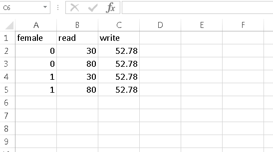
We next create a dataset of predictor values at which we will estimate the outcome math score in Excel. To create this dataset, we need to cross the values of 3 sets of variables: 1) the range of the slope variable 2) the values of the moderator(s) at which the slopes are to be separated 3) the fixed values of the covariates. We have 2 values for the slope variable (read=30 and read=80), 2 values for the moderator (female=0 and female=1), and 1 fixed value of the covariate (write=52.78). We will thus have 2*2*1=4 rows of data in our dataset:
We recommend that you reserve the first row for variable names, as you will need a row for labeling the graph lines as well.
Step 5 Use the regression equation in Excel to estimate predicted values
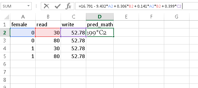
Let’s copy the right hand side of the regression equation from step 1 into cell D2 to estimate the first predicted values. But, where it says “(female=1)” we will click on cell A2, where it says “read” we will click on cell B2, and where it says “write” we will click on cell C2. This is how the formula for cell D2 should appear:
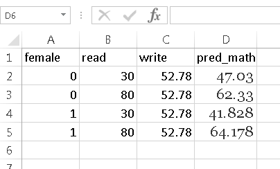
Upon hitting “Enter”, the equation will resolve to the predicted value of the outcome math. We can then drag the formula down the column to get predicted values of math for each set of predictor values.
Step 6 Set up the data for graphing
Arrange data representing separate lines in separate rows
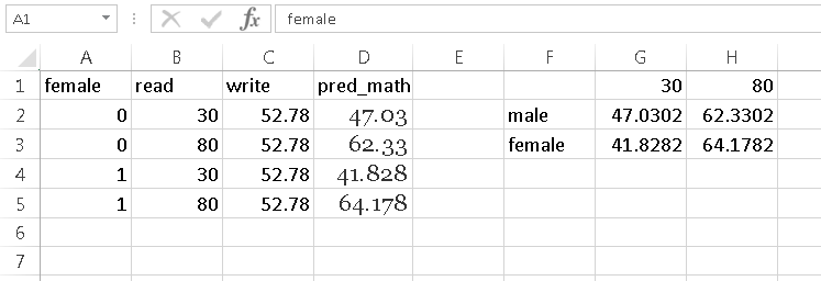
Because we want 2 lines separated by gender, we will arrange our data to be graphed in 2 rows in Excel. The first 2 pred_math values, which represent the slope for males, are placed in the first row while the second 2 values for the female slope are placed in the second row.
Note that when you are transferring data, in addition to transposing the data from a column to a row, you will need to use Paste Special-Values to avoid transferring the formula. You can transpose only values simultaneously through the keyboard shortcut Ctrl-Alt-V and then selecting “Values” and “Transpose”.
Column titles are x-axis coordinates and labels
We will name the 2 columns 30 and 80, which places the two points on each line at the x-coordinates 30 and 80, respectively.
Row titles are legend keys
We label the first row “male” and the second “female” to label the legend entries.
Here is how we arrange our data:
Step 7 Highlight the graph data and select “Insert Line Chart” from the Insert tab (Charts section). Select one of the desired styles of line graph.
The graph should be placed in the sheet below the graph data.
Further edits to the graph can be made by clicking on the graph, and the then clicking on the green plus symbol that appears.

