Version info: Code for this page was tested in R Under development (unstable) (2012-07-05 r59734)

 On: 2012-08-08

With: knitr 0.6.3
Graphics are built up from a few simple pieces. Most of these were introduced in the introduction (Graphics in R I). This part focuses on how to combine many small elements to make more informative graphs, combine multiple subplots in one larger image, and customize graphs for publication.
For this part, we will work with two small datasets.
- attitude is built into R and contains aggregated responses from 30 departments. The values are percent proportion of favourable responses. See ?attitude for more details.
- iris is also built into R and contains sepal and petal widths and lengths for three species of flower.
attitude data
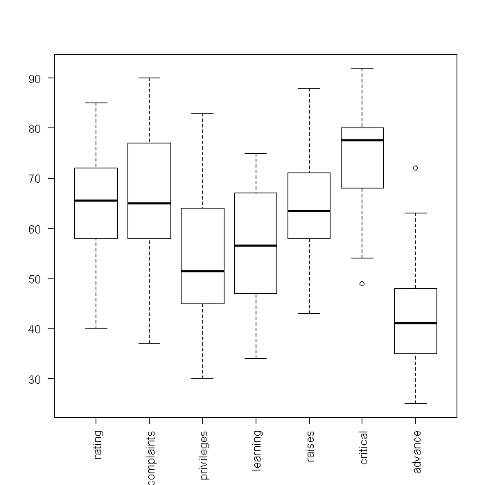
An easy way to start looking at the dataset is to just create boxplots of all the variables. This works in this case because all of the variables are percentages. If the variables were on different scales (e.g., income and age), we might want to standardize each variable first and then plot it.
## boxplots of raw variables
boxplot(attitude, las = 2)
## boxplots of standardized variables
boxplot(scale(attitude), las = 2)
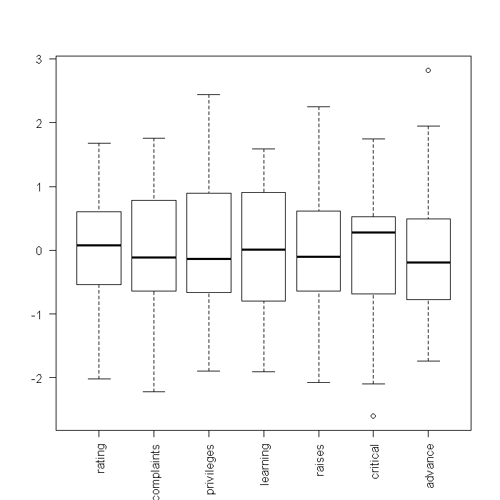
From these boxplots, we can see the medians and quartiles of each variable. Because standardized variables have a mean of 0, looking at the boxplots of the standardized variables gives a sense of skewness. However, little information on the shapes of the distributions is shown. Next, we might investigate density plots. To get an overall view, we tell R that the current device should be split into a 3 x 3 array where each cell can contain a figure. This way, each figure we plot will appear in the same device, rather than in separate windows. We could manually type out the code for all 7 variables, but that would take along time to do in the first place, and would be slow to edit (any change has to be done 7 times). Instead, we will take advantage of the fact that the “attitude” dataset is stored in a data frame and there are easy ways in R to implicitly loop through every variable.
## create a 3 x 3 array for figures
par(mfrow = c(3, 3))

invisible(lapply(colnames(attitude), function(i) {
    plot(density(attitude[[i]], bw = "SJ"), main = i)
    rug(attitude[[i]])
}))
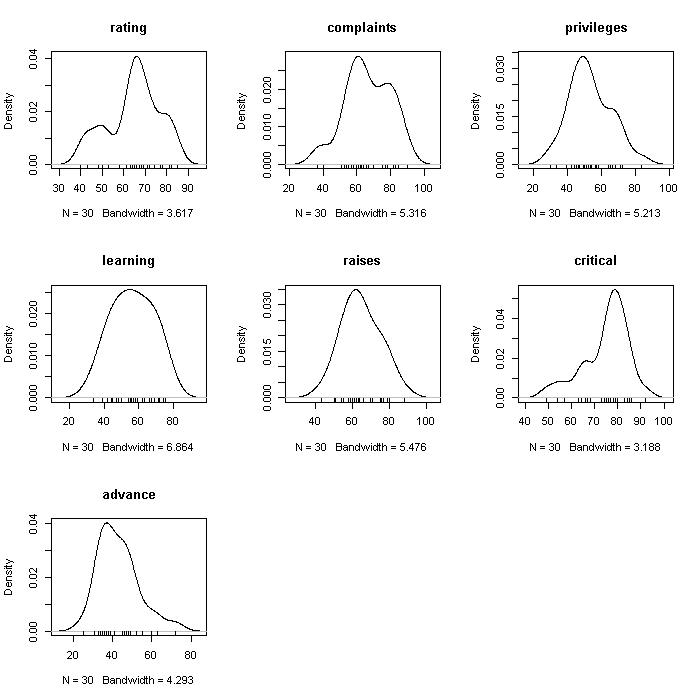
Note that although the graphs are a uniform size, the axes are not held constant. We could fix the axes limits if we wanted to; it would make comparing between variables easier, but could obscure aspects within a variable. The rugs at the bottom of each plot are actual observations.
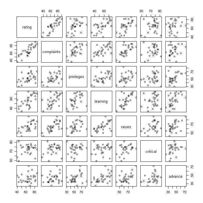
Another way to start to look at the relationships between variables is with a scatter plot matrix.
plot(attitude)
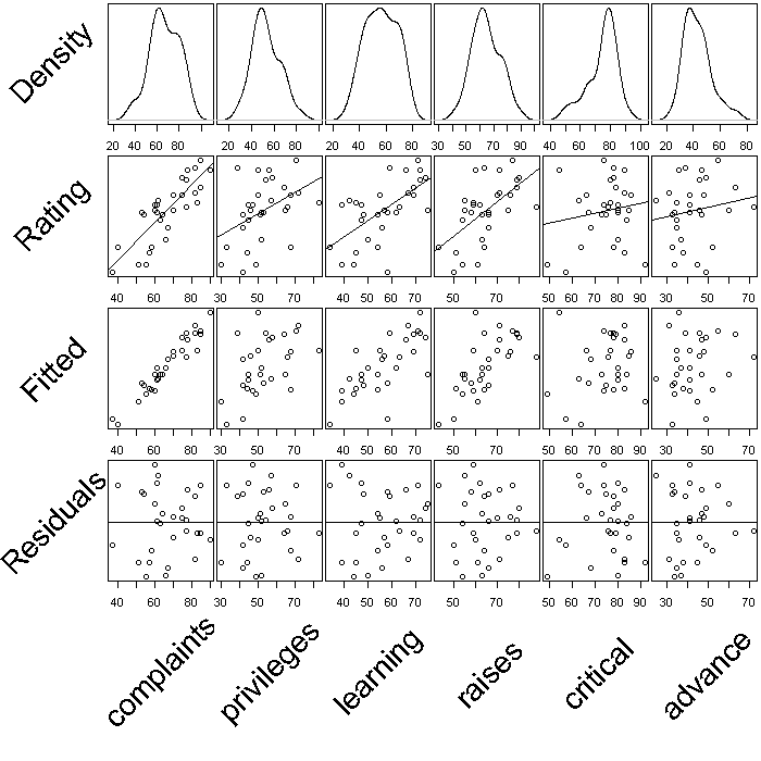
Finally, we might look at how the subcomponents relate to the overall rating. We create one large figure where the first row has the density plots for each explanatory variable (the subcomponents), the second row the scatter plots with lines of best fit between each explanatory variable (EV) and the overall rating, the third row scatter plots between the fitted values under the model and each EV, and the fourth row the residuals against each EV. This is not particularly a plot you would actually make when exploring or modelling a dataset, but it demonstrates one way to go about combining multiple plots.
## store the overall rating in the variable y
y <- attitude[, 1]
## store all the explanatory variables in x
x <- attitude[, -1]
## fit a linear model
m <- lm(y ~ as.matrix(x))
## store the fitted values under the model in yhat
yhat <- predict(m)
## store the residuals
res <- resid(m)

## setup the parameters for the device there will be 5 rows and 7 columns
## plots will fill rows first (because we used mfrow) mar sets the margins
## (bottom, left, top, right) we leave space on the bottom for an axis srt
## stands for string rotation, this is for our labels
par(mfrow = c(5, 7), mar = c(2, 0, 0.25, 0.25), srt = 45)

## Row label call plot.new() to tell R we are in a new plot set the size
## of the plot and fix aspect ratio at 1
plot.new()
plot.window(c(0, 1), c(0, 1), asp = 1)
## add text to the plot in the center cex stands for character expansion
## and controls text size note text is rotated 45 degrees because of the
## global option set earlier in the call to par()
text("Density", cex = 2.5, x = 0.5, y = 0.5)

## Density plots yaxt = 'n' turns of the y axis completely and all labels
## are empty
invisible(lapply(colnames(x), function(i) {
    plot(density(x[[i]]), yaxt = "n", main = "", ylab = "", xlab = "")
}))

## Row label
plot.new()
plot.window(c(0, 1), c(0, 1), asp = 1)
text("Rating", cex = 2.5, x = 0.5, y = 0.5)

## Scatter plots
invisible(lapply(colnames(x), function(i) {
    plot(x = x[[i]], y = y, yaxt = "n", main = "", ylab = "", xlab = "")
    ## adds the line of best fit to the graph
    abline(lm(y ~ x[[i]]))
}))

## Row label
plot.new()
plot.window(c(0, 1), c(0, 1), asp = 1)
text("Fitted", cex = 2.5, x = 0.5, y = 0.5)

## Explanatory variables against fitted values
invisible(lapply(colnames(x), function(i) {
    plot(x = x[[i]], y = yhat, yaxt = "n", main = "", ylab = "", xlab = "")
}))

## Row label
plot.new()
plot.window(c(0, 1), c(0, 1), asp = 1)
text("Residuals", cex = 2.5, x = 0.5, y = 0.5)

## Explanatory variables against residuals
invisible(lapply(colnames(x), function(i) {
    plot(x = x[[i]], y = res, yaxt = "n", main = "", ylab = "", xlab = "")
    ## adds a reference line at y = 0
    abline(h = 0)
}))

## Column lables (blank first)
invisible(lapply(c("", colnames(x)), function(i) {
    plot.new()
    plot.window(c(0, 1), c(0, 1), asp = 1)
    text(i, x = 0.5, y = 0.5, cex = 2.5)
}))
iris data
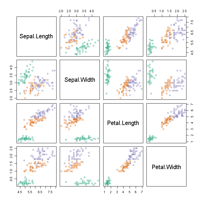
We start looking at the iris data with a coloured scatter plot matrix. This suggests there is a high degree of separation between species in the lengths and widths of petals and sepals.
## define a (nominally) colour blind safe pallette
pal <- rgb(c(27, 217, 117), c(158, 95, 112), c(119, 2, 179), maxColorValue = 255)
## scatter plot matrix of continuous variables, coloured by species
plot(iris[, -5], col = pal[iris[, 5]])
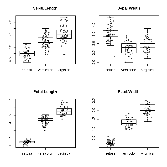
To explore the species effect a bit more, we might look at boxplots, broken down by species. Graphs excel at elucidating large (at least relative to tables) amounts of data. We take advantage of this by adding the raw data on top of the boxplots. The plots do look a bit ‘busy’ but this does not actually obscure any information from the boxplots.
par(mfrow = c(2, 2))

invisible(lapply(colnames(iris[, -5]), function(i) {
    ## boxplots
    boxplot(as.formula(paste(i, "~ Species")), data = iris, main = i)
    ## add points for each species, jittering the x axis to alleviate
    ## overplotting
    points(x = jitter(as.numeric(factor(iris[["Species"]]))), y = iris[[i]])
}))
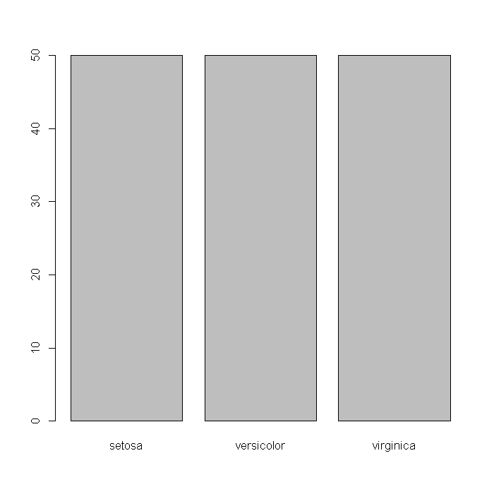
We might also wonder about how many observations of each species are in the data. Evidently the data are perfectly balanced with 50 observations from each species. Evidently the data are perfectly balanced with 50 observations from each species.
barplot(table(iris$Species))
So far we have focused on visualizing the data itself or simple summaries of it. Another area graphics are used is to present results from analyses. Say we wanted to plot the adjusted means and 95% CIs of Sepal.Width for each species, adjusted for Sepal.Length.
## Fit a linear model
m <- lm(Sepal.Width ~ Sepal.Length + Species, data = iris)

## create a data frame of the values to fit from the model
newdat <- data.frame(Sepal.Length = mean(iris$Sepal.Length), Species = levels(iris$Species))

newdat <- cbind(newdat, predict(m, newdat, se = TRUE))

with(newdat, {
    plot(x = as.numeric(Species), y = fit, pch = 18, cex = 2, xaxt = "n", asp = 1,
        ylim = range(iris$Sepal.Width), xlab = "Species", ylab = "Adjusted Sepal Width")
    axis(side = 1, at = 1:3, labels = Species)
    arrows(x0 = as.numeric(Species), y0 = fit + se.fit * qt(0.05/2, df = df),
        y1 = fit - se.fit * qt(0.05/2, df = df), length = 0.2, angle = 90, code = 3)
})
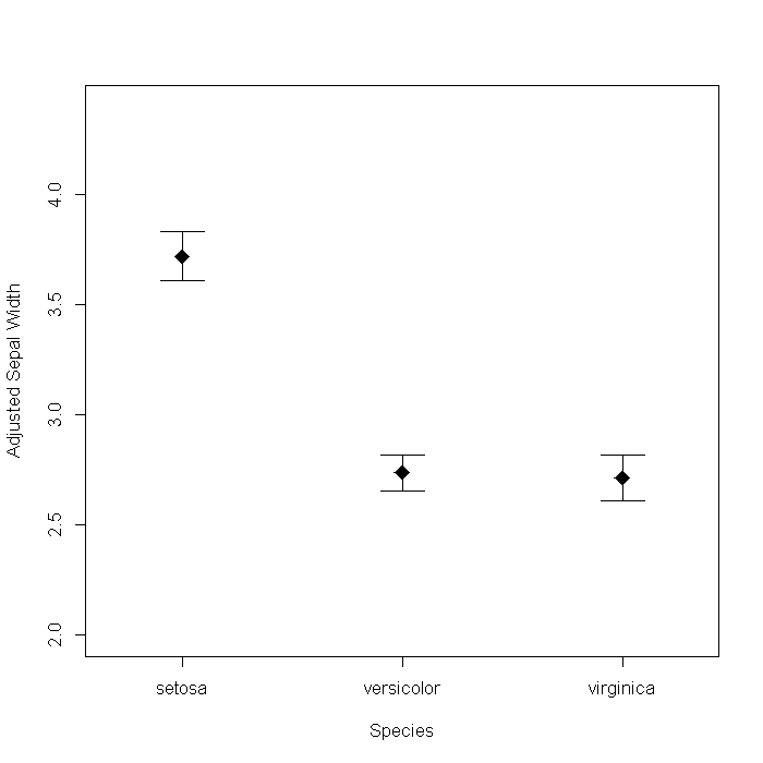
We could dress it up a bit by adding some information from the model. For example, the sum of squares accounted for by Species. The Hmisc package has a function, errbar that creates the graph slightly easier, so we will use that too.
## Extract sum of squares from the model
ss <- anova(m)[, "Sum Sq"]

## load Hmisc package
require(Hmisc)
## create plot
with(newdat, {
    errbar(as.numeric(Species), fit, fit + se.fit * qt(0.05/2, df = df), fit -
        se.fit * qt(0.05/2, df = df), pch = 18, cex = 2, xlab = "Species", ylab = "Adjusted Sepal Width",
        xaxt = "n", )
    axis(side = 1, at = 1:3, labels = Species)
})

text(x = 2.5, y = 3.8, label = paste("Unique variance accounted forn by Species: ",
    round(ss[2]/sum(ss) * 100, 1), "%", sep = ""))
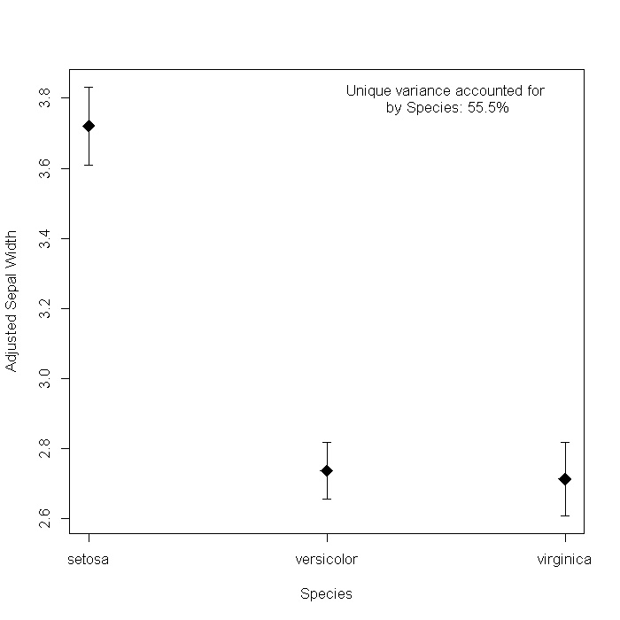
I have never been a big fan of this sort of graph, mostly because I cannot figure
out what it adds over a simple sumary of the coefficients, where it is clear Versicolor
and Virginica are signicantly lower than Setosa. One is -0.98
and the other -1.01 so they probably are not different from
each other, just from Setosa.
coef(summary(m))
##                   Estimate Std. Error t value Pr(>|t|)
## (Intercept)          1.677     0.2354    7.12 4.46e-11
## Sepal.Length         0.350     0.0463    7.56 4.19e-12
## Speciesversicolor   -0.983     0.0721  -13.64 7.62e-28
## Speciesvirginica    -1.008     0.0933  -10.80 2.41e-20
Summary
The traditional graphics system in R provides very low level control making it possible to create nearly any combination of graphic you want. This introduction to traditional graphics covered many of the basic building blocks—points, lines, bars, and text that are combined to create most graphics. Despite the flexibility of traditional graphics, creating complex graphs can be cumbersome. For many purposes, it is convenient to use a higher level system for graphics. Two of the major ones in R are ggplot2 and lattice. ggplot2 is covered in another one of our seminars on R graphics.
