Mixed effects logistic regression is used to model binary outcome variables, in which the log odds of the outcomes are modeled as a linear combination of the predictor variables when data are clustered or there are both fixed and random effects.
This page uses the following packages. Make sure that you can load
them before trying to run the examples on this page. If you do not have
a package installed, run: install.packages("packagename"), or
if you see the version is out of date, run: update.packages().
require(ggplot2)
require(GGally)
require(reshape2)
require(lme4)
require(compiler)
require(parallel)
require(boot)
require(lattice)
Version info: Code for this page was tested in R version 3.1.0 (2014-04-10)
On: 2014-07-10
With: boot 1.3-11; lme4 1.1-6; Rcpp 0.11.2; Matrix 1.1-3; GGally 0.4.4; reshape 0.8.4; plyr 1.8; xtable 1.7-3; car 2.0-20; foreign 0.8-61; Hmisc 3.14-4; Formula 1.1-1; survival 2.37-7; lattice 0.20-29; mgcv 1.7-29; nlme 3.1-117; png 0.1-7; gridExtra 0.9.1; reshape2 1.2.2; ggplot2 0.9.3.1; vcd 1.3-1; rjson 0.2.14; RSQLite 0.11.4; DBI 0.2-7; knitr 1.5
Please note: The purpose of this page is to show how to use various data analysis commands. It does not cover all aspects of the research process which researchers are expected to do. In particular, it does not cover data cleaning and checking, verification of assumptions, model diagnostics or potential follow-up analyses.
Examples of mixed effects logistic regression
Example 1: A researcher sampled applications to 40 different colleges to study factor that predict admittance into college. Predictors include student’s high school GPA, extracurricular activities, and SAT scores. Some schools are more or less selective, so the baseline probability of admittance into each of the schools is different. School level predictors include whether the school is public or private, the current student-to-teacher ratio, and the school’s rank.
Example 2: A large HMO wants to know what patient and physician factors are most related to whether a patient’s lung cancer goes into remission after treatment as part of a larger study of treatment outcomes and quality of life in patients with lunger cancer.
Example 3: A television station wants to know how time and advertising campaigns affect whether people view a television show. They sample people from four cities for six months. Each month, they ask whether the people had watched a particular show or not in the past week. After three months, they introduced a new advertising campaign in two of the four cities and continued monitoring whether or not people had watched the show.
Description of the data
In this example, we are going to explore Example 2 about lung cancer using a simulated
dataset, which we have posted online. A variety of outcomes were collected on
patients, who are nested within doctors, who are in turn nested within hospitals.
There are also a few doctor level variables, such as Experience
that we will use in our example.
hdp <- read.csv("https://stats.idre.ucla.edu/stat/data/hdp.csv")
hdp <- within(hdp, {
  Married <- factor(Married, levels = 0:1, labels = c("no", "yes"))
  DID <- factor(DID)
  HID <- factor(HID)
  CancerStage <- factor(CancerStage)
})
Now we are going to graph our continuous predictor variables. Visualizing data can help us understand the distributions, catch coding errors (e.g., we know a variable only takes values from 0 to 7, but we see a 999 in the graph), and give us a sense of the relationship among our variables. For example, we might see that two predictors are highly correlated and decide we only want to include one in the model, or we might note a curvilinear relation between two variables. Data visualization is a fast, intuitive way to check all of this at once. If most your predictors appear independent of each other, that is fine. It shapes your expectations of the model. For example, if they are independent, the estimate for one predictor should not change much when you enter another predictor (although the standard error and significance tests may). We can get all of this information and intuition about what and how to model are data by simply viewing it.
ggpairs(hdp[, c("IL6", "CRP", "LengthofStay", "Experience")])
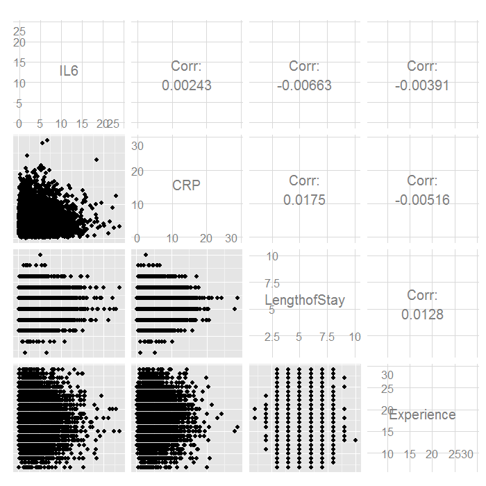
There do not seem to be any strong linear relations among our continuous
predictors. Let us look at the distributions of our variables by
CancerStage.
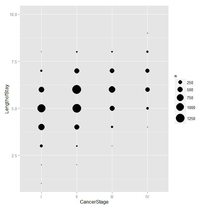
Because LengthofStay is coded discretely in days,
we can examine how CancerStage is associated
with it using bubble plots. The area of each bubble is
proportional to the number of observations with those values.
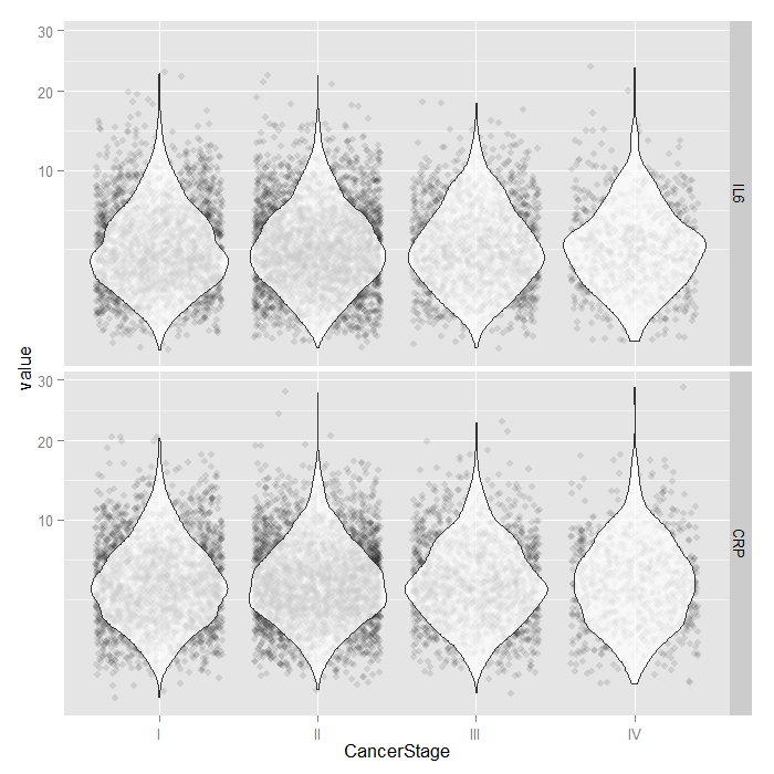
For the continuous predictors, we use violin plots with jittered
data values. All of the raw data is presented separated by
CancerStage. To alleviate overplotting and see the
values better, we add a small amount of random noise (primarily
to the x axis) as well as set the alpha transparency.
Although the jittered dots are helpful for seeing the raw data,
it can be difficult to get a precise sense of the distribution.
For that, we add violin plots. Violin plots are just kernel
density plots reflected around the plotting axis. We plot the
violin plots on top of the jittered points with a transparency
so that you can stil see the raw data, but the violin plots are
dominant. Because both IL6 and CRP
tend to have skewed distributions, we use a square root scale
on the y axis. The distributions look fairly normal and symmetric,
although you can still see the long right tail, even using a
square root scale (note that only the scale was shifted, the
values themselves are not transformed, which is important
because this lets you see and interpret the actual scores,
rather than the square root of the scores).
ggplot(hdp, aes(x = CancerStage, y = LengthofStay)) +
  stat_sum(aes(size = ..n.., group = 1)) +
  scale_size_area(max_size=10)
tmp <- melt(hdp[, c("CancerStage", "IL6", "CRP")], id.vars="CancerStage")
ggplot(tmp, aes(x = CancerStage, y = value)) +
  geom_jitter(alpha = .1) +
  geom_violin(alpha = .75) +
  facet_grid(variable ~ .) +
  scale_y_sqrt()
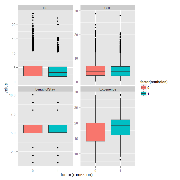
Because it is difficult to see how binary variables change over levels of continuous variables, we can flip the problem around and look at the distribution of continuous variables at each level of the binary outcome.
tmp <- melt(hdp[, c("remission", "IL6", "CRP", "LengthofStay", "Experience")],
  id.vars="remission")
ggplot(tmp, aes(factor(remission), y = value, fill=factor(remission))) +
  geom_boxplot() +
  facet_wrap(~variable, scales="free_y")
Analysis methods you might consider
Below is a list of analysis methods you may have considered.
- Mixed effects logistic regression, the focus of this page.
- Mixed effects probit regression is very similar to mixed effects logistic regression, but it uses the normal CDF instead of the logistic CDF. Both model binary outcomes and can include fixed and random effects.
- Fixed effects logistic regression is limited in this case because it may ignore necessary random effects and/or non independence in the data.
- Fixed effects probit regression is limited in this case because it may ignore necessary random effects and/or non independence in the data.
- Logistic regression with clustered standard errors. These can adjust for non independence but does not allow for random effects.
- Probit regression with clustered standard errors. These can adjust for non independence but does not allow for random effects.
Mixed effects logistic regression
Below we use the glmer command to estimate a mixed effects
logistic regression model with Il6, CRP, and
LengthofStay as patient level continuous predictors,
CancerStage as a patient level categorical predictor (I, II, III, or IV),
Experience as a doctor level continuous predictor,
and a random intercept by DID, doctor ID.
Estimating and interpreting generalized linear mixed models (GLMMs, of which mixed effects logistic regression is one) can be quite challenging. If you are just starting, we highly recommend reading this page first Introduction to GLMMs . It covers some of the background and theory as well as estimation options, inference, and pitfalls in more detail.
# estimate the model and store results in m
m <- glmer(remission ~ IL6 + CRP + CancerStage + LengthofStay + Experience +
    (1 | DID), data = hdp, family = binomial, control = glmerControl(optimizer = "bobyqa"),
    nAGQ = 10)

# print the mod results without correlations among fixed effects
print(m, corr = FALSE)
## Generalized linear mixed model fit by maximum likelihood (Adaptive
##   Gauss-Hermite Quadrature, nAGQ = 10) [glmerMod]
##  Family: binomial ( logit )
## Formula:
## remission ~ IL6 + CRP + CancerStage + LengthofStay + Experience +
##     (1 | DID)
##    Data: hdp
##      AIC      BIC   logLik deviance df.resid
##     7397     7461    -3690     7379     8516
## Random effects:
##  Groups Name        Std.Dev.
##  DID    (Intercept) 2.01
## Number of obs: 8525, groups: DID, 407
## Fixed Effects:
##    (Intercept)             IL6             CRP   CancerStageII
##        -2.0527         -0.0568         -0.0215         -0.4139
## CancerStageIII   CancerStageIV    LengthofStay      Experience
##        -1.0035         -2.3370         -0.1212          0.1201
The first part tells us the estimates are based on an
adaptive Gaussian Hermite approximation of the likelihood. In particular we used 10
integration points. As we use more
integration points, the approximation becomes more accurate converging to the ML estimates;
however, more points are more computationally demanding and can be extremely slow
or even intractable with today’s technology. To avoid a warning of nonconvergence, we specify a different optimizer with the argument control=glmerControl(optimizer="bobyqa"). Although the model will produce nearly identical results without the new argument, we prefer to use models without such warnings.
The next section gives us basic information that can be used to compare models, followed by the random effect estimates. This represents the estimated variability in the intercept on the logit scale. Had there been other random effects, such as random slopes, they would also appear here. The top section concludes with the total number of observations, and the number of level 2 observations. In our case, this includes the total number of patients (8,525) and doctors (407).
The last section is a table of the fixed effects estimates. For many applications, these are what people are primarily interested in. The estimates represent the regression coefficients. These are unstandardized and are on the logit scale. The estimates are followed by their standard errors (SEs). As is common in GLMs, the SEs are obtained by inverting the observed information matrix (negative second derivative matrix). However, for GLMMs, this is again an approximation. The approximations of the coefficient estimates likely stabilize faster than do those for the SEs. Thus if you are using fewer integration points, the estimates may be reasonable, but the approximation of the SEs may be less accurate. The Wald tests, (frac{Estimate}{SE}), rely on asymptotic theory, here referring to as the highest level unit size converges to infinity, these tests will be normally distributed, and from that, p values (the probability of obtaining the observed estimate or more extreme, given the true estimate is 0).
It can be nice to get confidence intervals (CIs). We can get rough estimates using the SEs.
se <- sqrt(diag(vcov(m)))
# table of estimates with 95% CI
(tab <- cbind(Est = fixef(m), LL = fixef(m) - 1.96 * se, UL = fixef(m) + 1.96 *
    se))
##                     Est       LL        UL
## (Intercept)    -2.05269 -3.09435 -1.011025
## IL6            -0.05677 -0.07935 -0.034196
## CRP            -0.02148 -0.04151 -0.001455
## CancerStageII  -0.41393 -0.56243 -0.265436
## CancerStageIII -1.00346 -1.19610 -0.810828
## CancerStageIV  -2.33704 -2.64683 -2.027241
## LengthofStay   -0.12118 -0.18710 -0.055261
## Experience      0.12009  0.06628  0.173895
If we wanted odds ratios instead of coefficients on the logit scale, we could exponentiate the estimates and CIs.
exp(tab)
##                    Est      LL     UL
## (Intercept)    0.12839 0.04530 0.3638
## IL6            0.94481 0.92372 0.9664
## CRP            0.97875 0.95934 0.9985
## CancerStageII  0.66104 0.56982 0.7669
## CancerStageIII 0.36661 0.30237 0.4445
## CancerStageIV  0.09661 0.07088 0.1317
## LengthofStay   0.88587 0.82936 0.9462
## Experience     1.12760 1.06853 1.1899
Multilevel bootstrapping
Inference from GLMMs is complicated. Except for cases where there are many observations at each level (particularly the highest), assuming that (frac{Estimate}{SE}) is normally distributed may not be accurate. A variety of alternatives have been suggested including Monte Carlo simulation, Bayesian estimation, and bootstrapping. Each of these can be complex to implement. We are going to focus on a small bootstrapping example.
Bootstrapping is a resampling method. It is by no means perfect, but it is conceptually straightforward and easy to implement in code. One downside is that it is computationally demanding. For large datasets or complex models where each model takes minutes to run, estimating on thousands of bootstrap samples can easily take hours or days. In the example for this page, we use a very small number of samples, but in practice you would use many more. Perhaps 1,000 is a reasonable starting point.
For single level models, we can implement a simple random sample with replacement for bootstrapping. With multilevel data, we want to resample in the same way as the data generating mechanism. We start by resampling from the highest level, and then stepping down one level at a time. In our case, we first will sample from doctors, and then within each doctor sampled, we will sample from their patients. To do this, we first need to write a function to resample at each level.
The Biostatistics Department at Vanderbilt has a nice page describing the idea: Applied Nonparametric Bootstrap with Hierarchical and Correlated Data
sampler <- function(dat, clustervar, replace = TRUE, reps = 1) {
    cid <- unique(dat[, clustervar[1]])
    ncid <- length(cid)
    recid <- sample(cid, size = ncid * reps, replace = TRUE)
    if (replace) {
        rid <- lapply(seq_along(recid), function(i) {
            cbind(NewID = i, RowID = sample(which(dat[, clustervar] == recid[i]),
                size = length(which(dat[, clustervar] == recid[i])), replace = TRUE))
        })
    } else {
        rid <- lapply(seq_along(recid), function(i) {
            cbind(NewID = i, RowID = which(dat[, clustervar] == recid[i]))
        })
    }
    dat <- as.data.frame(do.call(rbind, rid))
    dat$Replicate <- factor(cut(dat$NewID, breaks = c(1, ncid * 1:reps), include.lowest = TRUE,
        labels = FALSE))
    dat$NewID <- factor(dat$NewID)
    return(dat)
}
Now we will resample our data and take 100 replicates. Again in practice you would probably take thousands. We set the seed so that our results are reproducible. It is also likely that you will need to sample more replicates than you ultimately want because many samples may not converge so you do not get estimates from them.
set.seed(20)
tmp <- sampler(hdp, "DID", reps = 100)
bigdata <- cbind(tmp, hdp[tmp$RowID, ])
Next we refit the model on the resampled data. First we store the
estimates from our original model, which we will use as start values
for the bootstrap models. Then we make a local cluster with 4 nodes
(the number of processors on our machine; set to the number of
processors you have on yours). Next, we export the data and load
the lme4 package on the cluster. Finally,
we write a function to fit the model and return the estimates.
The call to glmer() is wrapped in try
because not all models may converge on the resampled data.
This catches the error and returns it, rather than stopping processing.
f <- fixef(m)
r <- getME(m, "theta")

cl <- makeCluster(4)
clusterExport(cl, c("bigdata", "f", "r"))
clusterEvalQ(cl, require(lme4))
## [[1]]
## [1] TRUE
##
## [[2]]
## [1] TRUE
##
## [[3]]
## [1] TRUE
##
## [[4]]
## [1] TRUE
myboot <- function(i) {
    object <- try(glmer(remission ~ IL6 + CRP + CancerStage + LengthofStay +
        Experience + (1 | NewID), data = bigdata, subset = Replicate == i, family = binomial,
        nAGQ = 1, start = list(fixef = f, theta = r)), silent = TRUE)
    if (class(object) == "try-error")
        return(object)
    c(fixef(object), getME(object, "theta"))
}
Now that we have the data, the local cluster, and the fitting
function setup, we are ready to actually do the bootstrapping.
To do this, we use the parLapplyLB function, which
loops through every replicate, giving them out to each node of
the cluster to estimate the models. The “LB” stands for load
balancing, which means replicates are distributed as a node completes
its current job. This is valuable because not all replicates will
converge, and if there is an error and it happens early on,
one node may be ready for a new job faster than another node.
There is some extra communication overhead, but this is small
compared to the time it takes to fit each model.
The results from all nodes are aggregated back into
a single list, stored in the object res. Once that
is done, we can shut down the local cluster, which terminates
the additional R instances and frees memory.
start <- proc.time()
res <- parLapplyLB(cl, X = levels(bigdata$Replicate), fun = myboot)
end <- proc.time()

# shut down the cluster
stopCluster(cl)
Now that we have the bootstrap results, we can summarize them. First, we calculate the number of models that successfully converged. We do this by checking whether a particular result is numeric or not. Errors are not numeric, so they will be skipped. We can calculate the mean of the successes to see the proportion of replicates that converged and that we have results for.
# calculate proportion of models that successfully converged
success <- sapply(res, is.numeric)
mean(success)
## [1] 1
Next we convert the list of bootstrap results into a matrix, and then calculate the 2.5th and 97.5th percentiles for each parameter. Finally, we can make a table of the results, including the original estimates and standard errors, the mean bootstrap estimate (which is asymptotically equivalent to the original results, but may be biased for a small number of replicates, as in our case), and the bootstrapped confidence intervals. With these data, you could also calculate bias-corrected bootstrap confidence intervals if you wanted, although we only show the percentile CIs.
# combine successful results
bigres <- do.call(cbind, res[success])

# calculate 2.5th and 97.5th percentiles for 95% CI
(ci <- t(apply(bigres, 1, quantile, probs = c(0.025, 0.975))))
##                       2.5%     97.5%
## (Intercept)       -3.61982 -0.985404
## IL6               -0.08812 -0.029664
## CRP               -0.04897  0.006824
## CancerStageII     -0.60754 -0.228019
## CancerStageIII    -1.30217 -0.754609
## CancerStageIV     -2.91414 -2.002643
## LengthofStay      -0.21596 -0.046420
## Experience         0.06819  0.207223
## NewID.(Intercept)  2.03868  2.476366
# All results
finaltable <- cbind(Est = c(f, r), SE = c(se, NA), BootMean = rowMeans(bigres),
    ci)
# round and print
round(finaltable, 3)
##                    Est    SE BootMean   2.5%  97.5%
## (Intercept)     -2.053 0.531   -2.205 -3.620 -0.985
## IL6             -0.057 0.012   -0.059 -0.088 -0.030
## CRP             -0.021 0.010   -0.022 -0.049  0.007
## CancerStageII   -0.414 0.076   -0.417 -0.608 -0.228
## CancerStageIII  -1.003 0.098   -1.043 -1.302 -0.755
## CancerStageIV   -2.337 0.158   -2.460 -2.914 -2.003
## LengthofStay    -0.121 0.034   -0.142 -0.216 -0.046
## Experience       0.120 0.027    0.128  0.068  0.207
## DID.(Intercept)  2.015    NA    2.263  2.039  2.476
Predicted probabilities and graphing
These results are great to put in the table or in the text of a research manuscript; however, the numbers can be tricky to interpret. Visual presentations are helpful to ease interpretation and for posters and presentations. As models become more complex, there are many options. We will discuss some of them briefly and give an example how you could do one.
In a logistic model, the outcome is commonly on one of three scales:
- Log odds (also called logits), which is the linearized scale
- Odds ratios (exponentiated log odds), which are not on a linear scale
- Probabilities, which are also not on a linear scale
For tables, people often present the odds ratios. For visualization, the logit or probability scale is most common. There are some advantages and disadvantages to each. The logit scale is convenient because it is linearized, meaning that a 1 unit increase in a predictor results in a coefficient unit increase in the outcome and this holds regardless of the levels of the other predictors (setting aside interactions for the moment). A downside is the scale is not very interpretable. It is hard for readers to have an intuitive understanding of logits. Conversely, probabilities are a nice scale to intuitively understand the results; however, they are not linear. This means that a one unit increase in the predictor, does not equal a constant increase in the probability—the change in probability depends on the values chosen for the other predictors. In ordinary logistic regression, you could just hold all predictors constant, only varying your predictor of interest. However, in mixed effects logistic models, the random effects also bear on the results. Thus, if you hold everything constant, the change in probability of the outcome over different values of your predictor of interest are only true when all covariates are held constant and you are in the same group, or a group with the same random effect. The effects are conditional on other predictors and group membership, which is quite narrowing. An attractive alternative is to get the average marginal probability. That is, across all the groups in our sample (which is hopefully representative of your population of interest), graph the average change in probability of the outcome across the range of some predictor of interest.
We are going to explore an example with average marginal probabilities. These take more work than conditional probabilities, because you have to calculate separate conditional probabilities for every group and then average them. It is also not easy to get confidence intervals around these average marginal effects in a frequentist framework (although they are trivial to obtain from Bayesian estimation).
First, let’s define the general procedure using the notation from here . We create \(\mathbf{X}_{i}\) by taking \(\mathbf{X}\) and setting a particular predictor of interest, say in column \(j\), to a constant. If we only cared about one value of the predictor, \(i \in {1}\). However, more commonly, we want a range of values for the predictor in order to plot how the predicted probability varies across its range. We can do this by taking the observed range of the predictor and taking \(k\) samples evenly spaced within the range. For example, suppose our predictor ranged from 5 to 10, and we wanted 6 samples, \(\frac{10 – 5}{6 – 1} = 1\), so each sample would be 1 apart from the previous and they would be: \({5, 6, 7, 8, 9, 10}\). Then we create \(k\) different \(\mathbf{X}_{i}\)s where \(i \in {1, \ldots, k}\) where in each case, the \(j\)th column is set to some constant. Then we calculate: $$ \boldsymbol{\eta}_{i} = \mathbf{X}_{i}\boldsymbol{\beta} + \mathbf{Z}\boldsymbol{\gamma} $$ These are all the different linear predictors. Finally, we take \(h(\boldsymbol{\eta})\), which gives us \(\boldsymbol{\mu}_{i}\), which are the conditional expectations on the original scale, in our case, probabilities. We can then take the expectation of each \(\boldsymbol{\mu}_{i}\) and plot that against the value our predictor of interest was held at. We could also make boxplots to show not only the average marginal predicted probability, but also the distribution of predicted probabilities.
You may have noticed that a lot of variability goes into those estimates. We are using \(\mathbf{X}\) only holding our predictor of interest at a constant, which allows all the other predictors to take on values in the original data. Also, we have left \(\mathbf{Z}\boldsymbol{\gamma}\) as in our sample, which means some groups are more or less represented than others. If we had wanted, we could have re-weighted all the groups to have equal weight. We chose to leave all these things as-is in this example based on the assumption that our sample is truly a good representative of our population of interest. Rather than attempt to pick meaningful values to hold covariates at (even the mean is not necessarily meaningful, particularly if a covariate as a bimodal distribution, it may be that no participant had a value at or near the mean), we used the values from our sample. This also suggests that if our sample was a good representation of the population, then the average marginal predicted probabilities are a good representation of the probability for a new random sample from our population.
Now that we have some background and theory, let’s
see how we actually go about calculating these things.
We get a summary of LengthofStay,
our predictor of interest, and then get 100 values across its range
to use in prediction. We make a
copy of our data so we can fix the values of one of the predictors
and then use the predict function to calculate the
predicted values. All random effects are included by default,
see ?predict.merMod for more details.
Note that the predict method for mixed effects models is new
and currently is only in the development version of lme4,
so make sure that you have that installed.
# temporary data
tmpdat <- hdp[, c("IL6", "CRP", "CancerStage", "LengthofStay", "Experience",
    "DID")]

summary(hdp$LengthofStay)
##    Min. 1st Qu.  Median    Mean 3rd Qu.    Max.
##    1.00    5.00    5.00    5.49    6.00   10.00
jvalues <- with(hdp, seq(from = min(LengthofStay), to = max(LengthofStay), length.out = 100))

# calculate predicted probabilities and store in a list
pp <- lapply(jvalues, function(j) {
    tmpdat$LengthofStay <- j
    predict(m, newdata = tmpdat, type = "response")
})
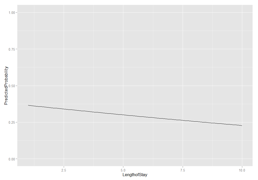
Now that we have all the predicted probabilities, we can work on displaying them. For example, we could look at the average marginal predicted probability at a handful of different lengths of stay. We can also plot all of them.
# average marginal predicted probability across a few different Lengths of
# Stay
sapply(pp[c(1, 20, 40, 60, 80, 100)], mean)
## [1] 0.3652 0.3366 0.3075 0.2796 0.2530 0.2278
# get the means with lower and upper quartiles
plotdat <- t(sapply(pp, function(x) {
    c(M = mean(x), quantile(x, c(0.25, 0.75)))
}))

# add in LengthofStay values and convert to data frame
plotdat <- as.data.frame(cbind(plotdat, jvalues))

# better names and show the first few rows
colnames(plotdat) <- c("PredictedProbability", "Lower", "Upper", "LengthofStay")
head(plotdat)
##   PredictedProbability   Lower  Upper LengthofStay
## 1               0.3652 0.08490 0.6156        1.000
## 2               0.3637 0.08405 0.6130        1.091
## 3               0.3622 0.08320 0.6103        1.182
## 4               0.3607 0.08237 0.6077        1.273
## 5               0.3591 0.08154 0.6051        1.364
## 6               0.3576 0.08072 0.6024        1.455
# plot average marginal predicted probabilities
ggplot(plotdat, aes(x = LengthofStay, y = PredictedProbability)) + geom_line() +
    ylim(c(0, 1))
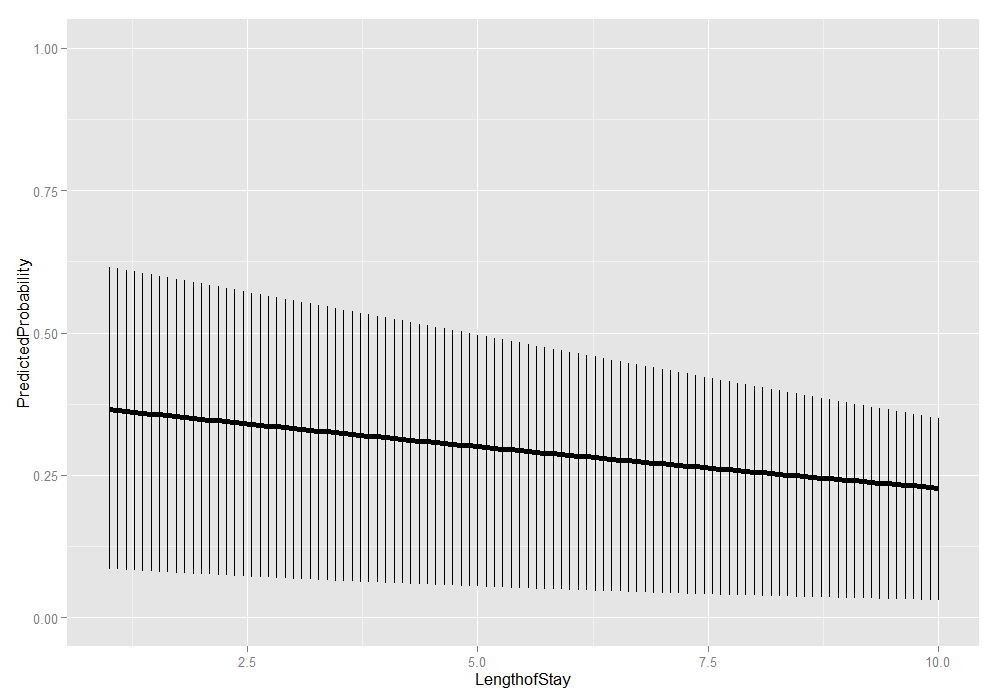
We could also add the lower and upper quartiles. This information shows us the range in which 50 percent of the predicted probabilities fell.
ggplot(plotdat, aes(x = LengthofStay, y = PredictedProbability)) + geom_linerange(aes(ymin = Lower,
    ymax = Upper)) + geom_line(size = 2) + ylim(c(0, 1))
This is just the beginning of what can be done. For plots, it is
useful to add more information. We could make the same average marginal
predicted probabilities, but in addition to varying LengthofStay
we could do it for each level of CancerStage.
# calculate predicted probabilities and store in a list
biprobs <- lapply(levels(hdp$CancerStage), function(stage) {
  tmpdat$CancerStage[] <- stage
  lapply(jvalues, function(j) {
    tmpdat$LengthofStay <- j
    predict(m, newdata = tmpdat, type = "response")
  })
})

# get means and quartiles for all jvalues for each level of CancerStage
plotdat2 <- lapply(biprobs, function(X) {
  temp <- t(sapply(X, function(x) {
    c(M=mean(x), quantile(x, c(.25, .75)))
  }))
  temp <- as.data.frame(cbind(temp, jvalues))
  colnames(temp) <- c("PredictedProbability", "Lower", "Upper", "LengthofStay")
  return(temp)
})

# collapse to one data frame
plotdat2 <- do.call(rbind, plotdat2)

# add cancer stage
plotdat2$CancerStage <- factor(rep(levels(hdp$CancerStage), each = length(jvalues)))

# show first few rows
head(plotdat2)
##   PredictedProbability  Lower  Upper LengthofStay CancerStage
## 1               0.4475 0.1547 0.7328        1.000           I
## 2               0.4458 0.1533 0.7307        1.091           I
## 3               0.4441 0.1519 0.7285        1.182           I
## 4               0.4425 0.1505 0.7263        1.273           I
## 5               0.4408 0.1491 0.7241        1.364           I
## 6               0.4391 0.1477 0.7219        1.455           I
# graph it
ggplot(plotdat2, aes(x = LengthofStay, y = PredictedProbability)) +
  geom_ribbon(aes(ymin = Lower, ymax = Upper, fill = CancerStage), alpha = .15) +
  geom_line(aes(colour = CancerStage), size = 2) +
  ylim(c(0, 1)) + facet_wrap(~  CancerStage)
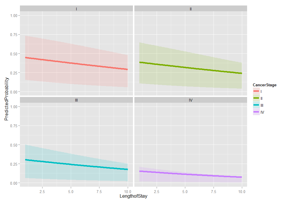
Things look fairly bleak for the chances of a Stage IV lung cancer patient who was in the hospital 10 days having cancer in remission (please remember that these are simulated data). It also looks like the distribution is skewed. We can examine the distribution of predicted probabilities just for that group.
ggplot(data.frame(Probs = biprobs[[4]][[100]]), aes(Probs)) + geom_histogram() +
    scale_x_sqrt(breaks = c(0.01, 0.1, 0.25, 0.5, 0.75))
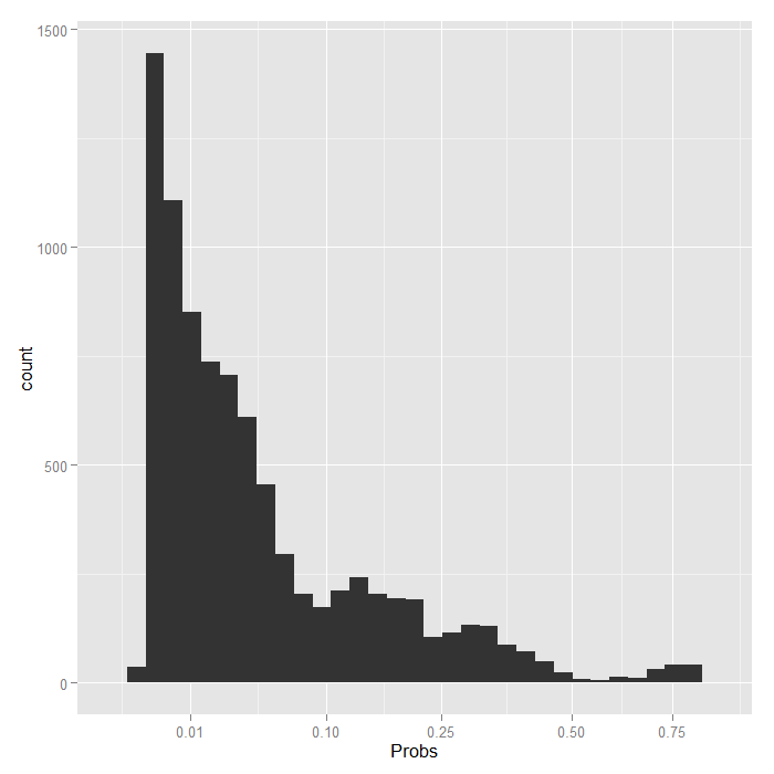
Even using a square root scale that stretches out the lower values, it is still extremely skewed. The vast majority are estimated to have less than a .1 probability of being in remission.
Three level mixed effects logistic regression
We have looked at a two level logistic model with a random intercept in depth. This is the simplest mixed effects logistic model possible. Now we are going to briefly look at how you can add a third level and random slope effects as well as random intercepts.
Below we estimate a three level logistic model with a random
intercept for doctors and a random intercept for hospitals.
In this examples, doctors are nested within hospitals,
meaning that each doctor belongs to one and only one hospital.
The alternative case is sometimes called “cross classified”
meaning that a doctor may belong to multiple hospitals, such as
if some of the doctor’s patients are from hospital A and others
from hospital B. In glmer you do not need to specify
whether the groups are nested or cross classified, R
can figure it out based on the data. We use the same
(1 | ID) general syntax to indicate the intercept (1)
varying by some ID. For models with more than a single
scalar random effect, glmer only supports a single
integration point, so we use nAGQ=1.
# estimate the model and store results in m
m3a <- glmer(remission ~ Age + LengthofStay + FamilyHx + IL6 + CRP +
  CancerStage + Experience + (1 | DID) + (1 | HID),
  data = hdp, family = binomial, nAGQ=1)
## Warning: Model failed to converge with max|grad| = 74.1215 (tol = 0.001)
# print the mod results without correlations among fixed effects
print(m3a, corr=FALSE)
## Generalized linear mixed model fit by maximum likelihood (Laplace
##   Approximation) [glmerMod]
##  Family: binomial ( logit )
## Formula:
## remission ~ Age + LengthofStay + FamilyHx + IL6 + CRP + CancerStage +
##     Experience + (1 | DID) + (1 | HID)
##    Data: hdp
##      AIC      BIC   logLik deviance df.resid
##     7199     7284    -3588     7175     8513
## Random effects:
##  Groups Name        Std.Dev.
##  DID    (Intercept) 1.952
##  HID    (Intercept) 0.549
## Number of obs: 8525, groups: DID, 407; HID, 35
## Fixed Effects:
##    (Intercept)             Age    LengthofStay     FamilyHxyes
##        -1.6881         -0.0149         -0.0447         -1.3066
##            IL6             CRP   CancerStageII  CancerStageIII
##        -0.0569         -0.0222         -0.3185         -0.8570
##  CancerStageIV      Experience
##        -2.1375          0.1269
The output tells us the family (binomial for binary outcomes) and the link (logit). Followed by usual fit indices and the variance of the random effects. In this case the variability in the intercept (on the log odds scale) between doctors and between hospitals. The standard deviation is also displayed (simply the square root of the variance, not the standard error of the estimate of the variance). We also get the number of unique units at each level. Last are the fixed effects, as before.
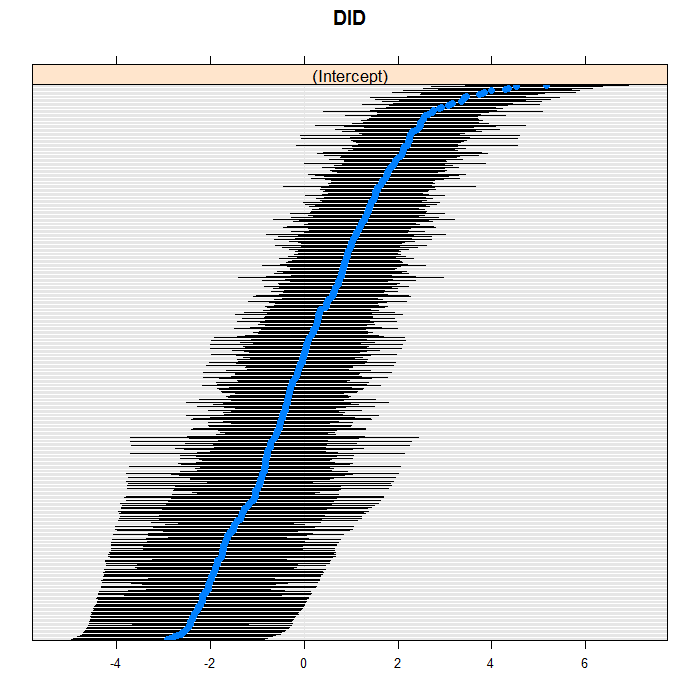
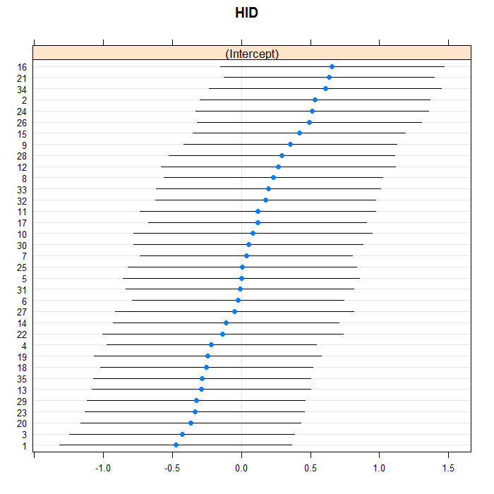
It can also be useful to look at the distribution of the
conditional modes, which we do with caterpillar polots below.
The blue dots are the conditional models with error bars.
We do this for both doctors and hospitals. For example for
doctors, we can see a bit of a long right tail in that there
are more extreme positive than negative values. For the
doctors, we suppress their IDs (using the
scales=list(y = list(alternating=0)) argument)
because there are so many, but we leave them in for the hospitals.
lattice::dotplot(ranef(m3a, which = "DID", condVar = TRUE), scales = list(y = list(alternating = 0)))
## $DID
lattice::dotplot(ranef(m3a, which = "HID", condVar = TRUE))
## $HID
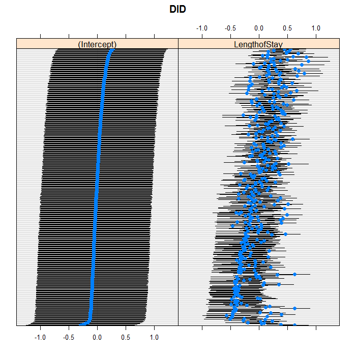
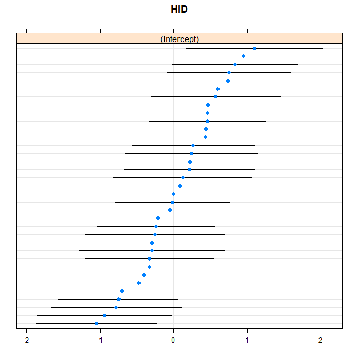
We can easily add random slopes to the model as well,
and allow them to vary at any level. We are just going to
add a random slope for LengthofStay that
varies between doctors. As in regular R
formulae, we use the + operator to “add”
an effect, and we do it in the section for doctor random
effects. All terms in one group of parentheses use an
unstructured covariance matrix, you can get a diagonal
covariance structure by splitting the grouping into
separate pieces. Between groupings is assumed indepedent.
# estimate the model and store results in m
m3b <- glmer(remission ~ Age + LengthofStay + FamilyHx + IL6 + CRP + CancerStage +
    Experience + (1 + LengthofStay | DID) + (1 | HID), data = hdp, family = binomial,
    nAGQ = 1)
## Warning: Model failed to converge with max|grad| = 34.9006 (tol = 0.001)
# print the mod results without correlations among fixed effects
print(m3b, corr = FALSE)
## Generalized linear mixed model fit by maximum likelihood (Laplace
##   Approximation) [glmerMod]
##  Family: binomial ( logit )
## Formula:
## remission ~ Age + LengthofStay + FamilyHx + IL6 + CRP + CancerStage +
##     Experience + (1 + LengthofStay | DID) + (1 | HID)
##    Data: hdp
##      AIC      BIC   logLik deviance df.resid
##     7148     7246    -3560     7120     8511
## Random effects:
##  Groups Name         Std.Dev. Corr
##  DID    (Intercept)  0.504
##         LengthofStay 0.372    -0.11
##  HID    (Intercept)  0.731
## Number of obs: 8525, groups: DID, 407; HID, 35
## Fixed Effects:
##    (Intercept)             Age    LengthofStay     FamilyHxyes
##        -0.5447         -0.0152         -0.1901         -1.3395
##            IL6             CRP   CancerStageII  CancerStageIII
##        -0.0586         -0.0210         -0.2941         -0.8651
##  CancerStageIV      Experience
##        -2.2964          0.1044
lattice::dotplot(ranef(m3b, which = "DID", condVar = TRUE), scales = list(y = list(alternating = 0)))
## $DID
lattice::dotplot(ranef(m3b, which = "HID", condVar = TRUE), scales = list(y = list(alternating = 0)))
## $HID
Things to consider
See the Other Issues section of the introduction to GLMMs page for some considerations and issues.
See also
References
- Agresti, A. (2013). Categorical Data Analysis (3rd Ed.), Hoboken, New Jersey: John Wiley & Sons.
