The tobit model, also called a censored regression model, is designed to estimate linear relationships between variables when there is either left- or right-censoring in the dependent variable (also known as censoring from below and above, respectively). Censoring from above takes place when cases with a value at or above some threshold, all take on the value of that threshold, so that the true value might be equal to the threshold, but it might also be higher. In the case of censoring from below, values those that fall at or below some threshold are censored.
This page uses the following packages. Make sure that you can load
them before trying to run the examples on this page. If you do not have
a package installed, run: install.packages("packagename"), or
if you see the version is out of date, run: update.packages().
require(ggplot2)
require(GGally)
require(VGAM)
Version info: Code for this page was tested in R Under development (unstable) (2012-11-16 r61126)

 On: 2012-12-15

With: VGAM 0.9-0; GGally 0.4.2; reshape 0.8.4; plyr 1.8; ggplot2 0.9.3; knitr 0.9
Please Note: The purpose of this page is to show how to use various data analysis commands. It does not cover all aspects of the research process which researchers are expected to do. In particular, it does not cover data cleaning and checking, verification of assumptions, model diagnostics and potential follow-up analyses.
Examples of Tobit Analysis
Example 1. In the 1980s there was a federal law restricting speedometer readings to no more than 85 mph. So if you wanted to try and predict a vehicle’s top-speed from a combination of horse-power and engine size, you would get a reading no higher than 85, regardless of how fast the vehicle was really traveling. This is a classic case of right-censoring (censoring from above) of the data. The only thing we are certain of is that those vehicles were traveling at least 85 mph.
Example 2. A research project is studying the level of lead in home drinking water as a function of the age of a house and family income. The water testing kit cannot detect lead concentrations below 5 parts per billion (ppb). The EPA considers levels above 15 ppb to be dangerous. These data are an example of left-censoring (censoring from below).
Example 3. Consider the situation in which we have a measure of academic aptitude (scaled 200-800) which we want to model using reading and math test scores, as well as, the type of program the student is enrolled in (academic, general, or vocational). The problem here is that students who answer all questions on the academic aptitude test correctly receive a score of 800, even though it is likely that these students are not “truly” equal in aptitude. The same is true of students who answer all of the questions incorrectly. All such students would have a score of 200, although they may not all be of equal aptitude.
Description of the Data
For our data analysis below, we are going to expand on Example 3 from above. We have generated hypothetical data, which can be obtained from our website from within R. Note that R requires forward slashes, not back slashes when specifying a file location even if the file is on your hard drive.
dat <- read.csv("https://stats.idre.ucla.edu/stat/data/tobit.csv")
The dataset contains 200 observations.
The academic aptitude variable is apt, the reading and math test scores are
read and math respectively. The variable prog
is the type of program the student is in, it is a categorical (nominal) variable that takes on three
values, academic (prog = 1), general (prog = 2), and
vocational (prog = 3). The variable id is an identification variable.
Now let’s look at the data descriptively. Note that in this dataset, the lowest
value of apt is 352. That is, no students received a score of 200 (the lowest
score possible), meaning that even though censoring from below was possible, it
does not occur in the dataset.
summary(dat)
##        id             read           math              prog
##  Min.   :  1.0   Min.   :28.0   Min.   :33.0   academic  : 45
##  1st Qu.: 50.8   1st Qu.:44.0   1st Qu.:45.0   general   :105
##  Median :100.5   Median :50.0   Median :52.0   vocational: 50
##  Mean   :100.5   Mean   :52.2   Mean   :52.6
##  3rd Qu.:150.2   3rd Qu.:60.0   3rd Qu.:59.0
##  Max.   :200.0   Max.   :76.0   Max.   :75.0
##       apt
##  Min.   :352
##  1st Qu.:576
##  Median :633
##  Mean   :640
##  3rd Qu.:705
##  Max.   :800
# function that gives the density of normal distribution
# for given mean and sd, scaled to be on a count metric
# for the histogram: count = density * sample size * bin width
f <- function(x, var, bw = 15) {
  dnorm(x, mean = mean(var), sd(var)) * length(var)  * bw
}

# setup base plot
p <- ggplot(dat, aes(x = apt, fill=prog))

# histogram, coloured by proportion in different programs
# with a normal distribution overlayed
p + stat_bin(binwidth=15) +
  stat_function(fun = f, size = 1,
    args = list(var = dat$apt))

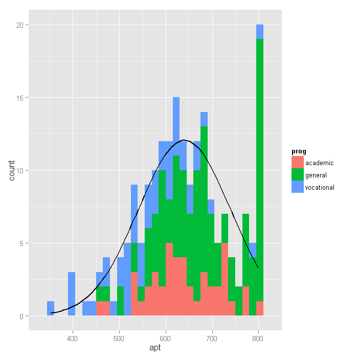
Looking at the above histogram, we can
see the censoring in the values of apt, that is, there are far
more cases with scores of 750 to 800 than
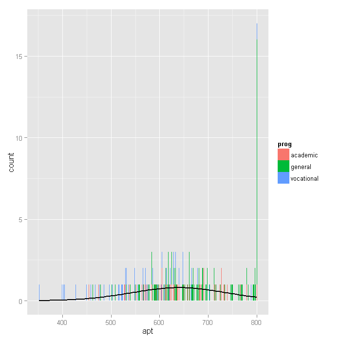
one would expect looking at the rest of the distribution. Below is an alternative histogram
that further highlights the excess of cases where apt=800. In the
histogram below, the breaks option produces a histogram where each
unique value of apt has its own bar (by setting breaks equal to a vector
containing values from the minimum of apt to the maximum of apt). Because
apt is continuous, most values of apt are unique in the dataset,
although close to the center of the distribution there are a few values of apt
that have two or three cases. The spike on the far right of the
histogram is the bar for cases where apt=800, the height of this bar
relative to all the others clearly shows the excess number of cases with this value.
p + stat_bin(binwidth = 1) + stat_function(fun = f, size = 1, args = list(var = dat$apt,
    bw = 1))

Next we’ll explore the bivariate relationships in our dataset.
cor(dat[, c("read", "math", "apt")])
##        read   math    apt
## read 1.0000 0.6623 0.6451
## math 0.6623 1.0000 0.7333
## apt  0.6451 0.7333 1.0000
# plot matrix
ggpairs(dat[, c("read", "math", "apt")])

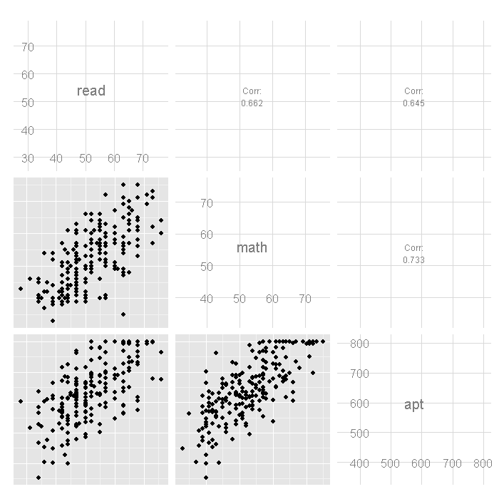
In the first row of the scatterplot matrix shown above, we see the
scatterplots showing the relationship between read and apt,
as well as math and apt. Note the collection of cases at
the top these two scatterplots, this is due to the censoring in
the distribution of apt.
Analysis methods you might consider
Below is a list of some analysis methods you may have encountered. Some of the methods listed are quite reasonable while others have either fallen out of favor or have limitations.
- Tobit regression, the focus of this page.
- OLS Regression – You could analyze these data using OLS regression. OLS regression will treat the 800 as actual values and not as the lower limit of the top academic aptitude. A limitation of this approach is that when the variable is censored, OLS provides inconsistent estimates of the parameters, meaning that the coefficients from the analysis will not necessarily approach the “true” population parameters as the sample size increases. See Long (1997, chapter 7) for a more detailed discussion of problems of using OLS regression with censored data.
- Truncated Regression – There is sometimes confusion about the difference between truncated data and censored data. With censored variables, all of the observations are in the dataset, but we don’t know the “true” values of some of them. With truncation some of the observations are not included in the analysis because of the value of the variable. When a variable is censored, regression models for truncated data provide inconsistent estimates of the parameters. See Long (1997, chapter 7) for a more detailed discussion of problems of using regression models for truncated data to analyze censored data.
Tobit regression
Below we run the tobit model, using the vglm function of the VGAM package.
summary(m <- vglm(apt ~ read + math + prog, tobit(Upper = 800), data = dat))
##
## Call:
## vglm(formula = apt ~ read + math + prog, family = tobit(Upper = 800),
##     data = dat)
##
## Pearson Residuals:
##          Min    1Q Median   3Q Max
## mu      -2.6 -0.76 -0.051 0.79 4.1
## log(sd) -1.1 -0.62 -0.369 0.25 5.4
##
## Coefficients:
##                Estimate Std. Error z value
## (Intercept):1     209.6     32.457     6.5
## (Intercept):2       4.2      0.053    79.4
## read                2.7      0.618     4.4
## math                5.9      0.705     8.4
## proggeneral       -12.7     12.355    -1.0
## progvocational    -46.1     13.770    -3.4
##
## Number of linear predictors:  2
##
## Names of linear predictors: mu, log(sd)
##
## Dispersion Parameter for tobit family:   1
##
## Log-likelihood: -1041 on 394 degrees of freedom
##
## Number of iterations: 4
- In the output above, the first thing we see is the call, this is R reminding us what the model we ran was, what options we specified, etc.
- The table labeled coefficients gives the coefficients, their standard errors,
and the z-statistic. No p-values are included in the summary table, but we show how to calculate
them below. Tobit regression coefficients are interpreted in the similar
manner to OLS regression coefficients; however, the linear effect is on the
uncensored latent variable, not the observed outcome. See McDonald and Moffitt (1980) for more details.
- For a one unit increase in
read, there is a2.6981point increase in the predicted value ofapt. - A one unit increase in
mathis associated with a5.9146unit increase in the predicted value ofapt. - The terms for
proghave a slightly different interpretation. The predicted value ofaptis-46.1419points lower for students in a vocational program than for students in an academic program. - The coefficient labeled “(Intercept):1” is the intercept or constant for the model.
- The coefficient labeled “(Intercept):2” is an ancillary statistic. If we
exponentiate this value, we get a statistic that is analogous to the square
root of the residual variance in OLS regression. The value of
65.6773can compared to the standard deviation of academic aptitude which was 99.21, a substantial reduction.
- For a one unit increase in
- The final log likelihood,
-1041.0629, is shown toward the bottom of the output, it can be used in comparisons of nested models.
Below we calculate the p-values for each of the coefficients in the model. We
calculate the p-value for each coefficient using the z values and then display in
a table with the coefficients. The coefficients for read, math,
and prog = 3 (vocational) are statistically significant.
ctable <- coef(summary(m))
pvals <- 2 * pt(abs(ctable[, "z value"]), df.residual(m), lower.tail = FALSE)
cbind(ctable, pvals)
##                Estimate Std. Error z value      pvals
## (Intercept):1   209.555   32.45655   6.456  3.157e-10
## (Intercept):2     4.185    0.05268  79.432 1.408e-244
## read              2.698    0.61808   4.365  1.625e-05
## math              5.915    0.70480   8.392  8.673e-16
## proggeneral     -12.716   12.35467  -1.029  3.040e-01
## progvocational  -46.142   13.76971  -3.351  8.831e-04
We can test the significant of program type overall by fitting a model without program in it and using a likelihood ratio test.
m2 <- vglm(apt ~ read + math, tobit(Upper = 800), data = dat)

(p <- pchisq(2 * (logLik(m) - logLik(m2)), df = 2, lower.tail = FALSE))
## [1] 0.003155
The LRT with two degrees of freedom is associated with
a p-value of 0.0032, indicating that the overall effect
of prog is statistically significant.
Below we calculate the upper and lower 95% confidence intervals for the coefficients.
b <- coef(m)
se <- sqrt(diag(vcov(m)))

cbind(LL = b - qnorm(0.975) * se, UL = b + qnorm(0.975) * se)
##                     LL      UL
## (Intercept):1  145.941 273.169
## (Intercept):2    4.081   4.288
## read             1.487   3.909
## math             4.533   7.296
## proggeneral    -36.930  11.499
## progvocational -73.130 -19.154
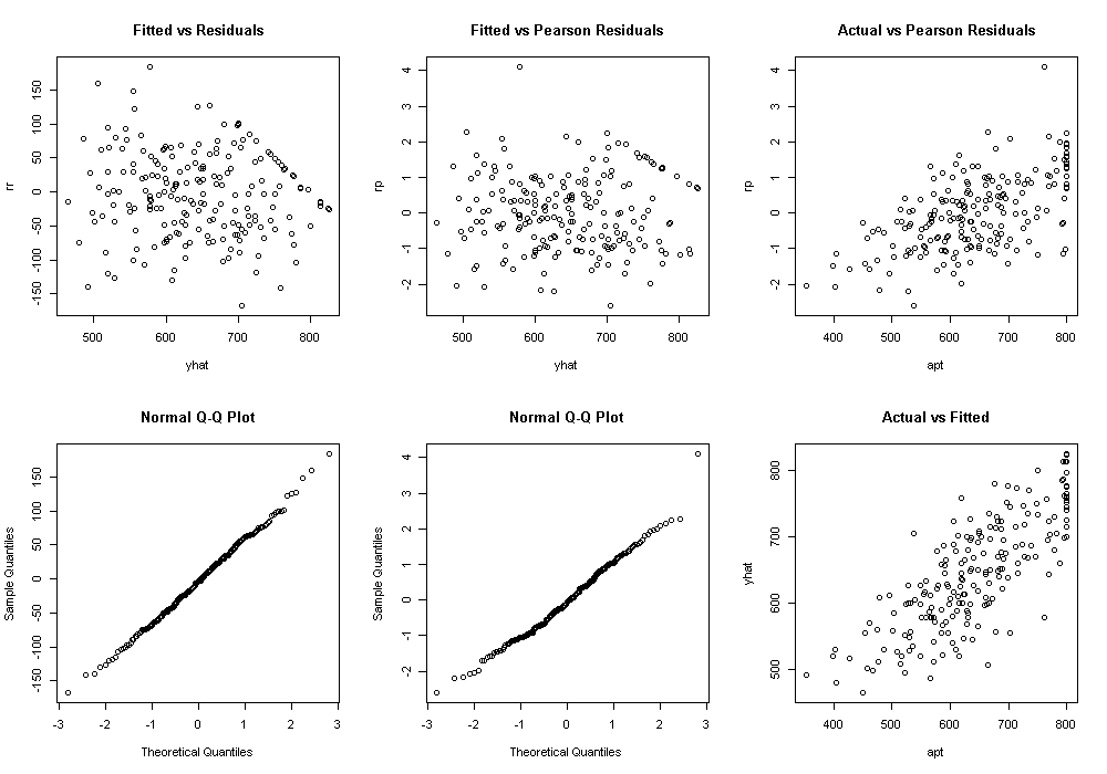
We may also wish to examine how well our model fits the data. One way to start is with plots of the residuals to assess their absolute as well as relative (pearson) values and assumptions such as normality and homogeneity of variance.
dat$yhat <- fitted(m)[,1]
dat$rr <- resid(m, type = "response")
dat$rp <- resid(m, type = "pearson")[,1]

par(mfcol = c(2, 3))

with(dat, {
  plot(yhat, rr, main = "Fitted vs Residuals")
  qqnorm(rr)
  plot(yhat, rp, main = "Fitted vs Pearson Residuals")
  qqnorm(rp)
  plot(apt, rp, main = "Actual vs Pearson Residuals")
  plot(apt, yhat, main = "Actual vs Fitted")
})

The graph in the bottom right was the predicted, or fitted, values plotted against the actual. This can be particularly useful when comparing competing models. We can calculate the correlation between these two as well as the squared correlation, to get a sense of how accurate our model predicts the data and how much of the variance in the outcome is accounted for by the model.
# correlation
(r <- with(dat, cor(yhat, apt)))
## [1] 0.7825
# variance accounted for
r^2
## [1] 0.6123
The correlation between the predicted and observed values of apt is
0.7825. If we square this value, we get the multiple squared
correlation, this indicates predicted values share
61.23%
of their variance with apt.
References
Long, J. S. 1997. Regression Models for Categorical and Limited Dependent Variables. Thousand Oaks, CA: Sage Publications.
McDonald, J. F. and Moffitt, R. A. 1980. The Uses of Tobit Analysis. The Review of Economics and Statistics Vol 62(2): 318-321.
Tobin, J. 1958. Estimation of relationships for limited dependent variables. Econometrica 26: 24-36.
