Zero-truncated poisson regression is used to model count data for which the value zero cannot occur.
This page uses the following packages. Make sure that you can load
them before trying to run the examples on this page. If you do not have
a package installed, run: install.packages("packagename"), or
if you see the version is out of date, run: update.packages().
require(foreign)
require(ggplot2)
require(VGAM)
require(boot)
Version info: Code for this page was tested in R Under development (unstable) (2012-11-16 r61126)
On: 2012-12-15
With: boot 1.3-7; VGAM 0.9-0; ggplot2 0.9.3; foreign 0.8-51; knitr 0.9
Please Note: The purpose of this page is to show how to use various data analysis commands. It does not cover all aspects of the research process which researchers are expected to do. In particular, it does not cover data cleaning and verification, verification of assumptions, model diagnostics and potential follow-up analyses.
Examples of zero-truncated Poisson regression
Example 1. A study of length of hospital stay, in days, as a function of age, kind of health insurance and whether or not the patient died while in the hospital. Length of hospital stay is recorded as a minimum of at least one day.
Example 2. A study of the number of journal articles published by tenured faculty as a function of discipline (fine arts, science, social science, humanities, medical, etc). To get tenure faculty must publish, therefore, there are no tenured faculty with zero publications.
Example 3. A study by the county traffic court on the number of tickets received by teenagers as predicted by school performance, amount of driver training and gender. Only individuals who have received at least one citation are in the traffic court files.
Description of the data
Let’s pursue Example 1 from above.
We have a hypothetical data file, ztp.dta with 1,493 observations.
The length of hospital stay variable is stay.
The variable age gives the age group from 1 to 9 which will be treated as
interval in this example. The variables hmo and died are binary indicator variables
for HMO insured patients and patients who died while in the hospital, respectively.
Let’s look at the data. We import the Stata dataset using
the foreign package.
dat <- read.dta("https://stats.idre.ucla.edu/stat/data/ztp.dta")

dat <- within(dat, {
    hmo <- factor(hmo)
    died <- factor(died)
})

summary(dat)
##       stay            age       hmo      died
##  Min.   : 1.00   Min.   :1.00   0:1254   0:981
##  1st Qu.: 4.00   1st Qu.:4.00   1: 239   1:512
##  Median : 8.00   Median :5.00
##  Mean   : 9.73   Mean   :5.23
##  3rd Qu.:13.00   3rd Qu.:6.00
##  Max.   :74.00   Max.   :9.00
Now let’s look at some graphs of the data conditional on various
combinations of the variables to get a sense of how the variables work together.
We will use the ggplot2 package. First we can look at histograms of
stay broken down by hmo on the rows and died on the columns.
We also include the marginal distributions, thus the lower right corner represents
the overall histogram. We use a log base 10 scale to approximate the canonical link function of
the poisson distribution (natural logarithm).
ggplot(dat, aes(stay)) +
  geom_histogram() +
  scale_x_log10() +
  facet_grid(hmo ~ died, margins=TRUE, scales="free_y")
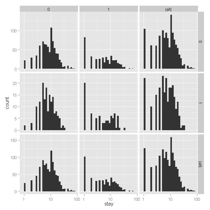
From the histograms, it looks like the density of the distribution,
does vary across levels of hmo and died, with
shorter stays for those in HMOs (1) and shorter for those who did die,
including what seems to be an inflated number of 1 day stays.
To examine how stay varies across age groups, we can use conditional
violin plots which show a kernel density estimate of the distribution of stay
mirrored (hence the violin) and conditional on each age group. To further understand
the raw data going into each density estimate, we add raw data on top of the violin plots
with a small amount of random noise (jitter) to alleviate over plotting. Finally, to get a
sense of the overall trend, we add a locally weighted regression line.
ggplot(dat, aes(factor(age), stay)) +
  geom_violin() +
  geom_jitter(size=1.5) +
  scale_y_log10() +
  stat_smooth(aes(x = age, y = stay, group=1), method="loess")
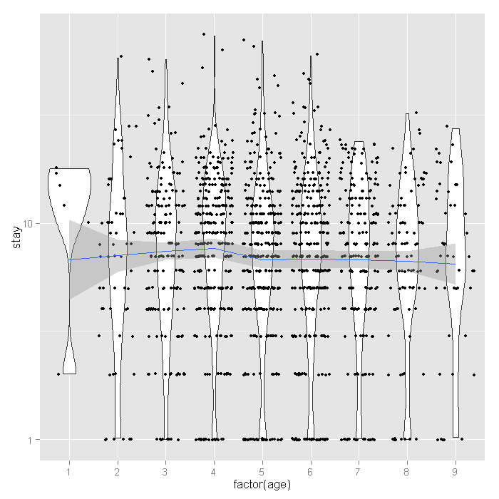
The distribution of length of stay does not seem to vary much across age groups. This observation from the raw data is corroborated by the relatively flat loess line. Finally let’s look at the proportion of people who lived or died across age groups by whether or not they are in HMOs.
ggplot(dat, aes(age, fill=died)) +
  geom_histogram(binwidth=.5, position="fill") +
  facet_grid(hmo ~ ., margins=TRUE)
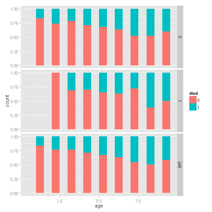
For the lowest ages, a smaller proportion of people in HMOs died, but for higher ages, there does not seem to be a huge difference, with a slightly higher proportion in HMOs dying if anything. Overall, as age group increases, the proportion of those dying increases, as expected.
Analysis methods you might consider
Below is a list of some analysis methods you may have encountered. Some of the methods listed are quite reasonable while others have either fallen out of favor or have limitations.
- Zero-truncated Poisson Regression – The focus of this web page.
- Zero-truncated Negative Binomial Regression – If you have overdispersion in addition to zero truncation. See the Data Analysis Example for ztnb.
- Poisson Regression – Ordinary Poisson regression will have difficulty with zero-truncated data. It will try to predict zero counts even though there are no zero values.
- Negative Binomial Regression – Ordinary Negative Binomial regression will have difficulty with zero-truncated data. It will try to predict zero counts even though there are no zero values.
- OLS Regression – You could try to analyze these data using OLS regression. However, count data are highly non-normal and are not well estimated by OLS regression.
Zero-truncated Poisson regression
To fit the zero-truncated poisson model, we use the vglm function
in the VGAM package. This function fits a very flexible class of models
called vector generalized linear models to a wide range of assumed distributions.
In our case, we believe the data are poisson, but without zeros. Thus the values are
strictly positive poisson, for which we use the positive poisson family via the
pospoisson function passed to vglm.
m1 <- vglm(stay ~ age + hmo + died, family = pospoisson(), data = dat)
summary(m1)
##
## Call:
## vglm(formula = stay ~ age + hmo + died, family = pospoisson(),
##     data = dat)
##
## Pearson Residuals:
##             Min   1Q Median   3Q Max
## log(lambda)  -3 -1.7  -0.59 0.98  21
##
## Coefficients:
##             Estimate Std. Error z value
## (Intercept)    2.436      0.027    89.1
## age           -0.014      0.005    -2.9
## hmo1          -0.136      0.024    -5.7
## died1         -0.204      0.018   -11.1
##
## Number of linear predictors:  1
##
## Name of linear predictor: log(lambda)
##
## Dispersion Parameter for pospoisson family:   1
##
## Log-likelihood: -6909 on 1489 degrees of freedom
##
## Number of iterations: 4
The output looks very much like the output from an OLS regression:
- It begins by echoing the function call showing us what we modeled.
- Next comes the spread of the residuals, there is at least one high residual because the max is much higher than the min.
- Following the residuals are the parameter estimates and standard errors. The z values (frac{Estimate}{SE}) are also printed. No p values are given, although if one wished to assume that the estimates followed the normal distribution, one could easily compute the probability of obtaining that z value.
- The number of linear predictors is printed because vglm can fit far more complex models, for this page, this will always be one, the expected mean, (lambda).
- Next the dispersion parameter is printed, for the Poisson, this is assumed to be 1 and is not estimated.
- Finally the log likelihood
-6908.7991is printed along with the number of iterations needed to reach convergence.
Now let’s look at a plot of the residuals versus fitted values. We add random horizontal noise as well as 50 percent transparency to alleviate over plotting and better see where most residuals fall.
output <- data.frame(resid = resid(m1), fitted = fitted(m1))
ggplot(output, aes(fitted, resid)) +
  geom_jitter(position=position_jitter(width=.25), alpha=.5) +
  stat_smooth(method="loess")

The mean is around zero across all the fitted levels it looks like. However, there are some values that look rather extreme. To see if these have much influence, we can fit lines using quantile regression, these lines represent the 75th, 50th, and 25th percentiles.
ggplot(output, aes(fitted, resid)) +
  geom_jitter(position=position_jitter(width=.25), alpha=.5) +
  stat_quantile(method="rq")
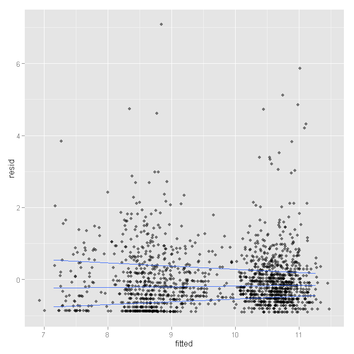
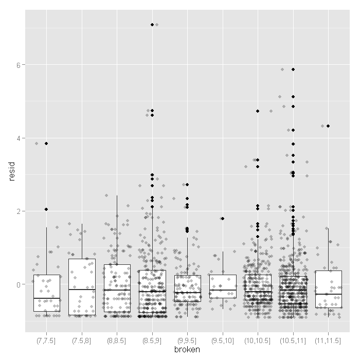
Here we see the spread narrowing at higher levels. Let’s cut the data into intervals and check box plots for each. We will get the breaks from the algorithm for a histogram.
output <- within(output, {
  broken <- cut(fitted, hist(fitted, plot=FALSE)$breaks)
})

ggplot(output, aes(broken, resid)) +
 geom_boxplot() +
 geom_jitter(alpha=.25)
Now that feel a little more confident the model fits okay, let’s look at the coefficients.
- The value of the coefficient for
age,-0.0144suggests that the log count of stay decreases by0.0144for each year increase in age. - The coefficient for
hmo,-0.1359indicates that the log count of stay for HMO patient is0.1359less than for non-HMO patients. - The log count of stay for patients who died while in the hospital was
0.2038less than those patients who did not die. - Finally, the value of the constant
2.4358is the log count of the stay when all of the predictors equal zero.
We can get confidence intervals for the parameters and the
exponentiated parameters using bootstrapping. For the Poisson model, these would
be incident risk ratios. We use the boot package.
First, we get the coefficients from our original model to
use as start values for the model to speed up the time it takes to estimate. Then
we write a short function that takes data and indices as input and returns the
parameters we are interested in. Finally, we pass that
to the boot function and do 1200 replicates, using snow to distribute across
four cores. Note that you should adjust the number of cores to whatever your machine
has. Also, for final results, one may wish to increase the number of replications to
help ensure stable results.
dput(round(coef(m1),3))
## structure(c(2.436, -0.014, -0.136, -0.204), .Names = c("(Intercept)",
## "age", "hmo1", "died1"))
f <- function(data, i) {
  require(VGAM)
  m <- vglm(formula = stay ~ age + hmo + died, family = pospoisson(),
    data = data[i, ], coefstart = c(2.436, -0.014, -0.136, -0.204))
  as.vector(t(coef(summary(m))[, 1:2]))
}

set.seed(10)
res <- boot(dat, f, R = 1200, parallel = "snow", ncpus = 4)

## print results
res
##
## ORDINARY NONPARAMETRIC BOOTSTRAP
##
##
## Call:
## boot(data = dat, statistic = f, R = 1200, parallel = "snow",
##     ncpus = 4)
##
##
## Bootstrap Statistics :
##      original     bias    std. error
## t1*  2.435808  2.124e-04   6.962e-02
## t2*  0.027332  8.324e-06   5.621e-04
## t3* -0.014442 -5.729e-05   1.212e-02
## t4*  0.005035  2.490e-06   9.896e-05
## t5* -0.135903  1.162e-03   5.105e-02
## t6*  0.023742  1.313e-05   7.497e-04
## t7* -0.203771 -1.487e-03   4.984e-02
## t8*  0.018373  3.854e-05   3.556e-04
The results are alternating parameter estimates and standard errors. That is, the first row has the first parameter estimate from our model. The second has the standard error for the first parameter. The third column contains the bootstrapped standard errors.
Now we can get the confidence intervals for all the parameters. We start on the original scale with percentile and basic bootstrap CIs.
## basic parameter estimates with percentile and bias adjusted CIs
parms <- t(sapply(c(1, 3, 5, 7), function(i) {
  out <- boot.ci(res, index = c(i, i + 1), type = c("perc", "basic"))
  with(out, c(Est = t0, pLL = percent[4], pUL = percent[5],
    basicLL = basic[4], basicLL = basic[5]))
}))

## add row names
row.names(parms) <- names(coef(m1))
## print results
parms
##                  Est      pLL       pUL  basicLL  basicLL
## (Intercept)  2.43581  2.29933  2.577805  2.29381  2.57228
## age         -0.01444 -0.04003  0.009798 -0.03868  0.01114
## hmo1        -0.13590 -0.23875 -0.038074 -0.23373 -0.03306
## died1       -0.20377 -0.30530 -0.106277 -0.30126 -0.10224
The bootstrapped confidence intervals are wider than would be expected using a normal based approximation. The bootstrapped CIs are more consistent with the CIs from Stata when using robust standard errors.
Now we can estimate the incident risk ratio (IRR) for the Poisson model.
This is done using almost identical code as before,
but passing a transformation function to the h argument of
boot.ci, in this case, exp to exponentiate.
## exponentiated parameter estimates with percentile and bias adjusted CIs
expparms <- t(sapply(c(1, 3, 5, 7), function(i) {
  out <- boot.ci(res, index = c(i, i + 1), type = c("perc", "basic"), h = exp)
  with(out, c(Est = t0, pLL = percent[4], pUL = percent[5],
    basicLL = basic[4], basicLL = basic[5]))
}))

## add row names
row.names(expparms) <- names(coef(m1))
## print results
expparms
##                 Est    pLL     pUL basicLL basicLL
## (Intercept) 11.4250 9.9675 13.1682  9.6819 12.8826
## age          0.9857 0.9608  1.0098  0.9615  1.0106
## hmo1         0.8729 0.7876  0.9626  0.7832  0.9582
## died1        0.8156 0.7369  0.8992  0.7321  0.8944
The results are consistent with what we initially viewed graphically,
age does not have a significant effect, but hmo and died both do.
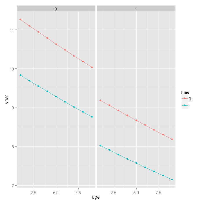
In order to better understand our results and model, let’s plot some predicted values.
Because all of our predictors were categorical (hmo and died)
or had a small number of unique values (age) we will get predicted values for
all possible combinations. First we create a new data set using the expand.grid
function, then estimate the predicted values using the predict function, and
finally plot them.
newdata <- expand.grid(age = 1:9, hmo = factor(0:1), died = factor(0:1))
newdata$yhat <- predict(m1, newdata, type = "response")

ggplot(newdata, aes(x = age, y = yhat, colour = hmo))  +
  geom_point() +
  geom_line() +
  facet_wrap(~ died)
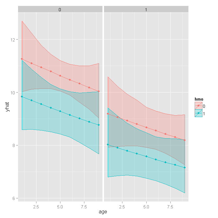
If we really wanted to compare the predicted values, we could bootstrap confidence intervals around the predicted estimates. These confidence intervals are not for the predicted value themselves, but that that is the mean predicted value (i.e., for the estimate, not a new individual). If we wanted to be efficient, we could have done this with our prior bootstrap so we only fit the models once. However, it is fast enough we just rerun the bootstrap rather than combine them.
## function to return predicted values
fpred <- function(data, i, newdata) {
  require(VGAM)
  m <- vglm(formula = stay ~ age + hmo + died, family = pospoisson(),
    data = data[i, ], coefstart = c(2.436, -0.014, -0.136, -0.204))
  predict(m, newdata, type = "response")
}

## set seed and run bootstrap with 1,200 draws
set.seed(10)
respred <- boot(dat, fpred, R = 1200, newdata = newdata,
  parallel = "snow", ncpus = 4)

## get the bootstrapped percentile CIs
yhat <- t(sapply(1:nrow(newdata), function(i) {
  out <- boot.ci(respred, index = i, type = c("perc"))
  with(out, c(Est = t0, pLL = percent[4], pUL = percent[5]))
}))

## merge CIs with predicted values
newdata <- cbind(newdata, yhat)
## graph with CIs
ggplot(newdata, aes(x = age, y = yhat, colour = hmo, fill = hmo))  +
  geom_ribbon(aes(ymin = pLL, ymax = pUL), alpha = .25) +
  geom_point() +
  geom_line() +
  facet_wrap(~ died)
Things to consider
- Count data often use exposure variable to indicate the number of times the event
could have happened. You can incorporate exposure into your model by using the
exposure()option. - It is not recommended that zero-truncated poisson models be applied to small samples. What constitutes a small sample does not seem to be clearly defined in the literature.
- Pseudo-R-squared values differ from OLS R-squareds, please see FAQ: What are pseudo R-squareds? for a discussion on this issue.
See Also
- Zero-truncated negative binomial regression in R useful when there is overdispersion.
References
- Yee, T. W. (2008). The VGAM package. R News 8(2), 28 39. URL http://CRAN.R-project.org/doc/Rnews/
- Yee, T. W., Hastie, T. J. (2003). Reduced-rank vector generalized linear models. Statistical Modelling 3(1), 15 41.
- Yee, T. W., Wild, C. J. (1996). Vector generalized additive models. J. Roy. Statist. Soc. Ser. B 58(3), 481 493.
- Long, J. Scott (1997). Regression Models for Categorical and Limited Dependent Variables. Thousand Oaks, CA: Sage Publications.
