There are times when you wish to control the angle at which the value labels of a plot axis appear. This is not easy to do in R, but it can be done. First, let’s look at how R displays labels by default.
x<-1:10
y<-x*x
plot(x, y, type="b")
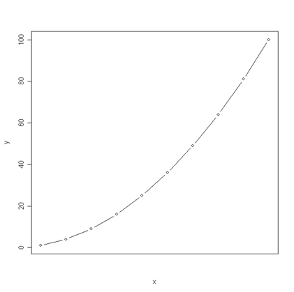
By default, R displays a value at each tick mark and the values for each axis appear to sit on a line parallel to the axis. In order to change the angle at which the value labels appear (or, for that matter, to change the value labels), we must first adjust R’s graphics settings. If we want to adjust the labels on the horizontal axis, we must first alter our graphics parameters so that we suppress the horizontal axis that usually appears with the graph. First, we save our current settings for the graphics parameters so that we can restore them later. Then we change our x-axis type, or xaxt, to “n”.
original.parameters<- par( no.readonly = TRUE )
par(xaxt="n")
We can see what our graph looks like after these adjustments.
plot(x, y, type="b")
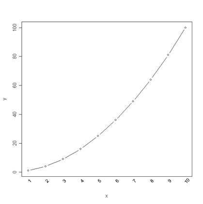
We have effectively cleared the horizontal axis, making room for us to add in the labels of our choosing at the angle of our choosing. We create a vector of the values of the labels we wish to add and we indicate in the axis command where we want tick marks to appear and that we do not want labels automatically added at the tick marks. Then, in a text command, we tell R where to place the labels on the axis, the position relative to the axis (here, we indicate “below”), what values to place as the labels (in this case, the contents of the vector lablist), the angle at which to place the labels (srt = 45), and what object to attach the labels to. For details on each of these and the other options, look at help(axis), help(text), and help(par) in R.
lablist<-as.vector(c(1:10))
axis(1, at=seq(1, 10, by=1), labels = FALSE)
text(seq(1, 10, by=1), par("usr")[3] - 0.2, labels = lablist, srt = 45, pos = 1, xpd = TRUE)
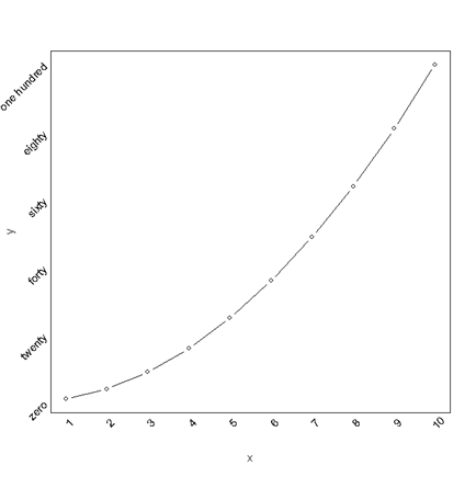
If we wish to similarly format our vertical axis labels and label the values with character strings, we would need to replot the graph suppressing both axes and then layer on the x and y labels with our specified angles and values. The code below provides an example. We define a vector of the strings we wish to use as labels on the vertical axis (lablist.y) and, as before, a vector of the numbers to be used on the horizontal axis (lablist.x). Note that we now require two axis statements, one indicating axis =1 and one indicating axis = 2. We also need two different text statements in which we specify that the which values are for either the x or y axis.
par(yaxt="n")
plot(x, y, type="b")
lablist.x<-as.vector(c(1:10))
lablist.y<-as.vector(c("zero", "twenty", "forty", "sixty", "eighty", "one hundred"))
axis(1, at=seq(1, 10, by=1), labels = FALSE)
text(x = seq(1, 10, by=1), par("usr")[3] - 0.2, labels = lablist.x, srt = 45, pos = 1, xpd = TRUE)
axis(2, at=seq(0, 100, by=20), labels = FALSE)
text(y = seq(0, 100, by=20), par("usr")[1], labels = lablist.y, srt = 45, pos = 2, xpd = TRUE)

We can now restore our default graphics parameters.
par(original.parameters)


