Venn diagrams are a very commonly used graphing technique that
illustrates levels of overlap between groups in data. They can be
created in R using code written as part of the Bioconductor
Project. We are following the directions supplied here for installing a package
for linear models for microarray data (limma).
For more information on how to install packages from Bioconductor you can look at this page: https://bioconductor.org/install
Note that you need to install the latest version of R for this package to work properly!
To install the package limma we need to install package BiocManager.
install.packages("BiocManager")
BiocManager::install("limma")
Finally, we need to load this package.
library(limma)
We can now use the commands in this package for generating Venn diagrams. The
data needed for a Venn diagram consists of a set of binary variables indicating
membership. We will be using the hsb2 dataset consisting of data
from 200 students including scores from writing, reading, and math tests.
We will create indicators for “high” values in each of these variables and
generate Venn diagrams that tell us about the degree of overlap in high math,
writing, and reading scores.
hsb2 <- read.csv("https://stats.idre.ucla.edu/wp-content/uploads/2016/02/hsb2-3.csv")
attach(hsb2)
hw <- (write >= 60)
hm <- (math >= 60)
hr <- (read >= 60)
c3 <- cbind(hw, hm, hr)
Next, we can use the vennCounts command to impose the
structure needed to generate the Venn diagram.
a <- vennCounts(c3)
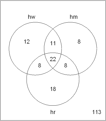
a
     hw hm hr Counts
[1,]  0  0  0    113
[2,]  0  0  1     18
[3,]  0  1  0      8
[4,]  0  1  1      8
[5,]  1  0  0     12
[6,]  1  0  1      8
[7,]  1  1  0     11
[8,]  1  1  1     22
attr(,"class")
[1] "VennCounts"
We can now generate our Venn diagram with
the vennDiagram command:
vennDiagram(a)

While some of the options for the vennDiagram command
are specific to tests run on microarray data, we can change some of
the formatting. Below, we add names to the groups, we change the
relative size of the labels and counts, and we opt for the counts to
appear in red.
vennDiagram(a, include = "both",
  names = c("High Writing", "High Math", "High Reading"),
  cex = 1, counts.col = "red")
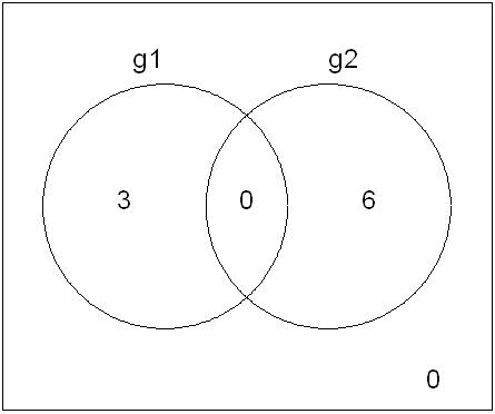
We could opt to present just two groups in this way, but it is not possible to add a fourth. Note that the size of the areas of overlap do not coincide with the relative counts. It is also worth noting that the areas in these Venn diagrams may suggest overlap where there, in fact, is none. The example below illustrates this.
  g <- cbind(
  g1 = c(rep(0, 6), rep(1, 3)),
  g2 = c(rep(1, 6), rep(0, 3)))
  d <- vennCounts(g)
  vennDiagram(d)


