We covered how to visualize aggregate longitudinal data here. When there are not too many unique units, it can also be helpful to view the individual growth curves. This technique can also be used with larger datasets by taking random or targetted (e.g., for unusual start or end values) subsets and plotting those).
We will use the ggplot2 package for the graphs and the dataset on drug tolerance from the book Applied Longitudinal Data Analysis.
## load ggplot2
require(ggplot2)
## read in data set (tolerance data from the ALDA book)
toldat <- read.table("https://stats.idre.ucla.edu/stat/r/examples/alda/data/tolerance1_pp.txt",
    sep = ",", header = TRUE)

## change id and male to factor variables
toldat <- within(toldat, {
    id <- factor(id)
    male <- factor(male, levels = 0:1, labels = c("female", "male"))
})

## view the first few lines of the data
head(toldat)
##   id age tolerance   male exposure time
## 1  9  11      2.23 female     1.54    0
## 2  9  12      1.79 female     1.54    1
## 3  9  13      1.90 female     1.54    2
## 4  9  14      2.12 female     1.54    3
## 5  9  15      2.66 female     1.54    4
## 6 45  11      1.12   male     1.16    0
Creating individual plots is very similar to the group level, but facetted by the ID variable.
ggplot(data = toldat, aes(x = time, y = tolerance)) + geom_line() +
    facet_wrap(~id)
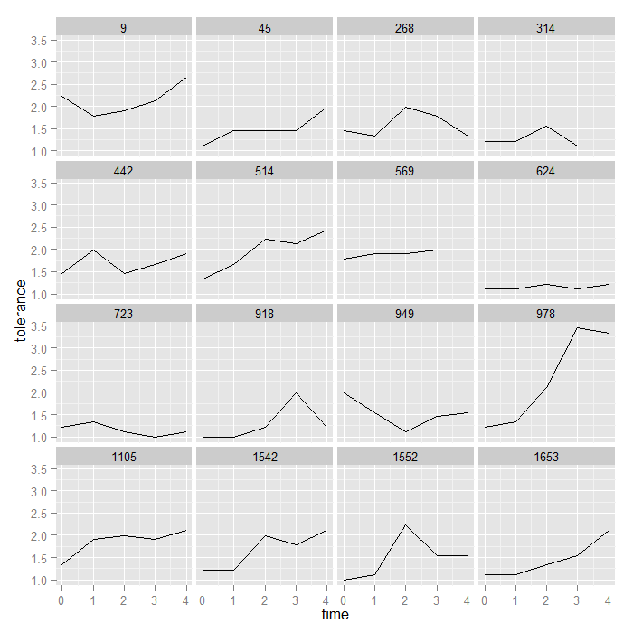
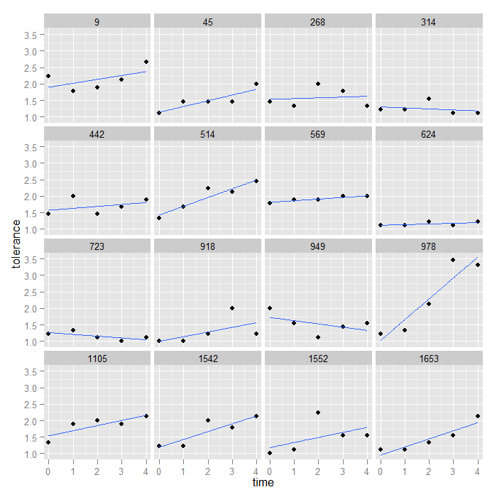
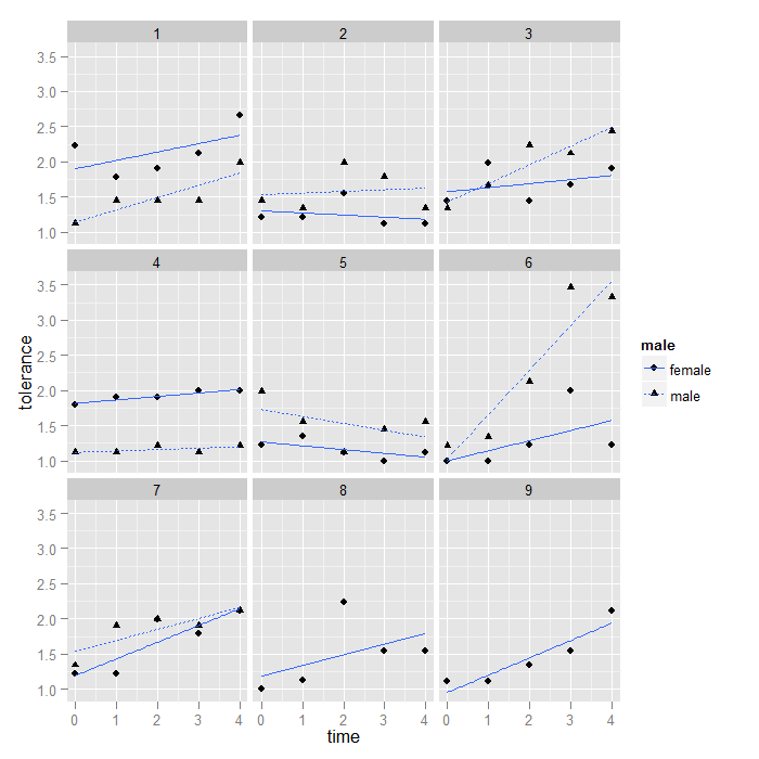
Right now, points are simply connected to make lines. The levels of the facetting variable (id) are displayed at the top of each facet. We could also be interested in looking at the linear growth of each individual. For this, we could plot the points and add the line of best fit. To accomplish this, we just switch geom_point() for geom_line() and add a linear smooth by specifying method = “lm” to stat_smooth(). Smooths in ggplot2 are discussed in more detail here.
ggplot(data = toldat, aes(x = time, y = tolerance)) + geom_point() +
    stat_smooth(method = "lm", se = FALSE) + facet_wrap(~id)
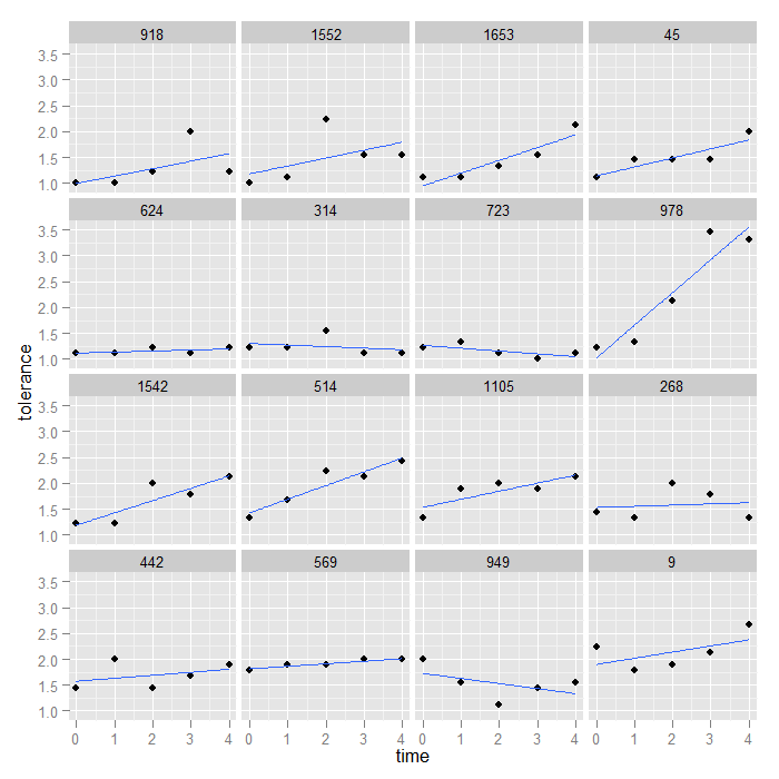
Unless the facetting variable is inherently meaningful, we may want to change the ordering. In this case, the IDs are not meaningfully ordered, and we might instead want to order the facets from lowest to highest value at time 0. We can do this with a bit of data manipulation.
The code is a bit complex so we will break down the logic. The outermost function is with this tells R that all the computations should be done inside the environment of the dataset, “tolerance”. The reorder function reorders the level of a factor (here id) by sorting on something else. The second part of the function is the variable that will be used to reorder the ids, tolerance (the variable tolerance in the dataset, tolerance). However, we do not want to order by all values of tolerance for each id (what would have happened by default), we only want to use the values of tolerance where time is equal to 0. We can subset the variable using logical indexing. However, the ordering variable needs to be as long as the id variable, so we cannot actually subset the data. Instead, what we do is create a vector that is TRUE if time is equal to 0 and otherwise is NA which is missing. When a missing value is used to index a vector, the result is missing no matter what is in the original vector. So when we index by TRUE and missing, we will get the original vector values when the indexing vector is TRUE and just missing otherwise. Now we can take the mean indexed tolerance value for each id, adding the na.rm = TRUE to ignore the missing values (actually everything but time 0), and that is what the ids are reordered by.
toldat$id <- with(toldat, reorder(id, tolerance[ifelse(time ==
    0, TRUE, NA)], FUN = mean, na.rm = TRUE))
## print the id variable to see the new order
toldat$id
##  [1] 9    9    9    9    9    45   45   45   45   45   268  268  268  268
## [15] 268  314  314  314  314  314  442  442  442  442  442  514  514  514
## [29] 514  514  569  569  569  569  569  624  624  624  624  624  723  723
## [43] 723  723  723  918  918  918  918  918  949  949  949  949  949  978
## [57] 978  978  978  978  1105 1105 1105 1105 1105 1542 1542 1542 1542 1542
## [71] 1552 1552 1552 1552 1552 1653 1653 1653 1653 1653
## attr(,"scores")
##    9   45  268  314  442  514  569  624  723  918  949  978 1105 1542 1552
## 2.23 1.12 1.45 1.22 1.45 1.34 1.79 1.12 1.22 1.00 1.99 1.22 1.34 1.22 1.00
## 1653
## 1.11
## 16 Levels: 918 1552 1653 45 624 314 723 978 1542 514 1105 268 442 ... 9
Now we can use the same code as before to create the graph, just using the new, reordered data.
ggplot(data = toldat, aes(x = time, y = tolerance)) + geom_point() +
    stat_smooth(method = "lm", se = FALSE) + facet_wrap(~id)
We could use a similar logic to order the graphs by any variable we wanted to, by the time 4 values, by the average of all the values, etc.
Graphing nested and longitudinal data
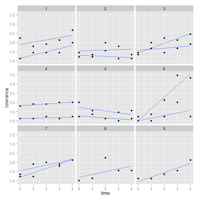
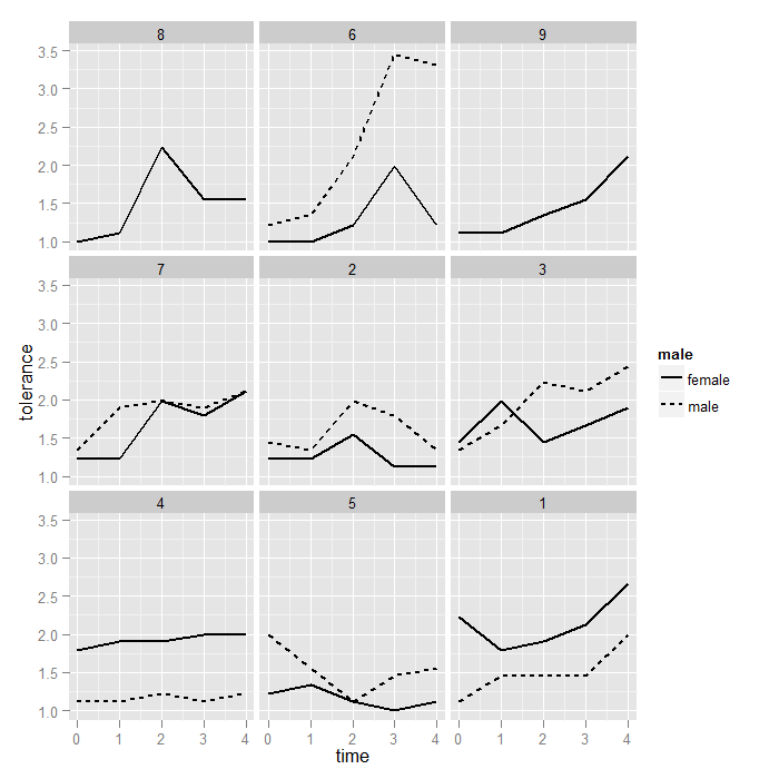
We have seen how to graph simple, longitudinal data, but what if there was a nesting factor also? For example, students nested within classrooms over time or partners within couples? To demonstrate this, we will make up a fake couple id for the tolerance dataset. The details of the code to simulate a couple id are not central.
toldat2 <- toldat[order(toldat$male), ]
toldat2$coupleid <- factor(rep(unlist(by(toldat2$id, toldat2$male,
    function(x) {
        ave(as.numeric(unique(x)), FUN = seq_along)
    })), each = 5))
The graphs in ggplot2 are similar to before, but we group by the regular id and facet by the couple id.
ggplot(data = toldat2, aes(x = time, y = tolerance, group = id)) +
    geom_point() + stat_smooth(method = "lm", se = FALSE) + facet_wrap(~coupleid)
We may also want to use different shapes and linetypes for males and females so we can tell for each couple which partner it is.
ggplot(data = toldat2, aes(x = time, y = tolerance, group = id,
    shape = male, linetype = male)) + geom_point() + stat_smooth(method = "lm",
    se = FALSE) + facet_wrap(~coupleid)
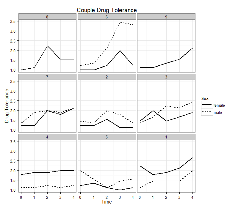
As before, we may want to order the facets by average couple value on tolerance at time 0. This graph also demonstrates how to save and reuse plots in ggplot2. The exact same logic we used to reorder the ids works for reordering the couple ids. This time, the mean function is actually doing something besides removing NAs because most couple ids have two partners.
toldat2$coupleid <- with(toldat2, reorder(coupleid, tolerance[ifelse(time ==
    0, TRUE, NA)], FUN = mean, na.rm = TRUE))
## print the id variable to see the new order
toldat2$coupleid
##  [1] 1 1 1 1 1 2 2 2 2 2 3 3 3 3 3 4 4 4 4 4 5 5 5 5 5 6 6 6 6 6 7 7 7 7 7
## [36] 8 8 8 8 8 9 9 9 9 9 1 1 1 1 1 2 2 2 2 2 3 3 3 3 3 4 4 4 4 4 5 5 5 5 5
## [71] 6 6 6 6 6 7 7 7 7 7
## attr(,"scores")
##    1    2    3    4    5    6    7    8    9
## 1.68 1.33 1.40 1.46 1.60 1.11 1.28 1.00 1.11
## Levels: 8 6 9 7 2 3 4 5 1
p <- ggplot(data = toldat2, aes(x = time, y = tolerance, group = id)) +
    geom_line(aes(linetype = male), size = 1) + facet_wrap(~coupleid)
print(p)
Finally we demonstrate a few common customizations used in ggplot2. Note we reuse the plot object from the previous graph.
## load the grid package for the unit function to adjust the legend width
require(grid)
p + labs(x = "Time", y = "Drug Tolerance", title = "Couple Drug Tolerance") +
	theme(legend.key.width = unit(1, "cm")) + theme_bw() + scale_linetype(name = "Sex")
Summary
ggplot2 can easily create individual growth curves. You also have access to all the power of ggplot2 with them—this means it is easy to facet, add data summaries, add smooths, or anything else. Some data manipulation can also help to make the individual curves more useable (e.g., sorting by a meaningful value rather than ID).