Version info: Code for this page was tested in R Under development (unstable) (2012-07-05 r59734)
On: 2012-07-08
With: knitr 0.6.3
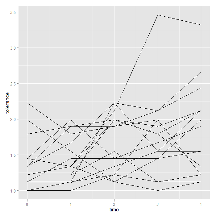
In this page, we demonstrate how to create spaghetti plots, explore overall trends, and look for interactions in longitudinal data using ggplot2. With longitudinal or repeated measures data, there are often two aspects that are interesting. First, how much variability is there between individual units at a given time or measure? Second, how much variance is their within units over time or measure? One convenient way to visualize both is using a spaghetti plot. This draws a plot with separate lines for each unit. The space between lines represents between unit variability, the change in each line (slope) represents within variability. Let’s use the person period tolerance data set from Applied Longitudinal Data Analysis: Modeling Change and Event Occurrence by Judith D. Singer and John B. Willett for our example.
Basics
First, we need to read the data in, convert the numeric id and sex indicators to factor class variables, and load the ggplot2 package that we will use to make the graphs.
## read in data set (tolerance data from ALDA book)
tolerance <- read.csv("https://stats.idre.ucla.edu/stat/r/examples/alda/data/tolerance1_pp.txt")

## change id and male to factor variables
tolerance <- within(tolerance, {
    id <- factor(id)
    male <- factor(male, levels = 0:1, labels = c("female", "male"))
})

## view the first few rows of the dataset
head(tolerance)
##   id age tolerance   male exposure time
## 1  9  11      2.23 female     1.54    0
## 2  9  12      1.79 female     1.54    1
## 3  9  13      1.90 female     1.54    2
## 4  9  14      2.12 female     1.54    3
## 5  9  15      2.66 female     1.54    4
## 6 45  11      1.12   male     1.16    0
## load ggplot2 package to make the graphs
require(ggplot2)
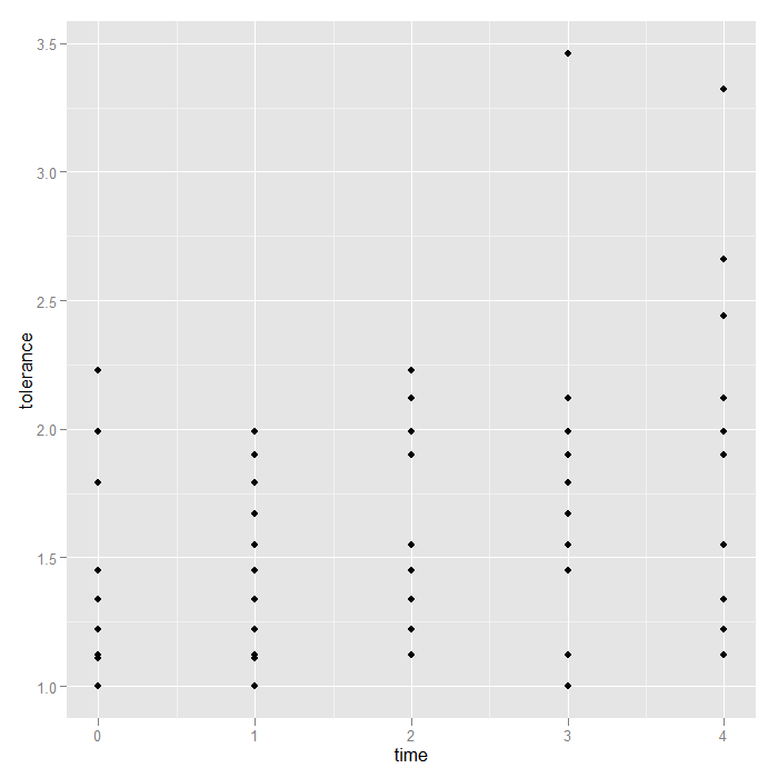
Now we are ready to start creating graphs. We begin by plotting tolerance on the y axis and time on the x axis. The ggplot2 package is based on the Grammar of Graphics by Leland Wilkinson. The theoretical structure behind how a graph is created is similar to how we might form a sentence. There are basic, structural components, things that say how one variable relates to another, and modifiers (like adjectives or adverbs) that control things like size, colour, shape, etc. All graphs start off with a base component that defines the data to be used, and indicates how variables are mapped to the graph. In our case, the data set is ‘tolerance‘, we are mapping time to the x axis, tolerance (the variable inside the dataset, not the data set itself) to the y axis, and we will group things by id. All of this information is created and stored in the object, ‘p‘ (for plot).
## define base for the graphs and store in object 'p'
p <- ggplot(data = tolerance, aes(x = time, y = tolerance, group = id))
Note that no graph is created yet. All we have said is how to map the data to the graph. We have not indicated what should be drawn. The shapes that are drawn are called geoms. Geoms are typically very basic building blocks (although there are more complex ones) consisting of things like points, lines, and polygons. These few things can be combined to create a virtually endless set of visualizations. For now, we will just look at points and lines. Notice how the variable mapping remains unchanged. All we need to vary is the shape being created.
## just plotting points (a.k.a., scatterplot)
p + geom_point()
## simple spaghetti plot
p + geom_line()
More customized graphs
This grammar of graphics system may seem difficult for a simple little scatter plot, and it is. Its value is in flexibility to create far more complex visualizations with minimal change. We see the spaghetti plot, but perhaps there are differences based on sex. We could compare the mean tolerance for females and males, but what if there was an interaction between time and male such that the effect of time on tolerance depends on whether an individual is female or male? Visual inspection is easy; we will simply create two separate subplots for females and males. To facilitate detection of main sex effects, we plot both subplots on the same scales (the default).
## facet (condition) the graph base on the male variable
p + geom_line() + facet_grid(. ~ male)
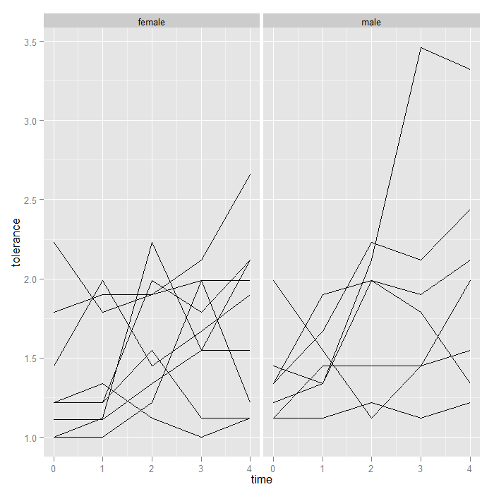
Aside from the one extremely high male, nothing visually ‘jumps out’, but it might be nice to see the means too. We add a summary function to the graph that calculates and plots the means. Note that because we are still faceting based on male (female/male), ggplot2 knows to calculate and plot the means separately. We override the groups = id we had set in our ‘p‘ object, otherwise we would calculate the mean at each time, for each id…not very interesting.
p + geom_line() + stat_summary(aes(group = 1), geom = "point", fun.y = mean,
    shape = 17, size = 3) + facet_grid(. ~ male)
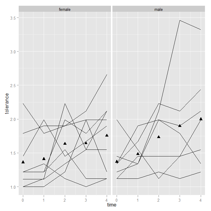
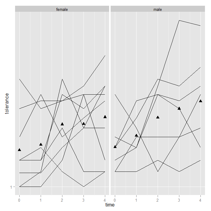
Besides easy conditioning, there is another benefit to doing the mean (or any graphed statistic) calculation within the graph call. ggplot2 has a particular order it operates. First, data is read and variables are mapped to axes or any other aspect of the graph, then any transformations are applied, next faceting or conditioning is performed, then the statistics are calculated, and finally the graphs are rendered. This means that if one were to transform the data (say with a log or square transformation), the means will be calculated on the transformed data. When trying out different ways of visualizing data, it is very convenient that the graphs are automatically updated to the transformation, facetting, etc.
## Here we plot the log base 10 of tolerance the means are now calculated
## on the logged values i.e., mean(log(y)) NOT log(mean(y)) --- these two
## are quite different things
p + geom_line() + stat_summary(aes(group = 1), geom = "point", fun.y = mean,
    shape = 17, size = 3) + scale_y_log10() + facet_grid(. ~ male)
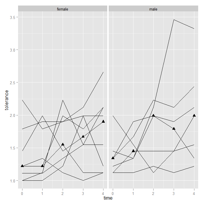
In the previous examples, the function used to calculate the summary y value was mean, but it could be any function. For example given the high score for on male at time 3, perhaps we would rather use medians. The change is trivial.
p + geom_line() + stat_summary(aes(group = 1), geom = "point", fun.y = median,
    shape = 17, size = 3) + facet_grid(. ~ male)
Alternately, we could plot the upper and lower quartile (as a side note, we might consider connecting the lower and upper quartiles with a line [like error bars]).
## note the probs argument is for the quantile function as for the
p + geom_line() + stat_summary(aes(group = 1), geom = "point", fun.y = quantile,
fun.args=(list(probs = c(0.25, 0.75))), shape = 17, size = 3) + facet_grid(. ~ male)
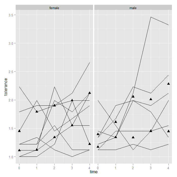
The point is that the framework is flexible—you can theoretically use any function for a summary. Now, we might be interested in estimating the overall trend in the data. One option is to add a line using locally weighted regression (lowess) to “smooth” over all the variability and give a sense of the overall or average trend. It just takes one short line of code and is automatically calculated separate by male.
## note again, we use group = 1, so the smooth is not calculated
## separately for each id


p + geom_line() + stat_smooth(aes(group = 1)) + stat_summary(aes(group = 1),
    geom = "point", fun.y = mean, shape = 17, size = 3) + facet_grid(. ~ male)
## `geom_smooth()` using method = 'loess' and formula 'y ~ x'
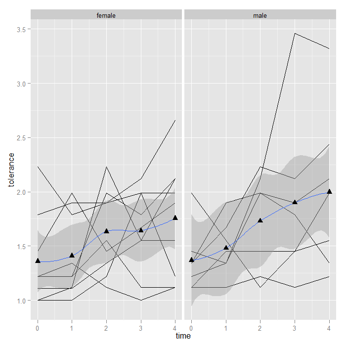
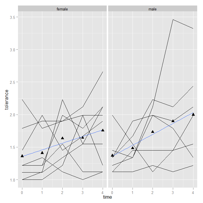
The lowess looks fairly linear, so we might choose a linear smooth and turn off the standard error shading.
p + geom_line() + stat_smooth(aes(group = 1), method = "lm", se = FALSE) +
    stat_summary(aes(group = 1), geom = "point", fun.y = mean, shape = 17, size = 3) +
    facet_grid(. ~ male)
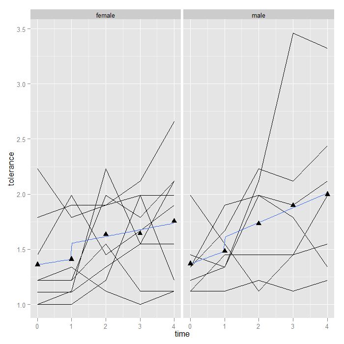
Adding smooths is more flexible than we have shown thus far (for more details, see the FAQ on ooths in ggplot2). Suppose that between time 1 and 2, an intervention occurred, and we wish to fit a piecewise linear model rather than an overall smooth. We can do this by creating a dummy variable (pre/post intervention) and its interaction with time. The only change is a slightly more complex formula. The default is y ~ x. “I(x > 1)” creates a dummy (TRUE/FALSE) variable if x (time in this case) is greater than 1. The “*” in the formula asks for the main effects and the interaction between x and the dummy variable from x. Of course ggplot2 takes care of fitting the model separately by male and plotting it for us. Now we can see that the trend line ‘jumps’ after time 1, and the slope is allowed to change (although the change appears minimal suggestion there is not an interaction between our hypothetical intervention and time).
p + geom_line() + stat_smooth(aes(group = 1), method = "lm", formula = y ~
    x * I(x > 1), se = FALSE) + stat_summary(aes(group = 1), fun.y = mean, geom = "point",
    shape = 17, size = 3) + facet_grid(. ~ male)
Summary
We created a variety of plots using ggplot2 to visualize longitudinal data and demonstrated how it is possible to easily add summary statistics, look for interactions with categorical variables through faceting, try data transformations, and look at linear and nonlinear effects.
