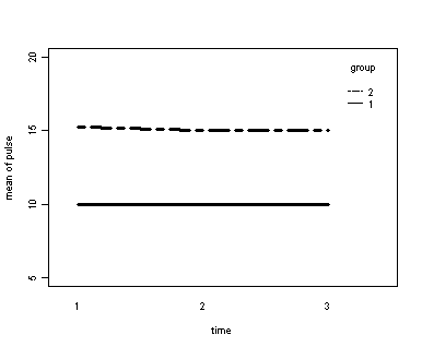
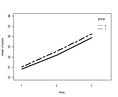
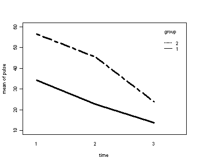
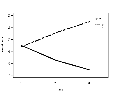
There are a number of situations that can arise when the analysis includes between groups effects as well as within subject effects. We start by showing 4 example analyses using measurements of depression over 3 time points broken down by 2 treatment groups. In the first example we see that the two groups differ in depression but neither group changes over time. In the second example the two groups grow in depression but at the same rate over time. In the third example, the two groups start off being quite different in depression but end up being rather close in depression. The fourth example shows the groups starting off at the same level of depression, and one group group increases over time whereas the other group decreases over time.
Note that in the interest of making learning the concepts easier we have taken the liberty of using only a very small portion of the output that R provides and we have inserted the graphs as needed to facilitate understanding the concepts. The code needed to actually create the graphs in R has been included.
Demo Analysis #1
The between groups test indicates that the variable group is significant, consequently in the graph we see that the lines for the two groups are rather far apart. The within subject test indicate that there is not a significant time effect, in other words, the groups do not change in depression over time. In the graph we see that the groups have lines that are flat, i.e. the slopes of the lines are approximately equal to zero. Also, since the lines are parallel, we are not surprised that the interaction between time and group is not significant.
demo1 <- read.csv("https://stats.idre.ucla.edu/stat/data/demo1.csv")
## Convert variables to factor
demo1 <- within(demo1, {
group <- factor(group)
time <- factor(time)
id <- factor(id)
})
par(cex = .6)
with(demo1, interaction.plot(time, group, pulse,
ylim = c(5, 20), lty= c(1, 12), lwd = 3,
ylab = "mean of pulse", xlab = "time", trace.label = "group"))
demo1.aov <- aov(pulse ~ group * time + Error(id), data = demo1)
summary(demo1.aov)
 Error: id
Df Sum Sq Mean Sq F value Pr(>F)
group 1 155.04 155.042 3721 1.305e-09 ***
Residuals 6 0.25 0.042
---
Signif. codes: 0 '***' 0.001 '**' 0.01 '*' 0.05 '.' 0.1 ' ' 1
Error: Within
Df Sum Sq Mean Sq F value Pr(>F)
time 2 0.08333 0.041667 1 0.3966
group:time 2 0.08333 0.041667 1 0.3966
Residuals 12 0.50000 0.041667
Demo Analysis #2
The between groups test indicates that the variable group is not significant, consequently in the graph we see that the lines for the two groups are rather close together. The within subject test indicate that there is a significant time effect, in other words, the groups do change in depression over time. In the graph we see that the groups have lines that increase over time. Again, the lines are parallel consistent with the finding that the interaction is not significant.
demo2 <- read.csv("https://stats.idre.ucla.edu/stat/data/demo2.csv")
## Convert variables to factor
demo2 <- within(demo2, {
group <- factor(group)
time <- factor(time)
id <- factor(id)
})
par(cex = .6)
with(demo2, interaction.plot(time, group, pulse,
ylim = c(10, 40), lty = c(1, 12), lwd = 3,
ylab = "mean of pulse", xlab = "time", trace.label = "group"))
demo2.aov <- aov(pulse ~ group * time + Error(id), data = demo2)
summary(demo2.aov)
 Error: id
Df Sum Sq Mean Sq F value Pr(>F)
group 1 15.042 15.042 0.8363 0.3957
Residuals 6 107.917 17.986
Error: Within
Df Sum Sq Mean Sq F value Pr(>F)
time 2 978.25 489.12 53.6845 1.032e-06 ***
group:time 2 1.08 0.54 0.0595 0.9426
Residuals 12 109.33 9.11
---
Signif. codes: 0 '***' 0.001 '**' 0.01 '*' 0.05 '.' 0.1 ' ' 1
Demo Analysis #3
The between groups test indicates that the variable group is significant, consequently in the graph we see that the lines for the two groups are rather far apart. The within subject test indicate that there is a significant time effect, in other words, the groups do change over time, both groups are getting less depressed over time. Moreover, the interaction of time and group is significant which means that the groups are changing over time but are changing in different ways, which means that in the graph the lines will not be parallel. In the graph we see that the groups have non-parallel lines that decrease over time and are getting progressively closer together over time.
demo3 <- read.csv("https://stats.idre.ucla.edu/stat/data/demo3.csv")
## Convert variables to factor
demo3 <- within(demo3, {
group <- factor(group)
time <- factor(time)
id <- factor(id)
})
par(cex = .6)
with(demo3, interaction.plot(time, group, pulse,
ylim = c(10, 60), lty = c(1, 12), lwd = 3,
ylab = "mean of pulse", xlab = "time", trace.label = "group"))
demo3.aov <- aov(pulse ~ group * time + Error(id), data = demo3)
summary(demo3.aov)
 Error: id
Df Sum Sq Mean Sq F value Pr(>F)
group 1 2035.04 2035.04 343.15 1.596e-06 ***
Residuals 6 35.58 5.93
---
Signif. codes: 0 '***' 0.001 '**' 0.01 '*' 0.05 '.' 0.1 ' ' 1
Error: Within
Df Sum Sq Mean Sq F value Pr(>F)
time 2 2830.33 1415.17 553.761 1.517e-12 ***
group:time 2 200.33 100.17 39.196 5.474e-06 ***
Residuals 12 30.67 2.56
---
Signif. codes: 0 '***' 0.001 '**' 0.01 '*' 0.05 '.' 0.1 ' ' 1
Demo Analysis #4
The within subject test indicate that the interaction of time and group is significant. The main effect of time is not significant. However, the significant interaction indicates that the groups are changing over time and they are changing in different ways, in other words, in the graph the lines of the groups will not be parallel. The between groups test indicates that there the variable group is significant. In the graph for this particular case we see that one group is increasing in depression over time and the other group is decreasing in depression over time.
demo4 <- read.csv("https://stats.idre.ucla.edu/stat/data/demo4.csv")
## Convert variables to factor
demo4 <- within(demo4, {
group <- factor(group)
time <- factor(time)
id <- factor(id)
})
par(cex = .6)
with(demo4, interaction.plot(time, group, pulse,
ylim = c(10, 60), lty = c(1, 12), lwd = 3,
ylab = "mean of pulse", xlab = "time", trace.label = "group"))
demo4.aov <- aov(pulse ~ group * time + Error(id), data = demo4)
summary(demo4.aov)
 Error: id
Df Sum Sq Mean Sq F value Pr(>F)
group 1 2542.04 2542.04 628.96 2.646e-07 ***
Residuals 6 24.25 4.04
---
Signif. codes: 0 '***' 0.001 '**' 0.01 '*' 0.05 '.' 0.1 ' ' 1
Error: Within
Df Sum Sq Mean Sq F value Pr(>F)
time 2 1.0 0.50 0.0789 0.9246
group:time 2 1736.3 868.17 137.0789 5.438e-09 ***
Residuals 12 76.0 6.33
---
Signif. codes: 0 '***' 0.001 '**' 0.01 '*' 0.05 '.' 0.1 ' ' 1
Exercise data
The data called exer, consists of people who were randomly assigned to two different diets: low-fat and not low-fat and three different types of exercise: at rest, walking leisurely and running. Their pulse rate was measured at three different time points during their assigned exercise: at 1 minute, 15 minutes and 30 minutes.
exer <- read.csv("https://stats.idre.ucla.edu/stat/data/exer.csv")
## Convert variables to factor
exer <- within(exer, {
  diet <- factor(diet)
  exertype <- factor(exertype)
  time <- factor(time)
  id <- factor(id)
})
print(exer)

   id diet exertype pulse time
1   1    1        1    85    1
2   1    1        1    85    2
3   1    1        1    88    3
4   2    1        1    90    1
5   2    1        1    92    2
6   2    1        1    93    3
7   3    1        1    97    1
8   3    1        1    97    2
9   3    1        1    94    3
10  4    1        1    80    1
11  4    1        1    82    2
12  4    1        1    83    3
13  5    1        1    91    1
14  5    1        1    92    2
15  5    1        1    91    3
16  6    2        1    83    1
17  6    2        1    83    2
18  6    2        1    84    3
19  7    2        1    87    1
20  7    2        1    88    2
21  7    2        1    90    3
22  8    2        1    92    1
23  8    2        1    94    2
...
Exercise example, model 1 (time and diet)
Let us first consider the model including diet as the group variable. The graph would indicate that the pulse rate of both diet types increase over time but for the non-low fat group (diet=2) the pulse rate is increasing more over time than for the low fat group (diet=1)
par(cex=.6)

with(exer, interaction.plot(time, diet, pulse,
  ylim = c(90, 110), lty = c(1, 12), lwd = 3,
  ylab = "mean of pulse", xlab = "time", trace.label = "group"))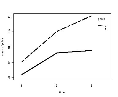
Looking at the results we conclude that the effect of time is significant but the interaction of time and diet is not significant. The between subject test of the effect of diet is also not significant. Consequently, in the graph we have lines that are not flat, in fact, they are actually increasing over time, which was expected since the effect of time was significant. Furthermore, the lines are approximately parallel which was anticipated since the interaction was not significant.
diet.aov <- aov(pulse ~ diet * time + Error(id),
  data = exer)
summary(diet.aov)

diet.aov
Error: id
          Df  Sum Sq Mean Sq F value  Pr(>F)
diet       1  1261.9 1261.88  3.1471 0.08694 .
Residuals 28 11227.0  400.97
---
Signif. codes:  0 '***' 0.001 '**' 0.01 '*' 0.05 '.' 0.1 ' ' 1

Error: Within
          Df Sum Sq Mean Sq F value    Pr(>F)
time       2 2066.6 1033.30 11.8078 5.264e-05 ***
diet:time  2  192.8   96.41  1.1017    0.3394
Residuals 56 4900.6   87.51
---
Signif. codes:  0 '***' 0.001 '**' 0.01 '*' 0.05 '.' 0.1 ' ' 1
Exercise example, model 2 (time and exercise type)
Next, let us consider the model including exertype as the group variable.
with(exer, interaction.plot(time, exertype, pulse,
  ylim = c(80, 130), lty = c(1, 2, 4), lwd = 2,
  ylab = "mean of pulse", xlab = "time"))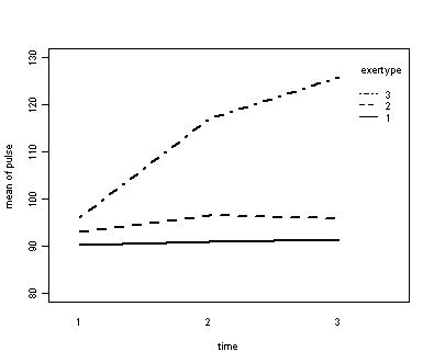
The interaction of time and exertype is significant as is the effect of time. The between subject test of the effect of exertype is also significant. Consequently, in the graph we have lines that are not parallel which we expected since the interaction was significant. Furthermore, we see that some of the lines that are rather far apart and at least one line is not horizontal which was anticipated since exertype and time were both significant.
exertype.aov <- aov(pulse ~ exertype * time + Error(id), data = exer)
summary(exertype.aov)

exertype.aov
Error: id
          Df Sum Sq Mean Sq F value   Pr(>F)
exertype   2 8326.1  4163.0  27.001 3.62e-07 ***
Residuals 27 4162.8   154.2
---
Signif. codes:  0 '***' 0.001 '**' 0.01 '*' 0.05 '.' 0.1 ' ' 1

Error: Within
              Df Sum Sq Mean Sq F value    Pr(>F)
time           2 2066.6 1033.30  23.543 4.446e-08 ***
exertype:time  4 2723.3  680.83  15.512 1.651e-08 ***
Residuals     54 2370.1   43.89
---
Signif. codes:  0 '***' 0.001 '**' 0.01 '*' 0.05 '.' 0.1 ' ' 1
Further Issues
Missing Data
- Compare aov and lme functions handling of missing data (under construction).
Variance-Covariance Structures
Independence
As though analyzed using between subjects analysis.
s2 0 s2 0 0 s2
Compound Symmetry
Assumes that the variance-covariance structure has a single variance (represented by s2) for all 3 of the time points and a single covariance (represented by s1) for each of the pairs of trials. This structure is illustrated by the half matrix below.
s2 s1 s2 s1 s1 s2
Unstructured
Assumes that each variance and covariance is unique. Each trial has its own variance (e.g. s12 is the variance of trial 1) and each pair of trials has its own covariance (e.g. s21 is the covariance of trial 1 and trial2). This structure is illustrated by the half matrix below.
s12 s21 s22 s31 s32 s32
Autoregressive
Another common covariance structure which is frequently observed in repeated measures data is an autoregressive structure, which recognizes that observations which are more proximate are more correlated than measures that are more distant. This structure is illustrated by the half matrix below.
s2 sr s2 sr2 sr s2
Autoregressive Heterogeneous Variances
If the variances change over time, then the covariance would look like this.
s12 sr s22 sr2 sr s32
However, we cannot use this kind of covariance structure in a traditional repeated measures analysis (using the aov function), but we can use it in the gls function.
Let’s look at the correlations, variances and covariances for the exercise data.
mat <- with(exer, matrix(c(pulse[time==1], pulse[time==2], pulse[time==3]), ncol = 3))
var(mat)


         [,1]      [,2]      [,3]
[1,] 37.84368  48.78851  60.28506
[2,] 48.78851 212.11954 233.76092
[3,] 60.28506 233.76092 356.32299
cor(mat)
          [,1]      [,2]      [,3]
[1,] 1.0000000 0.5445409 0.5191479
[2,] 0.5445409 1.0000000 0.8502755
[3,] 0.5191479 0.8502755 1.0000000
Exercise example, model 2 using the gls function
Even though we are very impressed with our results so far, we are not completely convinced that the variance-covariance structure really has compound symmetry. In order to compare models with different variance-covariance structures we have to use the gls function (gls = generalized least squares) and try the different structures that we think our data might have.
Compound Symmetry
The first model we will look at is one using compound symmetry for the variance-covariance structure. This model should confirm the results of the results of the tests that we obtained through the aov function and we will be able to obtain fit statistics which we will use for comparisons with our models that assume other variance-covariance structures.
In order to use the gls function we need to include the repeated structure in our data set object. We do this by using the groupedData function and the id variable following the bar notation indicates that observations are repeated within id. We then fit the model using the gls function and we use the corCompSymm function in the corr argument because we want to use compound symmetry. We obtain the 95% confidence intervals for the parameter estimates, the estimate of rho and the estimated of the standard error of the residuals by using the intervals function.
library(nlme)
longg <- groupedData(pulse ~ as.numeric(exertype) * as.numeric(time) | id, data = exer)
fit.cs <- gls(pulse ~ exertype * time, data = longg,
  corr = corCompSymm(, form= ~ 1 | id) )
summary(fit.cs)

Generalized least squares fit by REML
  Model: pulse ~ exertype * time
  Data: longg
       AIC      BIC    logLik
  612.8316 639.1706 -295.4158

Correlation Structure: Compound symmetry
 Formula: ~1 | id
 Parameter estimate(s):
     Rho
0.455816
Unstructured
We now try an unstructured covariance matrix. Option “corr = corSymm” specifies that the correlation structure is unstructured. Option “weights = varident(form = ~ 1 | time)” specifies that the variance at each time point can be different.
fit.un <- gls(pulse ~ exertype * time, data = longg,
  corr=corSymm(form = ~ 1 | id),
  weights = varIdent(form = ~ 1 | time))
summary(fit.un)


Generalized least squares fit by REML
  Model: pulse ~ exertype * time
  Data: longg
       AIC      BIC    logLik
  607.7365 643.6532 -288.8682

Correlation Structure: General
 Formula: ~1 | id
 Parameter estimate(s):
 Correlation:
  1     2
2 0.434
3 0.417 0.583
Variance function:
 Structure: Different standard deviations per stratum
 Formula: ~1 | time
 Parameter estimates:
       1        2        3
1.000000 1.596720 1.877599

anova(fit.un)
Denom. DF: 81
              numDF  F-value p-value
(Intercept)       1 8184.123
Autoregressive
From previous studies we suspect that our data might actually have an auto-regressive variance-covariance structure so this is the model we will look at next. However, for our data the auto-regressive variance-covariance structure does not fit our data much better than the compound symmetry does.
fit.ar1 <- gls(pulse ~ exertype * time, data = longg,
  corr = corAR1(, form= ~ 1 | id))
summary(fit.ar1)

Generalized least squares fit by REML
  Model: pulse ~ exertype * time
  Data: longg
       AIC      BIC    logLik
  612.1163 638.4553 -295.0582

Correlation Structure: AR(1)
 Formula: ~1 | id
 Parameter estimate(s):
      Phi
0.4992423

anova(fit.ar1)
Denom. DF: 81
              numDF  F-value p-value
(Intercept)       1 6167.352
Autoregressive with heterogeneous variances
Now we suspect that what is actually going on is that the we have auto-regressive covariances and heterogeneous variances.
fit.arh1 <- gls(pulse ~ exertype * time, data = longg,
  corr = corAR1(, form = ~ 1 | id), weight = varIdent(form = ~ 1 | time))
summary(fit.arh1)


Generalized least squares fit by REML
  Model: pulse ~ exertype * time
  Data: longg
       AIC      BIC    logLik
  605.7693 636.8971 -289.8846

Correlation Structure: AR(1)
 Formula: ~1 | id
 Parameter estimate(s):
      Phi
0.5100781
Variance function:
 Structure: Different standard deviations per stratum
 Formula: ~1 | time
 Parameter estimates:
       1        2        3
1.000000 1.561315 1.796993

anova(fit.arh1)
Denom. DF: 81
              numDF  F-value p-value
(Intercept)       1 8284.813
Model comparison (using the anova function)
We can use the anova function to compare competing models to see which model fits the data best.
anova(fit.cs, fit.un)
       Model df      AIC      BIC    logLik   Test  L.Ratio p-value
fit.cs     1 11 612.8316 639.1706 -295.4158
fit.un     2 15 607.7365 643.6532 -288.8682 1 vs 2 13.09512  0.0108

anova(fit.cs, fit.ar1)
        Model df      AIC      BIC    logLik
fit.cs      1 11 612.8316 639.1706 -295.4158
fit.ar1     2 11 612.1163 638.4553 -295.0582

anova(fit.cs, fit.arh1)
         Model df      AIC      BIC    logLik   Test  L.Ratio p-value
fit.cs       1 11 612.8316 639.1706 -295.4158
fit.arh1     2 13 605.7693 636.8971 -289.8846 1 vs 2 11.06236   0.004
The two most promising structures are Autoregressive Heterogeneous Variances and Unstructured since these two models have the smallest AIC values and the -2 Log Likelihood scores are significantly smaller than the -2 Log Likelihood scores of other models.
Exercise example, model 3 (time, diet and exertype)—using the aov function
Looking at models including only the main effects of diet or exertype separately does not answer all our questions. We would also like to know if the people on the low-fat diet who engage in running have lower pulse rates than the people participating in the not low-fat diet who are not running. In order to address these types of questions we need to look at a model that includes the interaction of diet and exertype. After all the analysis involving the variance-covariance structures we will look at this model using both functions aov and gls.
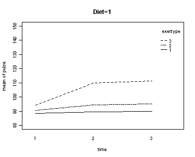
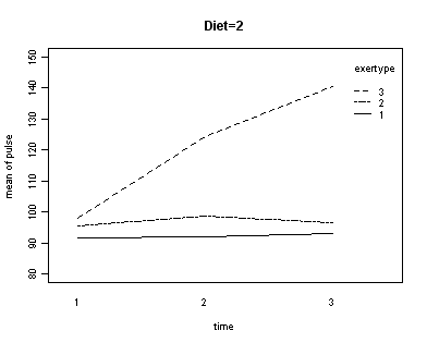
In the graph of exertype by diet we see that for the low-fat diet (diet=1) group the pulse rate for the two exercise types: at rest and walking, are very close together, indeed they are almost flat, whereas the running group has a higher pulse rate that increases over time. For the not low-fat diet (diet=2) group the same two exercise types: at rest and walking, are also very close together and almost flat. For this group, however, the pulse rate for the running group increases greatly over time and the rate of increase is much steeper than the increase of the running group in the low-fat diet group. The within subject tests indicate that there is a three-way interaction between diet, exertype and time. In other words, the pulse rate will depend on which diet you follow, the exercise type you engage in and at what time during the the exercise that you measure the pulse. The interactions of time and exertype and diet and exertype are also significant as are the main effects of diet and exertype.
par(cex = .6)
with(exer, interaction.plot(time[diet==1], exertype[diet==1], pulse[diet==1],
  ylim = c(80, 150), lty = c(1, 12, 8),
  trace.label = "exertype", ylab = "mean of pulse", xlab = "time"))
title("Diet = 1")

with(exer, interaction.plot(time[diet==2], exertype[diet==2], pulse[diet==2],
  ylim = c(80, 150), lty = c(1, 12, 8),
  trace.label = "exertype", ylab = "mean of pulse", xlab = "time"))
title("Diet = 2")
Looking at the graphs of exertype by diet.
both.aov <- aov(pulse ~ exertype * diet * time + Error(id), data = exer)
summary(both.aov)

both.aov
Error: id
              Df Sum Sq Mean Sq F value    Pr(>F)
exertype       2 8326.1  4163.0 47.9152 4.166e-09 ***
diet           1 1261.9  1261.9 14.5238 0.0008483 ***
exertype:diet  2  815.8   407.9  4.6945 0.0190230 *
Residuals     24 2085.2    86.9
---
Signif. codes:  0 '***' 0.001 '**' 0.01 '*' 0.05 '.' 0.1 ' ' 1

Error: Within
                   Df  Sum Sq Mean Sq F value    Pr(>F)
time                2 2066.60 1033.30 31.7206 1.662e-09 ***
exertype:time       4 2723.33  680.83 20.9005 4.992e-10 ***
diet:time           2  192.82   96.41  2.9597   0.06137 .
exertype:diet:time  4  613.64  153.41  4.7095   0.00275 **
Residuals          48 1563.60   32.57
---
Signif. codes:  0 '***' 0.001 '**' 0.01 '*' 0.05 '.' 0.1 ' ' 1
Exercise example, model 3 (time, diet and exertype)–using the gls fuction
For the gls model we will use the autoregressive heterogeneous variance-covariance structure since we previously observed that this is the structure that appears to fit the data the best (see discussion of variance-covariance structures). We do not expect to find a great change in which factors will be significant but we do expect to have a model that has a better fit than the anova model. The graphs are exactly the same as the anova model and we find that the same factors are significant. However, since the model has a better fit we can be more confident in the estimate of the standard errors and therefore we can be more confident in the tests and in the findings of significant factors. The model has a better fit than the model only including exertype and time because both the -2Log Likelihood and the AIC has decrease dramatically. The -2 Log Likelihood decreased from 579.8 for the model including only exertype and time to 505.3 for the current model.
longa <- groupedData(pulse ~ as.numeric(exertype) * as.numeric(diet) * as.numeric(time) | id,
  data = exer)
both.arh1 <- gls(pulse ~ exertype * diet * time, data = longa,
  corr = corAR1(, form = ~ 1 | id), weight = varIdent(form = ~ 1 | time))
summary(both.arh1)

Generalized least squares fit by REML
  Model: pulse ~ exertype * diet * time
  Data: longa
       AIC      BIC    logLik
  549.2788 599.3654 -252.6394

Correlation Structure: AR(1)
 Formula: ~1 | id
 Parameter estimate(s):
     Phi
0.360999
Variance function:
 Structure: Different standard deviations per stratum
 Formula: ~1 | time
 Parameter estimates:
       1        2        3
1.000000 1.490617 1.171196
anova(both.arh1)
Denom. DF: 72
                   numDF   F-value p-value
(Intercept)            1 13391.413
Contrasts and interaction contrasts for model 3
From the graphs in the above analysis we see that the runners (exertype level 3) have a pulse rate that is increases much quicker than the pulse rates of the two other groups. We would like to know if there is a statistically significant difference between the changes over time in the pulse rate of the runners versus the change over time in the pulse rate of the walkers and the people at rest across diet groups and across time. Furthermore, we suspect that there might be a difference in pulse rate over time and across exercise type between the two diet groups. But to make matters even more complicated we would like to test if the runners in the low fat diet group are statistically significantly different from all the other groups (i.e. the runners in the non-low fat diet, the walkers and the people at rest in both diet groups). Since we are being ambitious we also want to test if the runners in the low fat diet group (diet=1) are different from the runners in the non-low fat diet group (diet=2).
In order to implement contrasts coding for diet and exertype we will make copies of the variables. If they were not already factors, we would need to convert them to factors first. Note that we are still using the data frame longa which has the hierarchy characteristic that we need for the gls function.
longa[, c("ef", "df", "tf")] <- longa[, c("exertype", "diet", "time")]
Now we can attach the contrasts to the factor variables using the contrasts function. We need to use the contrast coding for regression which is discussed in the chapter 6 in our regression web book (note that the coding system is not package specific so we arbitrarily choose to link to the SAS web book.) For the contrast coding of ef and tf we first create the matrix containing the contrasts and then we assign the contrasts to them. The contrasts coding for df is simpler since there are just two levels and we can therefore assign the contrasts directly without having to create a matrix of contrasts.
m <- matrix( c( c(-1/2, 1/2, 0), c(-1/3, -1/3, 2/3) ), ncol=2)
contrasts(longa$ef) <- m
(contrasts(longa$tf) <- m)

     [,1]       [,2]
[1,] -0.5 -0.3333333
[2,]  0.5 -0.3333333
[3,]  0.0  0.6666667

(contrasts(longa$df)  <- c(-1/2, 1/2))

[1] -0.5  0.5
Now that we have all the contrast coding we can finally run the model. Looking at the results the variable ef1 corresponds to the contrast of exertype=1 versus exertype=2 and it is not significant indicating that there is no difference between the pulse rate of the people at rest and the people who walk leisurely. The variable ef2 corresponds to the contrast of exertype=3 versus the average of exertype=1 and exertype=2. This contrast is significant indicating that there is a difference between the mean pulse rate of the runners compared to the walkers and the people at rest. The variable df1 corresponds to the contrast of the two diets and it is significant indicating that the mean pulse rate of the people on the low-fat diet is different from that of the people on a non-low fat diet. The interaction ef2:df1 corresponds to the contrast of the runners on a low fat diet (people who are in the group exertype=3 and diet=1) versus everyone else. This contrast is significant indicating the the mean pulse rate of the runners on a low fat diet is different from everyone else’s mean pulse rate.
model.cs <- gls(pulse ~ ef * df * tf, data = longa,
  corr = corCompSymm(, form = ~ 1 | id) )

summary(model.cs)

Generalized least squares fit by REML
  Model: pulse ~ ef * df * tf
  Data: longa
       AIC      BIC    logLik
  547.6568 593.1901 -253.8284

Correlation Structure: Compound symmetry
 Formula: ~1 | id
 Parameter estimate(s):
      Rho
0.3572133

Coefficients:
               Value Std.Error   t-value p-value
(Intercept) 99.70000  0.982533 101.47246  0.0000
ef1          4.36667  2.406704   1.81438  0.0738
ef2         20.05000  2.084266   9.61969  0.0000
df1          7.48889  1.965065   3.81101  0.0003
tf1          8.40000  1.473658   5.70010  0.0000
tf2          7.10000  1.276225   5.56328  0.0000
ef1:df1      0.46667  4.813407   0.09695  0.9230
ef2:df1     12.76667  4.168533   3.06263  0.0031
ef1:tf1      2.80000  3.609709   0.77569  0.4405
ef2:tf1     18.90000  3.126100   6.04587  0.0000
ef1:tf2      0.20000  3.126100   0.06398  0.9492
ef2:tf2     18.45000  2.707282   6.81495  0.0000
df1:tf1      2.93333  2.947315   0.99526  0.3229
df1:tf2      5.66667  2.552450   2.22009  0.0296
ef1:df1:tf1 -0.40000  7.219418  -0.05541  0.9560
ef2:df1:tf1 11.20000  6.252200   1.79137  0.0774
ef1:df1:tf2 -3.40000  6.252200  -0.54381  0.5883
ef2:df1:tf2 21.20000  5.414564   3.91537  0.0002
The contrasts that we were not able to obtain in the previous code were the tests of the simple effects, i.e. testing for difference between the two diets at exertype=3. We would like to test the difference in mean pulse rate of the people following the two diets at a specific level of exertype. We would like to know if there is a difference in the mean pulse rate for runners (exertype=3) in the lowfat diet (diet=1) versus the runners in the non-low fat diet (diet=2). In order to obtain this specific contrasts we need to code the contrasts for diet at each level of exertype and include these in the model. For more explanation of why this is the case we strongly urge you to read chapter 5 in our web book that we mentioned before. Looking at the results the variable e3d12 corresponds to the contrasts of the runners on the low fat diet versus the runners on the non-low fat diet. This contrast is significant indicating that the mean pulse rate of runners on the low fat diet is different from that of the runners on a non-low fat diet.
longa$e1d12 <- (-1/2*(longa$exertype==1 & longa$diet==1))
longa$e1d12[longa$exertype==1 & longa$diet==2] <- 1/2

longa$e2d12 <- (-1/2*(longa$exertype==1))
longa$e2d12[longa$exertype==2 & longa$diet==2] <- 1/2

longa$e3d12 <- (-1/2*(longa$exertype==3 & longa$diet==1))
longa$e3d12[longa$exertype==3 & longa$diet==2] <- 1/2

modela.cs <- gls(pulse ~ ef + e1d12 + e2d12 + e3d12 , data = longa,
  corr = corCompSymm(, form = ~ 1 | id) )
summary(modela.cs)

Coefficients:
                Value Std.Error  t-value p-value
(Intercept) 100.27778  1.134531 88.38699  0.0000
ef1          -0.83333  5.644220 -0.14764  0.8830
ef2          19.18333  2.251265  8.52113  0.0000
e1d12         3.00000  3.403593  0.88142  0.3806
e2d12         6.93333  6.807186  1.01853  0.3114
e3d12        16.00000  3.403593  4.70091  0.0000
Unequally Spaced Time Points
Modeling Time as a Linear Predictor of Pulse
We have another study which is very similar to the one previously discussed except that in this new study the pulse measurements were not taken at regular time points. In this study a baseline pulse measurement was obtained at time = 0 for every individual in the study. However, subsequent pulse measurements were taken at less regular time intervals. The second pulse measurements were taken at approximately 2 minutes (time = 120 seconds); the pulse measurement was obtained at approximately 5 minutes (time = 300 seconds); and the fourth and final pulse measurement was obtained at approximately 10 minutes (time = 600 seconds). The data for this study is displayed below.
study2 <- read.csv("https://stats.idre.ucla.edu/stat/data/study2.csv")
study2 <- within(study2, {
  id <- factor(id)
  exertype <- factor(exertype)
  diet <- factor(diet)
})
study2[1:20, ]

   id exertype diet pulse time
1   1        1    1    90    0
2   1        1    1    92  228
3   1        1    1    93  296
4   1        1    1    93  639
5   2        1    1    90    0
6   2        1    1    92   56
7   2        1    1    93  434
8   2        1    1    93  538
9   3        1    1    97    0
10  3        1    1    97  150
11  3        1    1    94  295
12  3        1    1    94  541
13  4        1    1    80    0
14  4        1    1    82  121
15  4        1    1    83  256
16  4        1    1    83  575
17  5        1    1    91    0
18  5        1    1    92  161
19  5        1    1    91  252
20  5        1    1    91  526
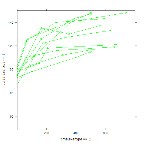
In order to get a better understanding of the data we will look at a scatter plot of the data with lines connecting the points for each individual.
## Load library(lattice) ## par(cex = .6) xyplot(pulse ~ time, data = study2, groups = id, type = "o", panel = panel.superpose)xyplot(pulse ~ time | exertype, data = study2, groups = id, type = "o", panel = panel.superpose)
xyplot(pulse ~ time | diet, data = study2, groups = id, type = "o", panel = panel.superpose)
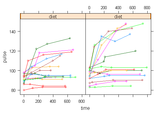
This is a situation where multilevel modeling excels for the analysis of data with irregularly spaced time points. The multilevel model with time as a linear effect is illustrated in the following equations.
Level 1 (time): Pulse = β0j + β1j (Time) + rij Level 2 (person): β0j = γ00 + γ01(Exertype) + u0j Level 2 (person): β1j = γ10 + γ11(Exertype) + u1j
Substituting the level 2 model into the level 1 model we get the following single equations. Note: The random components have been placed in square brackets.
Pulse = γ00 + γ01(Exertype) + γ10(Time) + γ11(Exertype*time) + [ u0j + u1j(Time) + rij ]
Since this model contains both fixed and random components, it can be analyzed using the lme function as shown below.
time.linear <- lme(pulse ~ exertype * time,
  random = list(id = pdDiag(~ time)), data = study2)
summary(time.linear)

Linear mixed-effects model fit by REML
 Data: study2
       AIC      BIC    logLik
  856.8227 881.4485 -419.4113

Random effects:
 Formula: ~time | id
 Structure: Diagonal
        (Intercept)       time Residual
StdDev:    5.821602 0.01151569 5.692529

Fixed effects: pulse ~ exertype * time
                  Value Std.Error DF  t-value p-value
(Intercept)    91.07179  2.274185 87 40.04591  0.0000
exertype2       3.51075  3.220818 27  1.09002  0.2853
exertype3      12.62517  3.226279 27  3.91323  0.0006
time            0.00158  0.005244 87  0.30185  0.7635
exertype2:time  0.00716  0.007599 87  0.94272  0.3484
exertype3:time  0.05477  0.007531 87  7.27233  0.0000
 Correlation:
               (Intr) exrty2 exrty3 time   exrt2:
exertype2      -0.706
exertype3      -0.705  0.498
time           -0.311  0.220  0.220
exertype2:time  0.215 -0.320 -0.152 -0.690
exertype3:time  0.217 -0.153 -0.320 -0.696  0.481

Standardized Within-Group Residuals:
        Min          Q1         Med          Q3         Max
-2.51744499 -0.31571963 -0.05192003  0.26453221  3.19537209

Number of Observations: 120
Number of Groups: 30

anova(time.linear)
              numDF denDF  F-value p-value
(Intercept)       1    87 6373.823
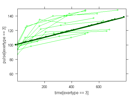
Graphs of predicted values. The first graph shows just the lines for the predicted values one for each level of exertype. It is obvious that the straight lines do not approximate the data very well, especially for exertype group 3. The rest of the graphs show the predicted values as well as the observed values. The predicted values are the darker straight lines; the line for exertype group 1 is blue, for exertype group 2 it is red and for exertype group 3 the line is green. In this graph it becomes even more obvious that the model does not fit the data very well.
fitted <- fitted(time.linear, level=0) with(study2, plot(time[exertype==3], fitted[exertype==3], ylim = c(50, 150), xlab = "time", ylab = "predicted", type = "b", col = "green")) with(study2, points(time[exertype==2], fitted[exertype==2], pch = 4, type = "b", col = "red")) with(study2, points(time[exertype==1], fitted[exertype==1], pch = 16, type = "b", col = "blue"))xyplot(pulse[exertype==1] ~ time[exertype==1], data = study2, groups = id, type = "o", ylim = c(50, 150), xlim = c(0, 800), panel = panel.superpose, col = "blue") with(study2, lines(time[exertype==1], fitted[exertype==1], ylim = c(50, 150), xlim = c(0, 800), type = "b", col = "dark blue", lwd = 4))
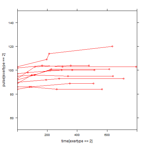
xyplot(pulse[exertype==2] ~ time[exertype==2], data = study2, groups=id, type = "o", ylim = c(50, 150), xlim = c(0, 800), panel = panel.superpose, col = "red") with(study2, lines(time[exertype==2], fitted[exertype==2], ylim = c(50, 150), xlim = c(0, 800), type = "b", col = "dark red", lwd = 4))
xyplot(pulse[exertype==3] ~ time[exertype==3], data = study2, groups = id, type = "o", ylim = c(50, 150), xlim = c(0, 800), panel = panel.superpose, col = "green") with(study2, lines(time[exertype==3], fitted[exertype==3], ylim = c(50, 150), xlim = c(0, 800), type = "b", col = "dark green", lwd = 4))
Modeling Time as a Quadratic Predictor of Pulse
To model the quadratic effect of time, we add time*time to the model. We see that term is significant.
study2$time2 <- study2$time^2
time.quad <- lme(pulse ~ exertype * time + time2,
  random = list(id = pdDiag(~ time)), study2)
summary(time.quad)

Linear mixed-effects model fit by REML
 Data: study2
       AIC      BIC    logLik
  859.3578 886.6317 -419.6789

Random effects:
 Formula: ~time | id
 Structure: Diagonal
        (Intercept)      time Residual
StdDev:    5.763908 0.0122891 4.981454

Fixed effects: pulse ~ exertype * time + time2
                  Value Std.Error DF  t-value p-value
(Intercept)    88.75438 2.2189692 86 39.99802  0.0000
exertype2       3.56744 3.0669444 27  1.16319  0.2549
exertype3      12.92326 3.0722775 27  4.20641  0.0003
time            0.03524 0.0086532 86  4.07252  0.0001
time2          -0.00005 0.0000106 86 -4.82532  0.0000
exertype2:time  0.00563 0.0073822 86  0.76218  0.4480
exertype3:time  0.05253 0.0073320 86  7.16392  0.0000

anova(time.quad)
              numDF denDF  F-value p-value
(Intercept)       1    86 6717.113
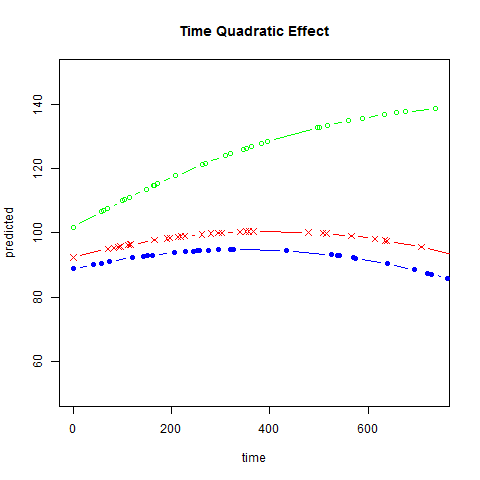
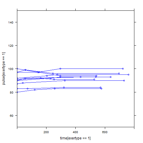
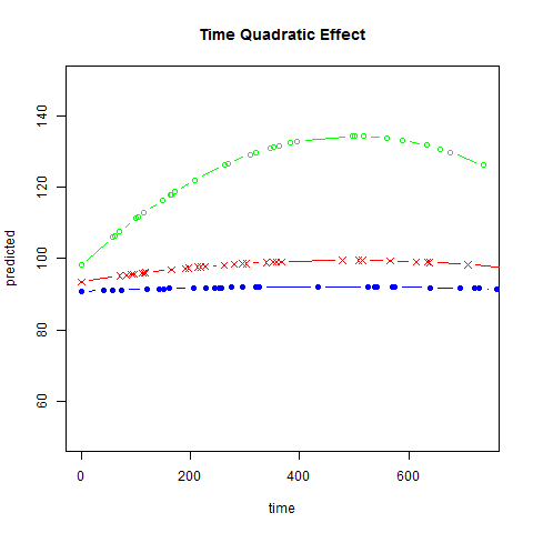
Graphs of predicted values. The first graph shows just the lines for the predicted values one for each level of exertype. The curved lines approximate the data better than the straight lines of the model with time as a linear predictor. The rest of the graphs show the predicted values as well as the observed values. The predicted values are the very curved darker lines; the line for exertype group 1 is blue, for exertype group 2 it is orange and for exertype group 3 the line is green. This model fits the data better, but it appears that the predicted values for the exertype group 3 have too little curvature and the predicted values for exertype groups 1 and 2 have too much curvature.
fitted2 <- fitted(time.quad, level = 0)
a <- with(study2,
data.frame(time, fitted2, exertype)[order(exertype, time), ])
with(a, {
plot(time[exertype==3], fitted2[exertype==3], ylim = c(50, 150),
xlab = "time", ylab = "predicted", col = "green", type = "b")
points(time[exertype==2], fitted2[exertype==2],
pch = 4, col = "red", type = "b")
points(time[exertype==1], fitted2[exertype==1],
pch = 16, col = "blue", type = "b")
title("Time Quadratic Effect")})
 xyplot(pulse[exertype==1] ~ time[exertype==1], groups = id, data = study2,
ylim = c(50, 150), xlim = c(0, 800), type = "o",
panel=panel.superpose, col="blue")
with(a, lines(time[exertype==1], fitted2[exertype==1],
ylim = c(50, 150), xlim = c(0, 800),
type = "b", col = "dark blue", lwd = 4))
 xyplot(pulse[exertype==2] ~ time[exertype==2], groups = id, data = study2,
ylim=c(50, 150), xlim=c(0, 800), type="o",
panel=panel.superpose, col="red")
with(a, lines(time[exertype==2], fitted2[exertype==2],
ylim = c(50, 150), xlim = c(0, 800),
type = "b", col = "dark red", lwd = 4))
 xyplot(pulse[exertype==3] ~time[exertype==3], groups = id, data = study2,
ylim = c(50, 150), xlim = c(0, 800), type = "o",
panel = panel.superpose, col = "green")
with(a, lines(time[exertype==3], fitted2[exertype==3],
ylim = c(50, 150), xlim = c(0, 800),
type = "b", col = "dark green", lwd = 4))
Modeling Time as a Quadratic Predictor of Pulse, Interacting by Exertype
We can include an interaction of time*time*exertype to indicate that the different exercises not only show different linear trends over time, but that they also show different quadratic trends over time, as shown below. The time*time*exertype term is significant.
time.quad2 <- lme(pulse ~ exertype * time + exertype * time2,
  random = list(id = pdDiag(~ time)), data = study2)
summary(time.quad2)

Linear mixed-effects model fit by REML
 Data: study2
       AIC      BIC    logLik
  864.3194 896.8337 -420.1597

Random effects:
 Formula: ~time | id
 Structure: Diagonal
        (Intercept)       time Residual
StdDev:    5.996351 0.01192684 3.869181

Fixed effects: pulse ~ exertype * time + exertype * time2
                   Value Std.Error DF  t-value p-value
(Intercept)     90.81505 2.1902570 84 41.46319  0.0000
exertype2        2.66056 3.1027921 27  0.85747  0.3987
exertype3        7.28070 3.0989266 27  2.34943  0.0264
time             0.00554 0.0099971 84  0.55411  0.5810
time2           -0.00001 0.0000136 84 -0.45396  0.6510
exertype2:time   0.01889 0.0142534 84  1.32521  0.1887
exertype3:time   0.13928 0.0146086 84  9.53418  0.0000
exertype2:time2 -0.00002 0.0000198 84 -0.94590  0.3469
exertype3:time2 -0.00014 0.0000208 84 -6.66757  0.0000

anova(time.quad2)
               numDF denDF  F-value p-value
(Intercept)        1    84 6779.738
Graphs of predicted values. The first graph shows just the lines for the predicted values one for each level of exertype. The lines now have different degrees of curvature which approximates the data much better than the other two models. The rest of graphs show the predicted values as well as the observed values. The line for exertype group 1 is blue, for exertype group 2 it is orange and for exertype group 3 the line is green. This model fits the data the best with more curvature for exertype group 3 and less curvature for exertype groups 1 and 2.
fitted3 <- fitted(time.quad2, level = 0)
a <- with(study2,
data.frame(time, fitted3, exertype)[order(exertype, time), ])
with(a, {
plot(time[exertype==3], fitted3[exertype==3], ylim = c(50, 150),
xlab = "time", ylab = "predicted", col = "green", type = "b")
points(time[exertype==2], fitted3[exertype==2],
pch = 4, col = "red", type = "b")
points(time[exertype==1], fitted3[exertype==1],
pch = 16, col = "blue", type = "b")
title("Time Quadratic Effect")})
 xyplot(pulse[exertype==1] ~ time[exertype==1], groups = id, data = study2,
ylim = c(50, 150), xlim = c(0, 800), type = "o",
panel = panel.superpose, col = "blue")
with(a, lines(time[exertype==1], fitted3[exertype==1],
ylim = c(50, 150), xlim = c(0, 800),
type = "b", col = "dark blue", lwd = 4))
 xyplot(pulse[exertype==2] ~ time[exertype==2], groups = id, data = study2,
ylim = c(50, 150), xlim = c(0, 800), type = "o",
panel = panel.superpose, col = "red")
with(a, lines(time[exertype==2], fitted3[exertype==2],
ylim = c(50, 150), xlim = c(0, 800),
type = "b", col = "dark red", lwd = 4))
 xyplot(pulse[exertype==3] ~ time[exertype==3], groups = id, data = study2,
ylim = c(50, 150), xlim = c(0, 800), type = "o",
panel = panel.superpose, col = "green")
with(a, lines(time[exertype==3], fitted3[exertype==3],
ylim = c(50, 150), xlim = c(0, 800),
type = "b", col = "dark green", lwd = 4))

