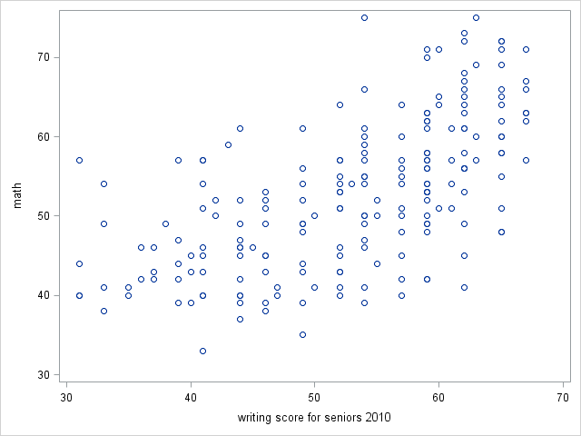
SAS does not have any built-in options for formatting an axis label on separate lines. For example, in the graph below you may feel that the x-axis label “writing score for seniors 2010” is too long to span a single line. Instead you would like the label to span 2 lines, both of which are centered. No options in proc sgplot provide an obvious way to either start part of the label on a newline or to center the text in the label.

proc sgplot data = hsb; scatter x = write y = math;
 xaxis label="writing score for seniors 2010";
 run;
Fortunately, the xaxis and yaxis statements in proc sgplot understand Unicode character encodings, which allows us to add newlines to our lables. Unicode is a standard system of numerical codes used to represent text characters (Click here to learn more about the unicode system). For example, one can represent the greek symbol alpha with the hexadeimal code 03B1 and a newline character with the code 000A. For our graph, then, we can insert a newline and then manually center the two lines for a centered two-line axis label.
Getting the data for the plots
We will first need to get the dataset for plotting. Our data consist of 200 students scores on various achievement tests, such as writing, reading, math, etc. We would like to plot the students writing scores, write, against the math scores, math. The code below will load the data into SAS.
filename hsb url "https://stats.idre.ucla.edu/stat/data/hsbdemo.csv";

 data hsb;
 infile hsb dlm =',' firstobs=2 dsd;
 input id female $ ses $ schtyp $ prog $ read write math science socst honors $  awards cid;
 run;
Adding a newline to an axis label
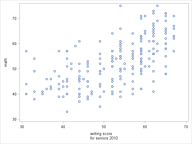
As we mentioned above, the unicode encoding for a newline is 000A. We need to tell SAS not to print the characters 000A as they are, but instead to translate them first to a newline character, and then to print the newline. To tell SAS that we would like to use Unicode encodings, we insert the unicode encoding into the following syntax: (*ESC*){unicode 'encoding'x}, where encoding is the unicode encoding of the character we would like to translate. Notice the single quotes surrounding encoding and the x that follows, as they are both necessary (double quotes will not work). So, we insert this syntax into our xaxis statement, and below are the results.

proc sgplot data = hsb;
 scatter x = write y = math;
 xaxis label="writing score(*ESC*){unicode '000a'x}for seniors 2010";
 run;
Adding spaces to approximate centering
In the graph immediately above, the two lines of the x-axis label are left-justified with respect to one another. In terms of the whole graph, the second line "for seniors 2010" appears to be centered, but "writing score" seems too far the left (it is not centered under 50, the center of the x-axis). We can simply add two spaces before "writing score" to center it reasonably well.

proc sgplot data = hsb;
 scatter x = write y = math;
 xaxis label="  writing score(*ESC*){unicode '000a'x}for seniors 2010";
 run;
Using an annotation dataset for complete control of axis label placement
Creating the annotation dataset
Conveniently, we can use annotation dataset with proc sgplot to take complete control of where our axis labels appear and how they are formatted. Each row of an annotation dataset corresponds to some addition (annotation) to a plot. For example, the first row may be a text box that labels an outlier as "outlier", the second row could be a reference line at y = 0, and the third row could be an axis label whose placement we would like to control. Once the annotation dataset is created, we can tell proc sgplot to use the annotation dataset by supplying the name of the dataset to the sganno= option on the proc sgplot statement. Click here for more information regarding annotatation datasets in SAS.
The code below generates our annotation dataset, which we call anno. The variable names in the input statement should be copied as is, as SAS expects certain variable names to be used as options for our annotation. The options we specify are:
functiona string variable that defines what type of annotation this entry is; here we specify a text annotation; other possible are line, image, polygon, arrow, etc.x1where along the x-axis to place the annotationy1where along the y-axis to place the annotationdrawspacehow SAS interpretsx1andy1; by default, this is set tographpercent, which if unchanged would tell SAS to interpret the values as percentages of the graph, so (x1=50 y1=25) would tell SAS to place the text at 50% of the width of the graph from the left and at 25% of the height of the graph from the bottom; here we setdrawspacetodatavaluewhich tells SAS to interpretx1andy1as datavalues, so (x1=50 and y1=25) would place the text at write=50 and math = 25. This specification allows easy centering below a particular value in the graph, namely write=50 here.labelthe text to be printedjustifyhow the text is to be justified, which isleftby defaultwidthwidth of the space in which the text will be printed; increase this if you see the text wrapping
data anno;
 infile datalines dlm="#";
 length function $ 8 label $ 30 justify $ 20 drawspace $ 10;
 input function $ x1 y1 drawspace $ label $ justify $ width ;
 datalines;
 text # 50 # 25 # datavalue # writing score # center # 20
 text # 50 # 23 # datavalue # for seniors 2010 # center # 20
 ;
 run;
The code above uses the infile datalines syntax, which allows specification of a column delimiter through the dlm= option. This allows us strict control of how the columns are separated, which is important when we have string variables. Basically, the annotation dataset specifies that "writing score" be printed at write=50 math=25 and that "for seniors 2010" be printed at write=50 math=23. Both text annotations are to be centered. The y-values math=25 and math=23 were determined by trial-and-error until we were satisfied with the label placements.
Padding an SGPLOT for the annotation
When you annotate a plot in proc sgplot, SAS does not automatically pad the graph with extra space for the annotations. However, you can use the pad= on the proc sgplot statement to add padding to a specific region of the graph. We add extra space (in pixel units, the default) to the bottom of the graph. The changes we have made to our proc sgplot code are:
- Add the name of the annotation dataset to the
sganno=option on theproc sgplotstatement - Add 35 pixels of padding space to the bottom of the graph with the
pad=option on theproc sgplotstatement - Override the x-axis label
proc sgplotwill try to print by specifyingnolabelin thedisplay=option on thexaxisstatement

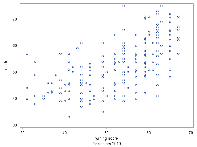
proc sgplot data = hsb sganno=anno pad=(bottom=35);
 scatter x = write y = math;
 xaxis display=(nolabel);
 run;
The above graph has slightly more space between the separate lines on the x-axis labels than the graph above it. We can adjust the y1 values to widen or narrow this space as we please.
