Introduction
The first example uses the quartet data file. You can copy and paste this data step into the program editor to run the examples below.
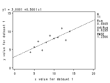
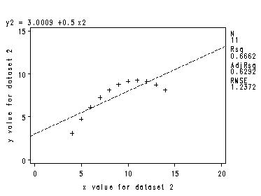
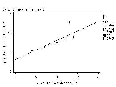
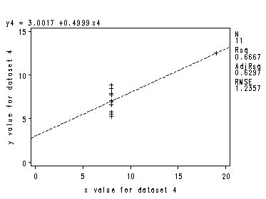
Page 34, Figure 3.1. We use the regression procedure in SAS to draw a scatterplot and regression line.
proc reg data=quartet;
  model y1=x1;
  plot y1*x1 /vaxis=(0 to 15 by 5) haxis=(0 to 20 by 5);
  label x1='x value for dataset 1';
  label y1 ='y value for dataset 1';
run;
quit;
proc reg data=quartet;
  model y2=x2;
  plot y2*x2 /vaxis=(0 to 15 by 5) haxis=(0 to 20 by 5);
  label x2='x value for dataset 2';
  label y2 ='y value for dataset 2';
run;
quit;
proc reg data=quartet;
  model y3=x3;
  plot y3*x3 /vaxis=(0 to 15 by 5) haxis=(0 to 20 by 5);
  label x3='x value for dataset 3';
  label y3 ='y value for dataset 3';
run;
quit;
proc reg data=quartet;
  model y4=x4;
  plot y4*x4 /vaxis=(0 to 15 by 5) haxis=(0 to 20 by 5);
  label x4='x value for dataset 4';
  label y4 ='y value for dataset 4';
run;
quit;
Section 3.1
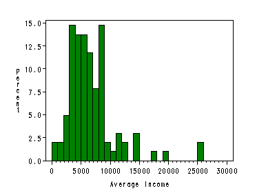
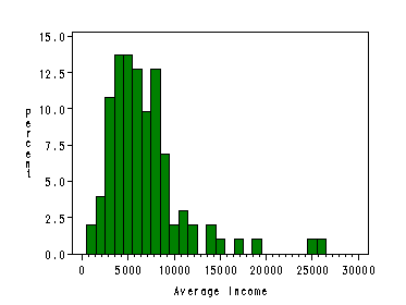
Page 37, figure 3.2. We use the histogram statement in proc capability to generate the desired histograms. By specifying the midpoints, we can create those histograms accordingly. These examples use the prestige data.
axis1 order=(0 to 30000 by 5000);
axis2 order=(0 to 15.0 by 2.5);
proc capability data=prestige noprint;
  histogram income / midpoints=500 to 29000 by 1000
  haxis=axis1
  cfill=green;
  label income='Average Income';
run;
quit;
axis1 order=(0 to 30000 by 5000);
axis2 order=(0 to 15.0 by 2.5);

proc capability data=prestige noprint;
  histogram income/ midpoints=1000 to 29000 by 1000
  haxis=axis1 cfill=green;
  label income='Average Income';
run;
quit;
Page 38, figure 3.3. This is a stem and leaf plot. Proc univariate gives stem-leaf plots when the plot option is specified (we also include the plotsize option to control the size of the plot). The output also includes the basic statistics on our variable income and normal probability plot. Here we omit most of them.
proc univariate data=prestige plots  plotsize=30;
  var income;
run;

The UNIVARIATE Procedure
Variable:  income

Quantile      Estimate

100% Max       25879.0
99%            25308.0
95%            14163.0
90%            11030.0
75% Q3          8206.0
50% Median      5930.5
25% Q1          4075.0
10%             3016.0
5%              2448.0
1%               918.0
0% Min           611.0

The UNIVARIATE Procedure
Variable:  income

         Extreme Observations

----Lowest----        ----Highest----

Value      Obs         Value      Obs

  611       63         14558       25
  918       53         17498       26
 1656       68         19263       17
 1890       73         25308       24
 2370       54         25879        2


   Stem Leaf                     #  Boxplot
     25 39                       2     *
     24
     23
     22
     21
     20
     19 3                        1     0
     18
     17 5                        1     0
     16
     15
     14 026                      3     0
     13                                |
     12 45                       2     |
     11 004                      3     |
     10 4                        1     |
      9 36                       2     |
      8 0000123344889999        16  +-----+
      7 01145679                 8  |     |
      6 012335566799            12  |  +  |
      5 1111234566889           13  *-----*
      4 01223345677788          14  +-----+
      3 001125556667999         15     |
      2 44689                    5     |
      1 79                       2     |
      0 69                       2     |
        ----+----+----+----+
    Multiply Stem.Leaf by 10**+3
We skip figure 3.4 on Page 40 for the time being.
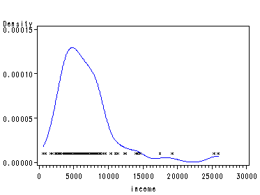
Figure 3.5 on Page 41 shows an example of a kernel density estimator which can be obtained in SAS with proc kde followed by proc gplot. The new variable mycount in the dataset pkdeout was created for the purpose of the one-dimensional scatterplot on the bottom of our kernel density plot.
proc kde data=prestige out=pkde;
  var income;
run;
data pkdeout;
  set pkde;
  if count ne 0 then mycount=0.00001;
run;

proc sort data=pkdeout;
  by income;
run;
axis2 order=(0 to 0.00015 by 0.00005);
symbol1 c=blue i=join v=none height=1;
symbol2 c=black i=none v=star height=0.5;
proc gplot data=pkdeout;
  plot density*income=1 mycount*income=2 / haxis=axis1 vaxis=axis2 overlay;
run;
quit;
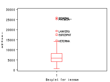
Page 47, figure 3.11. Proc boxplot does not do one variable boxplot itself. So we first get a new dataset with a second variable to plot by. Then we use proc boxplot to plot income by a as the group variable. The outliers are labels with their occupation titles.
data mypre;
  set prestige;
  a=1; * our second variable to plot by ;
run;

proc boxplot data=mypre;
  plot income*a / boxstyle=schematicid boxwidth=10;
  id title;
  label a='Boxplot for income';
run;
quit;
Section 3.2
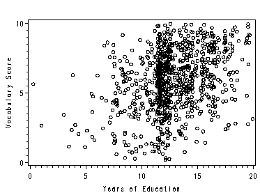
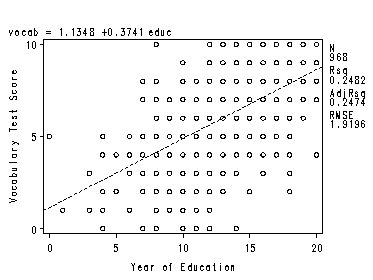
Page 51, figure 3.12 We can use proc reg with the plot statement inside it to obtain a scatterplot like figure 3.12. This example uses the vocab data file.
axis1 order=(0 to 20 by 5);
axis2 order=(0 to 10 by 5)label=(r=0 a=90);
symbol c=black i=none v=circle height=0.8;
proc reg data=vocab;
  model vocab=educ;
  plot vocab*educ/haxis=(0 to 20 by 5) vaxis=(0 to 10 by 5);
  label educ='Year of Education';
  label vocab='Vocabulary Test Score';
run;
quit;
SAS does not have a procedure that can give a specific amount of jitter to a dataset and then plot it. So we create a dataset with jitter and then use proc gplot to obtain the graph. You can also go to the SAS website http://support.sas.com/kb/24/923.html to see a slightly different way of jittering.
data Jitter;
  set vocab;
  retain seed 0;
  educ=educ+1.2*(Ranuni(seed)-0.5); /* Add Some Random Noise */
  vocab=vocab+4*(ranuni(seed)-0.5);
run;
axis1 order=(0 to 20 by 5);
axis2 order=(0 to 10 by 5)label=(r=0 a=90);

proc gplot data=Jitter;
  plot vocab*educ / haxis=axis1 vaxis=axis2;
  label educ='Years of Education';
  label vocab='Vocabulary Score';
run;
quit;
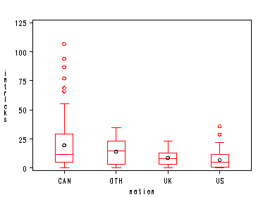
Page 52, figure 3.14 Proc boxplot simply does side by side boxplots for the same variable. This example uses the ornstein data file.
proc sort data=ornstein;
  by nation;
run;

proc boxplot data=ornstein;
  plot intrlcks*nation / boxstyle=schematic idsymbol=circle;
run;
quit;
Section 3.3
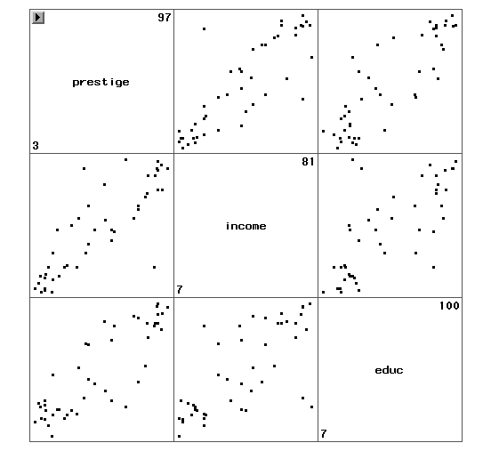
Page 54, figure 3.15 shows a scatterplot matrix. One way to get this is to use INSIGHT within SAS by clicking solutions then analysis then interactive data analysis from the SAS pulldown menus. This example uses the duncan data file.
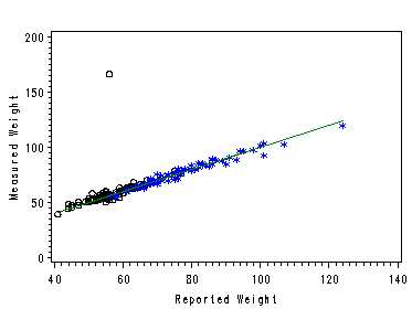
Page 55, figure 3.16. This example shows the scatterplot of measwt by reptwt for male and females combined, with the reference line X=Y for both groups. We create a new dataset with new variables fmeaswt and mmeaswt. Then we can simply plot them using the overlay option of proc gplot. In our plot, circle is for female and star is for male. This uses the davis data file.
data davisSep;
  set davis;
  if male =1 then mmeaswt=measwt;
  else if male =0 then fmeaswt=measwt;
run;
symbol1 c=black i=none v=circle height=1;
symbol2 c=blue i =none v=star height=1;
symbol3 c=green i =join v=none height=1;
axis1 order=(40 to 140 by 20);
axis2 order=(0 to 200 by 50)label=(r=0 a=90);
proc gplot data=davisSep;
  plot  fmeaswt*reptwt =1  mmeaswt*reptwt=2
  reptwt*reptwt=3/overlay haxis=axis1 vaxis=axis2;
  label reptwt='Reported Weight';
  label fmeaswt='Measured Weight';
run;
quit;
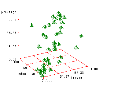
Using proc g3d, we can plot 3D scatterplot. But SAS does not have an option for overlay in G3D, therefore, we can not easily put the regression plane with the scatterplot.
symbol1 c=black i=none v=circle height=1;

proc g3d data=duncan;
  scatter educ* income = prestige / noneedle rotate=30;
run;
