This page shows how to obtain the results and graphical figures displayed in Hamilton’s Chapter 2 using SAS. The concord1 and oilspill datasets are used.
Scatterplots and Regression
Figure 2.3, page 35. We use the macro %boxanno here which outputs the annotated dataset necessary for creating the figure. We use proc gplot with two axis statements to produce the correct labeling and a symbol statement. Additionally the anno= statement is needed to use the annotated dataset created by the macro %boxanno.
%boxanno(data=concord1,xvar=income,yvar=water81,out=boxanno);
axis1 label=(angle=90 justify=center "Y: Summer 1981 Water Use") ;
axis2 label= (justify= center "X: Income in Thousands");
symbol value=circle;
proc gplot data=concord1 gout=mycat;
plot water81*income / vaxis=axis1
                      haxis=axis2
                      anno=boxanno ;
run;
quit;
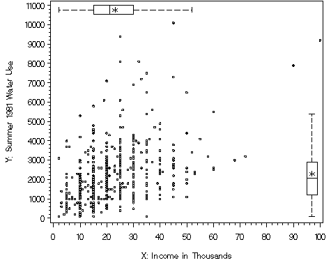
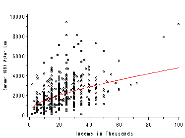
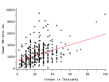
Figure 2.4, page 35. We use proc glplot here with a symbol statement which interpolates the regression line. Another method for this type of plot is shown with Figure 2.15 using proc reg.
The estimates on page 36 were obtained using proc reg. The RSS is listed in the output below as the Sum of Squares for Error. The residual standard deviation is the root mse. This procedure also produces the estimates in Table 2.1 on page 41.
proc reg data=concord1;
    model water81=income;
    output out=concord1b p=pw81 r=rw81;
run;
quit;
The REG Procedure
Model: MODEL1
Dependent Variable: WATER81 Summer 1981 Water Use

                             Analysis of Variance

                                    Sum of           Mean
Source                   DF        Squares         Square    F Value    Pr > F

Model                     1      190820566      190820566     104.46    <.0001
Error                   494      902418143        1826757
Corrected Total         495     1093238710


Root MSE           1351.57589    R-Square     0.1745
Dependent Mean     2298.38710    Adj R-Sq     0.1729
Coeff Var            58.80541

                                     Parameter Estimates

                                              Parameter       Standard
Variable     Label                    DF       Estimate          Error    t Value    Pr > |t|

Intercept    Intercept                 1     1201.12436      123.32451       9.74      <.0001
INCOME       Income in Thousands       1       47.54869        4.65229      10.22      <.0001
Predicted Values and Residuals
The predicted values and residuals shown on page 37 were output to a new dataset called concord1b in the previous proc reg with the output statement. This data has variables pw81 and rw81 along with the original variables. The estimates are slightly different due to rounding error and are not in the same order as in the book.
R2, Correlation and Standardized Regression Coefficients
Variances and standard deviations on pages 38-40.
proc means data=concord1b var std;
  var pw81 water81 income;
run;
The MEANS Procedure
Variable    Label                         Variance         Std Dev
------------------------------------------------------------------
pw81        Predicted Value of WATER81   385496.09     620.8833171
WATER81     Summer 1981 Water Use       2208563.05         1486.12
INCOME      Income in Thousands        170.5072499      13.0578425
 ------------------------------------------------------------------
Hypothesis Tests for Regression Coefficients
The estimates, test statistics and p-values in this section were obtained in the previous proc reg.
Confidence Intervals
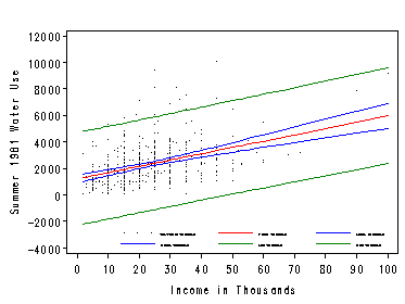
Figure 2.7, page 48. The alpha= option sets the significance level for confidence and prediction intervals. The default is .05 for 95% intervals. Conf and pred graphs the bands. The legend can be modified with the legend1 statement, but not suppressed.
symbol1 value=point cv=black ;      /* scatterplot */
symbol2 ci=red;                     /* reg line */
symbol3 ci=blue; symbol4 ci=blue;   /* ci lines */
symbol5 ci=green; symbol6 ci=green; /* pi lines */

legend1 label=none value=(height=.4 font=swiss)
        position=(bottom right inside);

proc reg data=concord1;
  model water81=income / alpha=.01 noprint;
  plot water81*income  / conf pred
                         legend=legend1
                         nostat nomodel;
run;
quit;
Regression Through the Origin
Output predicted values for a model with an intercept to reg1.
proc reg data=oilspill;
  model lost=spills / noprint;
  output out=reg1 pred=yconst;
Use noint to regress without an intercept and output to reg2.
proc reg data=oilspill;
  model lost=spills / noint noprint;
  output out=reg2 pred=nconst;
Merge the values from both models by year and label the variables.
data reg;
  merge reg1 reg2;
  by year;

  label yconst='with constant'
  nconst='no constant';
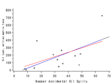
Figure 2.8, page 50. Plot the scatterplot and two regression lines using the overlay option in proc gplot. A spline interpolation with a smoothing constant of 5 yields smoother lines.
axis1 label=(angle=90 height=0.75);
symbol1 value=circle color=black height=.5;
symbol2 value=none   color=blue  interpol=sm5s;
symbol3 value=none   color=red   interpol=sm5s;

proc gplot data=reg;
  plot (lost yconst nconst)*spills / overlay noframe
                                     vaxis=axis1 vminor=1
                                     hminor=0;
run;
quit;
Residual Analysis
Residual plots can be produced in SAS with the plot option in proc reg. However, this does not graph marginal boxplots. We plot the residual graph two ways here, with and without boxplots. For the plot without marginal boxplots we need not output the predicted and residual values. Instead use the residual. and predicted. keywords available in proc reg.
proc reg data=concord1;
  model water81=income / noprint;
  plot  residual.*predicted.  / nostat nomodel;
run;
quit;
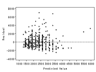
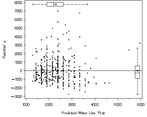
Figure 2.9, page 52. We use the macro %boxanno here which outputs the annotated dataset necessary for creating the figure with marginal boxplots. We use proc gplot with two axis statements to produce the correct labeling and a symbol statement. The vref= statement adds the reference line at 0. Additionally the anno= statement is needed to use the annotated dataset created by the macro %boxanno.
%boxanno(data=c,xvar=pred,yvar=resid, out=boxanno);
axis1 label=(angel=90 justify=center "Residual: e");
axis2 label=(justify=center "Predicted Water Use: Yhat");
symbol1 value=circle;
proc gplot data=c gout=mycat;
plot residual.*predicted. / vaxis=axis1
			    vref=0
			    haxis=axis2
			    anno=boxanno;
run;
quit;
Power Transformations in Regression
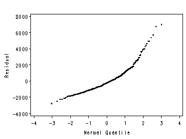
Figure 2.12, page 54. We plot this graph 2 ways here also using proc reg and proc univariate, since the first method does not graph the reference line for the Normal distribution. Method 1: using keywords in proc reg (no reference line):
symbol1 value=circle height=0.25;

proc reg data=concord1;
  model water81=income / noprint;
   plot residual.*nqq. / nostat nomodel noline
   haxis=(-4 to 4);
run;
quit;
Method 2: using qqplot in proc univariate (has line):
proc univariate data=concord1b noprint;
  var rw81;
  qqplot / normal(mu=est sigma=est color=red);
run;
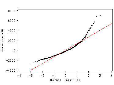
Figure 2.13, page 54 is skipped. The method is the same as Fig 2.14. Figure 2.14, page 55. We first transform income and water81.
data concord1c;
  set concord1;
  cvar = 0; /* need for boxplot */

  inc_3 = income**.3;
  wtr81_3 = water81**.3;

  label inc_3 = 'Income to .3 Power'
      wtr81_3 = 'Water Use to .3 Power';
run;
Turn off graphics display and clear graphics catalog mycat. Then plot each graph individually and output to mycat.
goptions nodisplay;
proc greplay igout=mycat tc=tempcat nofs;
  delete _all_;
run;
Top left histogram.
proc univariate data=concord1c gout=mycat noprint;
  var inc_3;
  histogram / normal(color=red)
              cbarline=black
              cfill=grey
              vaxis=(0 to 40 by 10)
              midpoints=(1.1667 to 3.8333 by .3333)
              noframe;
run;
Bottom left symmetry plot: This example has been removed.
Top right boxplot.
axis2 label=none value=none major=none minor=none;

proc boxplot data=concord1c gout=mycat;
  plot inc_3*cvar / cboxes=black
                    noframe
                    boxstyle=schematic
                    haxis=axis2
                    vaxis=(1 to 4 by 1);
run ;
Bottom right quantile normal plot. Using the scale in Figure 2.14 would require plotting the quantiles of the inverse normal distribution on the x-axis. This is not currently a SAS option.
symbol1 value=circle height=0.4;

proc univariate data=concord1c noprint gout=mycat;
  var inc_3;
  qqplot / normal(mu=est sigma=est color=red)
           noframe;
run;
quit;
Turn graphics display back on and replay the four graph in mycat together using SAS’ l2r2 template.
goptions display;

proc greplay nofs igout=mycat tc=sashelp.templt template=l2r2;
  treplay 1:univar 2:gplot 3:boxplot 4:univar1 ;
run;
quit;
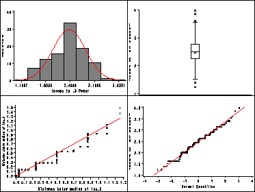
Table 2.3, page 55.
proc reg data=concord1c;
  model wtr81_3 = inc_3;

proc means data=concord1c mean n;
  var wtr81_3 inc_3;
run;
quit;
The REG Procedure
Model: MODEL1
 Dependent Variable: wtr81_3 Water Use to .3 Power

                             Analysis of Variance

                                    Sum of           Mean
Source                   DF        Squares         Square    F Value    Pr > F

Model                     1       370.33707        370.33707       126.22     <.0001
Error                   494      1449.41669          2.93404
Corrected Total         495      1819.75376


Root MSE              1.71290     R-Square      0.2035
Dependent Mean        9.77698     Adj R-Sq     0.2019
Coeff Var            17.51977

                                     Parameter Estimates

                                              Parameter       Standard
Variable     Label                    DF       Estimate          Error    t Value    Pr > |t|

Intercept    Intercept                 1        4.98901         0.43306       11.52       <.0001
 inc_3          Income to .3 Power         1        1.93454         0.17219       11.23       <.0001

The MEANS Procedure
Variable    Label                          Mean      N
-------------------------------------------------------
 wtr81_3     Water Use to .3 Power     9.7769822     496
inc_3       Income to .3 Power        2.4749983     496
-------------------------------------------------------
Figure 2.15, page 56. The plot statement in proc reg is used. Nostat suppresses the statistics from being displayed in the margin of the graph and noprint suppresses the regression output. The predicted and residual values are output for Figure 2.16.
symbol1 value=circle height=.5 cv=black ci=red;

proc reg data=concord1c;
  model wtr81_3=inc_3 / noprint;
  plot  wtr81_3*inc_3 / nostat nomodel
                        haxis=(1 to 4)
                        vaxis=(4 to 16 by 2);
  output out=ests2 p=pw81_3 r=rw81_3;
run;
quit;
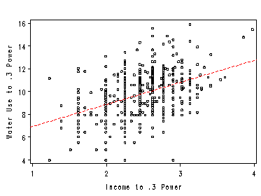
Figure 2.16, page 56.
We have skipped this example
Understanding Curvilinear Regression
Before graphing we must first convert the transformed predicted values back into the natural units with an inverse transformation.
data ests3;
  set ests2;
  pw81_i3 = pw81_3**(1/.3);
run;
Figure 2.17, page 58. The regression curve is plotted by overlaying the values returned by the inverse transformation using a spline interpolation with a smoothing constant of 10.
symbol1 interpol=none value=circle cv=black height=.5 ;
symbol2 interpol=sm10s value=none ci=red;
axis1 order=(0 to 10000 by 2000) label=(angle=90 height=.75);
axis2 order=(0 to 100 by 20);

proc gplot data=ests3;
  plot (water81 pw81_i3)*income / overlay noframe
                                  vaxis=axis1 vminor=1
                                  haxis=axis2 hminor=1;
run;
quit;
