This page is updated for SAS 9.2 on May 12, 2009.
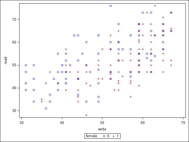
Suppose we are using the High School and Beyond data file (hsb2) which has test scores for 200 students, 91 males and 109 females. We are going to look at the relationship between the reading score and the writing score by gender. The easiest way for creating such a plot with different symbols for different gender is to use proc sgplot using the option group, which allows us to specify a group variable.
ods graphics on;
proc sgplot data = hsb2;
  scatter x = write y = read /group=female;
run;

The example below shows how to create a similar graph using proc gplot. This can be done by using variable female as the third variable in the plot statement, and optionally using more symbol statements.
goptions reset = all;
symbol1 v=star c=red h=1;
symbol2 v=triangle c=blue h=1;
proc gplot data = hsb2;
  plot read*write=female;
run;
quit;

