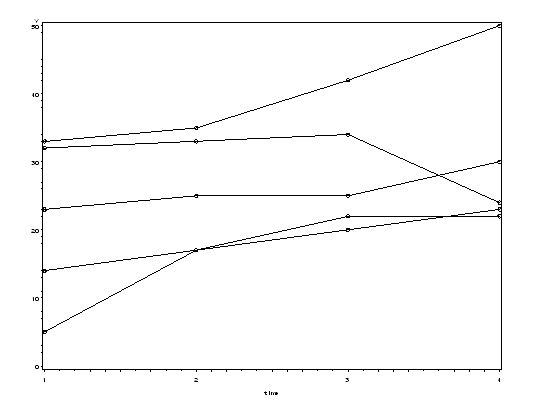
Longitudinal data are data containing measurements on subjects at multiple times. Visualizing longitudinal data without loss of data can be difficult, but it is possible to do so in SAS. Once your dataset is in the appropriate configuration, proc gplot allows you to generate plots with time on the horizontal axis and levels of an outcome on the vertical axis. Graphing options allow you connect the related points (points from a single subject or from a specified group) with a line. This type of plot allows you to trace the levels of the outcome variable over time for a given subject and can often reveal larger patterns that may be of interest.
If your dataset is "wide" (each time point is represented as its own variable and the measured responses are the values found in the multiple time variables), then you will need to convert your data to long form in order to visualize your data using proc gplot.
Obs    id    time1    time2    time3    time4

 1      1      23       25       25       30
 2      2      14       17       20       23
 3      3      32       33       34       24
 4      4      33       35       42       50
 5      5       5       17       22       22
The dataset above contains four measurements on five subjects in wide form. For details on how to reconfigure such a dataset to long form, see the "Reshaping Wide to Long" section of the SAS arrays seminar. Below, we have the same dataset in long form.
Obs    id    time     y

  1     1      1     23
  2     1      2     25
  3     1      3     25
  4     1      4     30
  5     2      1     14
  6     2      2     17
  7     2      3     20
  8     2      4     23
  9     3      1     32
 10     3      2     33
 11     3      3     34
 12     3      4     24
 13     4      1     33
 14     4      2     35
 15     4      3     42
 16     4      4     50
 17     5      1      5
 18     5      2     17
 19     5      3     22
 20     5      4     22
If you dataset is "long" (there is one variable indicating time and another variable with the measured response from the given time value), then proc gplot will allow you to visualize your data without reconfiguring it. We can indicate the variables represented on our vertical and horizontal axes as we would in an ordinary gplot, and then indicate how the records are grouped with = (groupvar). In this case, we are interested in grouping the records by id. In order to join the points associated with one id, we need to indicate "join" as part of our symbol options.
symbol1 value = circle color = black interpol = join repeat = 5;

proc gplot;
  plot y*time = id / nolegend;
run;
We can see the plot generated by the above code includes all of the information in our dataset with one line for each id. For more ways to plot longitudinal data in SAS, see Chapter 2 of Modeling Longitudinal Data and Chapter 2 of Applied Longitudinal Data Analysis.

