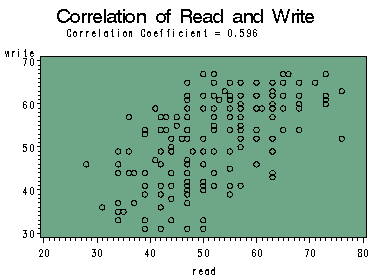
The correlation coefficient measures the strength of relations between two variables. Sometime, we may want to visualize relationship between two variables with a given correlation coefficient. This page shows a SAS macro that we developed for these purposes.
This link will take you to a SAS macro called %corrgraph. This link will take you to the help file for %corrgraph.
Using %corrgraph
This macro takes a data file and two numeric variables in the data file. It calculates the correlation coefficient of the two variables and displays the correlation coefficient of the scatter plot of the two variables. A few examples are shown below.
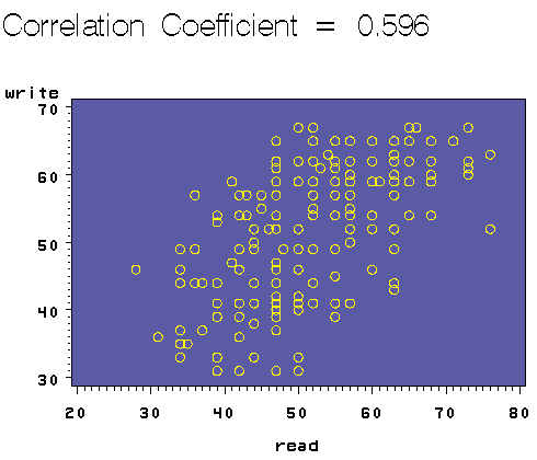
By only specifying the name of the data set and the two variables, the scatter plot will be in SAS graph display window. For example, using the hsb2 data file you can graph the write by read as shown below and the result will show in the SAS graph display window.
%corrgraph(data="c:sasdatahsb2", varx=read, vary=write)
and the graph will look like this
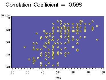
Sometimes you may want to save the graph to a file. The simplest thing to do is to save it to a gif file by specifying the physical location and the name of the file such as the following. We saved the graph to a file called https://stats.idre.ucla.edu/wp-content/uploads/2016/02/cor1.gif in directory c:temp.
%corrgraph(data="c:sasdatahsb2", varx=read, vary=write, outfile="c:temphttps://stats.idre.ucla.edu/wp-content/uploads/2016/02/cor1.gif")
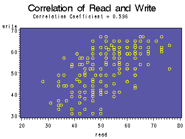
You can add your own title to the plot. For example, we can add the title "Correlation of Read and Write" as shown below.
%corrgraph(data="c:sasdatahsb2", varx=read, vary=write, outfile="c:temphttps://stats.idre.ucla.edu/wp-content/uploads/2016/02/cor2.gif",
  title="Correlation of Read and Write)
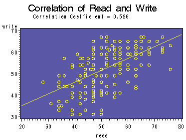
You can also add regression line to the plot by adding the symbol option i=r as shown below.
%corrgraph(data="c:sasdatahsb2", varx=read, vary=write, outfile="c:temphttps://stats.idre.ucla.edu/wp-content/uploads/2016/02/cor3.gif",
  title="Correlation of Read and Write",symbol=i=r)
Similarly, you can change the background color or the symbol shape by adding corresponding statements. For example, the following call of the macro %corrgraph creates a graph with light green background and black symbol color.
%corrgraph(data="c:sasdatahsb2", varx=read, vary=write, outfile="c:temphttps://stats.idre.ucla.edu/wp-content/uploads/2016/02/cor4.gif",
  title="Correlation of Read and Write", symbol=c=black, plot=cframe=lig)

