1. Introduction and description of data
This module demonstrates how to obtain basic high resolution graphics using SAS 9.3. This example uses a data file about 26 automobiles with their make, mpg, repair record, weight, and whether the car was foreign or domestic. The program below reads the data and creates a temporary data file called auto. The graphs shown in this module are all performed on this data file called auto.
DATA auto ;
  INPUT make $  mpg rep78 weight foreign ;
CARDS;
AMC     22 3 2930 0
AMC     17 3 3350 0
AMC     22 . 2640 0
Audi    17 5 2830 1
Audi    23 3 2070 1
BMW     25 4 2650 1
Buick   20 3 3250 0
Buick   15 4 4080 0
Buick   18 3 3670 0
Buick   26 . 2230 0
Buick   20 3 3280 0
Buick   16 3 3880 0
Buick   19 3 3400 0
Cad.    14 3 4330 0
Cad.    14 2 3900 0
Cad.    21 3 4290 0
Chev.   29 3 2110 0
Chev.   16 4 3690 0
Chev.   22 3 3180 0
Chev.   22 2 3220 0
Chev.   24 2 2750 0
Chev.   19 3 3430 0
Datsun  23 4 2370 1
Datsun  35 5 2020 1
Datsun  24 4 2280 1
Datsun  21 4 2750 1
;
RUN;
2. Creating charts with proc gchart
We create vertical Bar Charts with proc gchart and the vbar statement. The program below creates a vertical bar chart for mpg.
TITLE 'Simple Vertical Bar Chart ';
PROC GCHART DATA=auto;
      VBAR mpg;
RUN;
This program produces the following chart.
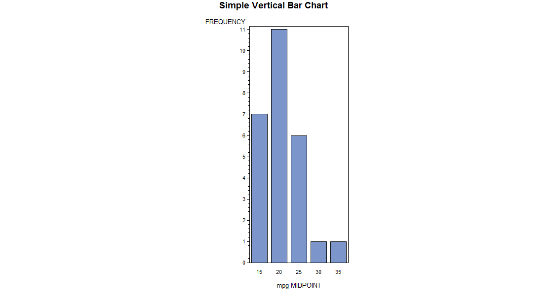
The vbar statement produces a vertical bar chart, and while optional the title statement allows you to label the chart. Since mpg is a continuous variable the automatic “binning” of the data into five groups yields a readable chart. The midpoint of each bin labels the respective bar.
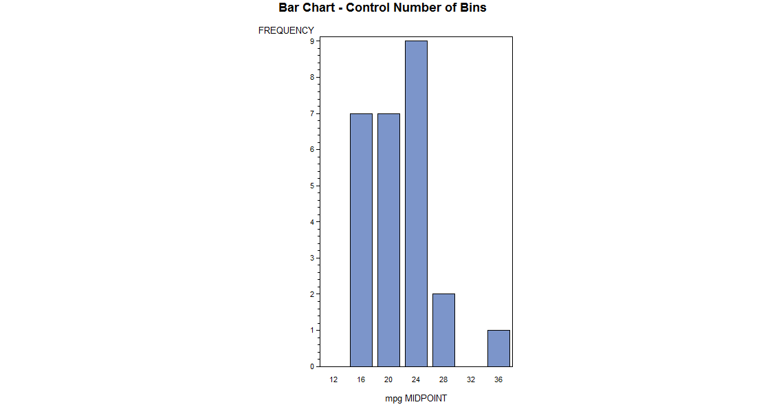
You can control the number of bins for a continuous variable with the level= option on the vbar statement. The program below creates a vertical bar chart with seven bins for mpg.
TITLE 'Bar Chart - Control Number of Bins';
PROC GCHART DATA=auto;
     VBAR mpg/LEVELS=7;
RUN;
This program produces the following chart.
On the other hand, rep78 has only four categories and SAS’s tendency to bin into five categories and use midpoints would not do justice to the data. So when you want to use the actual values of the variable to label each bar you will want to use the discrete option on the vbar statement.
TITLE 'Bar Chart with Discrete Option';
PROC GCHART DATA=auto;
      VBAR rep78/ DISCRETE;
RUN;
This program produces the following chart.
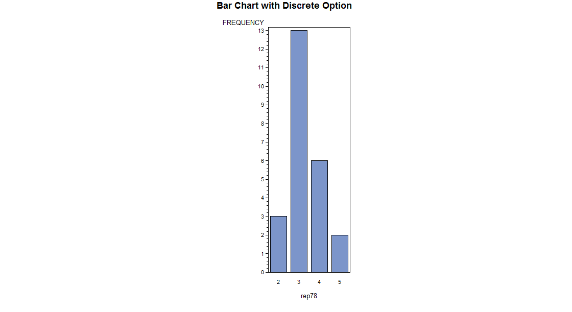
Notice that only the values in the dataset for rep78 appear in the bar chart.
Other charts may be easily produced simply by changing vbar. For example, you can produce a horizontal bar chart by replacing vbar with hbar.
TITLE 'Horizontal Bar Chart with Discrete';
PROC GCHART DATA=auto;
      HBAR rep78/ DISCRETE;
RUN;
This program produces the following horizontal bar chart.
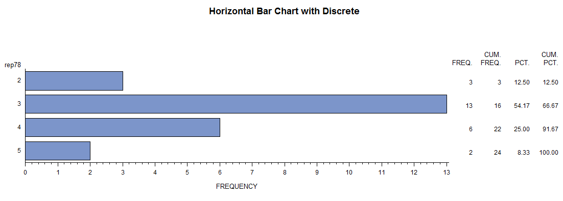
Use the discrete option to insure that only the values in the dataset for rep78 label bars in the bar chart. With hbar you automatically obtain frequency, cumulative frequency, percent, and cumulative percent to the right of each bar.
You can produce a pie chart by replacing hbar in the above example with pie. The value=, percent=, and slice= options control the location of each of those labels.
TITLE 'Pie Chart with Discrete';
PROC GCHART DATA=auto;
      PIE rep78/ DISCRETE VALUE=INSIDE
                 PERCENT=INSIDE SLICE=OUTSIDE;
RUN;
This program produces the following pie chart.
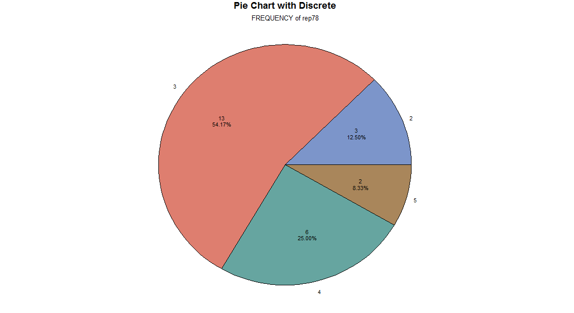
Use the discrete option to insure that only the values in the dataset for rep78 label slices in the pie chart.
value=inside causes the frequency count to be placed inside the pie slice. percent=inside causes the percent to be placed inside the pie slice.
slice=outside causes the label (value of rep78) to be placed outside the pie slice.
We have shown only some of the charts and options available to you. Additionally you can create city block charts (block) and star charts (star), and use options and statements to further control the look of charts.
3. Creating Scatter plots with proc gplot
To examine the relationship between two continuous variables you will want to produce a scattergram using proc gplot, and the plot statement. The program below creates a scatter plot for mpg*weight. This means that mpg will be plotted on the vertical axis, and weight will be plotted on the horizontal axis.
TITLE 'Scatterplot - Two Variables';
PROC GPLOT DATA=auto;
     PLOT mpg*weight ;
RUN;
This program produces the following scattergram.
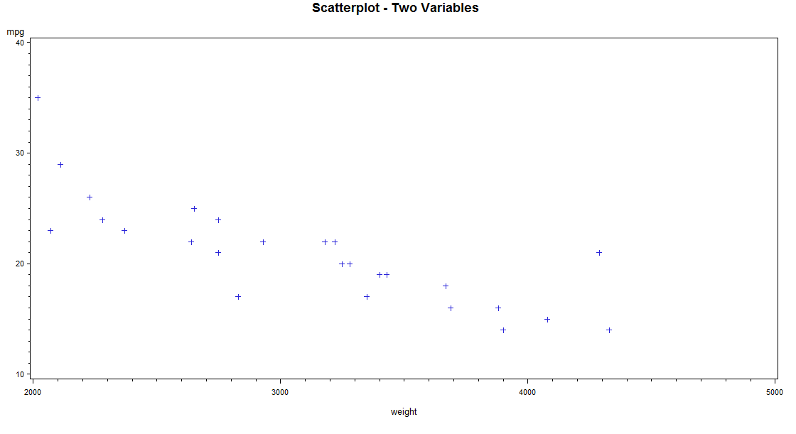
You can easily tell that there is a negative relationship between mpg and weight. As weight increases mpg decreases.
You may want to examine the relationship between two continuous variables and see which points fall into one or another category of a third variable. The program below creates a scatter plot for mpg*weight with each level of foreign marked. You specify mpg*weight=foreign on the plot statement to have each level of foreign identified on the plot.
TITLE 'Scatterplot - Foreign/Domestic Marked';
PROC GPLOT DATA=auto;
     PLOT mpg*weight=foreign;
RUN;
This program produces the following scattergram with each foreign and domestic marked.
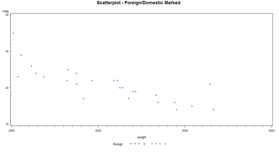
You can easily tell which level of foreign you are looking at, as values of zero are in black and values of 1 are in red. Since the default symbol is plus for both, if this graph is printed in black and white you will not be able to tell the levels of foreign apart. The next example demonstrates how to use different symbols in scattergrams.
4. Customizing with proc gplot and symbol statements
The program below creates a scatter plot for mpg*weight with each level of foreign marked. The proc gplot is specified exactly the same as in the previous example. The only difference is the inclusion of symbol statements to control the look of the graph through the use of the operands V=, I=, and C=.
SYMBOL1 V=circle C=black I=none;
SYMBOL2 V=star   C=red   I=none;

TITLE 'Scatterplot - Different Symbols';
PROC GPLOT DATA=auto;
     PLOT mpg*weight=foreign;
RUN;
QUIT;
Symbol1 is used for the lowest value of foreign which is zero (domestic cars), and symbol2 is used for the next lowest value which is one (foreign cars) in this case.
V= controls the type of point to be plotted. We requested a circle to be plotted for domestic cars, and a star (asterisk) for foreign cars. I= none causes SAS not to plot a line joining the points.
C= controls the color of the plot. We requested black for domestic cars, and red for foreign cars. (Sometimes the C= option is needed for any options to take effect.)
This program produces the following scatter plot with each foreign and domestic marked and with different symbols.
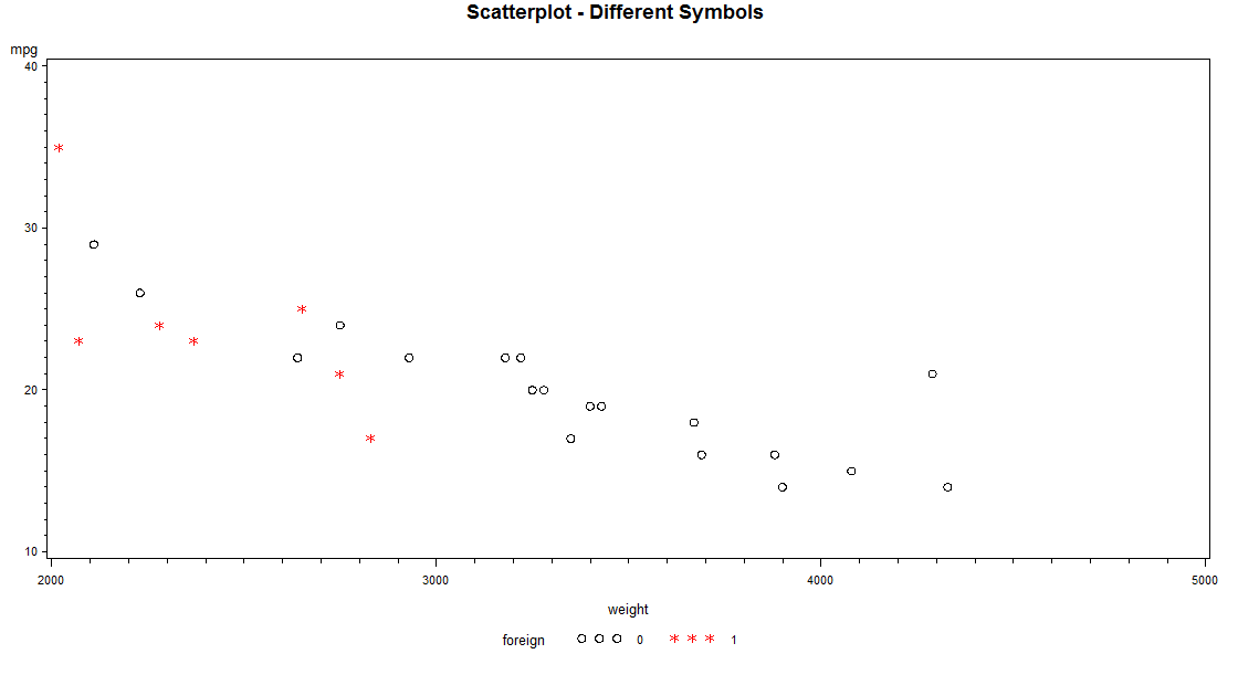
You can easily tell which level of foreign you are looking at, as values of zero are marked with circles in black and values of 1 are marked with asterisks in red. Now if this graph is printed in black and white you will be able to tell the levels of foreign apart.
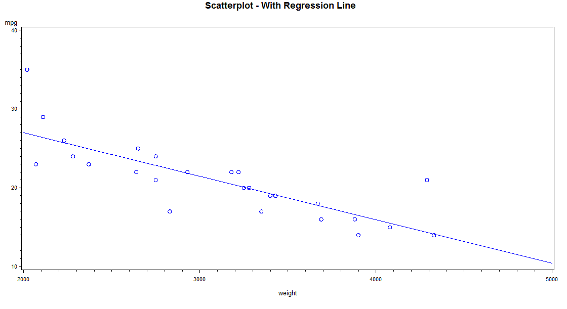
At times it is useful to plot a regression line along with the scatter gram of points. The program below creates a scatter plot for mpg*weight with such a regression line. The regression line is produced with the I=R operand on the symbol statement.
SYMBOL1 V=circle C=blue I=r;

TITLE 'Scatterplot - With Regression Line ';
PROC GPLOT DATA=auto;
     PLOT mpg*weight ;
RUN;
QUIT;
The symbol statement controls color, the shape of the points, and the production of a regression line.
I=R causes SAS to plot a regression line. V=circle causes a circle to be plotted for each case.
C=blue causes the points and regression line to appear in blue. Always specify the C= option to insure that the symbol statement takes effect.
This program produces the following scattergram with using blue circles and plotting a regression line.
5. Problems to look out for
- If SAS seems to be ignoring your symbol statement, then try including a color specification (C=).
- Avoid using the discrete option in proc chart with truly continuous variables, for this causes problems with the number of bars.
6. For more information
- For information on Labeling in SAS, see the SAS Learning Module Labeling data, variables, and values.
