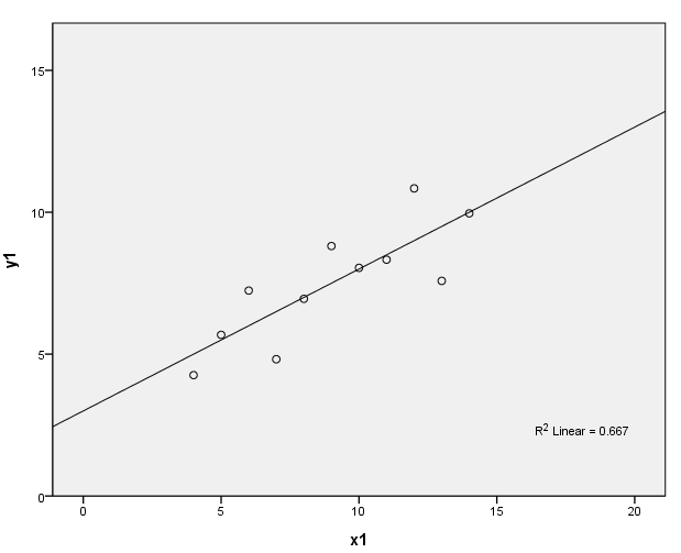
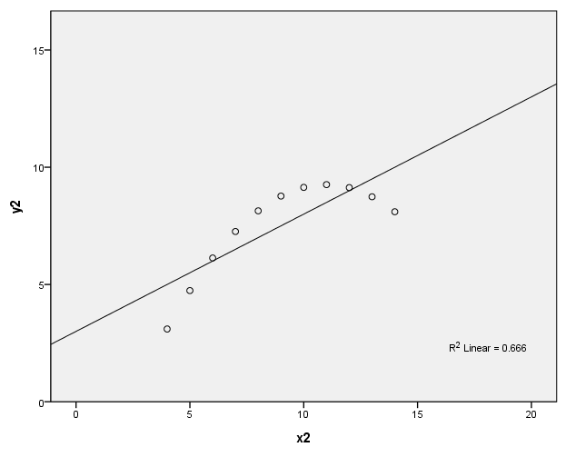
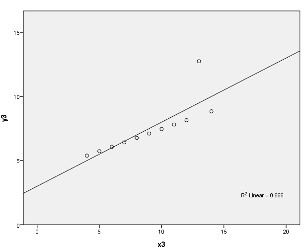
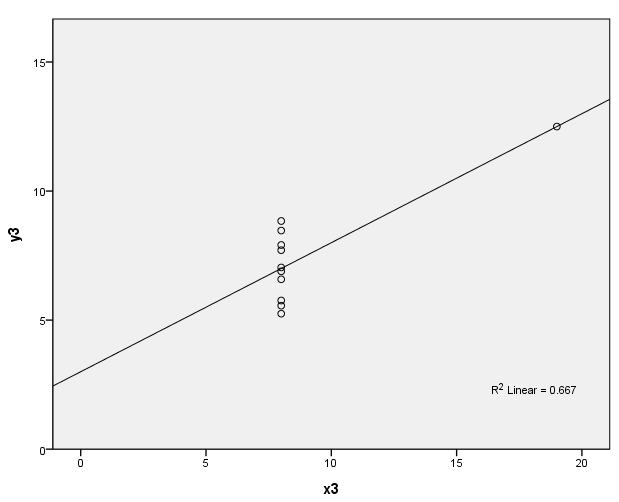
page 34 Figure 3.1 Four datasets, due to Anscombe (1973), with identical least-squares regressions. In (a), the linear regression is an accurate summary; in (b), the linear regression distorts the curvilinear relationship between Y and X; in (c), the linear regression is drawn toward an outlier; in (d), the linear regression "chases" the influential observation at the right.
get file 'd:quartet.sav'.
(a)
formats x1 to y4 (f2.0).
GGRAPH
  /GRAPHDATASET NAME="GraphDataset" VARIABLES= y1 x1
  /GRAPHSPEC SOURCE=INLINE
      INLINETEMPLATE=["<addFitLine  type='linear' target='pair'/> "].
BEGIN GPL
SOURCE: s=userSource( id( "GraphDataset" ) )
DATA: y1=col( source(s), name( "y1" ) )
DATA: x1=col( source(s), name( "x1" ) )
GUIDE: axis( dim( 1 ), label( "x1" ), start(0.0), delta(5) )
GUIDE: axis( dim( 2 ), label( "y1" ) )
SCALE: linear( dim( 1 ), min(0), max(20) )
SCALE: linear( dim( 2 ), min(0), max(15) )
ELEMENT: point( position( ( x1 * y1 ) ) )
END GPL.
(b)
GGRAPH
  /GRAPHDATASET NAME="GraphDataset" VARIABLES= y2 x2
  /GRAPHSPEC SOURCE=INLINE
      INLINETEMPLATE=["<addFitLine  type='linear' target='pair'/> "].
BEGIN GPL
SOURCE: s=userSource( id( "GraphDataset" ) )
DATA: y2=col( source(s), name( "y2" ) )
DATA: x2=col( source(s), name( "x2" ) )
GUIDE: axis( dim( 1 ), label( "x2" ), start(0.0), delta(5) )
GUIDE: axis( dim( 2 ), label( "y2" ) )
SCALE: linear( dim( 1 ), min(0), max(20) )
SCALE: linear( dim( 2 ), min(0), max(15) )
ELEMENT: point( position( ( x2 * y2 ) ) )
END GPL.
(c)
GGRAPH
  /GRAPHDATASET NAME="GraphDataset" VARIABLES= y3 x3
  /GRAPHSPEC SOURCE=INLINE
      INLINETEMPLATE=["<addFitLine  type='linear' target='pair'/> "].
BEGIN GPL
SOURCE: s=userSource( id( "GraphDataset" ) )
DATA: y3=col( source(s), name( "y3" ) )
DATA: x3=col( source(s), name( "x3" ) )
GUIDE: axis( dim( 1 ), label( "x3" ), start(0.0), delta(5) )
GUIDE: axis( dim( 2 ), label( "y3" ) )
SCALE: linear( dim( 1 ), min(0), max(20) )
SCALE: linear( dim( 2 ), min(0), max(15) )
ELEMENT: point( position( ( x3 * y3 ) ) )
END GPL.
(d)
GGRAPH
  /GRAPHDATASET NAME="GraphDataset" VARIABLES= y4 x4
  /GRAPHSPEC SOURCE=INLINE
      INLINETEMPLATE=["<addFitLine  type='linear' target='pair'/> "].
BEGIN GPL
SOURCE: s=userSource( id( "GraphDataset" ) )
DATA: y4=col( source(s), name( "y4" ) )
DATA: x4=col( source(s), name( "x4" ) )
GUIDE: axis( dim( 1 ), label( "x3" ), start(0.0), delta(5) )
GUIDE: axis( dim( 2 ), label( "y3" ) )
SCALE: linear( dim( 1 ), min(0), max(20) )
SCALE: linear( dim( 2 ), min(0), max(15) )
ELEMENT: point( position( ( x4 * y4 ) ) )
END GPL.
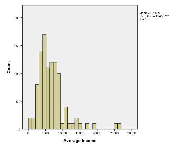
page 37 Figure 3.2 distribution of average income for 102 occupations in the Canadian occupational prestige data. The histograms both use bins of width 1000; histogram (a) employs bins that start at 0, while (b) employs bins that start at 500.
get file 'd:prestige.sav'.
(a)
GGRAPH
  /GRAPHDATASET NAME="GraphDataset" VARIABLES= income
  /GRAPHSPEC SOURCE=INLINE .
BEGIN GPL
SOURCE: s=userSource( id( "GraphDataset" ) )
DATA: count=col( source(s), name( "$count" ) )
DATA: income=col( source(s), name( "income" ) )
GUIDE: axis( dim( 1 ), label( "Average Income" ) )
GUIDE: axis( dim( 2 ), label( "Count" ) )
ELEMENT: interval( position( summary.count( bin.rect(income * 1, binCount( 30 ) ) ) ) )
END GPL.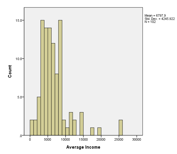
(b)
GGRAPH
  /GRAPHDATASET NAME="GraphDataset" VARIABLES= income
  /GRAPHSPEC SOURCE=INLINE .
BEGIN GPL
SOURCE: s=userSource( id( "GraphDataset" ) )
DATA: count=col( source(s), name( "$count" ) )
DATA: income=col( source(s), name( "income" ) )
GUIDE: axis( dim( 1 ), label( "Average Income" ), start(0.0), delta(5000) )
GUIDE: axis( dim( 2 ), label( "Count" ) )
SCALE: linear( dim( 1 ), min(0), max(30000) )
ELEMENT: interval( position( summary.count( bin.rect(income * 1, binStart( 16.5 ), binCount( 30 ) ) ) ) )
END GPL.
page 38 Figure 3.3 Stem-and-leaf display for average income in the Canadian occupational prestige data.
EXAMINE
  VARIABLES=income
  /PLOT STEMLEAF
  /COMPARE GROUP
  /STATISTICS NONE
  /NOTOTAL.
| |
Cases | |||||
|---|---|---|---|---|---|---|
| Valid | Missing | Total | ||||
| N | Percent | N | Percent | N | Percent | |
| Average income, dollars | 102 | 100.0% | 0 | .0% | 102 | 100.0% |
Average income, dollars Stem-and-Leaf Plot

 Frequency    Stem &  Leaf

     2.00        0 .  69
     2.00        1 .  68
     5.00        2 .  34589
    15.00        3 .  001114445667999
    14.00        4 .  00123345666777
    14.00        5 .  00111245567899
    12.00        6 .  112344556899
     8.00        7 .  01445789
    15.00        8 .  000122344788888
     2.00        9 .  25
     1.00       10 .  4
     3.00       11 .  003
     2.00       12 .  34
      .00       13 .
     2.00       14 .  01
     5.00 Extremes    (>=14558)

 Stem width:      1000
 Each leaf:       1 case(s)
page 40 Figure 3.4 Native density estimator for average income in the Canadian occupational prestige data, using a window half-width of h = 500. Note the roughness of the estimator. A 'one-dimensional scatterplot' of the data values appears at the bottom of the graph.
NOTE: This graph has been skipped for now.
page 41 Figure 3.5 Kernel (solid line) and adaptive-kernel (broken line) density estimators for average income in the Canadian occupational prestige data, using a normal kernel and a window half-width of h = 800. Note the 'images' of the normal kernel (i.e., the bumps) near the right of the display where data are sparse.
NOTE: This graph has been skipped for now.
page 46 Normal quantile comparison plot for average income in the Canadian occupational prestige data. Note the positive skew.
NOTE: This graph has been skipped for now.
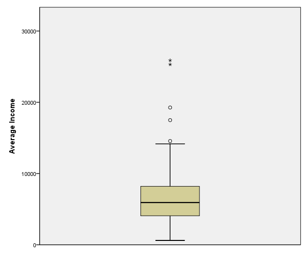
page 47 Figure 3.11 Boxplot for income in the Canadian occupational prestige data. The central box is drawn between the hinges; the position of the median is marked in the box; and outlying observations are displayed individually.
GGRAPH
  /GRAPHDATASET NAME="GraphDataset" VARIABLES= income
  /GRAPHSPEC SOURCE=INLINE.
BEGIN GPL
SOURCE: s=userSource( id( "GraphDataset" ) )
DATA: income=col( source(s), name( "income" ) )
GUIDE: axis( dim( 2 ), label( "Average Income" ) )
ELEMENT: schema( position( bin.quantile.letter( 1 * income ) ) )
END GPL.
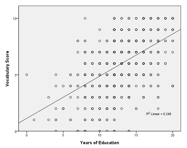
page 51 Figure 3.12 Scatterplot of scores on a 10-item vocabulary test versus years of education. Although there are n = 968 observations in the dataset, most of the plotted points fall on top of one another. The least-squares regression line is shown on the plot.
get file 'd:vocab.sav'.

GGRAPH
  /GRAPHDATASET NAME="GraphDataset" VARIABLES= vocab educ
  /GRAPHSPEC SOURCE=INLINE
      INLINETEMPLATE=["<addFitLine  type='linear' target='pair'/> "].
BEGIN GPL
SOURCE: s=userSource( id( "GraphDataset" ) )
DATA: vocab=col( source(s), name( "vocab" ) )
DATA: educ=col( source(s), name( "educ" ) )
GUIDE: axis( dim( 1 ), label( "educ" ), start(0.0), delta(5) )
GUIDE: axis( dim( 2 ), label( "vocab" ), start(0.0), delta(5) )
SCALE: linear( dim( 1 ), min(0), max(20) )
SCALE: linear( dim( 2 ), min(0), max(10) )
ELEMENT: point( position( ( educ * vocab ) ) )
END GPL.
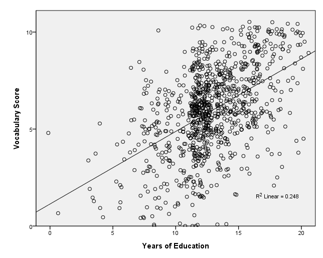
page 51 Figure 3.13 Jittered scatterplot for vocabulary score versus years of education. A uniformly distributed random quantity between -1/2 and +1/2 was added to each score for both variables. The original least-squares regression line is shown on the plot.
GGRAPH
  /GRAPHDATASET NAME="GraphDataset" VARIABLES= vocab educ
  /GRAPHSPEC SOURCE=INLINE
      INLINETEMPLATE=["<addFitLine  type='linear' target='pair'/> "].
BEGIN GPL
SOURCE: s=userSource( id( "GraphDataset" ) )
DATA: vocab=col( source(s), name( "vocab" ) )
DATA: educ=col( source(s), name( "educ" ) )
GUIDE: axis( dim( 1 ), label( "Years of Education" ), start(0.0), delta(5) )
GUIDE: axis( dim( 2 ), label( "Vocabulary Score" ), start(0.0), delta(5) )
SCALE: linear( dim( 1 ), min(0), max(20) )
SCALE: linear( dim( 2 ), min(0), max(10) )
ELEMENT: point.jitter(position( educ * vocab ) )
END GPL.
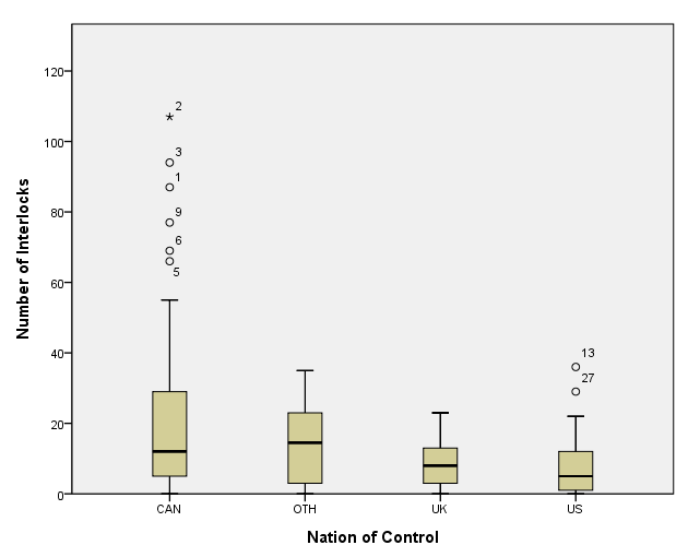
page 52 Figure 3.14 Number of interlocking directorate and executive positions by nation of control, for 248 dominant Canadian firms.
get file 'd:ornstein.sav'.

GGRAPH
  /GRAPHDATASET NAME="graphdataset" VARIABLES=nation intrlcks
  /GRAPHSPEC SOURCE=INLINE.
BEGIN GPL
  SOURCE: s=userSource(id("graphdataset"))
  DATA: nation=col(source(s), name("nation"), unit.category())
  DATA: intrlcks=col(source(s), name("intrlcks"))
  DATA: id=col(source(s), name("$CASENUM"), unit.category())
  GUIDE: axis(dim(1), label("Nation of Control"))
  GUIDE: axis(dim(2), label("Number of Interlocks"))
  ELEMENT: schema(position(bin.quantile.letter(nation*intrlcks)), label(id))
END GPL.
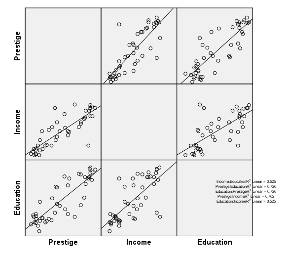
page 54 Figure 3.15 Scatterplot matrix for occupational prestige, level of education, and level of income, for 45 US occupations. The least-squares regression line is shown on each plot. Three unusual observations were identified interactively using a 'mouse.'
get file 'd:duncan.sav'.

GGRAPH
  /GRAPHDATASET NAME="GraphDataset" VARIABLES= prestige income educ
  /GRAPHSPEC SOURCE=INLINE
      INLINETEMPLATE=["<addFitLine  type='linear' target='pair'/> "].
BEGIN GPL
SOURCE: s=userSource( id( "GraphDataset" ) )
DATA: prestige=col( source(s), name( "prestige" ) )
DATA: income=col( source(s), name( "income" ) )
DATA: educ=col( source(s), name( "educ" ) )
ELEMENT: point(position((prestige/"Prestige"+income/"Income"+educ/"Education")*
(prestige/"Prestige"+income/"Income"+educ/"Education")))
END GPL.
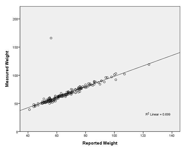
page 55 Figure 3.16 Davis's data on measured and reported weight, by gender. Data points for men are represented by asterisks, for women by circles. The line on the plot is Y = X.
get file 'd:davis.sav'.
GGRAPH
  /GRAPHDATASET NAME="GraphDataset" VARIABLES= measwt reptwt
  /GRAPHSPEC SOURCE=INLINE
      INLINETEMPLATE=["<addFitLine  type='linear' target='pair'/> "].
BEGIN GPL
SOURCE: s=userSource( id( "GraphDataset" ) )
DATA: measwt=col( source(s), name( "measwt" ) )
DATA: reptwt=col( source(s), name( "reptwt" ) )
GUIDE: axis( dim( 1 ), label( "Reported Weight" ), start(0.0), delta(20) )
GUIDE: axis( dim( 2 ), label( "Measured Weight" ), start(0.0), delta(50) )
SCALE: linear( dim( 1 ), min(40), max(140) )
SCALE: linear( dim( 2 ), min(0), max(200) )
ELEMENT: point( position( ( reptwt * measwt ) ) )
END GPL.
