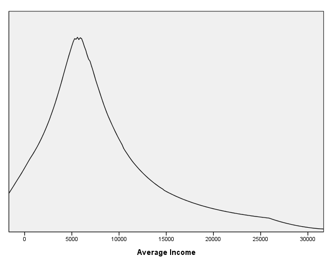
page 65 Figure 4.2 The distribution of income in the Canadian occupational prestige data. The solid line shows a kernel density estimate, the broken line an adaptive-kernel density estimate. The income values are displayed in the one-dimensional scatterplot at the bottom of the figure.
get file 'd:prestige.sav'.
GGRAPH
  /GRAPHDATASET NAME="graphdataset" VARIABLES=income
  /GRAPHSPEC SOURCE=INLINE.
BEGIN GPL
SOURCE: s=userSource(id("graphdataset"))
DATA: income=col(source(s), name("income"))
GUIDE: axis(dim(1), label("Average Income"))
GUIDE: axis(dim(2), label("Density"))
ELEMENT: line(position(density.kernel.epanechnikov(income, nearestNeighbor(85))))
END GPL.
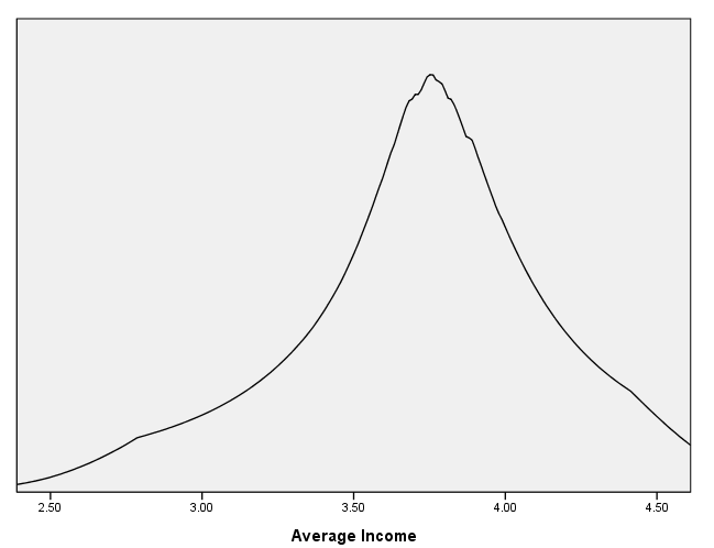
page 66 Figure 4.3 Adaptive-kernel density estimate for log(10) average income in the Canadian occupational prestige data. The window width is 0.05 (on the log-income scale). A one-dimensional scatterplot of the data values appears at the bottom of the graph.
compute income10 = lg10(income).
exe.
GGRAPH
  /GRAPHDATASET NAME="graphdataset" VARIABLES=income10
  /GRAPHSPEC SOURCE=INLINE.
BEGIN GPL
SOURCE: s=userSource(id("graphdataset"))
DATA: income10=col(source(s), name("income10"))
GUIDE: axis(dim(1), label("Average Income"))
ELEMENT: line(position(density.kernel.epanechnikov(income10, nearestNeighbor(85))))
END GPL.
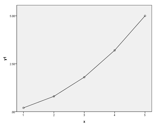
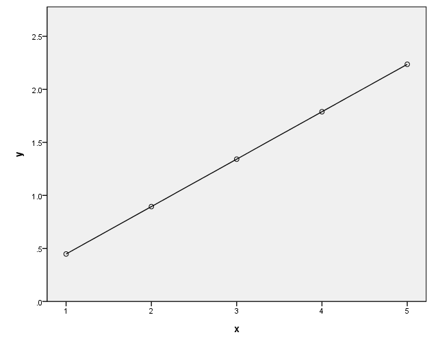
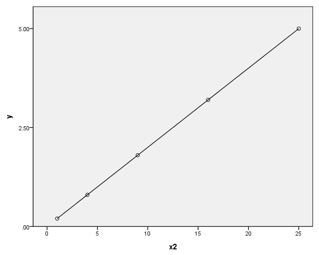
page 69 Figure 4.4 How a power transformation of Y or X can make a simple monotone nonlinear relationship linear. Panel (a) shows the . relationship Y = 1/5X**2. In panel (b), Y is replaced by the transformed value Y’ = Y**.5. In panel (c), X is replaced by the transformed value X’ = X**2.
data list list / x y.
begin data.
 1 .2
 2 .8
 3 1.8
 4 3.2
 5 5
end data.
execute.

compute y1 = .2*(x)**2.
compute y2 = y**.5.
compute y3 = x**2.
execute.
(a)
formats x (f1.0) y y2 (f8.1) x2 (f2.0).

GGRAPH
  /GRAPHDATASET NAME="GraphDataset" VARIABLES= x y1
  /GRAPHSPEC SOURCE=INLINE .
BEGIN GPL
SOURCE: s=userSource( id( "GraphDataset" ) )
DATA: x=col( source(s), name( "x" ) )
DATA: y1=col( source(s), name( "y1" ) )
GUIDE: axis( dim( 1 ), label( "x" ) )
GUIDE: axis( dim( 2 ), label( "y1" ), start(0.0), delta(2.5) )
SCALE: linear( dim( 2 ), min(0), max(5) )
ELEMENT: point( position( x * y1 ) )
ELEMENT: line( position( x * y1 ) )
END GPL.
(b)
GGRAPH
  /GRAPHDATASET NAME="GraphDataset" VARIABLES= x y2
  /GRAPHSPEC SOURCE=INLINE .
BEGIN GPL
SOURCE: s=userSource( id( "GraphDataset" ) )
DATA: x=col( source(s), name( "x" ) )
DATA: y2=col( source(s), name( "y2" ) )
GUIDE: axis( dim( 1 ), label( "x" ) )
GUIDE: axis( dim( 2 ), label( "y" ), start(0.0), delta(.5) )
SCALE: linear( dim( 2 ), min(0), max(2.5) )
ELEMENT: point( position(  x * y2 ) )
ELEMENT: line( position( x * y2 ) )
END GPL.
(c)
GGRAPH
  /GRAPHDATASET NAME="GraphDataset" VARIABLES= x2 y1
  /GRAPHSPEC SOURCE=INLINE.
BEGIN GPL
SOURCE: s=userSource( id( "GraphDataset" ) )
DATA: x2=col( source(s), name( "x2" ) )
DATA: y1=col( source(s), name( "y1" ) )
GUIDE: axis( dim( 1 ), label( "x2" ) )
GUIDE: axis( dim( 2 ), label( "y" ), start(0.0), delta(2.5) )
SCALE: linear( dim( 1 ), min(0), max(25) )
SCALE: linear( dim( 2 ), min(0), max(5) )
ELEMENT: point( position(  x2 * y1  ) )
ELEMENT: line( position( x2 * y1 ) )
END GPL.
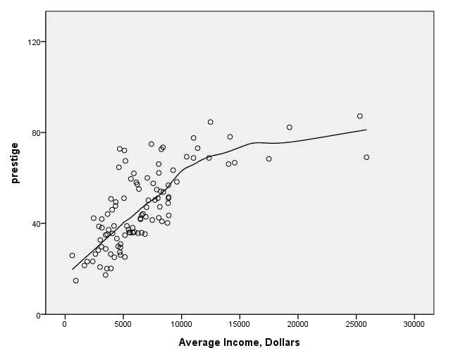
page 72 Figure 4.7 The relationship between prestige and income for the Canadian occupational prestige data. The nonparametric regression line on the plot is computed by local averaging.
get file 'd:prestige.sav'.formats prestige (f3.0). GGRAPH /GRAPHDATASET NAME="GraphDataset" VARIABLES= prestige income /GRAPHSPEC SOURCE=INLINE . BEGIN GPL SOURCE: s=userSource( id( "GraphDataset" ) ) DATA: prestige=col( source(s), name( "prestige" ) ) DATA: income=col( source(s), name( "income" ) ) GUIDE: axis( dim( 1 ), label( "Average Income, Dollars" ), start(0.0), delta(5000) ) GUIDE: axis( dim( 2 ), label( "prestige" ), start(0.0), delta(40) ) SCALE: linear( dim( 1 ), min(0), max(30000) ) SCALE: linear( dim( 2 ), min(0), max(120) ) ELEMENT: point( position( income * prestige ) ) ELEMENT: line(position(smooth.loess(income * prestige))) END GPL.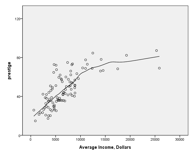
page 72 Figure 4.8 Scatterplot of prestige versus income(1/3) for 102 Canadian occupations in 1970. The solid line shows the least-squares linear regression, while the broken line shows a robust local regression.
formats i3 (f2.0). GGRAPH /GRAPHDATASET NAME="GraphDataset" VARIABLES= prestige i3 /GRAPHSPEC SOURCE=INLINE . BEGIN GPL SOURCE: s=userSource( id( "GraphDataset" ) ) DATA: prestige=col( source(s), name( "prestige" ) ) DATA: i3=col( source(s), name( "i3" ) ) GUIDE: axis( dim( 1 ), label( "Average Income, Dollars" ), start(0.0), delta(5) ) GUIDE: axis( dim( 2 ), label( "prestige" ), start(0.0), delta(40) ) SCALE: linear( dim( 1 ), min(5), max(30) ) SCALE: linear( dim( 2 ), min(0), max(120) ) ELEMENT: point( position( (i3 * prestige ) ) ) ELEMENT: line(position(smooth.linear(i3 * prestige))) ELEMENT: line(position(smooth.loess(i3 * prestige))) END GPL.
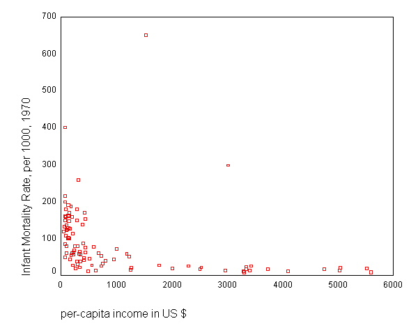
page 73 Figure 4.9 Scatterplot of infant mortality rate versus income in U.S. dollars, for 101 nations circa 1970. The nonparametric regression shown on the plot was calculated by robust regression. Several outlying observations are flagged.
get file 'd:leinhard.sav'. GRAPH /SCATTERPLOT(BIVAR)=inc WITH mortrate.
page 74 Figure 4.10 Scatterplot of log(10) infant mortality rate versus log(10) per-capita income for 101 nations. The solid line was calculated by least-squares regression, omitting Saudi Arabia and Libya; the broken line was calculated by robust local regression.
compute lmortrat = lg10(mortrate). compute linc = lg10(inc). execute.GGRAPH /GRAPHDATASET NAME="GraphDataset" VARIABLES= lmortrat linc /GRAPHSPEC SOURCE=INLINE . BEGIN GPL SOURCE: s=userSource( id( "GraphDataset" ) ) DATA: lmortrat=col( source(s), name( "lmortrat" ) ) DATA: linc=col( source(s), name( "linc" ) ) GUIDE: axis( dim( 1 ), label( "Per-capita Income, U.S. Dollars" ) ) GUIDE: axis( dim( 2 ), label( "Infant Mortality Rate per 1,000" ) ) ELEMENT: point( position( linc * lmortrat ) ) ELEMENT: line(position(smooth.linear(linc * lmortrat))) END GPL.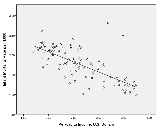
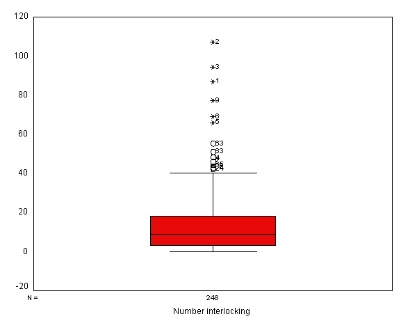
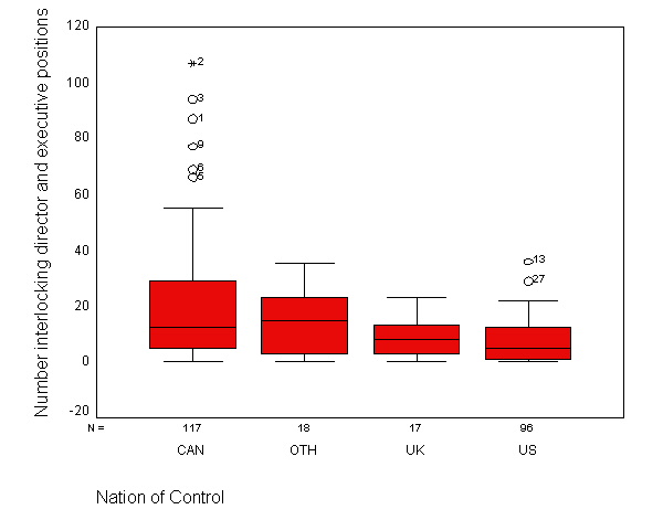
page 75 Figure 4.11 Number of interlocking directorate and executive positions by nation of control, for 248 dominant Canadian firms.
get file 'd:ornstein.sav'.EXAMINE VARIABLES=intrlcks BY nation /PLOT=BOXPLOT/STATISTICS=NONE.
| |
Cases | |||||
|---|---|---|---|---|---|---|
| Valid | Missing | Total | ||||
| N | Percent | N | Percent | N | Percent | |
| Number interlocking director and executive positions | 248 | 100.0% | 0 | .0% | 248 | 100.0% |
| |
Cases | ||||||
|---|---|---|---|---|---|---|---|
| Valid | Missing | Total | |||||
| Nation of Control | N | Percent | N | Percent | N | Percent | |
| Number interlocking director and executive positions | CAN | 117 | 100.0% | 0 | .0% | 117 | 100.0% |
| OTH | 18 | 100.0% | 0 | .0% | 18 | 100.0% | |
| UK | 17 | 100.0% | 0 | .0% | 17 | 100.0% | |
| US | 96 | 100.0% | 0 | .0% | 96 | 100.0% | |
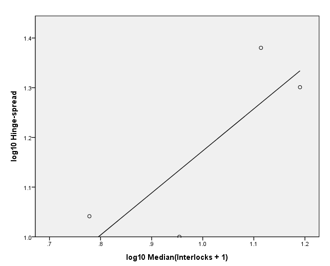
page 76 Figure 4.12 Spread (log(10) hinge spread) versus level [log(10) (median + 1)]. The plot is for Ornstein's interlocking-directorate data, with groups defined by nation of control. The line on the plot was fit by least squares.
NOTE: This output corresponds to the table in the middle of page 75 and is needed to create the variables for this graph.
SORT CASES BY nation (A).FILTER OFF. use 1 thru 117. EXECUTE.
FREQUENCIES VARIABLES=intrlcks /FORMAT=NOTABLE /NTILES= 4 /STATISTICS=MINIMUM MAXIMUM MEDIAN /ORDER=ANALYSIS.
| N | Valid | 117 |
|---|---|---|
| Missing | 0 | |
| Median | 12.00 | |
| Minimum | 0 | |
| Maximum | 107 | |
| Percentiles | 25 | 5.00 |
| 50 | 12.00 | |
| 75 | 29.00 | |
FILTER OFF. use 118 thru 135. EXECUTE.FREQUENCIES VARIABLES=intrlcks /FORMAT=NOTABLE /NTILES= 4 /STATISTICS=MINIMUM MAXIMUM MEDIAN /ORDER=ANALYSIS.
| N | Valid | 18 |
|---|---|---|
| Missing | 0 | |
| Median | 14.50 | |
| Minimum | 0 | |
| Maximum | 35 | |
| Percentiles | 25 | 2.75 |
| 50 | 14.50 | |
| 75 | 23.50 | |
FILTER OFF. use 136 thru 152. EXECUTE.FREQUENCIES VARIABLES=intrlcks /FORMAT=NOTABLE /NTILES= 4 /STATISTICS=MINIMUM MAXIMUM MEDIAN /ORDER=ANALYSIS.
| N | Valid | 17 |
|---|---|---|
| Missing | 0 | |
| Median | 8.00 | |
| Minimum | 0 | |
| Maximum | 23 | |
| Percentiles | 25 | 3.00 |
| 50 | 8.00 | |
| 75 | 13.50 | |
FILTER OFF. use 153 thru 248. EXECUTE.FREQUENCIES VARIABLES=intrlcks /FORMAT=NOTABLE /NTILES= 4 /STATISTICS=MINIMUM MAXIMUM MEDIAN /ORDER=ANALYSIS.
| N | Valid | 96 |
|---|---|---|
| Missing | 0 | |
| Median | 5.00 | |
| Minimum | 0 | |
| Maximum | 36 | |
| Percentiles | 25 | 1.00 |
| 50 | 5.00 | |
| 75 | 12.00 | |
data list list / x y. begin data. 14.5 20 12 24 8 10 5 11 end data. execute.compute lgx = lg10(x + 1). compute lgy = lg10(y). execute.
formats lgx lgy (f3.1).
GGRAPH /GRAPHDATASET NAME="GraphDataset" VARIABLES= lgy lgx /GRAPHSPEC SOURCE=INLINE . BEGIN GPL SOURCE: s=userSource( id( "GraphDataset" ) ) DATA: lgy=col( source(s), name( "lgy" ) ) DATA: lgx=col( source(s), name( "lgx" ) ) GUIDE: axis( dim( 1 ), label( "log10 Median(Interlocks + 1)" ) ) GUIDE: axis( dim( 2 ), label( "log10 Hinge-spread" ) ) ELEMENT: point( position( lgx * lgy ) ) ELEMENT: line(position(smooth.linear(lgx * lgy))) END GPL.
page 77 Figure 4.13 Parallel boxplots of number of interlocks by nation of control, plotting interlocks + 1 on the log(2) scale. Compare this plot with Figure 4.11, where number of interlocks is not transformed.
NOTE: We were unable to get SPSS to do log base 2.
page 78 Figure 4.14 Stem-and-leaf display of percentage of women in each of 102 Canadian occupations in 1970. Notice how the data "stack up" against both boundaries.
get file 'd:prestige.sav'.EXAMINE VARIABLES=percwomn /PLOT STEMLEAF /STATISTICS NONE.
| |
Cases | |||||
|---|---|---|---|---|---|---|
| Valid | Missing | Total | ||||
| N | Percent | N | Percent | N | Percent | |
| % of incumbents who were women | 102 | 100.0% | 0 | .0% | 102 | 100.0% |
% of incumbents who were women Stem-and-Leaf PlotFrequency Stem & Leaf
32.00 0 . 00000000000000111111222233334444 12.00 0 . 555566777899 8.00 1 . 01111333 7.00 1 . 5557779 4.00 2 . 1344 2.00 2 . 57 5.00 3 . 01334 2.00 3 . 99 .00 4 . 3.00 4 . 678 3.00 5 . 224 2.00 5 . 67 1.00 6 . 3 3.00 6 . 789 3.00 7 . 024 4.00 7 . 5667 3.00 8 . 233 .00 8 . 3.00 9 . 012 5.00 9 . 56667
Stem width: 10.00 Each leaf: 1 case(s)

