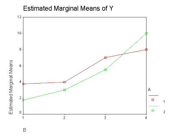
Let’s read in an example dataset, crf24,
adapted from Kirk (1968, First Edition).
get file 'c:https://stats.idre.ucla.edu/wp-content/uploads/2016/02/crf24.sav'.
First, let’s look at a table of the cells means to see what variables are in
the data set. A and B may be considered independent
variables, and y the dependent variable.
MEANS
  TABLES=y by a by b.
Case Processing Summary
Cases
Included
Excluded
Total
N
Percent
N
Percent
N
Percent
Y * A * B
32
100.0%
0
.0%
32
100.0%
Report
Y
A
B
Mean
N
Std. Deviation
1
1
3.75
4
1.500
2
4.00
4
.816
3
7.00
4
.816
4
8.00
4
.816
Total
5.69
16
2.120
2
1
1.75
4
.500
2
3.00
4
.816
3
5.50
4
.577
4
10.00
4
.816
Total
5.06
16
3.316
Total
1
2.75
8
1.488
2
3.50
8
.926
3
6.25
8
1.035
4
9.00
8
1.309
Total
5.38
32
2.756
Now, let’s plot the cell means.
graph
 /line(multiple) mean(y) by b by a.
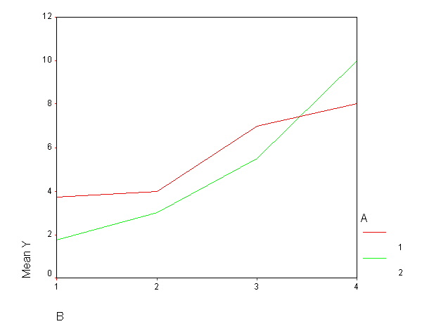
If you would like the means marked by a symbol, double click on the graph,
select "format", select "interpolation", and select "straight". Make sure that the "display markers" box is
checked. Click on "apply", then "close" and then close the
chart editor. If you would like to change the markers,
double click on the graph (again), select select "format", then "marker", and then
select the marker and the size that you would like. If you would like to have different markers
for the different groups, double click on the graph, double click on the legend on the
right that labels the groups, and select (i.e., single click on) the group whose symbol
(i.e., marker) you would like to change. Next, select "format", "marker",
and then select the marker and the size that you would like. Click on
"apply", then "close" and then close the chart editor.
graph
 /line(multiple) mean(y) by b by a.
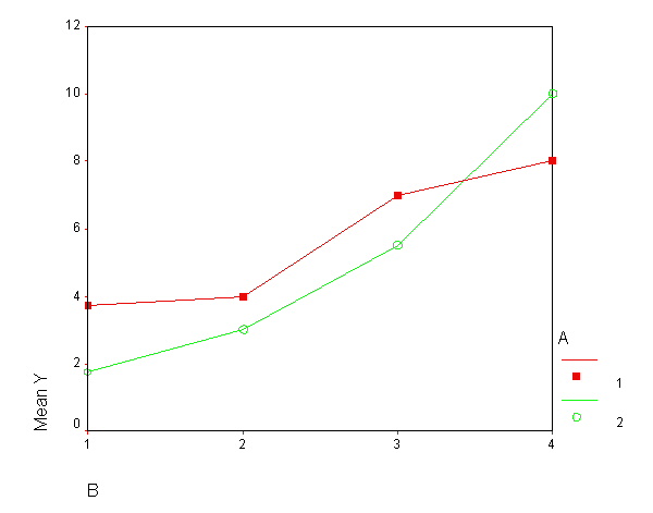
You can also obtain this graph by using the glm command. Note
that the first variable listed in the parentheses after profile will appear on the x-axis. The second variable listed will indicate the "grouping" variable.
glm y by a b
 /plot = profile(b*a).
Between-Subjects Factors
N
A
1
16
2
16
B
1
8
2
8
3
8
4
8
Tests of Between-Subjects Effects
Dependent Variable: Y
Source
Type III Sum of Squares
df
Mean Square
F
Sig.
Corrected Model
217.000(a)
7
31.000
40.216
.000
Intercept
924.500
1
924.500
1199.351
.000
A
3.125
1
3.125
4.054
.055
B
194.500
3
64.833
84.108
.000
A * B
19.375
3
6.458
8.378
.001
Error
18.500
24
.771
Total
1160.000
32
Corrected Total
235.500
31
a R Squared = .921 (Adjusted R Squared = .899)