This page was adapted from a web page at the SPSS web page. We thank SPSS for their permission to adapt and distribute this page via our web site.
What is a pivot table?
A pivot table is a table capable of dynamically displaying and rearranging multiple dimensions. There are three display areas of a pivot table: rows, columns, and layers. The dimensions of any table can be easily moved from row to column to layer. The ability to position multiple dimensions in each of these areas increases the number of data dimensions that can be viewed.
SPSS adds a Title, Caption, and Footnotes to the general idea of a pivot table. The parts of an SPSS pivot table are shown in Figure 1.
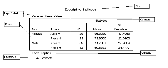
Figure 1: SPSS 7.0 Pivot Table
This table contains four dimensions, two in the rows (Sex and Tumor) one in the columns (Statistics) and one in the layer (the dimension name is Variable. The current value showing in this dimension is "Week of death"). The layer helps to reduce the dimensionality by displaying one slice of the table at a time. In this case, there are three visible dimensions being shown for the variable called "Week of Death". Stepping through the layer values will show the same three dimensions for other variables that are present in the table.
What are the advantages of pivot tables?
- Reorder Rows, Columns, and Layers. A pivot table is an organizational tool that allows the software user to rearrange the information in a table in a variety of ways. All the permutations of an n-dimensional table are just a few mouse clicks away. The table can be reordered by moving dimension to rows, columns, and layers (this is called pivoting the table). Different orderings of the table help to show different aspects of the relationships in that table
- Full Formatting Capabilities. Pivot tables can be formatted in a variety of ways, including the border styles and a full range of options for formatting text, numbers, cell color and pattern.
- Selective Hiding. Pivot table rows or columns can be hidden to focus on other parts of the table. This hidden data can be easily retrieved when later desired.
- Additional Documentation Capabilities. Pivot tables can have a title, caption and footnotes to fully document the information in the table.
- OLE 2.0 Functionality. Pivot tables are OLE 2.0 objects. A pivot table can be put in any other OLE 2.0 container and continue to be edited in the same manner as if it were in SPSS.
How does SPSS use pivot tables?
There is not a single new procedure added to SPSS that creates a pivot table. Rather, the current SPSS procedures are being updated so that all of their output is displayed as a series of pivot tables and charts. The output from all procedures is stored in a single document, which includes text, pivot tables, and charts. SPSS 7.0 has added a new Output Navigator to organize and display the contents of this document. The Output Navigator displays both the document and an outline view, which makes it easier to find and organize the output. An example of the Output Navigator is shown in Figure 2.
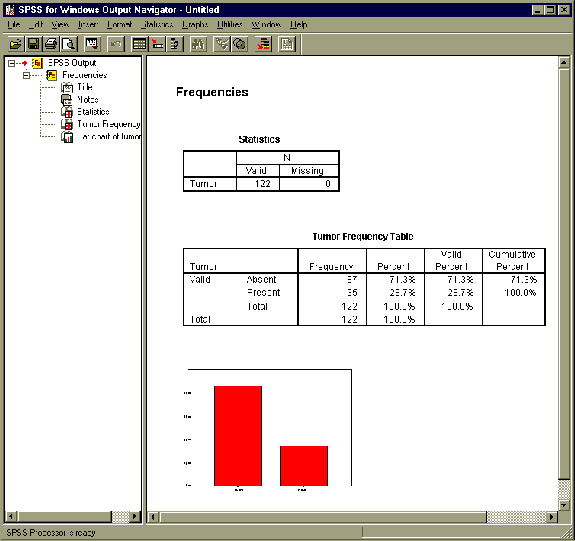
Figure 2: SPSS 7.0 Output Navigator
Procedures planned for upgrade in the first release of SPSS 7.0 are: Anova, Correlations, Crosstabs, Descriptives, Examine, Frequencies, GLM, Nonpar Correlations, Nonparametric Tests, Oneway, Regression, T-Tests, Tables, Means, and a new case reporting procedure called Summarize. In subsequent releases other procedures will be added to this list. Customizing the Format of Pivot Tables
In addition to the ability to rearrange the dimensions in a table, the SPSS pivot table can be customized to fit the look the user needs. There are a variety of ways to change the look of a pivot table.
- First, there is a TableLook, which can be applied to any pivot table. A default TableLook can be applied to all pivot tables, or can be later applied to change the look of any selected table(s). SPSS comes with a list of TableLooks to choose from and more can be created by the user. The examples on the preceding pages use the default TableLook. The example shown later in this paper use the TableLook called academ2, which is similar to the APA style recommendations for output tables.
- Captions can be added to the bottom of any table. Also, a footnote can be attached to any cell or set of cells in a pivot table.
- The attributes of data cells, label cells, the title, caption, and footnotes in any table can also be changed. This includes the ability to change font, alignment, text color, background color and pattern, as well as the numeric format of a cell’s data.
- The border styles of a pivot table can be changed, and can also be stored in a TableLook. Line style, weight, and color can be assigned to various lines that make up the pivot table.
- Rows or columns can be deleted in the table, or they can be hidden. Any row or column can be selected and hidden so that the information is not viewed, but is still present to be retrieved later.
Portability of pivot tables
All pivot tables are created as OLE 2.0 objects. This allows them to be displayed and edited in any application that is an OLE 2.0 container. For example the output from SPSS can easily be dragged into most popular word processor (such as Microsoft Word for Windows), and further edited directly inside the word processor document when desired. There is no difference in the way the user edits a table in SPSS or in any other OLE 2.0 container.
Example
To demonstrate a pivot table and the advantages of rearranging multidimensional output, a data set collected to study FD&C Red Dye #40 will be used. Mice were fed one of four different diets: a control group, which did not receive any red dye, and groups that got either a low, medium, or high dose of red dye #40. During the two year study, each mouse that died was autopsied to determine if a tumor was present. Of the original 400 mice, 122 died during the two year period. The data presented below is that of those mice that died during the study.
This data was originally analyzed in Lagakos and Mosteller (1981) and later published in Andrews and Herzberg (1985). Default Pivot Table
Figure 3 shows the original table from the SPSS Crosstabs procedure of Tumor by Dose controlling for Sex. Both counts and percents based on Tumor were requested for this table. After the output was produced, a caption was added to the table.
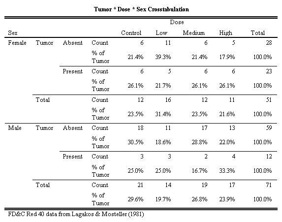
Figure 3: Pivot Table from Crosstabs Procedure
This table has four dimensions: Sex (Male, Female), Tumor (Absent, Present, and Total), and Statistics (Count, % of Tumor) in the rows and Dose (Control, Low, Medium, High and Total) in the columns.
Move Statistics
If the desire is to compare tumor percents for different dose groups by sex, one might start by moving the innermost row dimension (Statistics) to the first row dimension, thus getting all of the counts followed by all of the percents. This is done for Figure 4 by a simple drag of the mouse. To learn more about the user interface for pivot, be sure to see the Tutorial in SPSS 7.0.
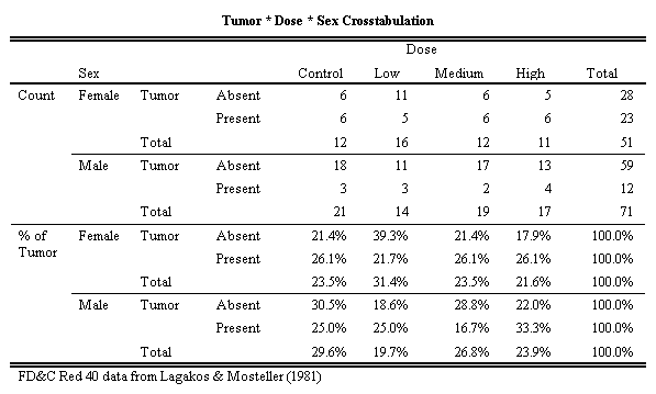
Figure 4: Pivot Statistics to First Row Dimension
This view makes it easiest to see the difference between Tumor absence and presence for
Female and then for Male. For females, 28 did not have tumors and 23 did. For males, 59
exhibited no tumor while 12 did have tumors. Red dye #40 seems to be more dangerous to
female mice.
Compare Sex Differences
Another interesting view of this table can be created by switching the order of Sex and Tumor, as is shown in Figure 5.
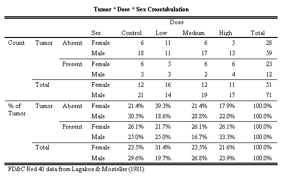
Figure 5: Change Order of Tumor, Sex
This view makes it easier to compare the male and female differences for tumor absence and presence. There are 23 females and 12 males that had tumors. Concentrate on Mice with Tumors
Since there are only two tumor values (Present and Absent), if one wants to compare tumor percents it is redundant to see both. This table can be simplified by putting the Tumor dimension in the layers, so that only one value is visible at a time. This was done for Figure 6.

Figure 6: Pivot Tumor to Layers
This view makes it even easier to see the patterns of tumor percent and how they differ for Male and Female, especially in the Medium and High doses. For Females, there was 26.1% with tumors in both he medium and high dosage groups, while males had fewer in medium (16.7%) and more in the high dosage group (33.3%). Examining the counts shows that these percents aren’t worth interpreting since there are so few males that had tumors in any of the groups.
Given the small sample size for males, this table would be the logical place to stop. The rest of this example shows steps which might be taken had the sample size been larger. Hide Rows
When the interest is in showing the percents, the Count section of the table can be hidden. This is shown in Figure 7.
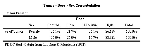
Figure 7: Hide Counts
Instead of hiding one could have instead pivoted the Statistics dimension into the layer. In situations where more than two categories exist, the decision to hide or pivot to a layer would be made based on how many categories you wish to be visible. When only a single category is desired, a pivot into the layer might be easier. When all but a few categories is desired, hiding is the way to accomplish the goal.
Figure 8 shows the same table as Figure 7 but with Statistics pivoted into the layer instead of hiding the Count category.

Figure 8: Pivot Statistics into Layers
Add a Footnote
Finally, Figure 9 shows the table after selecting the Male Medium Dose cell, bolding the text and inserting a footnote.
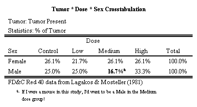
Figure 9: Add a Footnote
Summary
SPSS pivot tables provide the researcher with a tool to further investigate relationships in the output of statistical procedures. Pivoting makes it easy to rearrange the output in many interesting ways. The SPSS pivot table also opens up the output to formatting that was previously unavailable.
All the tables in this paper were created from a single run of the Crosstabs Procedure in SPSS. The different arrangements of the dimensions in the output are accomplished by interacting with the output, rather than going back and requesting different procedures. Thus, the user can pivot to understand and discover different parts of the story that is contained in the output. All the permutations of the dimensions into rows, columns, and layers are easily accessible from a single piece of output.
This paper was created by copying a single pivot table from the SPSS 7.0 output into Microsoft Word. This table was then copied and pasted into each of the additional figures, then edited by double clicking the figure to in-place activate the OLE 2.0 object. Thus, all the customization, pivoting, and hiding can be done either in SPSS or in any other application that is an OLE 2.0 container.
This page was adapted from a web page at the SPSS web page. We thank SPSS for their permission to adapt and distribute this page via our web site.
