NOTE: This page was created using SPSS version 19. Some of the syntax shown below may not work in earlier versions of SPSS.
The ggraph command was introduced in version 14 of SPSS and is documented in the Command Syntax Reference. In the point-and-click interface, this command is accessed by clicking on Graphs, Chart Builder. Graphs made in this way are modified with GPL. While ggraph is the command that makes the graph, GPL (graphics production language) is the language that is used to modify the graph, add elements to the graph, etc. The GPL reference is a separate PDF document that can be downloaded from the SPSS website. Please note that there is an updated version of the GPL reference for SPSS version 19.
Most of the examples on this page use the hsb2 data set.
A few comments on ggraph and GPL code
There are three required parts of the ggraph command. The name of the dataset must be specified on the name option. This can be any name that you choose; however, this name must be used on the source statement in the GPL code. The names of the variables that will used on the graph must be listed on the variables option. Finally, on the graphspec subcommand, you need to provide the source. If you are making the graph from the active dataset, the source=inline option should be used.
GPL is case sensitive. The GPL code can be indented or not; it does not matter. The necessary components are the source statement, on which the dataset is defined. This must match the name of the dataset given in the ggraph command. One data statement for each variable to be used on the graph must be given. The names of the variables must match those given in the ggraph command. The name option on this statement is necessary. The element statement defines what is to be displayed on the graph (for example, points, lines, etc.). You can have multiple element statements if you want to overlay different elements on the graph. On statements that specify dimensions, such as the guide statement, the x-axis is called dimension 1, and the y-axis is called dimension 2.
Scatterplots
A simple scatterplot
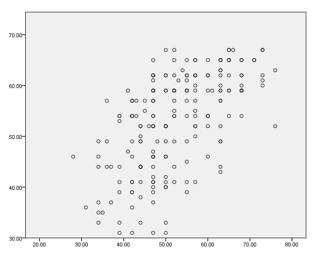
This is a simple scatterplot. Some points are plotted one on top of the other; an example using jitter is given below.
GGRAPH
  /GRAPHDATASET NAME="graphdataset" VARIABLES=read write
  /GRAPHSPEC SOURCE=INLINE.
BEGIN GPL
SOURCE: s=userSource(id("graphdataset"))
DATA: read=col(source(s), name("read"))
DATA: write=col(source(s), name("write"))
ELEMENT: point(position(read*write))
END GPL.
Adding jitter
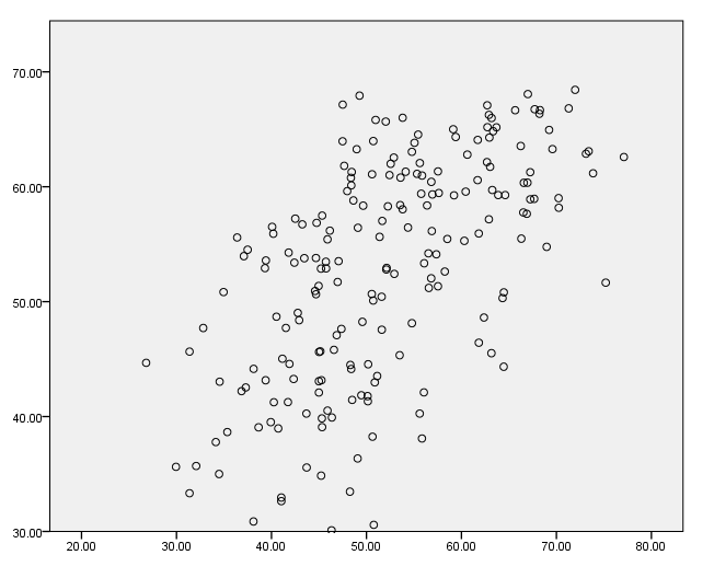
We can add jitter to the graph with jitter function.
GGRAPH
  /GRAPHDATASET NAME="graphdataset" VARIABLES=read write
  /GRAPHSPEC SOURCE=INLINE.
BEGIN GPL
SOURCE: s=userSource(id("graphdataset"))
DATA: read=col(source(s), name("read"))
DATA: write=col(source(s), name("write"))
ELEMENT: point.jitter(position(read*write))
END GPL.
Adding a title to the axes
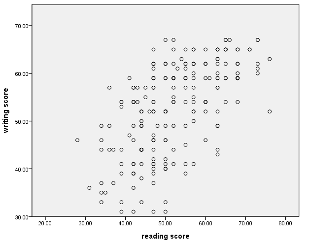
We can add one or more guide statements to the GPL code and include the label option. In quotes, we can type the text that we would like to use to label the axes.
GGRAPH
  /GRAPHDATASET NAME="graphdataset" VARIABLES=read write
  /GRAPHSPEC SOURCE=INLINE.
BEGIN GPL
SOURCE: s=userSource(id("graphdataset"))
DATA: read=col(source(s), name("read"))
DATA: write=col(source(s), name("write"))
GUIDE: axis(dim(1), label("reading score"))
GUIDE: axis(dim(2), label("writing score"))
ELEMENT: point(position(read*write))
END GPL.
Formatting the numbers on the axes
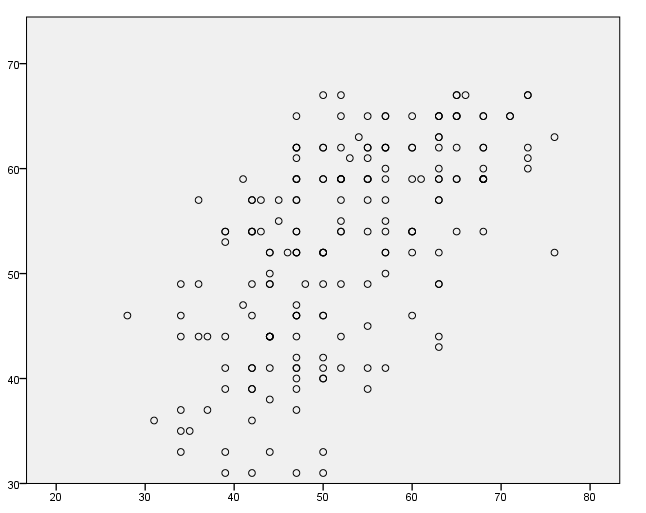
The SPSS formats command can be used to format the numbers that will appear on the axes of the graph. This should be done before the ggraph command is issued. The format to be used is given in parentheses, and the first number gives the total number of spaces to be used. The number after the decimal indicates the number of decimal places to be used.
formats read write (f2.0).
GGRAPH
  /GRAPHDATASET NAME="graphdataset" VARIABLES=read write
  /GRAPHSPEC SOURCE=INLINE.
BEGIN GPL
SOURCE: s=userSource(id("graphdataset"))
DATA: read=col(source(s), name("read"))
DATA: write=col(source(s), name("write"))
ELEMENT: point(position(read*write))
END GPL.
Adding a title to the graph
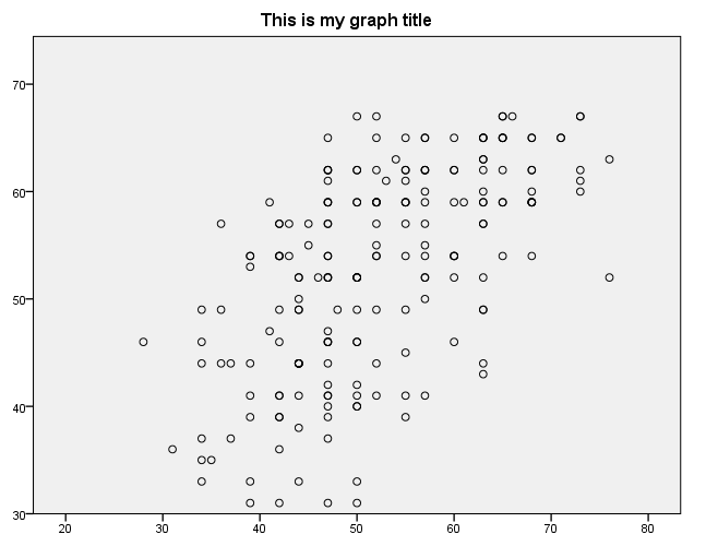
A title can be added on the guide statement.
GGRAPH
  /GRAPHDATASET NAME="graphdataset" VARIABLES=read write
  /GRAPHSPEC SOURCE=INLINE.
BEGIN GPL
SOURCE: s=userSource(id("graphdataset"))
DATA: read=col(source(s), name("read"))
DATA: write=col(source(s), name("write"))
GUIDE: text.title( label( "This is my graph title" ) )
ELEMENT: point(position(read*write))
END GPL.
Scaling the axes – method 1
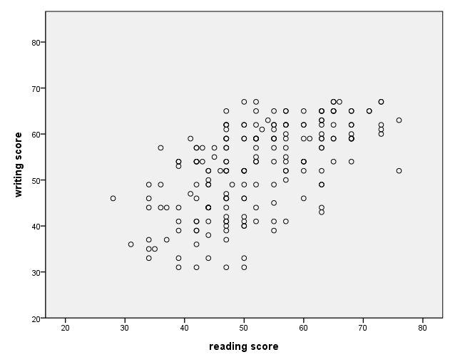
The minimum and maximum for an axis can be specified on the scale statement.
GGRAPH
  /GRAPHDATASET NAME="graphdataset" VARIABLES=read write
  /GRAPHSPEC SOURCE=INLINE.
BEGIN GPL
SOURCE: s=userSource(id("graphdataset"))
DATA: read=col(source(s), name("read"))
DATA: write=col(source(s), name("write"))
GUIDE: axis(dim(1), label("reading score"))
GUIDE: axis(dim(2), label("writing score"))
SCALE: linear( dim( 1 ), min(20), max(80) )
SCALE: linear( dim( 2 ), min(20), max(80) )
ELEMENT: point(position(read*write))
END GPL.
Scaling the axes – method 2
The minimum and maximum for an axis can be specified on the scale statement with the include option.
GGRAPH
  /GRAPHDATASET NAME="graphdataset" VARIABLES=read write
  /GRAPHSPEC SOURCE=INLINE.
BEGIN GPL
SOURCE: s=userSource(id("graphdataset"))
DATA: read=col(source(s), name("read"))
DATA: write=col(source(s), name("write"))
GUIDE: axis(dim(1), label("reading score"))
GUIDE: axis(dim(2), label("writing score"))
SCALE: linear( dim( 1 ), include(20, 80) )
SCALE: linear( dim( 2 ), include(20, 80) )
ELEMENT: point(position(read*write))
END GPL.
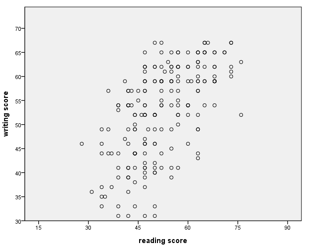
Modifying the distance between values on the axes
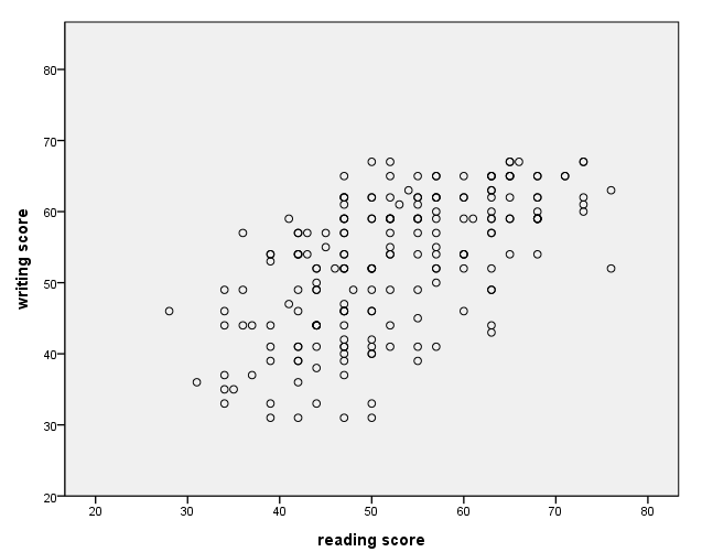
The distance between the values on the axes can be modified with the delta option on the guide statement.
GGRAPH
  /GRAPHDATASET NAME="graphdataset" VARIABLES=read write
  /GRAPHSPEC SOURCE=INLINE.
BEGIN GPL
SOURCE: s=userSource(id("graphdataset"))
DATA: read=col(source(s), name("read"))
DATA: write=col(source(s), name("write"))
GUIDE: axis(dim(1), label("reading score"), delta(15))
GUIDE: axis(dim(2), label("writing score"), delta(5))
SCALE: linear( dim( 1 ), min(15), max(90) )
SCALE: linear( dim( 2 ), min(30), max(70) )
ELEMENT: point(position(read*write))
END GPL.
Specifying certain axis labels (values)
Skipped for now.
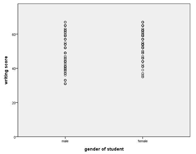
Axis with a categorical variable
The values labels, if they exist, are used on the axis with categorical variable. Note that on the data statement that defines the variable female, the unit.category() option must be used. Also, on the scale statement for dimension 1 (the x-axis) we have used cat instead of linear, and we have used the include option.
GGRAPH
  /GRAPHDATASET NAME="GraphDataset" VARIABLES= write female
  /GRAPHSPEC SOURCE=INLINE .
BEGIN GPL
SOURCE: s=userSource( id( "GraphDataset" ) )
DATA: female=col(source(s), name("female"), unit.category())
DATA: write=col(source(s), name("write"))
GUIDE: axis(dim(1), label("gender of student"))
GUIDE: axis(dim(2), label("writing score"))
SCALE: cat(dim(1), include("0", "1"))
SCALE: linear(dim(2), include(0))
ELEMENT: point(position(female*write))
END GPL.
Adding a regression line – method 1
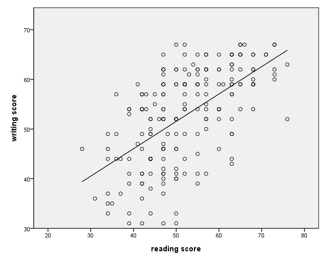
There are at least two different ways to add a regression line to a scatterplot. In this example, we use an additional element statement. The order of the element statements does not matter. If you add the regression line using this method, the line will be limited by the range of the data.
GGRAPH
  /GRAPHDATASET NAME="graphdataset" VARIABLES=read write
  /GRAPHSPEC SOURCE=INLINE.
BEGIN GPL
SOURCE: s=userSource(id("graphdataset"))
DATA: read=col(source(s), name("read"))
DATA: write=col(source(s), name("write"))
GUIDE: axis(dim(1), label("reading score"))
GUIDE: axis(dim(2), label("writing score"))
ELEMENT: line( position( smooth.linear(read*write ) ) )
ELEMENT: point(position(read*write))
END GPL.
Adding a regression line – method 2
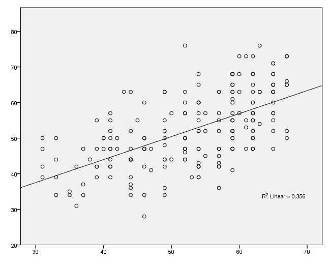
To add a regression line using this method, you need to use the inlinetemplate option on the graphspec subcommand of the ggraph command. Note that all of the quotes shown below are necessary. If you add a regression line using this method, the line will span the entire distance of the graph, and the R2 value will be displayed.
GGRAPH
  /GRAPHDATASET NAME="GraphDataset" VARIABLES= read write
  /GRAPHSPEC SOURCE=INLINE
      INLINETEMPLATE=["<addFitLine  type='linear' target='pair'/> " ].
BEGIN GPL
SOURCE: s=userSource( id( "GraphDataset" ) )
DATA: read=col( source(s), name( "read" ) )
DATA: write=col( source(s), name( "write" ) )
ELEMENT: point( position( write * read ))
END GPL.
Labeling points on the graph
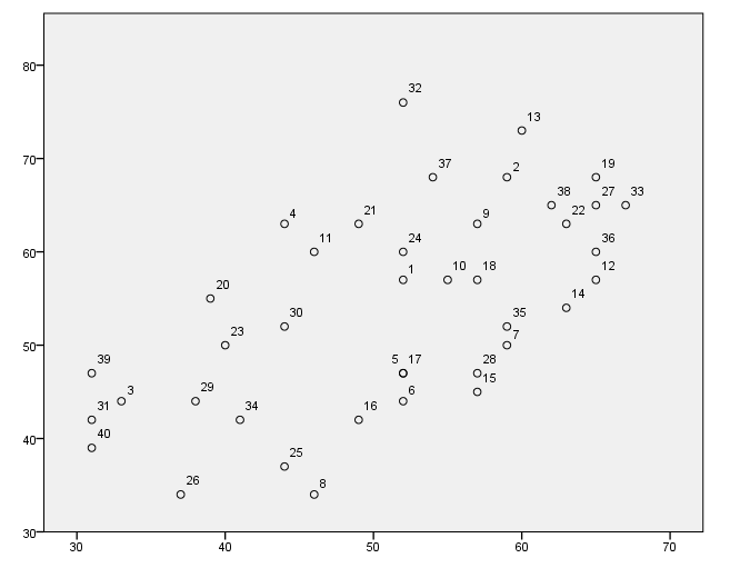
For this example, we first create a new variable called i that is simply the case number. Also, we use only the first 40 cases to make the graph more readable. We use the formats command to format the variable i to make the graph more readable. We issue the use all command at the end so that all of the data will be used in the next command.
compute i = $casenum.
use 1 thru 40.
exe.
formats i (f2.0).
GGRAPH
  /GRAPHDATASET NAME="GraphDataset" VARIABLES= read write i
  /GRAPHSPEC SOURCE=INLINE.
BEGIN GPL
SOURCE: s=userSource( id( "GraphDataset" ) )
DATA: read=col( source(s), name( "read" ) )
DATA: write=col( source(s), name( "write" ) )
DATA: i = col( source(s), name( "i" ), unit.category() )
ELEMENT: point( position( write * read ), label( i ) )
END GPL.
use all.
Scatterplot with groups – using different colors
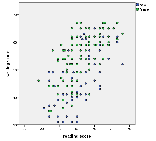
There are different ways to display different groups on a scatterplot. In this example, we make the points different colors by using the color option on the element statement.
GGRAPH
  /GRAPHDATASET NAME="graphdataset" VARIABLES=read write female
  /GRAPHSPEC SOURCE=INLINE.
BEGIN GPL
 SOURCE: s=userSource(id("graphdataset"))
 DATA: read=col(source(s), name("read"))
 DATA: write=col(source(s), name("write"))
 DATA: female=col(source(s), name("female"), unit.category())
 GUIDE: axis(dim(1), label("reading score"))
 GUIDE: axis(dim(2), label("writing score"))
 ELEMENT: point(position(read*write), color(female))
END GPL.
Scatterplot with groups – using different shapes
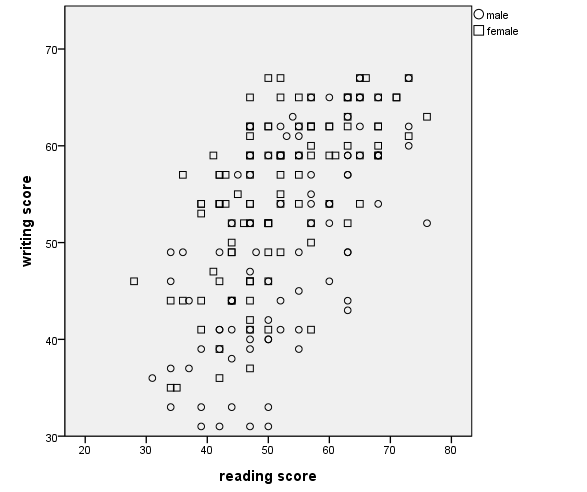
In this example, we show the different groups by using different shapes. To do this, use the shape option on the element statement.
GGRAPH
  /GRAPHDATASET NAME="graphdataset" VARIABLES=read write female
  /GRAPHSPEC SOURCE=INLINE.
BEGIN GPL
 SOURCE: s=userSource(id("graphdataset"))
 DATA: read=col(source(s), name("read"))
 DATA: write=col(source(s), name("write"))
 DATA: female=col(source(s), name("female"), unit.category())
 GUIDE: axis(dim(1), label("reading score"))
 GUIDE: axis(dim(2), label("writing score"))
 ELEMENT: point(position(read*write), shape(female))
END GPL.
Scatterplot with groups – using different colors and shapes
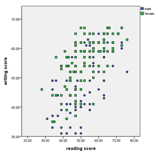
In this example, we make the groups different colors and different shapes.
GGRAPH
  /GRAPHDATASET NAME="graphdataset" VARIABLES=read write female
  /GRAPHSPEC SOURCE=INLINE.
BEGIN GPL
SOURCE: s=userSource(id("graphdataset"))
DATA: read=col(source(s), name("read"))
DATA: write=col(source(s), name("write"))
DATA: female=col(source(s), name("female"), unit.category())
GUIDE: axis(dim(1), label("reading score"))
GUIDE: axis(dim(2), label("writing score"))
ELEMENT: point(position(read*write), color(female), shape(female))
END GPL.
Scatterplot with regression lines for groups – example 1
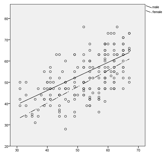
We can have separate regression lines for different groups. In this example, we use the shape option on the element statement to make the lines different. The color option could also be used.
GGRAPH
  /GRAPHDATASET NAME="GraphDataset" VARIABLES= read write female
  /GRAPHSPEC SOURCE=INLINE.
BEGIN GPL
SOURCE: s=userSource( id( "GraphDataset" ) )
DATA: read=col( source(s), name( "read" ) )
DATA: write=col( source(s), name( "write" ) )
DATA: female = col(source(s), name("female"), unit.category())
ELEMENT: point( position(write * read))
ELEMENT: line(position(smooth.linear(write * read)), shape(female))
END GPL.
Scatterplot with regression lines for groups – example 2
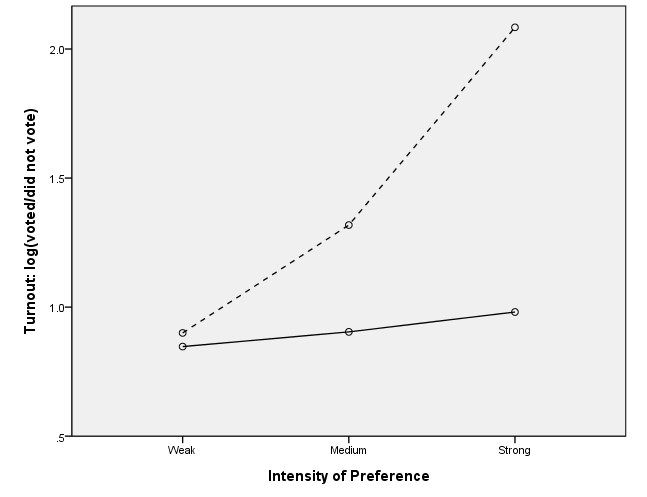
In this example, we specify which line is to be dashed by using the shape(shape.dash) option on the element statement.
data list list / logv1 logvc inten.
begin data.
.847  .9   0
.904 1.318 1
.981 2.084 2
end data.
execute.

formats logvc logv1 (f3.1).
value labels inten 0 "Weak" 1 "Medium" 2 "Strong".

VARIABLE LEVEL inten (ordinal).

GGRAPH
  /GRAPHDATASET NAME="GraphDataset" VARIABLES= inten logvc logv1
  /GRAPHSPEC SOURCE=INLINE.
BEGIN GPL
SOURCE: s=userSource( id( "GraphDataset" ) )
DATA: logvc=col( source(s), name( "logvc" ) )
DATA: logv1=col( source(s), name( "logv1" ) )
DATA: inten=col( source(s),  name("inten"), unit.category())
GUIDE: axis( dim( 1 ), label( "Intensity of Preference" ), start(0), delta(1) )
GUIDE: axis( dim( 2 ), label( "Turnout: log(voted/did not vote)" ), start(0), delta(.5) )
SCALE: cat(dim(1), include(".00", "1.00", "2.00"))
SCALE: linear( dim( 2 ), min(.5), max(2) )
ELEMENT: point( position( inten * logvc ) )
ELEMENT: line( position( inten * logvc ), shape(shape.dash) )
ELEMENT: point( position( inten * logv1 ) )
ELEMENT: line( position( inten * logv1 ) )
END GPL.
Adding a y=x line, method 1
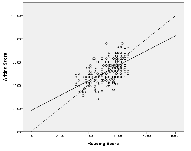
There are at least two ways to add a y=x line to a scatterplot. In this example, we add a data statement and define a new variable, called x, which starts at 0 and ends at 100 and increments in units of 10. We also include a second element statement on which x is plotted with x. We have used the shape(shape.dash) option to make this line dashed.
get file "D:datahsb2.sav".

GGRAPH
  /GRAPHDATASET NAME="GraphDataset" VARIABLES= read write
  /GRAPHSPEC SOURCE=INLINE .
BEGIN GPL
SOURCE: s=userSource( id( "GraphDataset" ) )
DATA: read=col( source(s), name( "read" ) )
DATA: write=col( source(s), name( "write" ) )
DATA: x = iter(0,100.,10.)
GUIDE: axis( dim( 1 ), label( "Reading Score" ) )
GUIDE: axis( dim( 2 ), label( "Writing Score" ))
ELEMENT: point( position( write * read ) )
ELEMENT: line(position(smooth.linear(write * read)))
ELEMENT: line(position(x*x), shape(shape.dash))
END GPL.
Adding a y=x line, method 2
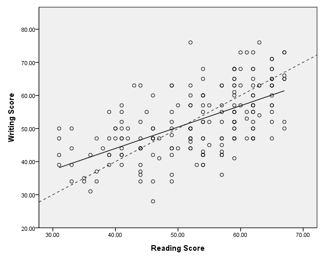
In this example, we add the y=x line by using the inlinetemplate option on the graphspec subcommand on the ggraph command. Note that this line spans the full range of the graph.
GGRAPH
  /GRAPHDATASET NAME="graphdataset" VARIABLES=read write
  /GRAPHSPEC SOURCE=INLINE inlinetemplate="<addReferenceLine numberPoints='200' y='x'/>".
BEGIN GPL
SOURCE: s=userSource(id("graphdataset"))
DATA: read=col( source(s), name( "read" ) )
DATA: write=col( source(s), name( "write" ) )
GUIDE: axis( dim( 1 ), label( "Reading Score" ) )
GUIDE: axis( dim( 2 ), label( "Writing Score" ) )
ELEMENT: point( position( write * read ) )
ELEMENT: line(position(smooth.linear(write * read)))
END GPL.
Adding a y=x line, method 2
This example is similar to the previous one, except that we have added some more options to the inlinetemplate to made the line dashed.
GGRAPH
  /GRAPHDATASET NAME="graphdataset" VARIABLES=read write
  /GRAPHSPEC SOURCE=INLINE inlinetemplate="<addReferenceLine numberPoints='200' y='x'><style color='black' stroke-dasharray='5px,5px'/></addReferenceLine>".
BEGIN GPL
SOURCE: s=userSource(id("graphdataset"))
DATA: read=col( source(s), name( "read" ) )
DATA: write=col( source(s), name( "write" ) )
GUIDE: axis( dim( 1 ), label( "Reading Score" ) )
GUIDE: axis( dim( 2 ), label( "Writing Score" ) )
ELEMENT: point( position( write * read ) )
ELEMENT: line(position(smooth.linear(write * read)))
END GPL.
Adding a loess line
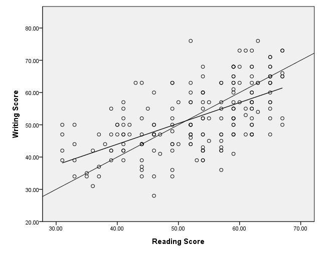
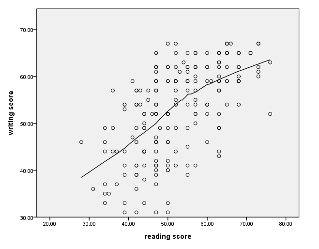
In this example, we add a loess smoother to the graph. We have done this with the second element statement using the smooth.loess option.
GGRAPH
  /GRAPHDATASET NAME="graphdataset" VARIABLES=read write
  /GRAPHSPEC SOURCE=INLINE.
BEGIN GPL
SOURCE: s=userSource(id("graphdataset"))
DATA: read=col(source(s), name("read"))
DATA: write=col(source(s), name("write"))
GUIDE: axis(dim(1), label("reading score"))
GUIDE: axis(dim(2), label("writing score"))
ELEMENT: point(position(read*write))
ELEMENT: line(position(smooth.loess(read*write)))
END GPL.
Using a different line style
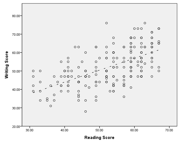
The different line styles that are available are given in the GPL guide in the section called GPL Constants: Shape Constants. There are about 10 different line styles from which to choose.
GGRAPH
  /GRAPHDATASET NAME="GraphDataset" VARIABLES= read write
  /GRAPHSPEC SOURCE=INLINE .
BEGIN GPL
SOURCE: s=userSource( id( "GraphDataset" ) )
DATA: read=col( source(s), name( "read" ) )
DATA: write=col( source(s), name( "write" ) )
GUIDE: axis( dim( 1 ), label( "Reading Score" ) )
GUIDE: axis( dim( 2 ), label( "Writing Score" ))
ELEMENT: point( position( write * read ) )
ELEMENT: line(position(smooth.linear(write * read)), shape(shape.dash_2_dots))
END GPL.
Adding grid lines
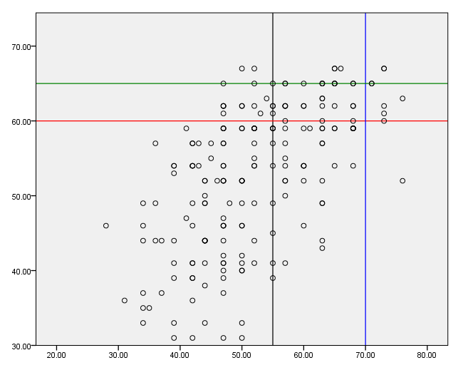
Grid lines can be added on the guide statement. If a vertical line is to be added, the value at which it is to be placed is given in parentheses. If a horizontal line is desired, an asterisk is given first in the parentheses, followed by a comma and then the value. We have used the color option to distinguish between the grid lines.
GGRAPH
  /GRAPHDATASET NAME="graphdataset" VARIABLES=read write
  /GRAPHSPEC SOURCE=INLINE.
BEGIN GPL
SOURCE: s=userSource(id("graphdataset"))
DATA: read=col(source(s), name("read"))
DATA: write=col(source(s), name("write"))
GUIDE: form.line(position(55), color(color.black))
GUIDE: form.line(position(*,60), color(color.red))
GUIDE: form.line(position(70), color(color.blue))
GUIDE: form.line(position(*, 65), color(color.green))
ELEMENT: point(position(read*write))
END GPL.
Bubble plot (dots sized to a variable)
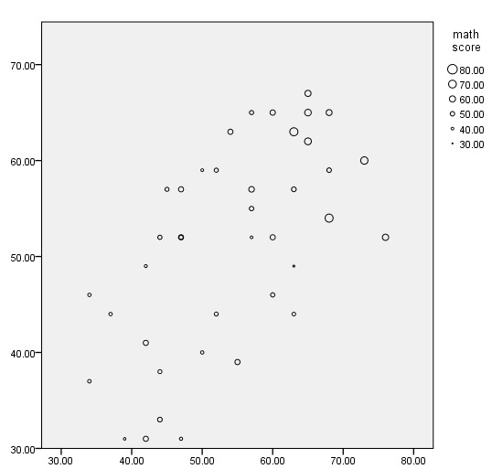
In this example, the points on the graph are sized according the value of the variable math. We do this with the size option on the element statement. We use only the first 40 cases in the data set to make the graph more readable, and we issue the use all command at the end so that all cases will be used in the next command.
use 1 thru 40.
GGRAPH
  /GRAPHDATASET NAME="graphdataset" VARIABLES=read write math
  /GRAPHSPEC SOURCE=INLINE.
BEGIN GPL
SOURCE: s=userSource(id("graphdataset"))
DATA: read=col(source(s), name("read"))
DATA: write=col(source(s), name("write"))
DATA: math=col(source(s), name("math"))
GUIDE: legend(aesthetic(aesthetic.size), label("math score"))
ELEMENT: point(position(read*write), size(math))
END GPL.
use all.
Using weighted data – without jitter
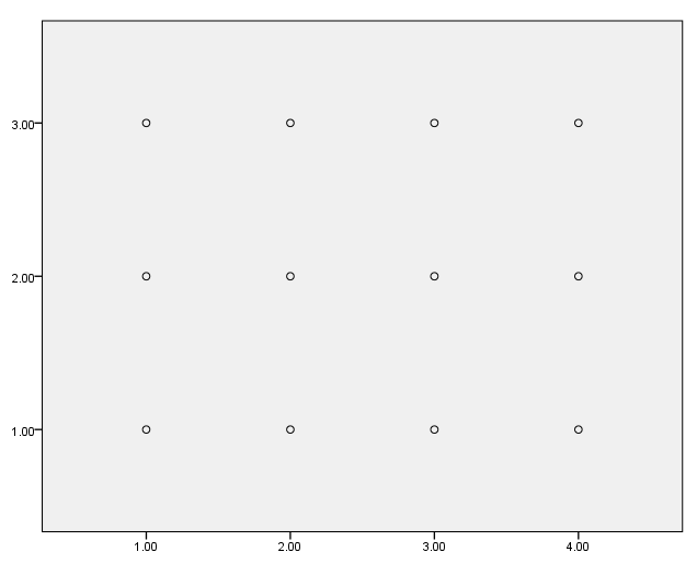
In this example, we graph the weighted data without jitter; the points are graphed on top of each other. Unlike most other commands in SPSS, the weight command should not be used with the ggraph command. To emphasize this, we issue the weight off command before issuing the ggraph command.
data list list / id var1 var2 wt.
begin data
1 1 1 4
2 1 2 7
3 1 3 6
4 2 1 9
5 2 2 5
6 2 3 11
7 3 1 1
8 3 2 2
9 3 3 3
10 4 1 12
11 4 2 8
12 4 3 10
end data.

weight off.
GGRAPH /GRAPHDATASET NAME="graphdataset" VARIABLES=var1 var2 wt /GRAPHSPEC SOURCE=INLINE. BEGIN GPL SOURCE: s=userSource(id("graphdataset")) SOURCE: s=userSource(id("graphdataset"), weight(wt)) DATA: var1=col(source(s), name("var1"), unit.category()) DATA: var2=col(source(s), name("var2"), unit.category()) ELEMENT: point(position(var1*var2)) END GPL.
Using weighted data – with jitter
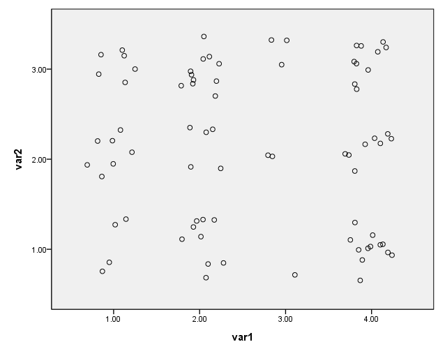
To use frequency weights with the ggraph command, the weight variable needs to be included in the list of variables. The weight variable must also be listed on a data statement. We have used jitter in this example so that the points are not graphed on top of each other.
GGRAPH
  /GRAPHDATASET NAME="graphdataset" VARIABLES=var1 var2 wt
  /GRAPHSPEC SOURCE=INLINE.
BEGIN GPL
SOURCE: s=userSource(id("graphdataset"), weight(wt))
DATA: var1=col(source(s), name("var1"), unit.category())
DATA: var2=col(source(s), name("var2"), unit.category())
DATA: wt = col(source(s), name("wt"))
GUIDE: axis(dim(1), label("var1"))
GUIDE: axis(dim(2), label("var2"))
ELEMENT: point.jitter(position(var1*var2))
END GPL.
Scatterplot matrix – example 1
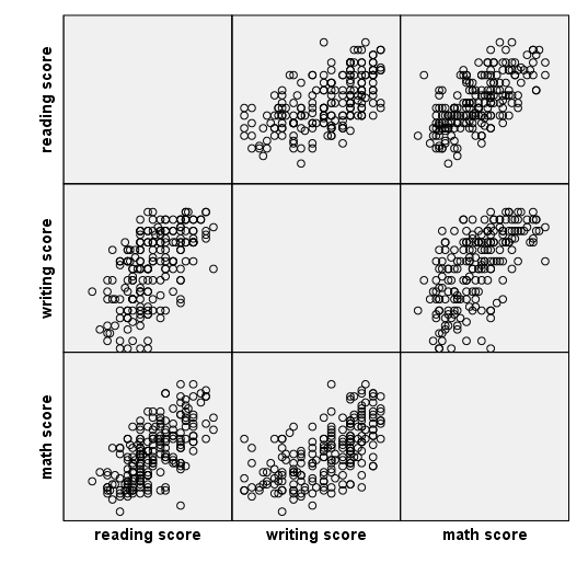
There are at least two different ways to make a scatterplot matrix. In this example, we use the trans statements to define the labels to be used on the graph. On the element statement, we use the names given to the labels. The names of the labels follow the name of the variable to be graphed and a forward slash, and this combination is connected to other such combinations with a plus.
get file "D:datahsb2.sav".

GGRAPH
  /GRAPHDATASET NAME="graphdataset" VARIABLES=read write math
  /GRAPHSPEC SOURCE=INLINE.
BEGIN GPL
SOURCE: s=userSource(id("graphdataset"))
DATA: read=col(source(s), name("read"))
DATA: write=col(source(s), name("write"))
DATA: math=col(source(s), name("math"))
TRANS: read_label = eval("reading score")
TRANS: write_label = eval("writing score")
TRANS: math_label = eval("math score")
ELEMENT: point(position((read/read_label+write/write_label+math/math_label)*(read/read_label+write/write_label+math/math_label)))
END GPL.
Scatterplot matrix – example 2
In this example, instead of using the trans statements, we enclose the labels to be used in quotes on the element statement.
GGRAPH
  /GRAPHDATASET NAME="graphdataset" VARIABLES=read write math
  /GRAPHSPEC SOURCE=INLINE.
BEGIN GPL
SOURCE: s=userSource(id("graphdataset"))
DATA: read=col(source(s), name("read"))
DATA: write=col(source(s), name("write"))
DATA: math=col(source(s), name("math"))
ELEMENT: point(position((read/"reading score"+write/"writing score"+math/"math score")*(read/"reading score"+write/"writing score"+math/"math score")))
END GPL.

Bar graphs
A simple bar graph
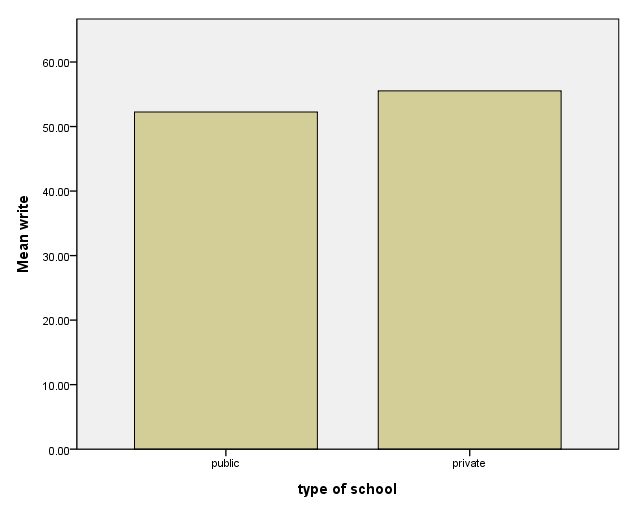
This is a simple bar graph. On the variables option on the graphdataset subcommand of the ggraph command, we specify that we want to graph the mean of the write.
GGRAPH
  /GRAPHDATASET NAME="graphdataset" VARIABLES=schtyp MEAN(write)[name="MEAN_write"]
  /GRAPHSPEC SOURCE=INLINE.
BEGIN GPL
SOURCE: s=userSource(id("graphdataset"))
DATA: schtyp=col(source(s), name("schtyp"), unit.category())
DATA: MEAN_write=col(source(s), name("MEAN_write"))
GUIDE: axis(dim(1), label("type of school"))
GUIDE: axis(dim(2), label("Mean write"))
SCALE: cat(dim(1), include("1.00", "2.00"))
SCALE: linear(dim(2), include(0))
ELEMENT: interval(position(schtyp*MEAN_write), shape.interior(shape.square))
END GPL.
Modifying the y-axis
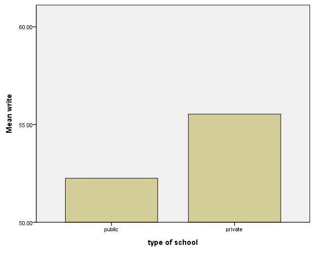
In this example, we modify the y-axis by using a scale statement, specifying the second dimension and using the min and max options.
GGRAPH
  /GRAPHDATASET NAME="graphdataset" VARIABLES=schtyp MEAN(write)[name="MEAN_write"]
  /GRAPHSPEC SOURCE=INLINE.
BEGIN GPL
SOURCE: s=userSource(id("graphdataset"))
DATA: schtyp=col(source(s), name("schtyp"), unit.category())
DATA: MEAN_write=col(source(s), name("MEAN_write"))
GUIDE: axis(dim(1), label("type of school"))
GUIDE: axis(dim(2), label("Mean write"), delta(5))
SCALE: cat(dim(1), include("1.00", "2.00"))
SCALE: linear(dim(2), min(50), max(60))
ELEMENT: interval(position(schtyp*MEAN_write), shape.interior(shape.square))
END GPL.
Grouped bar graph
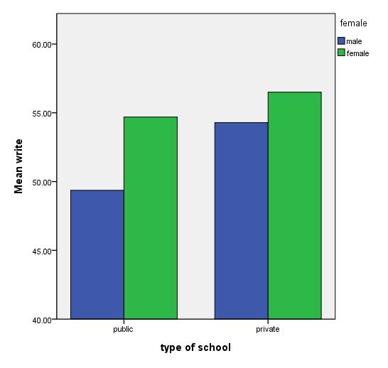
The coord (coordinate) statement needs to be included in order to get all four bars on one graph. If the coord statement is removed, you get two graphs side by side. If the shape(shape.square) option is removed, the bars are touching.
GGRAPH
  /GRAPHDATASET NAME="graphdataset" VARIABLES=schtyp MEAN(write)[name="MEAN_write"] female
  /GRAPHSPEC SOURCE=INLINE.
BEGIN GPL
SOURCE: s=userSource(id("graphdataset"))
DATA: schtyp=col(source(s), name("schtyp"), unit.category())
DATA: MEAN_write=col(source(s), name("MEAN_write"))
DATA: female=col(source(s), name("female"), unit.category())
COORD: rect(dim(1,2), cluster(3,0))
GUIDE: axis(dim(3), label("type of school"))
GUIDE: axis(dim(2), label("Mean write"), delta(5))
GUIDE: legend(aesthetic(aesthetic.color.interior), label("female"))
SCALE: linear(dim(2), min(40), max(60))
ELEMENT: interval(position(female*MEAN_write*schtyp), color.interior(female), shape.interior(shape.square))
END GPL.
Boxplots
A simple boxplot
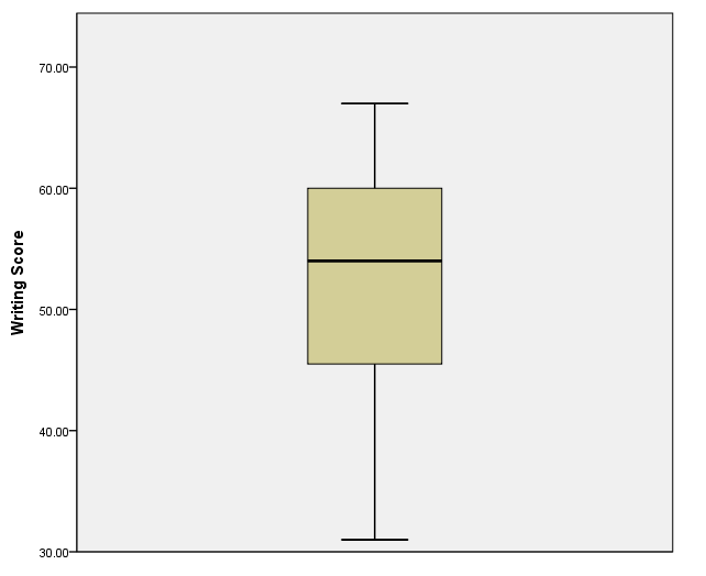
This is a simple boxplot of the variable write.
GGRAPH
  /GRAPHDATASET NAME="GraphDataset" VARIABLES= write
  /GRAPHSPEC SOURCE=INLINE.
BEGIN GPL
SOURCE: s=userSource( id( "GraphDataset" ) )
DATA: write=col( source(s), name( "write" ) )
GUIDE: axis( dim( 2 ), label( "Writing Score" ) )
ELEMENT: schema( position( bin.quantile.letter( 1 * write ) ) )
END GPL.
Adding ID numbers to outliers
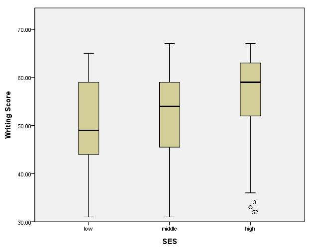
We can add the case number next to outliers by including a third data statement that defines a new variable, which we called id. This is the SPSS scratch variable $casenum, and we indicate that it is a categorical variable with the unit.category() option. We also include the label option on the element statement.
GGRAPH
  /GRAPHDATASET NAME="graphdataset" VARIABLES=ses write
  /GRAPHSPEC SOURCE=INLINE.
BEGIN GPL
SOURCE: s=userSource(id("graphdataset"))
DATA: ses=col(source(s), name("ses"), unit.category())
DATA: write=col(source(s), name("write"))
DATA: id=col(source(s), name("$CASENUM"), unit.category())
GUIDE: axis(dim(1), label("SES"))
GUIDE: axis(dim(2), label("Writing Score"))
ELEMENT: schema(position(bin.quantile.letter(ses*write)), label(id))
END GPL.
Histograms
A simple histogram – method 1
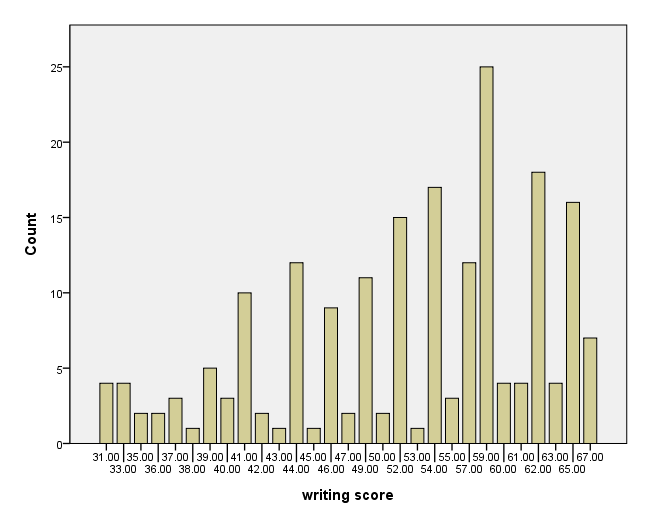
There are at least two ways to make a histogram. In this example, we use the count() option on the graphdataset subcommand on the ggraph command.
GGRAPH
  /GRAPHDATASET NAME="graphdataset" VARIABLES=write COUNT()[name="count"]
  /GRAPHSPEC SOURCE=INLINE.
BEGIN GPL
SOURCE: s=userSource(id("graphdataset"))
DATA: write=col(source(s), name("write"), unit.category())
DATA: count=col(source(s), name("count"))
GUIDE: axis(dim(1), label("writing score"))
GUIDE: axis(dim(2), label("Count"))
SCALE: linear(dim(2), include(0))
ELEMENT: interval(position(write*count), shape.interior(shape.square))
END GPL.
A simple histogram – method 2
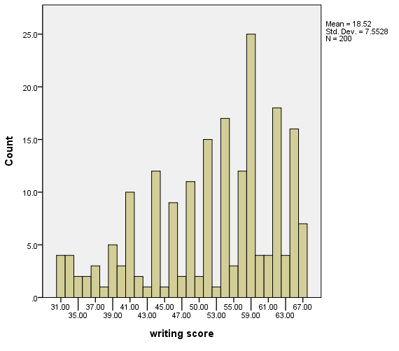
In this example, we use the summary.count option on the element statement to indicate that we want the counts of the variable write.
GGRAPH
  /GRAPHDATASET NAME="graphdataset" VARIABLES=write
  /GRAPHSPEC SOURCE=INLINE.
BEGIN GPL
SOURCE: s=userSource(id("graphdataset"))
DATA: write=col(source(s), name("write"), unit.category())
GUIDE: axis(dim(1), label("writing score"))
GUIDE: axis(dim(2), label("Count"))
SCALE: linear(dim(2), include(0))
ELEMENT: interval(position(summary.count(bin.rect(write))))
END GPL.
Using percentages
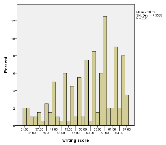
In this example, we use the summary.percent.count option on the element statement to indicate that we want the percentages of the variable write.
GGRAPH
  /GRAPHDATASET NAME="graphdataset" VARIABLES=write
  /GRAPHSPEC SOURCE=INLINE.
BEGIN GPL
SOURCE: s=userSource(id("graphdataset"))
DATA: write=col(source(s), name("write"), unit.category())
GUIDE: axis(dim(1), label("writing score"))
GUIDE: axis(dim(2), label("Percent"))
SCALE: linear(dim(2), include(0))
ELEMENT: interval(position(summary.percent.count(bin.rect(write))))
END GPL.
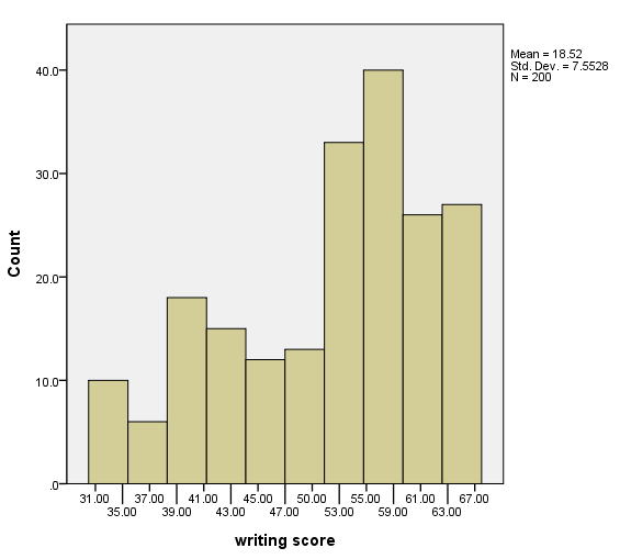
Selecting the number of bins
In this example, we use the binCount() option on the element statement to indicate how many bins are desired.
GGRAPH
  /GRAPHDATASET NAME="graphdataset" VARIABLES=write
  /GRAPHSPEC SOURCE=INLINE.
BEGIN GPL
SOURCE: s=userSource(id("graphdataset"))
DATA: write=col(source(s), name("write"), unit.category())
GUIDE: axis(dim(1), label("writing score"))
GUIDE: axis(dim(2), label("Count"))
SCALE: linear(dim(2), include(0))
ELEMENT: interval(position(summary.count(bin.rect(write, binCount( 10 )))))
END GPL.
Counts on bars
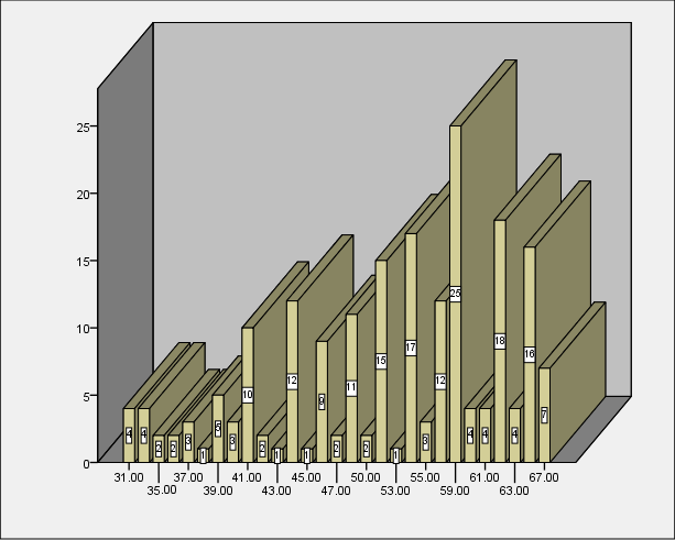
Many options are needed on the inlinetemplate option on the graphspec subcommand of the ggraph command. Also, the variable COUNT (which is created in the variables option of the graphdataset subcommand of the ggraph command must be included on a data statement in the GPL code.
GGRAPH
  /GRAPHDATASET NAME="graphdataset" VARIABLES=write COUNT()[name="COUNT"]
  /GRAPHSPEC SOURCE=INLINE  INLINETEMPLATE=
["<addBarEffects applyToNonBar='true' depth='100%'  foreshortening='0.2' theta='50' />"
 "<addDataLabels><labeling variable='count'></labeling></addDataLabels>" ].
BEGIN GPL
SOURCE: s=userSource(id("graphdataset"))
DATA: write=col(source(s), name("write"), unit.category())
DATA: COUNT=col(source(s), name("COUNT"))
GUIDE: axis(dim(3), label("Writing Score"), opposite())
SCALE: linear(dim(2), include(0))
ELEMENT: interval(position(write*COUNT), shape.interior(shape.square))
END GPL.
Setting the x-axis
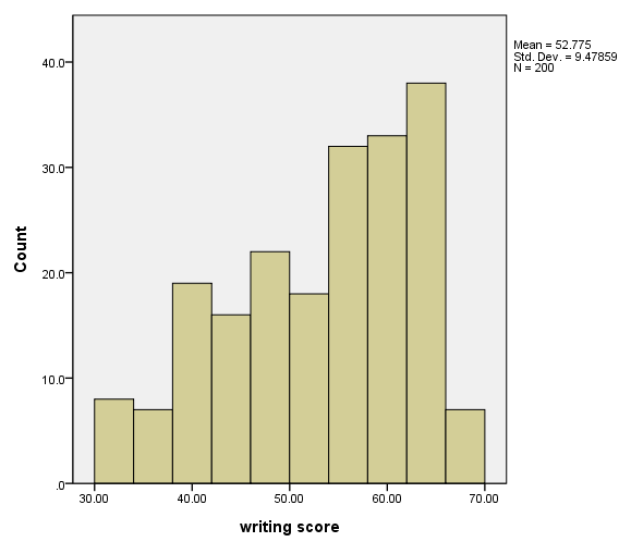
A scale statement for dimension 1 is used with the min and max options to set the x-axis.
GGRAPH
  /GRAPHDATASET NAME="graphdataset" VARIABLES=write
  /GRAPHSPEC SOURCE=INLINE.
BEGIN GPL
SOURCE: s=userSource(id("graphdataset"))
DATA: write=col(source(s), name("write"))
GUIDE: axis(dim(1), label("writing score"))
GUIDE: axis(dim(2), label("Count"))
SCALE: linear(dim(1), min(30), max(70))
SCALE: linear(dim(2), include(0))
ELEMENT: interval(position(summary.count(bin.rect(write, binCount( 10 )))))
END GPL.
Histogram with a normal curve
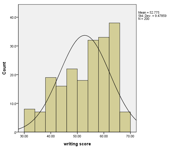
We add a normal curve to the graph by including a second element statement with the density.normal option.
GGRAPH
  /GRAPHDATASET NAME="graphdataset" VARIABLES=write
  /GRAPHSPEC SOURCE=INLINE.
BEGIN GPL
SOURCE: s=userSource(id("graphdataset"))
DATA: write=col(source(s), name("write"))
GUIDE: axis(dim(1), label("writing score"))
GUIDE: axis(dim(2), label("Count"))
SCALE: linear(dim(1), min(30), max(70))
SCALE: linear(dim(2), include(0))
ELEMENT: interval(position(summary.count(bin.rect(write, binCount( 10 )))))
ELEMENT: line(position(density.normal(write)))
END GPL.
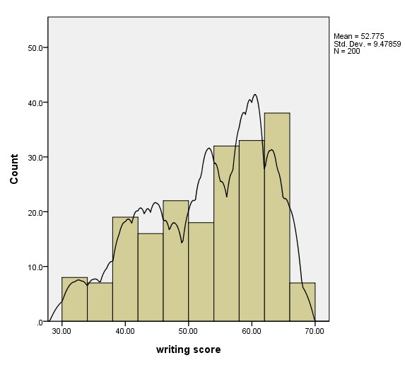
Histogram with kernel density curve
We add a kernel density curve to the graph by including a second element statement with the density.kernel.epanechnikov option.
GGRAPH
  /GRAPHDATASET NAME="graphdataset" VARIABLES=write
  /GRAPHSPEC SOURCE=INLINE.
BEGIN GPL
SOURCE: s=userSource(id("graphdataset"))
DATA: write=col(source(s), name("write"))
GUIDE: axis(dim(1), label("writing score"))
GUIDE: axis(dim(2), label("Count"))
SCALE: linear(dim(1), min(30), max(70))
SCALE: linear(dim(2), include(0))
ELEMENT: interval(position(summary.count(bin.rect(write, binCount( 10 )))))
ELEMENT: line(position(density.kernel.epanechnikov(write)))
END GPL.
