There are two commands in SPSS that are used exclusively to make graphs: graph and igraph. (There are several other commands that have subcommands that make graphs, but they will not be discussed here.) While graph and igraph will make many of the same kinds of graphs (e.g., histograms, scatterplots, etc.), the options available to you are different for the different commands. Because many of the options available in both graph and igraph cannot be utilized with code, we will show how to point-and-click to get these options. We will use the hsb2 data set to illustrate the commands and options.
THE GRAPH COMMAND
-
Options that are general to most types of graphs created with the graph command
There are several options that are common to most types of graphs that can be created with the graph command. We will illustrate these using a scatterplot. To create the scatterplot, at the top of the data editor, click on graphs > scatter. We will select simple and then click on "define". We will choose the variable read for the x-axis and the variable write for the y-axis and then click OK. If we double click anywhere on the graph, we will open up the chart editor. From here, we can alter many aspects of the graph’s appearance.
Changing aspects of the axes: click on chart > axis > select axis that you want to modify. We will choose the x-axis and then click on OK. From this dialogue box, you can hide the axis line by unchecking the check-box in the top left-hand corner. You can alter the axis title and where the title is positioned relative to the axis (e.g., left/bottom, right/top or centered). Note that "bottom" and "top" refer to the bottom and top of the scale, as in the lowest and highest values on the scale; they do not refer to the bottom or top of the graph. You can select either a linear or a log scale, as well as the minimum and maximum values displayed. You can specify the increments of both the major and minor divisions (in other words, where the tick marks are). In the lower right hand corner you can uncheck the check box entitled "display labels" if you do not want labels displayed. Clicking on the labels button takes you to a new dialogue box where you can indicate how many decimal places are shown, indicate a leading character, a trailing character, and a "1000s separator" (which means that a comma would be used when values exceed one thousand). You can also supply a scaling factor and alter the orientation of the axis labels.
Adding titles and subtitles: chart > titles. You can type in text for up to two titles and one subtitle. You can also left-, center- or right-justify the titles and subtitle.
Adding footnotes: chart > footnote. You can type in text for up to two footnotes and they can be left-, center- or right-justified.
Altering the legend: Double click on the legend in the chart editor. To hide the legend, uncheck the check-box in the upper left-hand corner of the dialogue box. You can also add a legend title left-, center- or right-justify it.
Adding text (annotations) to the graph: chart > annotation. To make an annotation, type the text into the text box in the middle of the dialogue box. Select the type of justification that you want from the pull-down menu. You can add a frame around the text by clicking on that check box. Finally, you will need to indicate where on the graph you want the text to appear. You do this by giving the coordinate for the x-axis and the coordinate for the y-axis. These coordinates must be within the range of the scale for that axis. Once you have made these specifications, click on the "add" button to add your annotation to the "annotation(s)" box. To make changes to an existing annotation, highlight it, make the changes in the dialogue box, and then click on "change." Finally, click on OK.
Deleting categories or variables: series > displayed. This dialogue box will allow you eliminate certain categories or variables from your graph, depending on the options that you selected previously.
Changing colors: format > color. This dialogue box will allow you to change the color(s) of the symbol(s) used on your graph. If your graph has different groups represented, such as males and females on a scatterplot or different boxes in a boxplot, click on the group whose color you want to change and then click on format > color.
Changing the font (type face) and size of text: format > text. First, click on the text whose font and/or size you would like to change. This can be any of the text associated with the graph or the numbers on the axes. We do not know of any way to select more than one piece of text at a time. Next, click on format > text and make your selections, then click on the "apply" button to have your changes take effect.
Adding reference lines: chart > reference line > select axis > type in position of line, click on "add" and then on OK.
Using a template: format > apply chart template > select file to be used. SPSS allows you to create a "template" and apply it to other graphs that you make or have already made. This template contains many, if not all, of the modifications that you have made to a particular graph. For example, if you have modified the size of text used for the x- and y-axis, selected a color other than the default for the symbols on your graph and added a title to the legend, you can save these changes into a template. Any graph created with the graph command that you apply this template to will have these characteristics. To save a template, click on file > save chart template and provide a name for the template. To apply a template to a graph that you have already made, click on format > apply chart template from within the chart editor.
EXAMPLES USING THE GRAPH COMMAND
graph > gallery > interactive
1. Barchart:
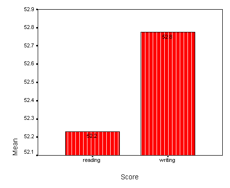
graphs > bar > simple and separate variables > define > select the variables read, write,
math
Double-click on the graph to open the SPSS
Chart Editor
1.) omit math scores: series > displayed and omit the math scores
2.) alter thickness of lines surrounding the bars: highlight bars >
format > line style > make selection > apply > close
3.) change the fill pattern within the bars: format > fill pattern >
make selection > apply > close
4.) change labeling on x-axis: double-click on x-axis to open dialogue
box, make the desired changes, and click OK
5.) add counts to the tops of the bars: highlight bars, format > bar
label style > make selection > apply all
6.) change the type of graph: gallery > make selection
7.) swap axes: format > swap axis
2. Histogram:
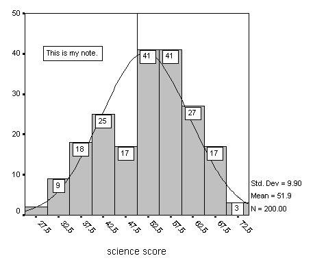
graphs > histogram > select the variable science and check on box to display
normal curve
Double-click on the graph to open the SPSS
Chart Editor
1.) change color of bars: highlight bars > format > color > make
selection > apply > close
2.) change labeling on x-axis: highlight x-axis > chart > axis > title
justification to center, intervals > custom > define > number of intervals = 10,
displayed minimum = 25 maximum = 75 > continue > labels > diagonal
3.) add annotation: chart > annotation > type in text, position 40, 30
justification center, display frame around text > add > OK
4.) change bar label style: format > bar label style > make selection >
apply all > close
5.) add a reference line: chart > reference line > interval scale >
type in selection (50) > add > OK
3. Line chart:
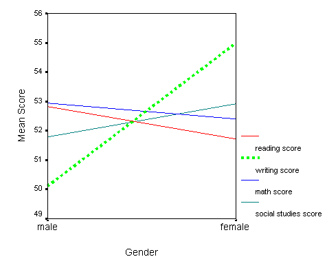
graphs > line > multiple and separate variables > define > select the variables
read, write, math and socst for lines and female for category axis > OK
Double-click on the graph to open the SPSS
Chart Editor
1.) change line style: highlight one line > format > line style > make
selection > apply > close
2.) change line color: highlight one line > format > color > make
selection > apply > close
3.) change labeling on x-axis: highlight x-axis > chart > axis > change
axis title to "Gender", center it > labels > make changes > continue > OK
4.) change text size: highlight text > format > text > make selections >
apply > close
5.) change labeling on y-axis: highlight y-axis > chart > axis >
make selections > OK
4. Scatterplot:
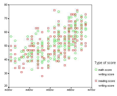
graphs > scatter > overlay > define > select the variables write – read and math
– write. Highlight math – write and click "swap pair".
Double-click on the graph to open the SPSS
Chart Editor
1.) change mark symbols and size: highlight one group (math-writing
scores) > format >
markers > select style and size > apply (to apply to highlighted group) or apply
all (to apply to all groups) > close
2.) add legend title: chart > legend > type in the title > OK
3.) add leading and trailing characters: highlight y-axis > chart > axis
> labels > type in leading and/or trailing character > continue > OK
THE IGRAPH COMMAND
-
Options that are general to most types of graphs created with the igraph command
After double-clicking on a graph in the output window created with the igraph command, there are two ways to access the dialogue boxes necessary to modify the graph. One is to click on one of the icons in the border surrounding the graph. The icon third from the left on the top will open the chart manager, and highlighting the various elements listed will allow you to open the respective dialogue boxes. The other way to access the dialogue boxes is to highlight an element of the graph and then right-click on it. Three options that are available for most elements that you can right-click on (except legends) are the "assign variables", "chart properties" and "ChartLooks".
The "assign variables" option allows you to re-assign variables to axes, label cases and make modifications to a pie chart. If you make appropriate changes, they will immediately be displayed in your graph; if the changes you make do not apply (for example, labeling cases in a barchart), no change will be made to your graph.
The "chart properties" option opens a dialogue box with eight tabs that allow you to modify many aspects of the graph, including various aspects of the colors, styles, sizes, text, filled objects, axes, grid lines and lines and symbols used. The changes that you make using chart properties can be save and applied to other graphs as you making them (if you use syntax to create the graph) or applied after you have made the graph. To save your modifications, right-click on an element in the graph and select "ChartLook" > save as and supply a name.
The third option is called "ChartLooks". SPSS comes with eight "ChartLooks" that you can select and apply to your graph. By selecting a "ChartLook" and clicking on "edit look" you can make changes to any of the "ChartLooks."
There are at least two other features of most graphs that can be modified that are not specific to the type of graph.
The first is adding annotations to the graph. This can be done by clicking on the second symbol down on the left of the frame around the graph (it looks like a line with the letter "a" after it), clicking on the graph where you would like the text to begin and typing in your annotation.
The second is three-dimensional rotation of the graph. To access the dialogue window for this option for the first time, click on the second-to-last icon on the top of the frame around the graph. Select 3-D effect and this will open the 3-D rotation box which will allow you to rotate your graph to any angle that you like. You can also rotate the graph with the blue hand that will become available.
EXAMPLES USING THE IGRAPH COMMAND
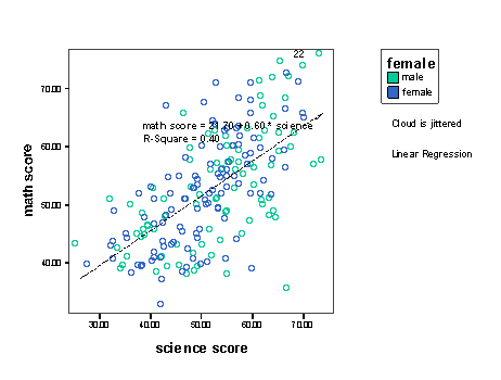
1. Scatterplot:
graphs > interactive > scatterplot > select the variable math for the y-axis,
science for the x-axis and female for the color variable. Next, select the
"fit" tab and select regression from the pull-down menu under method
and select "regress" and then check
the box for fit lines for total. Click OK in the lower left-hand corner of
the dialogue box.
1.) add jitter: After double-clicking on the graph to open the editor,
double-click on one of the data points in the graph. This will open a
dialogue box with three tabs at the top. Select the "jitter" tab, check
the box to jitter all scale variables, indicate a percentage from 1 to 10, and
click on apply and OK (sunflowers on scatterplots using graph).
2.) add identification numbers to particular points: Click on the
third icon down on the side of the graph editor (the square icon) and then click
on a point that you would like to label. To change where the label is
relative to the data point, click on the first icon on the top of the side of
the graph editor and then double-click on a point in the graph. This will
open the dialogue box that we saw earlier. This time, select the "labels"
tab. Using the location pull-down menu you can select where you would like
the label to be placed relative to the data point. You can also indicate
if you would like a connector between the label and the data point. If you
want a connector, you can select from 25 different ones.
3.) change the colors of the symbols: You can change the colors of the
symbols by double-clicking on the color in the legend and the selecting a new
color from the palette in the dialogue box.
4.) change aspects of the regression line: You can change many aspects
of the regression line by double-clicking on it. This will open a dialogue
box where you can add separate regression lines for the subgroups (in this case,
a regression line for the males and a different one for the females). You
can change the thickness of the line, the style of the line and the location of
the equation relative to the line by clicking on the options button in the lower
right-hand corner and making your selections.
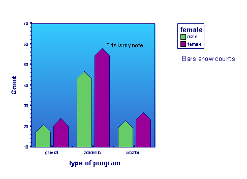
2. Barchart: graphs
> interactive > bar > select the variable prog for the x-axis and female for the
color. Select the "bar chart options" tab at the top of the dialogue box
and select a new bar shape. Select the "option" tab and uncheck the "auto"
check-box under scale range, set the minimum to 10 and the maximum to 70.
Click OK in the bottom left-hand corner.
1.) move the legend(s): You can move any of legend round the graph by
dragging it and dropping it where you want it
2.) add annotations: You can add annotations anywhere in the graph that
you would like by clicking on the arrow (which is the second icon down on the
left side of the frame around the graph), clicking on the graph where you would
like the text to begin and typing in your annotation.
3.) ChartLook: highlight an object on the chart and right-click on it,
then select ChartLook from the menu.
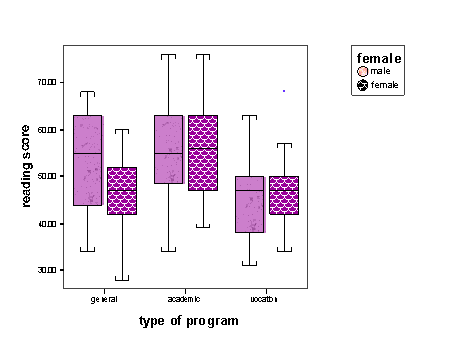
3. Boxplot:
graphs > interactive > boxplot > select the variable read for the y-axis, prog
for the x-axis and female for the style. Select the "boxes" tab at the top
and change the type of whisker caps. Then click on OK in the bottom left
of the dialogue box.
1.) change the color of a box: Highlight one of the boxes and
right-click on it. Select "boxes" and change the color of the box.
2.) chart properties: highlight an object on the chart and right-click
on it, then select chart properties from the menu.
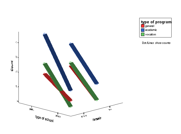
4. Ribbon:
graphs > interactive > ribbon > select the variable schtyp for the x-axis,
female for the z-axis and prog for the color. Select the "ribbon" tab and
select "dots".
1.) Rotate the graph: double-click on graph. You can enter the
numbers indicating the degrees to which the pie should be rotated or use the
hand with the arrow inside of it.
5. Pie chart: graphs
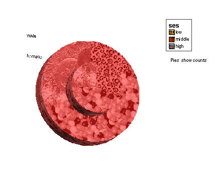
> interactive > pie > clustered > select ses for the "slice by"
variable and female for the "clustered by" variable and select 3-D effect.
Select the "pies" tab for more options.
1.) Rotate the graph: double-click on graph. You can enter the
numbers indicating the degrees to which the pie should be rotated or use the
hand with the arrow inside of it.
6.
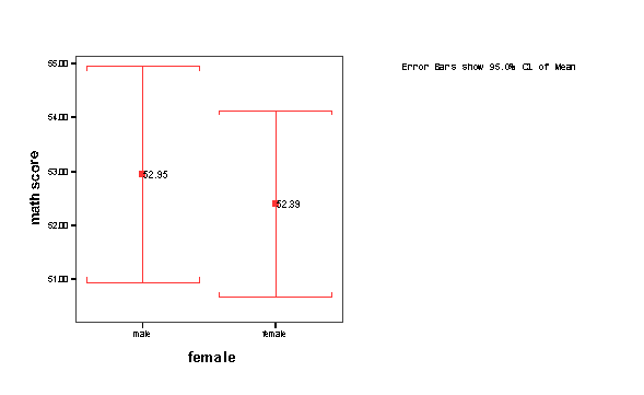
Error bar: graphs > interactive > error bar > select
the variable math for the y-axis and female for the x-axis. Next, select
the "error bars" tab, select a bar label and a different shape for the error
bar, and then click on OK in the bottom left-hand corner of the dialogue box.
1.) change the location of the bar labels: After double-clicking on the
graph to open the editor, double-click on one of the error bars. This will
open a dialogue box with four tabs at the top. Select the "labels" tab and
change the location of the label by using the drop-down menu. Next, click
on the "width" tab and change the width of the caps on the error bars.
Click on apply and then OK.
2.) change the key: To change any aspect of the key, right-click on it.
You can change the font that it is in, the size of the lettering, or hide the
key.
Dot plot:
Dot plots can be used to make indexplots. Dot plots have many of the
same features and options as scatterplots.
PASTING GRAPHS INTO OTHER APPLICATIONS:
Highlight the graph,
right-click on it and select "copy objects". In Word or PowerPoint, etc.,
edit > paste (or clt-v). You can also export the graph as a text file, an
HTM file or an XML file.
