The code below shows how to plot the means and confidence interval bars for
groups defined by two categorical variables. This type of plot appeared in
an article by Baker, et al, in The American Journal of Clinical Nutrition,
"High prepregnant body mass index is associated with early termination of full
and any breastfeeding in Danish women".
We start by generating the "bare bones" version of such a graph.
use https://stats.idre.ucla.edu/stat/stata/notes/hsb2, clear
preserve
local varname math
local group ses race
collapse (mean) y = `varname' (semean) se_y = `varname', by(`group')

sort `group'
gen x = _n
replace x = _n + 2 if _n >= 5
replace x = _n + 4 if _n >= 9

gen yu = y + 1.96*se_y
gen yl = y - 1.96*se_y


label  define x      1  "gr1"  2 "gr2" 3 "gr3"  4 "gr4" ///
                     7  "gr1"  8 "gr2" 9 "gr3"  10 "gr4" ///
					 13 "gr1" 14 "gr2" 15 "gr3"  16 "gr4"


label  value x x

twoway (scatter y x if x<=4, msymbol(S) ) ///
       (rcap yu  yl x if x<=4) (line y x if x<=4) ///
       (scatter y x if x>=7 & x<=10, msymbol(S) ) ///
       (rcap yu  yl x if x>=7 & x<=10) (line y x if x>=7 & x<=10) ///
       (scatter y x if x>=13, msymbol(S) ) ///
       (rcap yu  yl x if x>=13) (line y x if x>=13 ), ///
  	   xlabel(1(1)4 7(1)10 13(1)16, valuelabel) xtitle(" ") ///
	   ytitle("Mean of `varname' by `group'") yline(50) legend(off) scheme(lean1)
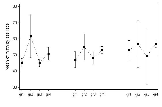
While this graph is of the general desired form, it not clear from looking at
it if there are three levels of SES and four levels of race, or vice versa.
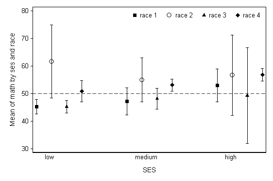
Ideally, different markers would be used for each of the four levels seen in one
group of points, the labeling would be more explicit, and the dotted lines
attaching the means would be removed. The code below is more complex, but
produces this ideal graph.
restore
local varname math
local group1 ses
local group2 race
collapse (mean) y = `varname' (semean) se_y = `varname', by(`group1' `group2')

sort `group1' `group2'
gen x = _n
replace x = _n + 2 if _n >= 5
replace x = _n + 4 if _n >= 9

gen yu = y + 1.96*se_y
gen yl = y - 1.96*se_y

separate y, by(`group2')
separate yu, by(`group2')
separate yl, by(`group2')

label  define x      1  "gr1"  2 "gr2" 3 "gr3"  4 "gr4" ///
                     7  "gr1"  8 "gr2" 9 "gr3"  10 "gr4" ///
		    13 "gr1" 14 "gr2" 15 "gr3"  16 "gr4"


label  value x x
local varname math
local group1 ses
local group2 race
twoway (scatter y1 x , msymbol(S) msize(medium)) ///
       (rcap yu1 yl1 x)  ///
       (scatter y2 x , msymbol(Oh) msize(large)) ///
       (rcap yu2 yl2 x )  ///
       (scatter y3 x , msymbol(T) msize(medium)) ///
       (rcap yu3 yl3 x )  ///
       (scatter y4 x , msymbol(D) msize(medium)) ///
       (rcap yu4 yl4 x ), scheme(lean1) ///
	   xlabel(none) xtitle(" ") b2("SES") ///
	   ytitle(Mean of `varname' by `group1' and `group2') yline(50, lpattern(dash)) ///
	   text(27 1.5 "low", place(e)) ///
	   text(27 7.5 "medium", place(e)) ///
	   text(27 13.5 "high", place(e)) ///
	   legend(order(1 "race 1" 3 "race 2" 5 "race 3" 7 "race 4") position(1) row(1) ring(0)) ///
	   name(g3, replace)
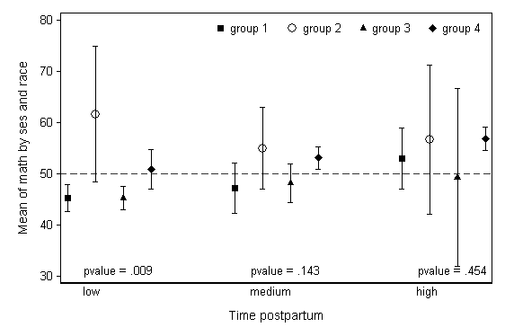
We may wish to add additional text to this plot, like p-values from ANOVA tests on race conducted within SES levels. The code below starts from the original dataset to generate
these values, saves them as macro variables, and then puts them into the plot
using the text option (similar to the placement of SES levels in
the above plot).
use https://stats.idre.ucla.edu/stat/stata/notes/hsb2, clear
anova math race if ses==1
test race
local pv1 = round(Ftail(r(df), r(df_r),r(F)), .001)

anova math race if ses==2
test race
local pv2 = round(Ftail(r(df), r(df_r),r(F)), .001)

anova math race if ses==3
test race
local pv3 = round(Ftail(r(df), r(df_r),r(F)), .001)

local varname math
local group1 ses
local group2 race
collapse (mean) y = `varname' (semean) se_y = `varname', by(`group1' `group2')

sort `group1' `group2'
gen x = _n
replace x = _n + 2 if _n >= 5
replace x = _n + 4 if _n >= 9

gen yu = y + 1.96*se_y
gen yl = y - 1.96*se_y

separate y, by(`group2')
separate yu, by(`group2')
separate yl, by(`group2')

* no connecting lines, another version
local varname math
local group1 ses
local group2 race
di `pv1'
twoway (scatter y1 x , msymbol(S) msize(medium)) ///
       (rcap yu1 yl1 x)  ///
       (scatter y2 x , msymbol(Oh) msize(large)) ///
       (rcap yu2 yl2 x )  ///
       (scatter y3 x , msymbol(T) msize(medium)) ///
       (rcap yu3 yl3 x )  ///
       (scatter y4 x , msymbol(D) msize(medium)) ///
       (rcap yu4 yl4 x ), scheme(lean1) ///
	   xlabel(none) xtitle(" ") b2("Time postpartum") ///
	   ytitle(Mean of `varname' by `group1' and `group2') yline(50, lpattern(dash)) ///
	   text(31 1.5 "p = `pv1'", place(e)) ///
	   text(31 7.5 "p = `pv2'", place(e)) ///
	   text(31 13.5 "p = `pv3'", place(e))  ///
	   text(27 1.5 "low", place(e)) ///
	   text(27 7.5 "medium", place(e)) ///
	   text(27 13.5 "high", place(e)) ///
	   legend(order(1 "group 1" 3 "group 2" 5 "group 3" 7 "group 4") position(1) row(1) ring(0))