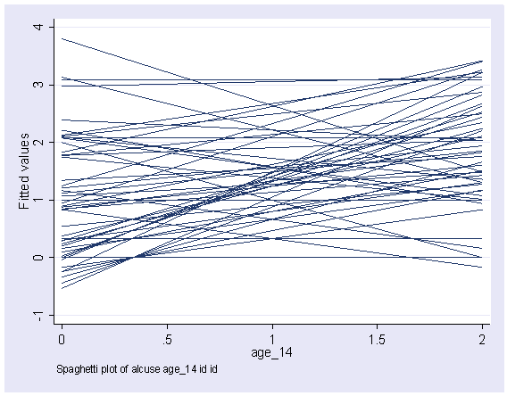
Here are a couple of examples of making spaghetti plots.
Here is a basic spaghetti plot that looks at "alcuse" over time (age_14) showing
one regression line per person (see "search spagplot")
spagplot alcuse age_14 , id( id )
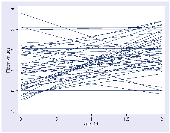
Here we make the same graph manually.
use https://stats.idre.ucla.edu/stat/stata/examples/alda/data/alcohol1_pp, clear

quietly xi: regress alcuse i.id*age_14
predict yhat
graph twoway line yhat age_14, connect(L L)

And here is the graph
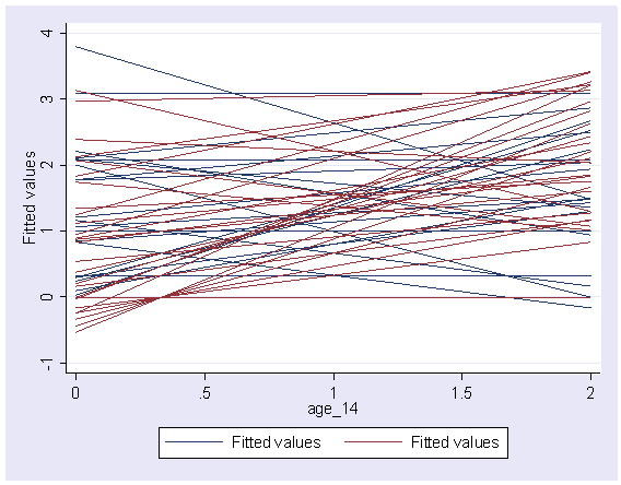
But say that you wanted to see separate lines for males and females.  We can
do that, as shown below.
use https://stats.idre.ucla.edu/stat/stata/examples/alda/data/alcohol1_pp, clear

separate alcuse, by(male)
quietly xi: regress alcuse0 i.id*age_14
predict yhat0
quietly xi: regress alcuse1 i.id*age_14
predict yhat1

graph twoway line yhat0 yhat1 age_14, connect(L L)
and here is the graph