
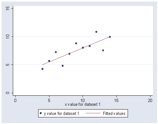
Page 34, figure 3.1.
use https://stats.idre.ucla.edu/stat/stata/examples/ara/quartet, clear

graph twoway (scatter y1 x1) (lfit y1 x1), xlabel(0(5)20) ylabel(0(5)15)
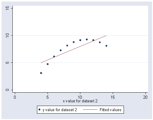
graph twoway (scatter y2 x2) (lfit y2 x2), xlabel(0(5)20) ylabel(0(5)15)
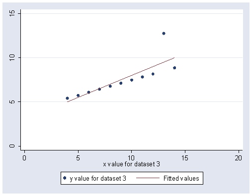
graph twoway (scatter y3 x3) (lfit y3 x3), xlabel(0(5)20) ylabel(0(5)15)
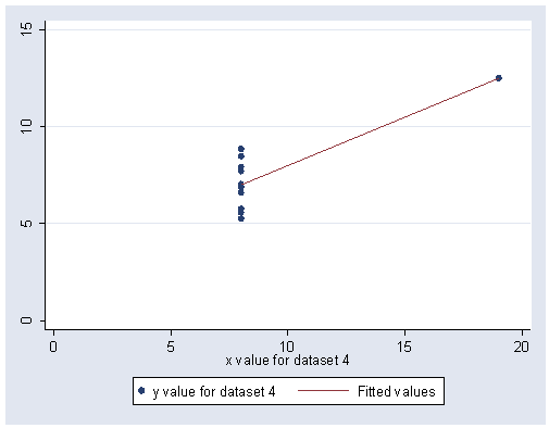
graph twoway (scatter y4 x4) (lfit y4 x4), xlabel(0(5)20) ylabel(0(5)15)
Page 37, figure 3.2. We have skipped this for now.
Page 38, figure 3.3 This is a stem and leaf plot. The plot looks a bit different from
Fox due to a different style of display. Also, Stata rounded to the nearest hundred, but Fox truncated the data.
For example, 1890 was displayed at 1|8 in Fox, but 1|9 in Stata.
use https://stats.idre.ucla.edu/stat/stata/examples/ara/prestige, clear

stem income, round(100)
Stem-and-leaf plot for income (Average income, dollars)

income rounded to nearest multiple of 100
plot in units of 100

   0* | 69
   1* | 79
   2* | 44689
   3* | 001125556667999
   4* | 01223345677788
   5* | 1111234566889
   6* | 012335566799
   7* | 01145679
   8* | 0000123344889999
   9* | 36
  10* | 4
  11* | 004
  12* | 45
  13* |
  14* | 026
  15* |
  16* |
  17* | 5
  18* |
  19* | 3
  20* |
  21* |
  22* |
  23* |
  24* |
  25* | 39
Page 40, figure 3.4. We have skipped this for now.
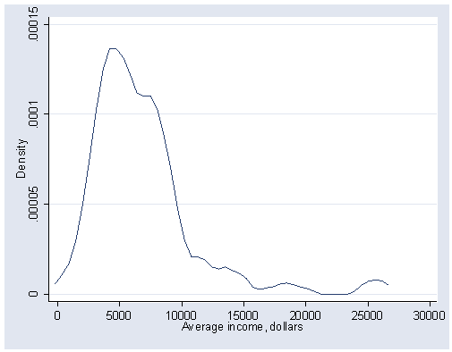
Page 41, figure 3.5 This figure shows an example of a kernel density estimator, which can be obtained
in Stata with the kdensity command. The width(800) option is used to
specify the half-width of 800.
kdensity income, xlabel(0(5000)30000) ylabel(0(.00005).00015) width(800)
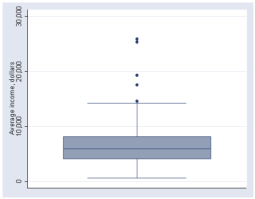
Page 47, figure 3.11 You can get a boxplot in Stata using the graph
box command.
graph box income, ylabel(0(10000)30000)
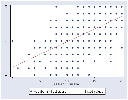
Page 51, figure 3.12 We can use the graph twoway command with two variables to obtain a scatterplot like figure 3.12.
use https://stats.idre.ucla.edu/stat/stata/examples/ara/vocab, clear

graph twoway (scatter vocab educ) (lfit vocab educ), ylabel(0 5 10)
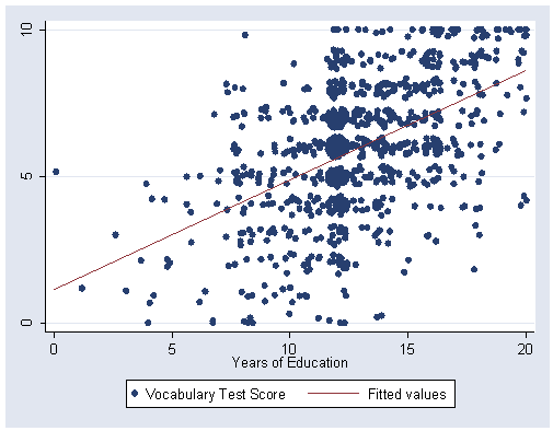
Page 51, figure 3.13. We can use the jitter(5) option to jitter the points and
provide a more readable scatterplot.
graph twoway (scatter vocab educ, jitter(5)) (lfit vocab educ), ylabel(0 5 10)
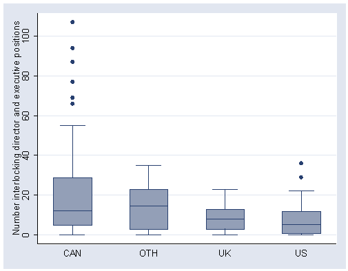
Page 52, figure 3.14 You can make side by side boxplots for the same variable in Stata by using
the over(nation) option on the graph command.
use https://stats.idre.ucla.edu/stat/stata/examples/ara/ornstein, clear

graph box intrlcks, over(nation)
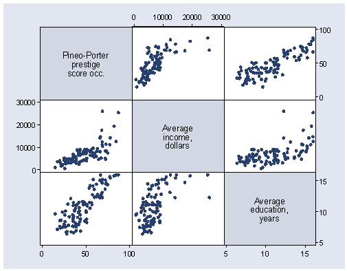
Page 54, figure 3.15 shows a scatterplot matrix using the graph matrix
command.
use https://stats.idre.ucla.edu/stat/stata/examples/ara/prestige, clear

graph matrix prestige income educat
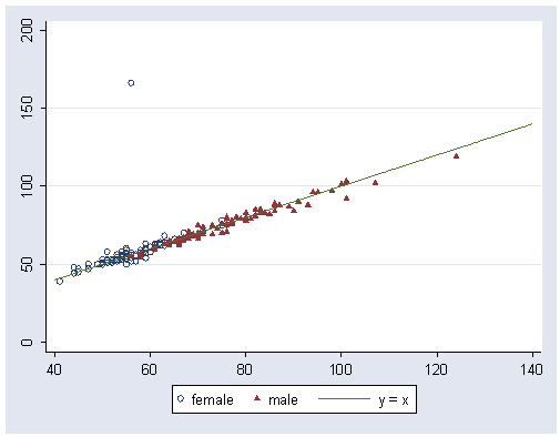
Page 55, figure 3.16.
use https://stats.idre.ucla.edu/stat/stata/examples/ara/davis, clear

graph twoway (scatter measwt reptwt if female == 1, msymbol(Oh) yvarlabel("female")) ///
	(scatter measwt reptwt if female == 0, msymbol(t) yvarlabel("male")) ///
	(function y = x, range(40 140) yvarlabel("y = x")), ylabel(0(50)200) legend(rows(1))
Page 56, figure 3.17. Unfortunately, Stata does not have 3-D graphs.