
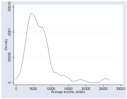
Page 65, figure 4.2 This figure shows an example of a kernel density estimator
(and is the same as page 41, figure 3.5, using the kdensity command.
The width(800) option is used to specify the half-width of 800.
use https://stats.idre.ucla.edu/stat/stata/examples/ara/prestige, clear

kdensity income, xlabel(0(5000)30000) ylabel(0(.00005).00015) width(800)
Page 66, table at top. You can download extrans from within Stata by typing search extrans
(see How can I use the search command to search for programs and get additional
help? for more information about using search).
extrans income

----> Variable income:

| Transformation      |    Q1    |    Q2    |    Q3    |(Q3-Q2)/(Q2-Q1)|
|_____________________|__________|__________|__________|_______________|
| income              |4075      |5930.5    |8206      |1.2263541
| SQRT(income)        |63.835728 |77.009518 |90.586975 |1.0306417
| LOG(income)         |8.3126259 |8.6878524 |9.0126209 |.86552668
| -1/SQRT(income)     |-.01566521|-.01298548|-.01103911|.72633104
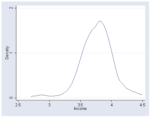
Page 66, figure 4.3. Stata cannot quite make a graph just like figure 4.3.
generate lincome = log10(income)
kdensity lincome, ylabel(0 1 2)
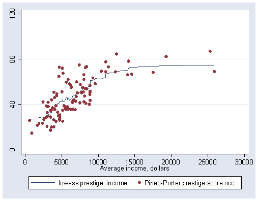
On page 72, figure 4.7 repeats figure 2.7 from Chapter 2.
graph twoway (lowess prestige income, bwidth(.2) noweight mean) (scatter prestige income), ///
	xlabel(0(5000)30000) ylabel(0(40)120)
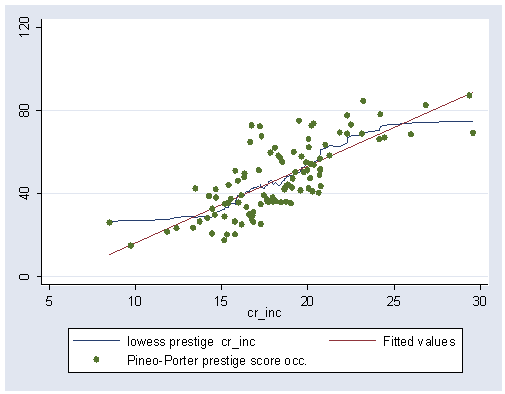
Page 72, figure 4.8. This figure shows performing a cube root transformation on income,
and then within graph twoway, combine the scatter plot, linear regression
line and lowess regression line.
generate cr_inc = income^(1/3)
graph twoway (lowess prestige cr_inc, bwidth(.2) noweight mean) (lfit prestige cr_inc) ///
	(scatter prestige cr_inc), xlabel(5(5)30) ylabel(0(40)120)
Page 73, figure 4.9 This shows a local regression and scatterplot of
mortality by income. In the final scatter overlay, we only scatter observations
with mortrate >= 250 and use mlabel(nation) option to portray
the outlying nation names.
use https://stats.idre.ucla.edu/stat/stata/examples/ara/leinhard, clear

graph twoway (lowess mortrate inc) (scatter mortrate inc) ///
	(scatter mortrate inc if mortrate >= 250, mlabel(nation)), ///
	xlabel(0(1000)6000) ylabel(0(250)750)
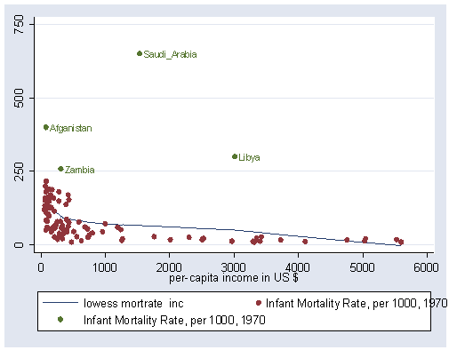
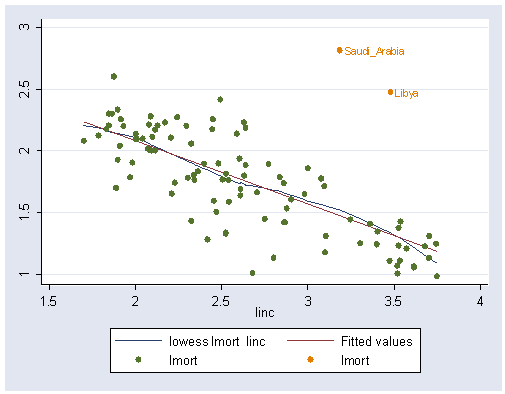
Page 74, figure 4.10 This graph shows the log of mortality by log of income.
Like figure 4.8, this shows the results of a local regression using lowess and least squares regression using
lfit.
generate linc = log10(inc)
generate lmort = log10(mortrate)
graph twoway (lowess lmort linc if nation ~="Saudi_Arabia" | nation ~="Libya", bwidth(.5)) ///
	(lfit lmort linc if nation ~="Saudi_Arabia" | nation ~="Libya") ///
        (scatter lmort linc if nation ~="Saudi_Arabia" | nation ~="Libya") ///
        (scatter lmort linc if nation =="Saudi_Arabia" | nation =="Libya", mlabel(nation))
Page 75, figure 4.11 repeats figure 3.14 shown on page 52, as shown below.
use https://stats.idre.ucla.edu/stat/stata/examples/ara/ornstein, clear

graph box intrlcks, over(nation) ylabel(0(50)150)
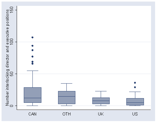
On page 75, the table in the center of the page can be produced using the table
command in Stata. The lower hinge is p25, the median is p50,
the upper hinge is p75 and the hinge spread is the interquartile range (iqr).
table nation, c(p25 intrlcks p50 intrlcks p75 intrlcks iqr intrlcks)

----------+-----------------------------------------------------------
Nation of |
Control   | p25(intrlcks)  med(intrlcks)  p75(intrlcks)  iqr(intrlcks)
----------+-----------------------------------------------------------
      CAN |             5             12             29             24
      OTH |             3           14.5             23             20
       UK |             3              8             13             10
       US |             1              5             12             11
----------+-----------------------------------------------------------
Page 76, figure 4.12, skipped for now.
Page 77, figure 4.13 skipped for now.
Page 78, figure 4.14. We convert the percent women to the proportion women,
and make a stem and leaf plot of that.
use https://stats.idre.ucla.edu/stat/stata/examples/ara/prestige, clear

gen propwomn = percwomn / 100
stem percwomn, round(1)

Stem-and-leaf plot for percwomn (% of incumbents who were women)

percwomn rounded to integers

  0* | 00000111111111111222223334444444
  0. | 555667788899
  1* | 11112344
  1. | 566777
  2* | 0144
  2. | 568
  3* | 0134
  3. | 599
  4* |
  4. | 778
  5* | 22
  5. | 567
  6* | 3
  6. | 889
  7* | 12
  7. | 56667
  8* | 334
  8. |
  9* | 123
  9. | 66678
Page 80, figure 4.16. This converts the proportion of women into the logit,
and makes a stem and leaf plot. The Stata stem and leaf plot does not look the same as the one in Fox.
generate pprime  = .005 + .99*propwomn
generate lgtperc = ln(pprime / (1-pprime))
stem lgtperc, round(.1) lines(2)

Stem-and-leaf plot for lgtperc

lgtperc rounded to nearest multiple of .1
plot in units of .1

 -5* | 33333
 -4. | 65555
 -4* | 4322210
 -3. | 98765
 -3* | 4332211000
 -2. | 8887755
 -2* | 4443210000
 -1. | 988777655
 -1* | 431111
 -0. | 988776
 -0* | 44111
  0* | 11223
  0. | 578899
  1* | 11112
  1. | 566
  2* | 24
  2. | 5
  3* | 1112
  3. | 5