use https://stats.idre.ucla.edu/stat/stata/examples/rwg/concord1, clear
(Hamilton (1983))
Use the summarize command to get the sample means and standard deviations for 1980 and 1981 water use (pages 2-4).
summarize water81

Variable |     Obs        Mean   Std. Dev.       Min        Max
---------+-----------------------------------------------------
 water81 |     496    2298.387   1486.123        100      10100
summarize water80

Variable |     Obs        Mean   Std. Dev.       Min        Max
---------+-----------------------------------------------------
 water80 |     496    2732.056     1763.8        200      12700
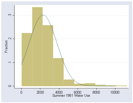
Figure 1.2, page 6. The bin(9) option allows us to change the number of bars in the histogram to 9. The graph is saved here for later use and overwritten if it already exists.
histogram water81, normal fraction bin(9) start(0) ///
	xlabel(0(2000)10000) ylabel(0(.1).3) saving(f1_2,replace)
Using the detail option with the summarize command, we get the median and percentiles on pages 7 – 8.
summarize water81, detail

                    Summer 1981 Water Use
-------------------------------------------------------------
      Percentiles      Smallest
 1%          200            100
 5%          500            100
10%          800            100       Obs                 496
25%         1200            100       Sum of Wgt.         496

50%         2050                      Mean           2298.387
                        Largest       Std. Dev.      1486.123
75%         2900           8100
90%         4000           9200       Variance        2208563
95%         4800           9400       Skewness       1.722315
99%         8100          10100       Kurtosis       7.655782
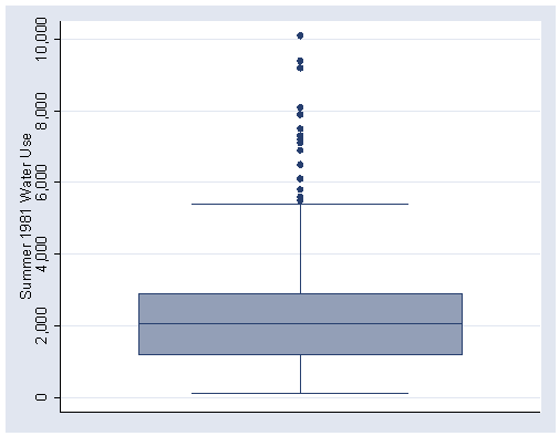
Figure 1.3, page 9.
graph box water81, ylabel(0(2000)10000) saving(f1_3,replace)
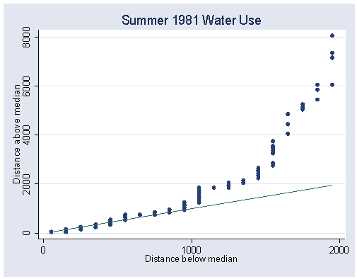
Figure 1.4, page 11.
symplot water81, xlabel(0 1000 2000) ylabel(0(2000)8000) saving(f1_4,replace)
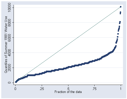
Figure 1.5, page 12. Note that we have one point which is above 10,000. Stata allows us to plot points outside the axis range we specify. This is a flexible feature, but can be deceiving.
quantile water81, ylabel(0(2000)10000)
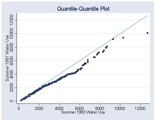
Figure 1.7, page 14.
qqplot water81 water80, xlabel(0(2000)12000) ylabel(0(2000)12000)
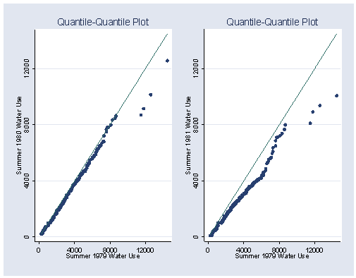
Figure 1.8, page 14. The two plots in this figure must first be saved separately before graphing them together.
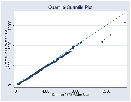
Left plot for figure 1.8.
qqplot water80 water79, xlabel(0(4000)12000) ylabel(0(4000)12000) saving(f1_8a,replace)
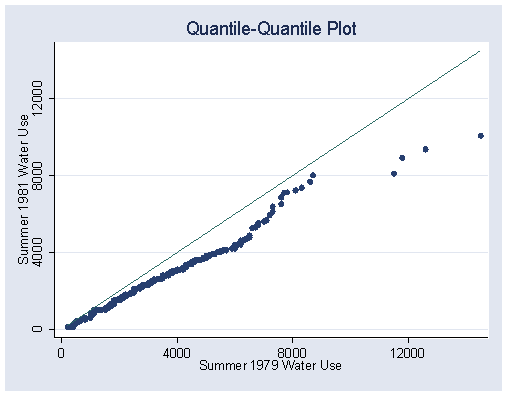
Right plot for figure 1.8.
qqplot water81 water79, xlabel(0(4000)12000) ylabel(0(4000)12000) saving(f1_8b,replace)
Left and right plots graphed together.
graph combine f1_8a.gph f1_8b.gph
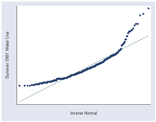
Figure 1.9, page 16. Stata automatically labels the x-axis ‘Inverse Normal’ but the graph is essentially the same.
qnorm water81, xlabel(-2000(0)6000) ylabel(-2000(0)10000) saving(f1_9,replace)
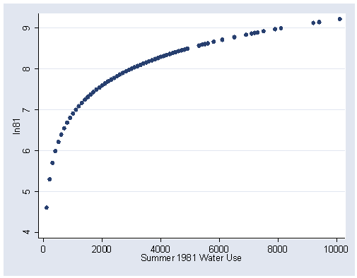
Figure 1.13, page 20. The natural log of water81 is not a variable in the concord1 data set, so we have to generate a new variable with the generate command.
generate ln81=ln(water81)
graph twoway scatter ln81 water81, xlabel(0(2000)10000) ylabel(4(1)9)
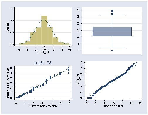
Figure 1.17, page 22. Here we see the three steps needed to combine several plots of the distribution of the transformed 1981 water use variable into one multiple graph. Figures 1.14 – 1.15 were skipped since the steps are the same. Also, the individual plots are not displayed this time.
Step 1. create a new variable of 1981 water to the 0.3 power.
generate wat81_03 = water81^0.3
Step 2. Graph each part individually and save each plot.
Top-left histogram:
histogram wat81_03, nodraw normal bin(9) xlabel(4(2)16) ylabel(0(.1).3) saving(f1_15a,replace)
Top-right boxplot:
graph box wat81_03, nodraw ylabel(4(2)16) saving(f1_15b,replace)
Bottom-left symmetry plot:
symplot wat81_03, nodraw xlabel(0(1)6) ylabel(0(1)6) saving(f1_15c,replace)
Bottom-right quantile normal plot:
qnorm wat81_03, nodraw xlabel(4(2)16) ylabel(4(2)16) saving(f1_15d,replace)
Step 3. Graph the four plots together as one figure and save it.
graph combine f1_15a.gph f1_15b.gph f1_15c.gph f1_15d.gph, saving(f1_15, replace)
Finally, save the dataset with the new variables we created.
save newconc1

