A user-written command called meansdplot that will produce this type of graph. To get this program just type the following into the Stata command box and follow the instructions: search meansdplot (see How can I use the search command to search for programs and get additional help? for more information about using search).
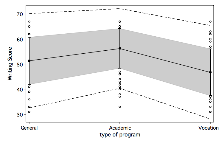
For the first example, we will set the outer fence at 2 standard deviations to check for outliers. We will leave the inner fence at the default value of 1 standard deviation.
use https://stats.idre.ucla.edu/stat/stata/notes/hsb2, clear

meansdplot write prog, outer(2) xlabel(1 "General" 2 "Academic" 3 "Vocational") ytitle(Writing Score)
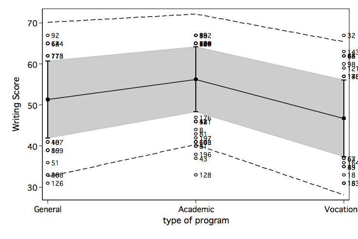
It is also possible to put marker labels on the values to identify the outliers. Don’t worry about the labels which are all jumbled on top of one another, just look at the ones you can read clearly, like 126, 128 and 32.
meansdplot write prog, outer(2) xlabel(1 "General" 2 "Academic" 3 "Vocational") ///
           ytitle(Writing Score) mlabel(id)

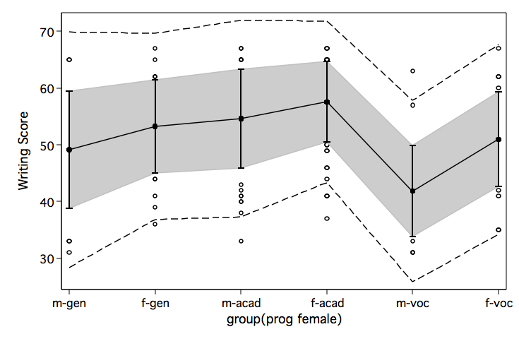
meansdplot can also be used with multiple group variables after using egen with the group option.
egen grp = group(prog female)

meansdplot write grp, outer(2) ytitle(Writing Score) ///
           xlabel(1 "m-gen" 2 "f-gen" 3 "m-acad" 4 "f-acad" 5 "m-voc" 6 "f-voc")


