Graphing results from the margins command can help in the interpretation of your model. Stata 12 introduced the
marginsplot command which make the graphing process very easy. These commands also work in later version of Stata.
Let’s start off with an easy example.
Example 1
The first example is a 3×2 factorial analysis of covariance. We will run the model using
anova but we would get the same results if we ran it using regression.
use https://stats.idre.ucla.edu/stat/data/hsbdemo, clear anova write prog##female math readNumber of obs = 200 R-squared = 0.6932 Root MSE = 6.59748 Adj R-squared = 0.5155 Source | Partial SS df MS F Prob > F ------------+---------------------------------------------------- Model | 12394.507 73 169.787767 3.90 0.0000 | prog | 22.3772184 2 11.1886092 0.26 0.7737 female | 1125.44586 1 1125.44586 25.86 0.0000 prog#female | 287.95987 2 143.979935 3.31 0.0398 math | 2449.19165 39 62.799786 1.44 0.0670 read | 2015.49976 29 69.4999916 1.60 0.0411 | Residual | 5484.36799 126 43.5267301 ------------+---------------------------------------------------- Total | 17878.875 199 89.843593
Next, we run the margins command to get the six adjust cell means from the 3×2
interaction. These adjusted cells means are called least squares means (lsmeans) in SAS or estimated marginal
means (emmeans) in SPSS.
margins prog#female, asbalancedAdjusted predictions Number of obs = 200 Expression : Linear prediction, predict() at : prog (asbalanced) female (asbalanced) math (asbalanced) read (asbalanced) ------------------------------------------------------------------------------ | Delta-method | Margin Std. Err. z P>|z| [95% Conf. Interval] -------------+---------------------------------------------------------------- prog#female | 1 0 | 50.43791 1.969439 25.61 0.000 46.57788 54.29794 1 1 | 56.9152 1.948113 29.22 0.000 53.09697 60.73343 2 0 | 52.58387 1.408514 37.33 0.000 49.82323 55.34451 2 1 | 55.05205 1.41875 38.80 0.000 52.27136 57.83275 3 0 | 47.81982 2.108078 22.68 0.000 43.68806 51.95158 3 1 | 57.29057 1.785628 32.08 0.000 53.79081 60.79034 ------------------------------------------------------------------------------
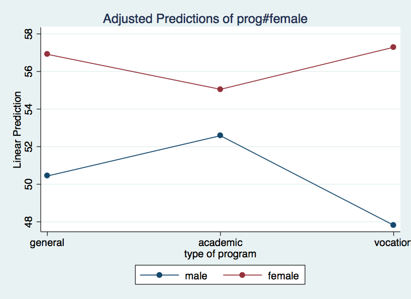
The marginsplot is used after margins to plot the adjusted cell means. The noci option tells Stata to suppress the confidence intervals.
/* plot prog by female */marginsplot, noci
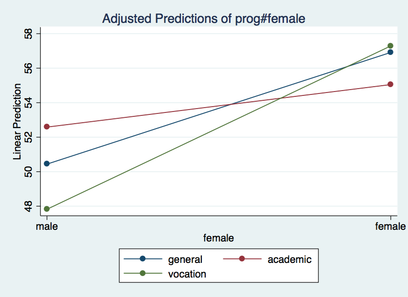
We can also graph the results for female by prog just by using the x()
option.
/* plot female by prog */marginsplot, x(female) noci
Example 2
For our second example, we will graph the results of a categorical by continuous interaction from a logistic regression model.
use https://stats.idre.ucla.edu/stat/data/logitcatcon, clear logit y i.f##c.s, nologLogistic regression Number of obs = 200 LR chi2(3) = 71.01 Prob > chi2 = 0.0000 Log likelihood = -96.28586 Pseudo R2 = 0.2694 ------------------------------------------------------------------------------ y | Coef. Std. Err. z P>|z| [95% Conf. Interval] -------------+---------------------------------------------------------------- 1.f | 5.786811 2.302518 2.51 0.012 1.273959 10.29966 s | .1773383 .0364362 4.87 0.000 .1059248 .2487519 | f#c.s | 1 | -.0895522 .0439158 -2.04 0.041 -.1756255 -.0034789 | _cons | -9.253801 1.94189 -4.77 0.000 -13.05983 -5.447767 ------------------------------------------------------------------------------
We will use the margins command to get the predicted probabilities for 11 values of
s from 20 to 70 for both f equal zero and f equal one. The syntax 20(5)70 means estimate predicted values for y when s equals 20, 25, 30 … 70. The vsquish option just reduces the number of blank lines in the output.
margins f, at(s=(20(5)70)) vsquishAdjusted predictions Number of obs = 200 Model VCE : OIM Expression : Pr(y), predict() 1._at : s = 20 2._at : s = 25 3._at : s = 30 4._at : s = 35 5._at : s = 40 6._at : s = 45 7._at : s = 50 8._at : s = 55 9._at : s = 60 10._at : s = 65 11._at : s = 70 ------------------------------------------------------------------------------ | Delta-method | Margin Std. Err. z P>|z| [95% Conf. Interval] -------------+---------------------------------------------------------------- _at#f | 1 0 | .0033115 .0040428 0.82 0.413 -.0046123 .0112353 1 1 | .1529993 .098668 1.55 0.121 -.0403864 .3463851 2 0 | .0079995 .0083179 0.96 0.336 -.0083033 .0243023 2 1 | .2188574 .1104097 1.98 0.047 .0024583 .4352564 3 0 | .0191964 .0164503 1.17 0.243 -.0130456 .0514383 3 1 | .3029251 .1126363 2.69 0.007 .082162 .5236882 4 0 | .0453489 .0304422 1.49 0.136 -.0143166 .1050145 4 1 | .4026401 .1026147 3.92 0.000 .201519 .6037612 5 0 | .1033756 .0500784 2.06 0.039 .0052238 .2015275 5 1 | .5111116 .0827069 6.18 0.000 .349009 .6732142 6 0 | .2186457 .0674192 3.24 0.001 .0865065 .3507849 6 1 | .6185467 .0611384 10.12 0.000 .4987176 .7383758 7 0 | .4044675 .0706157 5.73 0.000 .2660634 .5428717 7 1 | .7155135 .0476424 15.02 0.000 .6221361 .8088909 8 0 | .622414 .0675171 9.22 0.000 .4900828 .7547452 8 1 | .795962 .0437198 18.21 0.000 .7102727 .8816513 9 0 | .8000327 .0610245 13.11 0.000 .6804269 .9196385 9 1 | .8581703 .0421992 20.34 0.000 .7754613 .9408793 10 0 | .9066322 .0443791 20.43 0.000 .8196508 .9936136 10 1 | .9037067 .0387213 23.34 0.000 .8278143 .9795991 11 0 | .9592963 .0267857 35.81 0.000 .9067973 1.011795 11 1 | .9357181 .0332641 28.13 0.000 .8705218 1.000914 ------------------------------------------------------------------------------
In total, there are 22 values in the above table. There are two predicted probabilities for each value of
s. One each for level of f.
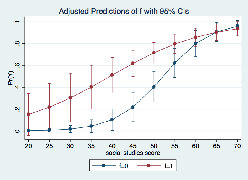
Now we can go ahead and graph the probabilities using the marginsplot command. This time we will include the default confidence intervals.
marginsplot
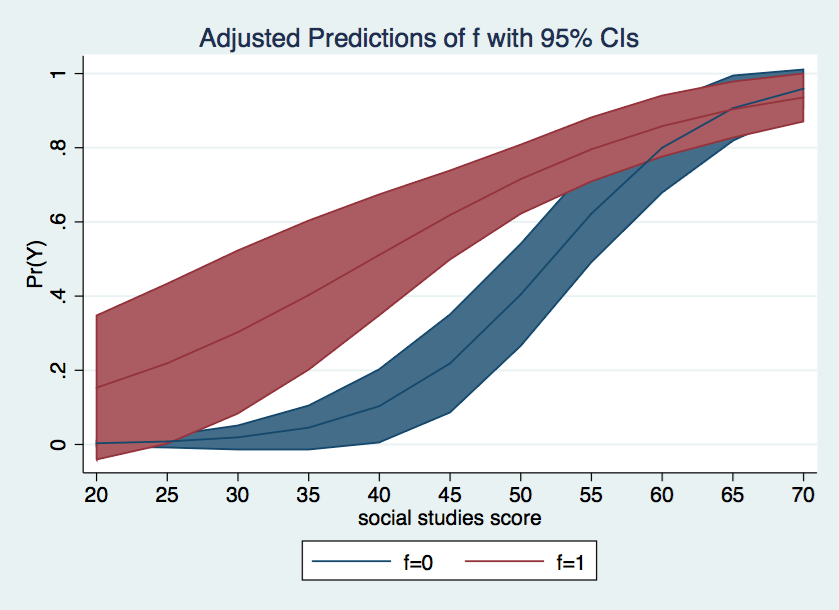
We can make the graph more visually attractive by shading the area inside the confidence intervals using the recast and recasti options. There are other options available in the Stata help file for marginsplot.
marginsplot, recast(line) recastci(rarea)
The graph of the probabilities above is nice as far as it goes but the presentation of the results
might be clearer if we were to graph the difference in probabilities between each level of f.
To do this we will need to rerun the margins command computing
the discrete change for f at each value of s. We can get the difference using the
dydx (derivative) option.
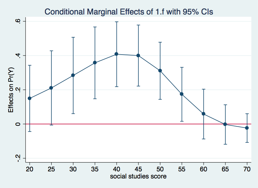
margins, dydx(f) at(s=(20(5)70)) vsquishConditional marginal effects Number of obs = 200 Model VCE : OIM Expression : Pr(y), predict() dy/dx w.r.t. : 1.f 1._at : s = 20 2._at : s = 25 3._at : s = 30 4._at : s = 35 5._at : s = 40 6._at : s = 45 7._at : s = 50 8._at : s = 55 9._at : s = 60 10._at : s = 65 11._at : s = 70 ------------------------------------------------------------------------------ | Delta-method | dy/dx Std. Err. z P>|z| [95% Conf. Interval] -------------+---------------------------------------------------------------- 1.f | _at | 1 | .1496878 .0987508 1.52 0.130 -.0438602 .3432358 2 | .2108578 .1107226 1.90 0.057 -.0061545 .4278701 3 | .2837288 .1138312 2.49 0.013 .0606236 .5068339 4 | .3572912 .107035 3.34 0.001 .1475064 .567076 5 | .407736 .0966865 4.22 0.000 .2182339 .597238 6 | .399901 .0910124 4.39 0.000 .22152 .578282 7 | .311046 .0851843 3.65 0.000 .1440878 .4780042 8 | .173548 .0804362 2.16 0.031 .0158959 .3312001 9 | .0581376 .0741941 0.78 0.433 -.0872801 .2035553 10 | -.0029255 .0588969 -0.05 0.960 -.1183612 .1125102 11 | -.0235782 .042708 -0.55 0.581 -.1072843 .0601279 ------------------------------------------------------------------------------ Note: dy/dx for factor levels is the discrete change from the base level.
Everything is ready for the marginsplot command. The yline(0) option adds a horizontal line at the 0 value of the y-axis, representing no difference in the probability of y=1 between the two levels of f.
marginsplot, yline(0)
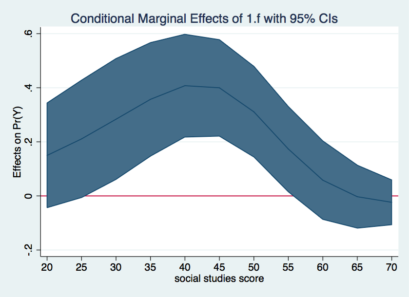
As nice as the above graph is, it might look better done as a range plot with area shading between the upper and lower confidence bounds.
marginsplot, recast(line) recastci(rarea) yline(0)
If you want the lines in these graphs to be smoother, just include more values in the
at option, say (20(2)70) instead of (20(5)70).

