This page will show several methods for making a correlation matrix heat map.
The first thing we need is a correlation matrix which we will create using the corr2data command by defining a correlation matrix (c), standard deviations (s) and means (m). We set the sample size to 400 using the n() option.
clear
mat c = (1, .7, .8, .02, .05, .01, .3, .36, .35     ///
       \ .7, 1, .75, .03, .02, .05, .29, .31, .37    ///
       \ .8, .75, 1, .005, .011, .01, .33, .4, .34   ///
       \ .02, .03, .005, 1, .72, .81, .2, .25, .19   ///
      \ .05, .02, .011, .72, 1,  .75, .21, .24, .29  ///
       \ .01, .05, .01, .81, .75, 1, .19, .28, .24   ///
       \ .3, .29, .33, .2, .21, .19, 1, .76, .79     ///
       \ .36, .31, .4, .25, .24, .28, .76, 1, .81    ///
       \ .35, .37, .34, .19, .29, .24, .79, .81, 1)
mat s = (10, 11, 9.5, 10.1, 10.5, 9.8, 9.5, 10.2, 9.9)
mat m = (50, 50, 50, 50, 50, 50, 50, 50, 50)

corr2data y1 y2 y3 y4 y5 y6 y7 y8 y9, corr(c) sds(s) mean(m) n(400)

corr

(obs=400)

     |       y1       y2       y3       y4       y5       y6       y7       y8       y9
-----+---------------------------------------------------------------------------------
  y1 |   1.0000
  y2 |   0.7000   1.0000
  y3 |   0.8000   0.7500   1.0000
  y4 |   0.0200   0.0300   0.0050   1.0000
  y5 |   0.0500   0.0200   0.0110   0.7200   1.0000
  y6 |   0.0100   0.0500   0.0100   0.8100   0.7500   1.0000
  y7 |   0.3000   0.2900   0.3300   0.2000   0.2100   0.1900   1.0000
  y8 |   0.3600   0.3100   0.4000   0.2500   0.2400   0.2800   0.7600   1.0000
  y9 |   0.3500   0.3700   0.3400   0.1900   0.2900   0.2400   0.7900   0.8100   1.0000
Inspection of the correlation matrix shows that there are three sets of variables that are strongly intercorrelated, (1, 2 & 3), (4, 5 & 6), and (7, 8 & 9). Correlations between variables in different sets vary from .01 to .40. These are the correlation that we want to visualize.
The next step is to take the elements of the correlation matrix and turn them into data values in our dataset. In this process we will create three new variables; rho1 the row index, rho2 the column index, and rho3 the correlation coefficient itself. The last command, svmat, saves the rho matrix to our dataset.
mat corr = r(C)
global nrows=rowsof(corr)
global nrows2=$nrows*$nrows
mat rho=J($nrows2,3,.)
local k=1
forvalues i=1/$nrows {
  forvalues j=1/$nrows {
    matrix rho[`k',1] = `i'
    matrix rho[`k',2] = `j'
    matrix rho[`k',3] = corr[`i',`j']
    local k=`k'+1
  }
}
svmat rho
Now we can create our correlation matrix heat maps beginning with one that uses the contour plot command. The ccuts() option define that cut values for the correlations while the ccolors defines the colors to be used for each of the cuts. One other item of note, the yscale(reverse) option reverses the scale on the y-axis so that the main diagonal of the plot goes from the upper left to the lower right.
twoway contour rho3 rho1 rho2 in 1/$nrows2, ccuts(0(.2)1) ///
  ccolors(white blue green yellow magenta red) xlabel(1(1)$nrows) ///
  ylabel(1(1)$nrows) xtitle("") ytitle("") yscale(reverse) ztitle(Correlation)
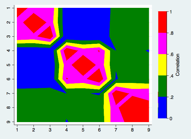
We can certainly see the structure of the correlations however there are other ways to produce a heat map.
This time we will use an ordinary twoway scatter plot command. This command looks a lot more complex but it really isn’t. Its just a scatterplot repeated multiple times for different ranges of the correlation coefficient. Again, we used the yscale(reverse) as before.
twoway (scatter rho1 rho2 if rho3>=.8, mcolor(red) msize(ehuge)) ///
  (scatter rho1 rho2 if rho3>=.6 & rho3<.8, mcolor(magenta) msize(ehuge)) /// (scatter rho1 rho2 if rho3>=.4 & rho3<.6, mcolor(yellow) msize(ehuge) ) /// (scatter rho1 rho2 if rho3>=.2 & rho3<.4, mcolor(green) msize(ehuge) )  ///
  (scatter rho1 rho2 if rho3<.2, mcolor(blue) msize(ehuge) ),  ///
  xlabel(.) ylabel(.) xtitle("") ytitle("") yscale(reverse)  ///
  legend(cols(1) stack position(3)  ///
  order(1 ".8-1.0" 2 ".6-.8" 3 ".4-.6" 4 ".2-.4" 5 "0-.2"))
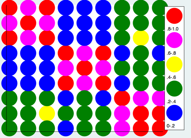
Using the same approach we can produce the heat map using a grey scale.
twoway (scatter rho1 rho2 if rho3>=.8, mcolor(gs4) msize(ehuge)) ///
  (scatter rho1 rho2 if rho3>=.6 & rho3<.8, mcolor(gs6) msize(ehuge)) /// (scatter rho1 rho2 if rho3>=.4 & rho3<.6, mcolor(gs8) msize(ehuge) ) /// (scatter rho1 rho2 if rho3>=.2 & rho3<.4, mcolor(gs10) msize(ehuge) )  ///
  (scatter rho1 rho2 if rho3<.2, mcolor(gs13) msize(ehuge) ),  ///
  xlabel(.) ylabel(.) xtitle("") ytitle("") yscale(reverse)  ///
  legend(cols(1) stack position(3)  ///
  order(1 ".8-1.0" 2 ".6-.8" 3 ".4-.6" 4 ".2-.4" 5 "0-.2"))
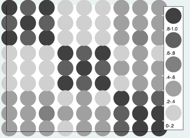
These examles show the basic principles but don’t deal with the complexity of negative correlations. One could always just take the absolute values of the correlation when reading in the correlation matrix. However, it is probably better to extend the scale of the heat map into the negative values of the correlations. Here is an example using twoway scatter. Using RGB values the colors range from the pink to red for the positive correlations and from light blue to dark blue for the negative correlations.
* define the correlation matrix
clear
mat c = (1, .7, .8, .02, .05, .01, -.3, -.36, -.35     ///
       \ .7, 1, .75, .03, .02, .05, -.29, -.31, -.37    ///
       \ .8, .75, 1, .005, .011, .01, -.33, -.4, -.34   ///
       \ .02, .03, .005, 1, .72, .81, -.2, -.25, -.19   ///
      \ .05, .02, .011, .72, 1,  .75, -.21, -.24, -.29  ///
       \ .01, .05, .01, .81, .75, 1, -.19, -.28, -.24   ///
       \ -.3, -.29, -.33, -.2, -.21, -.19, 1, .76, .79     ///
       \ -.36, -.31, -.4, -.25, -.24, -.28, .76, 1, .81    ///
       \ -.35, -.37, -.34, -.19, -.29, -.24, .79, .81, 1)
mat s = (10, 11, 9.5, 10.1, 10.5, 9.8, 9.5, 10.2, 9.9)
mat m = (50, 50, 50, 50, 50, 50, 50, 50, 50)
corr2data y1 y2 y3 y4 y5 y6 y7 y8 y9, corr(c) sds(s) mean(m) n(400)
corr

(obs=400)

     |       y1       y2       y3       y4       y5       y6       y7       y8       y9
-----+--------------------------------------------------------------------------------
  y1 |   1.0000
  y2 |   0.7000   1.0000
  y3 |   0.8000   0.7500   1.0000
  y4 |   0.0200   0.0300   0.0050   1.0000
  y5 |   0.0500   0.0200   0.0110   0.7200   1.0000
  y6 |   0.0100   0.0500   0.0100   0.8100   0.7500   1.0000
  y7 |  -0.3000  -0.2900  -0.3300  -0.2000  -0.2100  -0.1900   1.0000
  y8 |  -0.3600  -0.3100  -0.4000  -0.2500  -0.2400  -0.2800   0.7600   1.0000
  y9 |  -0.3500  -0.3700  -0.3400  -0.1900  -0.2900  -0.2400   0.7900   0.8100   1.0000

* read the correlations into data
mat corr = r(C)
global nrows=rowsof(corr)
global nrows2=$nrows*$nrows
mat rho=J($nrows2,3,.)
local k=1
forvalues i=1/$nrows {
  forvalues j=1/$nrows {
    mat rho[`k',1] = `i'
    mat rho[`k',2] = `j'
    mat rho[`k',3] = corr[`i',`j']
    local k=`k'+1
  }
}
svmat rho

* use twoway scatter to produce heat map
twoway (scatter rho1 rho2 if rho3>=.8, mcolor("250 50 50") msize(ehuge)) ///
  (scatter rho1 rho2 if rho3>=.6 & rho3<.8, mcolor("250 100 100") msize(ehuge)) /// (scatter rho1 rho2 if rho3>=.4 & rho3<.6, mcolor("250 150 150") msize(ehuge) ) /// (scatter rho1 rho2 if rho3>=.2 & rho3<.4, mcolor("250 200 200") msize(ehuge) ) /// (scatter rho1 rho2 if rho3>=0 & rho3<.2, mcolor("250 225 225") msize(ehuge) ) /// (scatter rho1 rho2 if rho3>= -.2 & rho3<0, mcolor("225 225 250") msize(ehuge) ) /// (scatter rho1 rho2 if rho3>= -.4 & rho3< -.2, mcolor("200 200 250") msize(ehuge) ) /// (scatter rho1 rho2 if rho3>= -.6 & rho3< -.4, mcolor("150 150 250") msize(ehuge) ) /// (scatter rho1 rho2 if rho3>= -.8 & rho3< -.6, mcolor("100 100 250") msize(ehuge) ) ///
  (scatter rho1 rho2 if rho3< -.8, mcolor("50 50 250") msize(ehuge) ),  ///
  xlabel(.) ylabel(.) xtitle("") ytitle("") yscale(reverse)  ///
  legend(cols(1) stack position(3)  ///
  order(1 ".8-1.0" 2 ".6-.8" 3 ".4-.6" 4 ".2-.4" 5 "0-.2" 6 "-.2-0" 7 "-.4 -.2" ///
  8 "-.6 -.4" 9 "-.8 -.6" 10 "-1.0 -.8"))
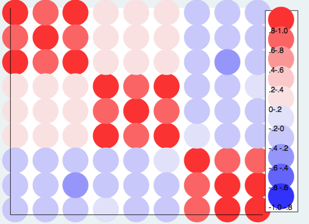
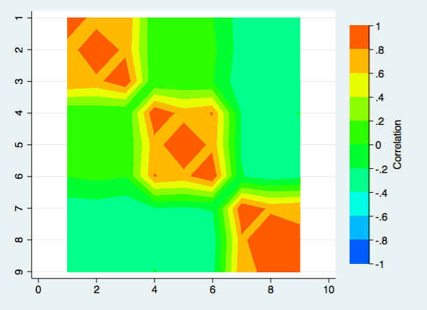
The choice of color scheme is very personal. Your choices may be very different from mine. If you like Stata’s default choice of colors for the contour plot, here is what that plot looks like.
twoway contour rho3 rho1 rho2 in 1/$nrows2, ccuts(-1(.2)1) ///
  ylabel(1(1)$nrows) xtitle("") ytitle("") yscale(reverse) ztitle(Correlation)
One final note, if you have more variables than the nine used in this example you may want to make the msize() smaller. In order from largest to smallest the sizes are: ehuge,vhuge, huge, vlarge, large, medlarge, medium, medsmall, small, vsmall, tiny, and vtiny.
