This FAQ shows examples of graphing data where the x axis represents dates.
For these examples, we will use the sp500 data file that comes with Stata and we can use it via the sysuse command. This data file contains data for all of the trading days in 2001.
sysuse sp500, clear
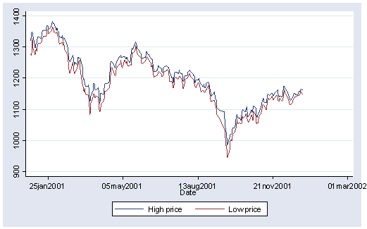
This file has variables like high and low that represents the high and low trading price for a given day and date which is a date variable indicating the date. We could use the graph twoway line command to graph the high and low closing price for the year, as shown below.
graph twoway line high low date
This graph does not look that bad. The x axis is properly labeled with the dates, but the selection of the values labeling this axis could be better. Also, it could be difficult to change the values labeling the x axis since these are date values.
Instead of using graph twoway line we can use graph twoway tsline which is specifically designed for making line graphs where the x axis is a date variable. We first need to use the tsset command to tell Stata that the variable date represents time and that its period is daily, see below.
tsset  date, daily
        time variable:  date, 02jan2001 to 31dec2001, but with gaps
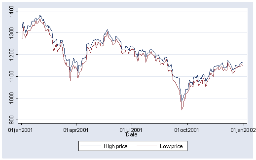
Now we can use graph twoway tsline to graph the data.
graph twoway tsline high low
Note that we did not need to specify date in the command. This is because Stata knew, from the tsset command, what the time variable was for this data file. Next, note that the labels for the x axis are labeled much better with more logical values having been chosen.
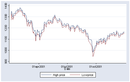
In addition to these benefits, there are options we can use that understand that the x axis is a date variable and are much easier to use. For example, say that we wanted the x axis to be labeled with just 01apr2001, 01jul2001, and 01oct2001, we can use the tlabel() option as shown below. Other options that can be used in a similar way include ttick(), tmlabel(), tmtick(), and tscale(), see axis_options for more details.
graph twoway tsline high low, tlabel(01apr2001 01jul2001 01oct2001)
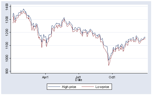
We can change the format of the display of the date variable using the format() option where we can supply in valid format that we would supply using the format command. Here we change the format of the date to be month and day.
graph twoway tsline high low , tlabel(01apr2001 01jul2001 01oct2001, format(%tdmd) )
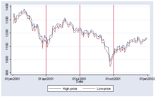
The tline() option also understands that the x axis is composed of dates and can be used to place lines at particular dates.
graph twoway tsline high low , tline(01apr2001 01jul2001 01oct2001)
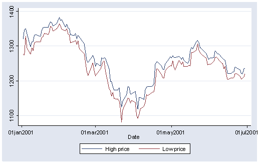
We can use if tin() to specify a range of date values that we would like to graph. Here we graph just the data for the first half of the year.
graph twoway tsline high low if tin(01jan2001, 30jun2001)
For more information
See the help for twoway_tsline.

