The xtline command allows you to generate linear plots for panel data.
We will show a number of examples from a data file which contains a measurement
of alcohol use, alcuse, taken at ages 14, 15 and 16 for 82 children
(identified by the variable id). We use Stata graph scheme s2mono, which
produces plots in grayscale, because publications often require monochromatic plots.
First, we read in the data file.
use https://stats.idre.ucla.edu/stat/stata/examples/alda/data/alcohol1_pp, clear
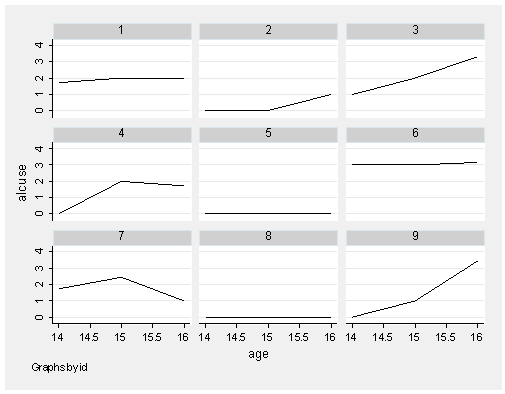
This first example shows a line connecting the three time points broken down
by id (one plot per child). We indicate that our time variable is age with t(age) and our
panel variable is id with i(id). The outcome that we wish to examine,
alcohol use, will appear on the vertical axis. The time variable we specify will
appear on the horizontal axis. A separate plot will be created for each
different id value.
xtline alcuse if id < 10, t(age) i(id) scheme(s2mono)
This example generates plots for the first 9 children’s observations in the file
(id < 10).
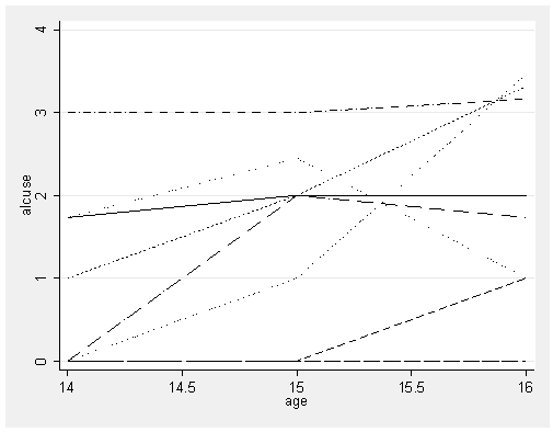
Suppose we are interested in seeing all of the above lines in one plot. To do this, we add overlay to our command.
xtline alcuse if id < 10, overlay t(age) i(id) legend(off) scheme(s2mono)
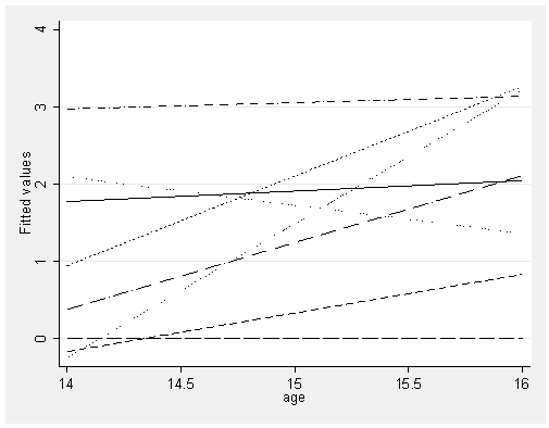
We can also plot fitted lines using the xtline command. In the next
example, we regress alcuse on age interacted with id. The
predicted values from this regression can then be plotted.
quietly regress alcuse i.id##c.age if id < 10
predict p
xtline p if id < 10, overlay t(age) i(id) legend(off) scheme(s2mono)