Question 1.
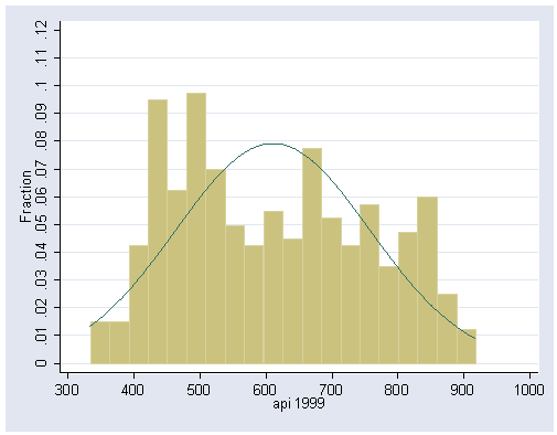
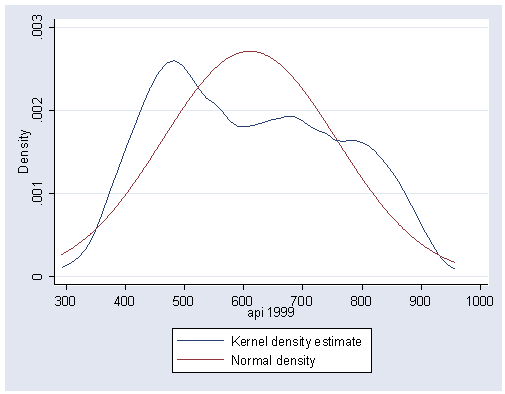
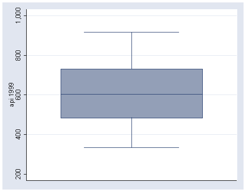
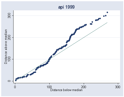
Make five graphs of api99: histogram, kdensity plot, boxplot, symmetry plot and normal
quantile plot.
Answer 1.
First we use the elemapi2 data file.
use https://stats.idre.ucla.edu/stat/stata/webbooks/reg/elemapi2, clear
Below we make the plots mentioned in question 1.
Histogram
histogram api99, bin(20) fraction normal xlabel(300(100)1000) ylabel(0(.01).12)
kdensity plot
kdensity api99, normal xlabel(300(100)1000)
boxplot
graph box api99
symmetry plot
symplot api99
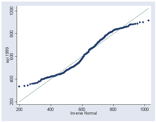
normal quantile plot
qnorm api99
Question 2.
What is the correlation between api99 and meals?
Answer 2.
Below we use the corr command to get this correlation.
corr api99 meals
(obs=400)

             |    api99    meals
-------------+------------------
       api99 |   1.0000
       meals |  -0.9081   1.0000
Question 3.
Regress api99 on meals. What does the output tell you?
Answer 3.
Below we perform the regression predicting api99 from meals.
regress api99 meals
      Source |       SS       df       MS              Number of obs =     400
-------------+------------------------------           F(  1,   398) = 1872.39
       Model |  7123743.65     1  7123743.65           Prob > F      =  0.0000
    Residual |  1514239.28   398  3804.62132           R-squared     =  0.8247
-------------+------------------------------           Adj R-squared =  0.8243
       Total |  8637982.94   399    21649.08           Root MSE      =  61.682

------------------------------------------------------------------------------
       api99 |      Coef.   Std. Err.      t    P>|t|     [95% Conf. Interval]
-------------+----------------------------------------------------------------
       meals |  -4.187142   .0967652   -43.27   0.000    -4.377377   -3.996908
       _cons |     862.76    6.60114   130.70   0.000     849.7825    875.7375
------------------------------------------------------------------------------
We see that the coefficient for meals has a t value of -43 and that it is significant. The coefficient is -4.18 (let’s round it to -4.2) so very every unit increase in meals, api99 goes down by 4.22 points. In other words, for every percent increase in children who receive free meals in a school, the api score for that school would be predicted to decrease by 4.2 points.
Question 4.
Create and list the fitted (predicted) values.
Answer 4.
We can create the predicted values using the predict command, as shown below.
predict yhat
(option xb assumed; fitted values)
We can view the first 20 predicted and actual values for api99 like this.
list api99 yhat in 1/20
      api99       yhat
  1.    600   582.2214
  2.    501   477.5429
  3.    472   456.6072
  4.    487   485.9172
  5.    425   490.1043
  6.    844   820.8885
  7.    864   841.8243
  8.    791   854.3857
  9.    838   841.8243
 10.    703   741.3329
 11.    808   858.5729
 12.    496   565.4729
 13.    815   850.1985
 14.    711   808.3271
 15.    802     833.45
 16.    780   770.6429
 17.    816     833.45
 18.    677   695.2743
 19.    759   820.8885
 20.    632   707.8358
Question 5.
Graph meals and api99 with and without the regression line.
Answer 5.
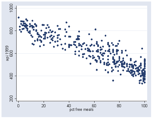
We can graph api99 by meals like this.
graph twoway scatter api99 meals
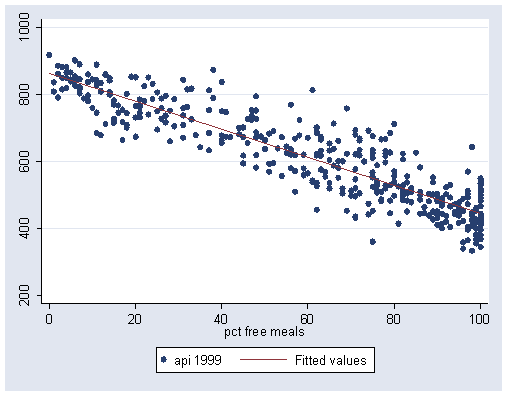
We can show a graph of api99 by meals with a regression line using the scatter program (assuming you installed it as shown in chapter 1) like this.
graph twoway (scatter api99 meals) (lfit api99 meals)
Question 6.
Look at the correlations among the variables api99 meals ell avg_ed using the corr
and pwcorr commands. Explain how these commands are different. Make a
scatterplot matrix for these variables and relate the correlation results to the
scatterplot matrix.
We first show the output using the corr command.
corr api99 meals ell avg_ed
(obs=381)

             |    api99    meals      ell   avg_ed
-------------+------------------------------------
       api99 |   1.0000
       meals |  -0.9088   1.0000
         ell |  -0.7638   0.7772   1.0000
      avg_ed |   0.7953  -0.8136  -0.6930   1.0000
Now we use the pwcorr command.
pwcorr api99 meals ell avg_ed
             |    api99    meals      ell   avg_ed
-------------+------------------------------------
       api99 |   1.0000
       meals |  -0.9081   1.0000
         ell |  -0.7628   0.7724   1.0000
      avg_ed |   0.7953  -0.8136  -0.6930   1.0000
It is hard to see the differences unless we use the obs option.
pwcorr api99 meals ell avg_ed, obs
             |    api99    meals      ell   avg_ed
-------------+------------------------------------
       api99 |   1.0000
             |      400
             |
       meals |  -0.9081   1.0000
             |      400      400
             |
         ell |  -0.7628   0.7724   1.0000
             |      400      400      400
             |
      avg_ed |   0.7953  -0.8136  -0.6930   1.0000
             |      381      381      381      381
             |
The corr command performs listwise deletion, so all of the correlations are based on the listwise n of 381. The pwcorr performs pairwise deletion and shows the correlation based on the number valid observations for each pair, for example api99 and meals have 400 valid pairs, but api99 and avg_ed have 381 valid pairs.
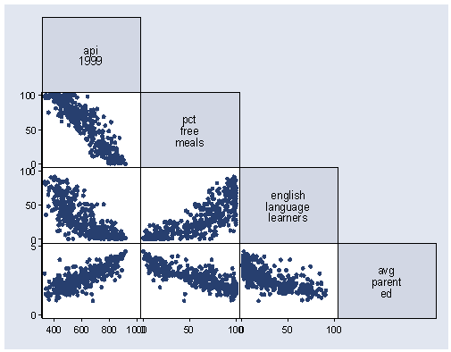
Below we show the scatterplot for api99 meals ell avg_ed.
graph matrix api99 meals ell avg_ed, half
The scatterplot matrix is a visual representation of the correlation between the variables. For each scatterplot in the scatterplot matrix, you can see the corresponding correlation in the correlation matrix.
Question 7.
Perform a regression predicting api99 from meals ell
avg_ed. Interpret the output.
Answer 7.
We can run this regression as shown below.
regress api99 meals ell
      Source |       SS       df       MS              Number of obs =     400
-------------+------------------------------           F(  2,   397) =  997.57
       Model |  7204423.31     2  3602211.66           Prob > F      =  0.0000
    Residual |  1433559.63   397  3610.98143           R-squared     =  0.8340
-------------+------------------------------           Adj R-squared =  0.8332
       Total |  8637982.94   399    21649.08           Root MSE      =  60.091

------------------------------------------------------------------------------
       api99 |      Coef.   Std. Err.      t    P>|t|     [95% Conf. Interval]
-------------+----------------------------------------------------------------
       meals |   -3.64528   .1484193   -24.56   0.000    -3.937066   -3.353494
         ell |  -.9013059    .190679    -4.73   0.000    -1.276173   -.5264392
       _cons |   858.4259   6.495999   132.15   0.000      845.655    871.1967
------------------------------------------------------------------------------
The t- value for all of these predictors are significant, so each is useful in predicting api99. The coefficient for meals is -3.6 and indicates that for every additional percent of children who receive free meals, the api score is predicted to be 3.6 points lower. The coefficient for ell is -.9, indicating that for every percentage increase in non-English speaking students, the api score for the school is predicted to be .9 units less.

